In the home health industry, web design is more than just a visual embellishment. It's about enabling care and building trust from the first click. Home health and home care organizations both rely on their websites as critical touchpoints with the people they serve. An engaging, user-friendly site can reassure visitors that they're in caring and competent hands.
A well-designed healthcare website can significantly boost patient engagement and drive business growth.
A successful home health website must speak to a range of external audiences. These include prospective patients or residents receiving care, family members researching services for their loved ones, job seekers looking to join the care team, investors evaluating the organization's stability, and vendor partners or referrers seeking information.
Each group comes to the website with unique questions and goals. The best sites provide intuitive navigation and targeted content to meet those needs. The following examples of outstanding home health websites demonstrate how inspiring design and clear communication can effectively serve all these audiences.
The 9 Best Home Health Website Designs
These examples demonstrate innovative approaches to fostering a healthier, more informed online community. They excel in the digital healthcare landscape, from providing user-friendly interfaces to offering comprehensive resources.
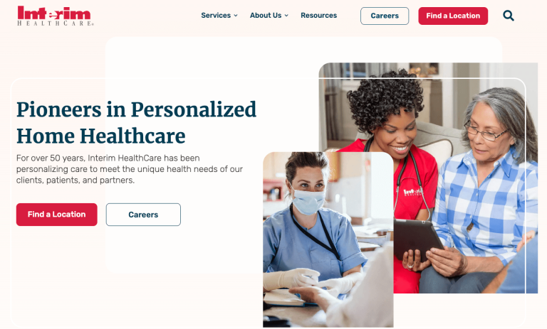


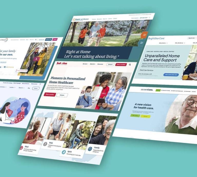
Interim Healthcare
– Clean Design

Interim Healthcare's website demonstrates impeccable design and a user-friendly interface. The site's minimalist approach is a breath of fresh air in a digital landscape often cluttered with information. The homepage strikes a delicate balance, offering enough information without overwhelming visitors.
The absence of unnecessary clutter combined with ample white space contributes to a sense of professionalism and trustworthiness. Clarity, simplicity, and user-centric design are prime examples of how a home health website can effectively communicate information while fostering a reassuring online experience for visitors.
One of the standout features of Interim Healthcare's website is its careful use of imagery and graphics.
The functional and aesthetically pleasing visuals convey a sense of care and compassion. The high-quality images humanize the healthcare experience, making it relatable for visitors seeking assistance.
The clear and concise icons are not merely decorative. They support on-page navigation, ensuring visitors find information quickly without unnecessary clicks or confusion.
Furthermore, information is logically structured and readily available for users seeking home health services.
CMS: Microsoft ASP.NET
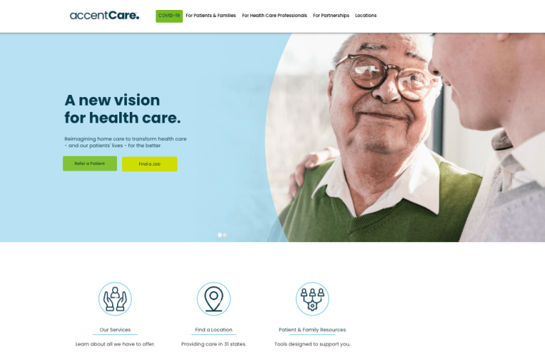
AccentCare
– Great User Experience
AccentCare boasts intuitive navigation and a pleasing color palette. It's immediately evident that user experience is a top priority.
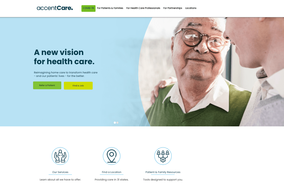
The website's navigation is a standout feature, with four primary choices, three of which focus on targeted audiences:
- Patients & Families
- Health Care Professionals
- Partnerships
The Location navigation item applies to all users.
The muted tones create a comforting atmosphere, crucial in healthcare, where visitors may seek support or guidance. AccentCare's website design goes beyond aesthetics. It embodies empathy.
The combination of intuitive navigation and soothing colors creates an environment that aligns with the supportive nature of home health services. That culture of support goes beyond promoting the company's services.
The website provides links to third-party service providers, making AccentCare's website a resource rather than just a sales platform. That approach creates a new level of trust and credibility for the company.
It's not just about providing information; it's about making the journey of seeking healthcare services as comforting and straightforward as possible.
CMS: Microsoft ASP.NET
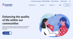
Maxim Healthcare Services
- Brand Confidence
Maxim Healthcare Services has a playful website design, embodying a clean and fun aesthetic. The cartoonish hero image features subtle movement of items in the background and blinking eyes. It is not overdone and does not distract from the words.

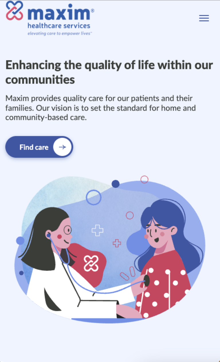
This creates a unique and inviting touch, steering clear of the clinical and sterile atmosphere often associated with healthcare websites. The decision balances professionalism and this lively spirit. The website's judicious use of color is another standout feature.
The flat design focuses attention on the headlines and labels. The red and blue color scheme creates a positive and uplifting online experience.
Its clean look, fun design, and effective use of color make it a standout example of how a home health website can be visually appealing and highly functional.
CMS: WordPress
Right at Home
– A Singular Focus
Right at Home earns its accolades through a stellar user experience anchored by a remarkable "Find Services" tool, which signals to visitors that the company wants to help.
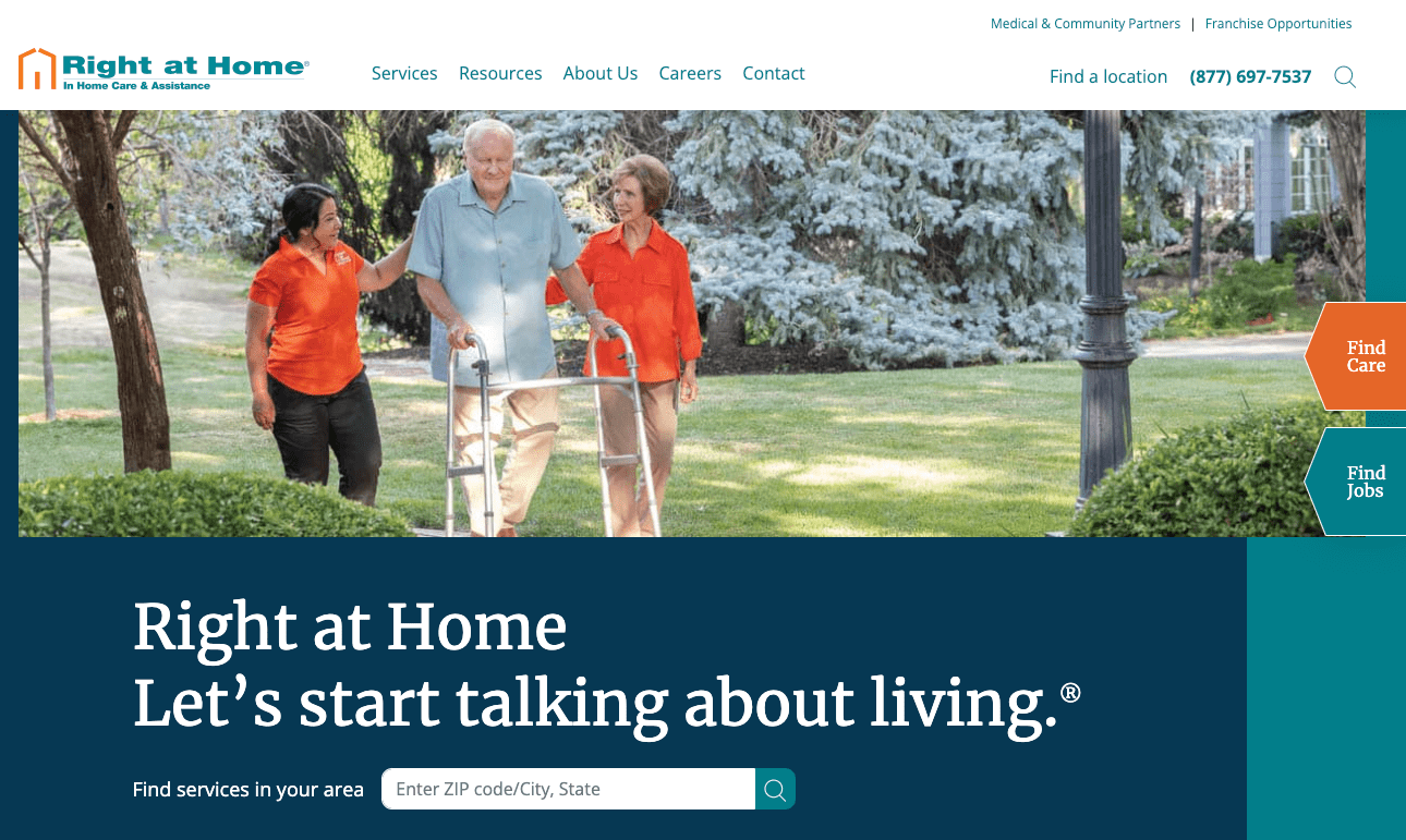
This tool, prominently positioned on the hero section of desktop browsers and the first screen of mobile devices, serves as a gateway to streamlined care navigation.
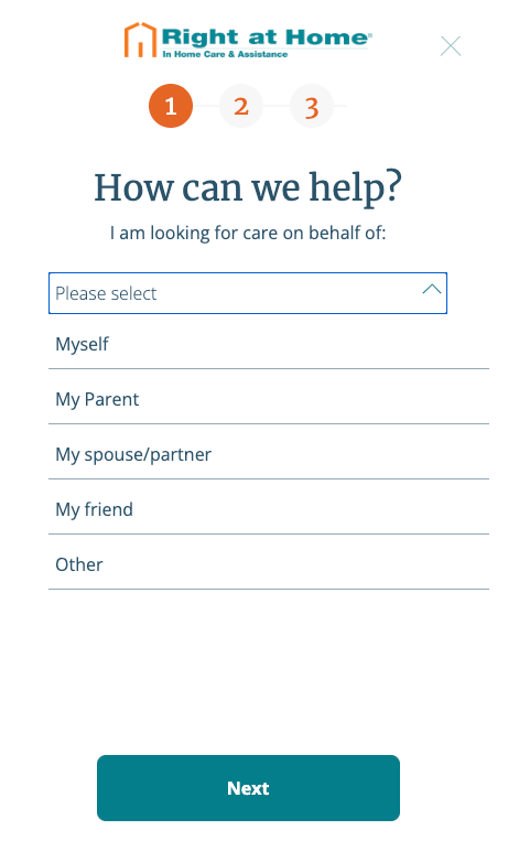
It's a powerful tool that simplifies finding the proper care signals to visitors the company wants to help.
It recognizes the user's primary intent — finding care — and places it front and center, minimizing the clicks to access information. The strategic placement supports the overall user experience, ensuring visitors can navigate Right at Home's resources.
It respects the user's time. If services are not offered, the user can move on.
Right at Home stands out for its commitment to user-friendly design, focusing on a seamless care-seeking process. The effective color scheme, mainly using dark blues and greens, creates a feeling of trust. Orange accents draw the eye to on-page navigation icons.
CMS: Sitecore
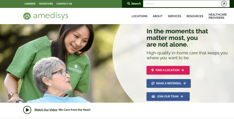
Amedisys
– User Engagement
Amedisys covers all the bases to answer questions for their primary audience – individuals or their loved ones needing to arrange home health services.
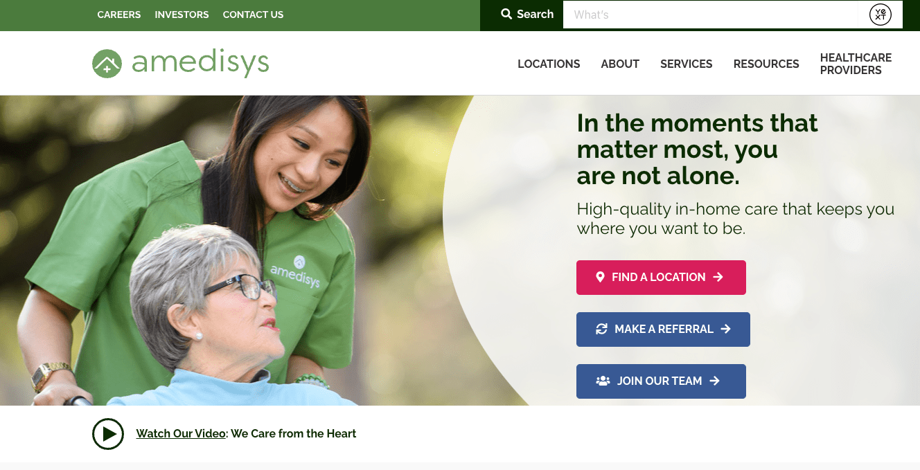
Users can immediately find a location where services are provided and then know what services are available with on-page images and headlines.
Further into the home page, Amedisys emphasizes the reasons to believe in the company with icons and bold label headlines that show its longevity in the industry and other statistics.
Another subtle feature can be found in the search box. On many websites, the search window is blank or features the word "SEARCH."
That's not the case with Amedisys. The window offers a sample search prompt. 
The intuitive navigation on Amedisys' website reflects a strategic approach to presenting services that acknowledges visitors' diverse needs. The thoughtful organization enhances the UX, making it easy for individuals to find specific care solutions without unnecessary clicks or confusion.
CMS: HubSpot
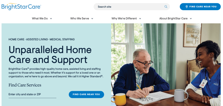
Brightstar Care
– Website Accessibility
Brightstar Care shines with its outstanding feature – big text that's easy to read and practical icon usage. This design enhances accessibility for all users and contributes to a clean and modern aesthetic. The user-centric interface, with key services like In-home care, memory care, and assisted living prominently displayed on the home screen, reflects a commitment to user experience.

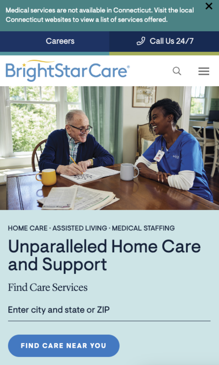
Large, readable text is a nod to inclusivity, ensuring that information is easily digestible for diverse audiences. The strategic use of icons further streamlines the user experience, offering a visual cue that aids quick comprehension.
In addition to the standard "Search" field at the top of the page, the website takes a unique approach with an interactive component that includes prompts in a selector for different audiences.
The tool begins with the phrase "I am looking for…" The word "Care" is auto-populated since it is the most common need for visitors. Users can select an icon for other options: Medical Staffing, A Job, or National Business Partnership.
CMS: Kentico, WordPress
Family Tree Cares
– Storytelling and Messaging
Family Tree Cares distinguishes itself with visual storytelling, employing engaging videos and eye-catching images to convey its commitment to supporting the aging experience with home healthcare services.
The website's home page features a captivating video focusing on people and relationships rather than clinical services.
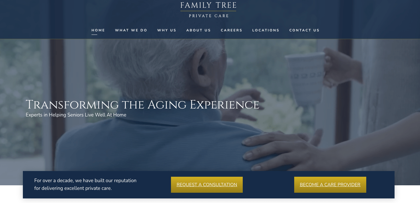
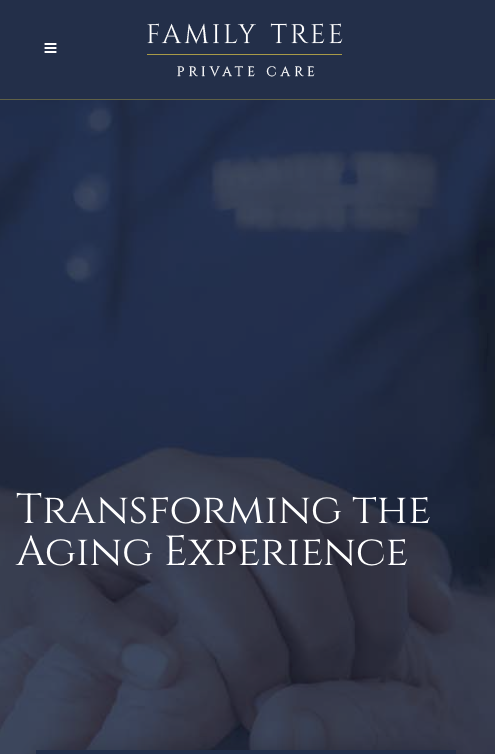
The video images mirror the words "Transforming the Aging Experience: Experts in Helping Seniors Live Well at Home."
This emphasis on visual storytelling delivers what text-based communication often can't convey.
The visuals evoke empathy and understanding. Incorporating videos and striking images enhances the website's aesthetic appeal and communicates the brand's values and dedication to improving the lives of those in their care.
CMS: Elementor, WordPress
Help at Home
– Color Harmony
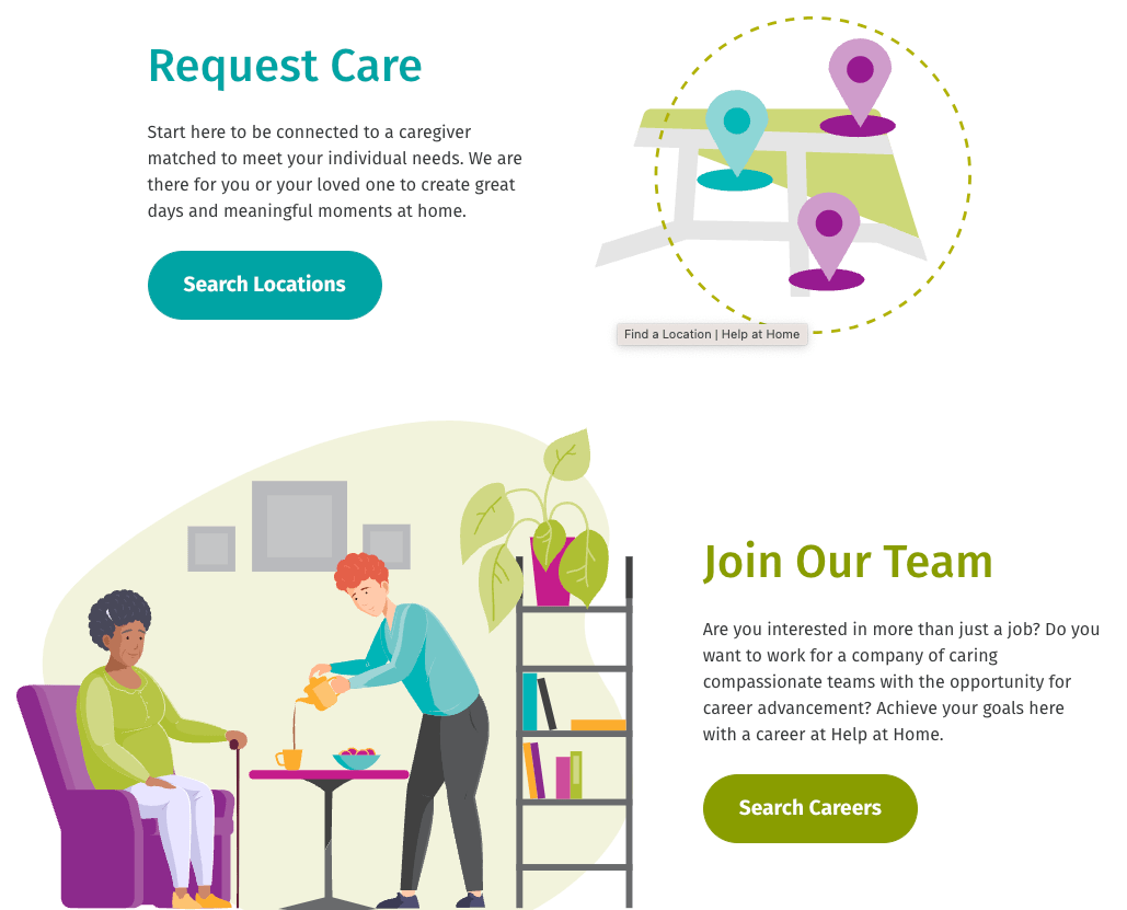
Help at Home excels in visual harmony, with its primary brand color supported by other bold colors throughout the website. This deliberate color scheme creates a cohesive and aesthetically pleasing experience, reinforcing the brand's identity and values.
The website's design demonstrates the importance of strategically creating and placing visual elements to convey a brand's message, make navigation intuitive, and create a distinct online identity.
The careful selection and coordination of colors on the Help at Home website contribute to a sense of unity and professionalism, making the brand more appealing and reflecting the organization's commitment to excellence.
CMS: WordPress
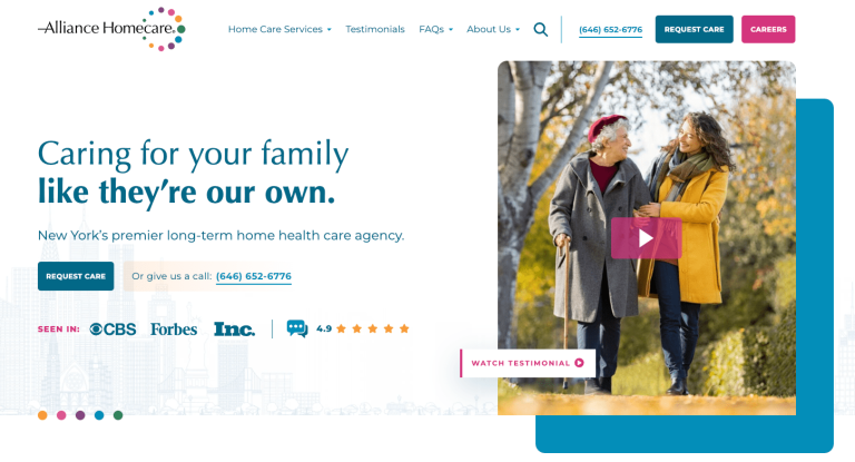
Alliance Homecare
– Fulfilling the Brand Promise
Alliance Homecare stands out for its emphasis on branding and brand promise — "Caring for your family like they're our own." This commitment to a personal and nurturing approach is evident throughout the website. The use of this brand promise helps establish a connection with visitors.

Visitors immediately see social proof to help establish credibility. The hero highlights credible news organizations where the company has been featured and stars representing their evaluations that link to testimonials. Finally, the hero image features a prompt to watch a testimonial video.
Additionally, Alliance Homecare's website presents detailed information without overwhelming the visitor, striking a careful balance between informative content and a clean, uncluttered layout. This approach showcases the organization's knowledge and expertise in home healthcare, instilling confidence in the quality of care.
CMS: WordPress
Behind Every Great Design
Even the most beautiful site needs a strong technical foundation to deliver the best user experience for visitors. Combining great design and robust development ensures that a home health website looks great, loads quickly, and responds perfectly on various connected devices used to access and browse the web.
High Performance is Essential

A solid web infrastructure is key because every marketing touchpoint (organic search, online ads, social media, email campaigns) ultimately leads users to the website. Various studies show that webpages optimized for speed and stability tend to keep visitors engaged longer, while slow sites drive them away.
In fact, decreasing page load times by just a fraction of a second can significantly boost user conversion and engagement. A 0.1-second improvement in mobile load time increased conversion rates by over 8% in some industries.
Performance metrics that website owners can measure using free tools like Google Lighthouse offer concrete benchmarks to strive for in development.
The bottom line: When the hub of your marketing wheel is fast, secure, and reliable, it fosters more trust once the audiences you're targeting with campaigns eventually land on the site, maximizing the ROI of all your marketing efforts.
SEO and AI-Driven Visibility

Great design and user experience are wasted if your audience can't find the site. This is where search engine optimization (SEO) and content strategy come in. Home health websites should be built with clean code and schema markup that search engines can easily crawl.
Structured data is no longer a "nice to have." It's a must-have for enhancing search visibility and rich results, even enabling voice search answers.
AI-driven search tools like ChatGPT, Bing Copilot, and Perplexity are changing how people discover information.
Your site needs well-structured, authoritative content to ensure your health organization appears in these conversational queries. Implementing schema markup helps AI platforms clearly understand your offerings, making it easier for them to retrieve and showcase your information.
In short, investing in SEO and structured content now means your site is prepared for both traditional Google searches and the emerging era of AI-powered search assistants.
Content That Informs and Builds Credibility

While design and tech set the stage, content and messaging engage audiences. The best home health websites strike a balance between promotion and education.
Beyond touting services, astute companies offer helpful content like guides for patients and families, resources on managing care at home, success stories, FAQs, and knowledge centers on health conditions.
This informational content positions the organization as a trusted advisor beyond being a service provider.
Accessibility and User Experience
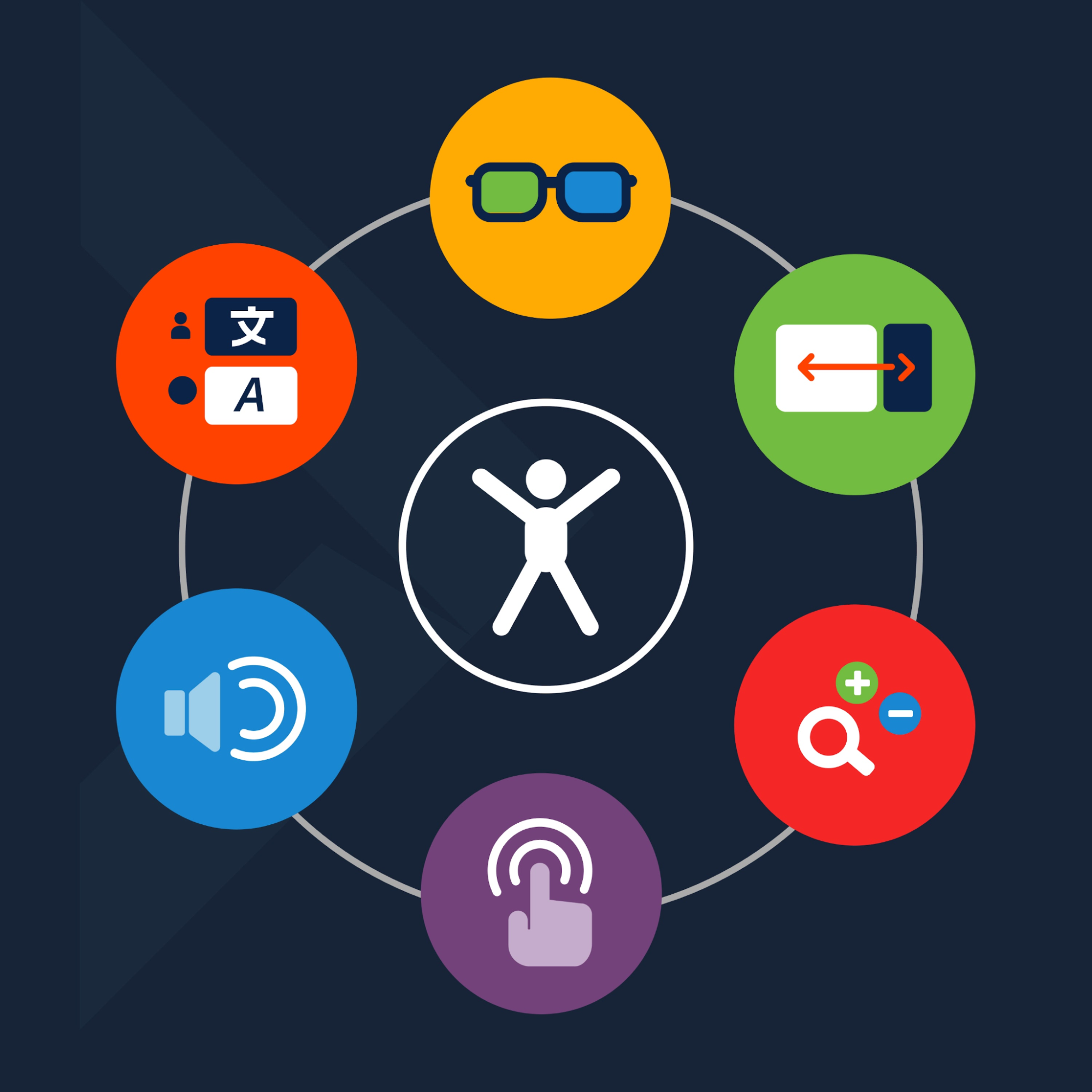
Accessibility and user experience (UX) are inseparable from good web design. With roughly one in four adults living with a disability, inclusive design is not just a compliance checkbox but a core requirement for healthcare brands.
Ensuring your home health site meets ADA/WCAG guidelines widens your reach and protects against legal risks. The new reality is that website accessibility benefits everyone.
Features like clear layouts, transcripts for multimedia, and easy-to-read typography improve usability for all visitors, including seniors or individuals with temporary setbacks.
A focus on UX means the site is easy to navigate with logical menus and on-site search. It also means optimizing for modern user behaviors. Many people now use voice search to ask questions like "home care services near me" or "how to get nursing help at home."
Sites that load fast, use natural language in their content, and employ appropriate schema are more likely to be surfaced by voice assistants and voice search results.
Supporting Careers and Talent Growth

Another often underestimated audience for home health websites is job seekers. The website's careers section plays a pivotal role in a field where quality care depends on attracting and retaining excellent staff.
Forward-thinking organizations treat their Careers page as a showcase for company culture, growth opportunities, and the meaningful work staff contribute to.
Practical elements like an up-to-date job board and easy online application forms are essential, but so is storytelling, for example, sharing employee testimonials or "day in the life" narratives to engage potential recruits.
As noted in our talent acquisition guide, top candidates evaluate potential employers just as carefully as consumers evaluate brands, so your site needs to put its best foot forward here. Home health providers can strengthen their workforce pipeline by investing in content and SEO geared toward job seekers, and home health providers can improve their workforce pipeline while building their client base.
For more on this topic, see our in-depth guide to leveraging your website for talent acquisition.
Full Digital Experience and Brand Trust
In the end, a home health organization's website is far more than a digital brochure. It's a critical part of the care experience and the business strategy.
When stunning design is backed by strong development, thoughtful content, and technical best practices, the result is a complete digital experience that reinforces the brand's trustworthiness at every touchpoint.
Patients and families feel confident reaching out for care, healthcare professionals see a reliable and forward-thinking partner, and prospective employees perceive an employer of choice.
This holistic approach to web design and execution ultimately drives success for home health organizations, converting more visitors into satisfied clients and engaged team members.
In a competitive, trust-based industry, a cohesive digital experience helps reinforce brand trust and positions the organization for long-term growth and impact.
High-Performance Websites Fuel Business Success
These home health websites reflect the care and dedication of the designers and developers. They embody the brand's mission through intuitive design, captivating visuals, and a user-centric commitment.
They go beyond functionality, becoming an outward expression of compassion and expertise, redefining the online healthcare experience with empathy at their core.
They redefine the online healthcare experience, seamlessly blending expertise with empathy.
See our Healthcare Website Services and Contact Us for an audit of your home health business website.
Related Posts