8 Examples of the Best B2B Website Design
Review our shortlist of great websites that use design principles to effectively market B2B brands and convert visiting prospects into new leads.
For many B2B organizations, web design is the best sales tool at their disposal because B2B marketing presents unique challenges when it comes to building customer relationships, bringing a steady flow of prospects into your marketing funnel, and generating qualified sales leads. That's why the best B2B websites are designed to inform, captivate, and persuade audiences to engage with brands.
The Impact of Great Web Design for B2B Brands
Designing B2B websites according to best practices is key to helping the site perform and deliver what your audience needs and expects. Design is key to offering the ideal user experience for website visitors. The better your website's user experience is for all visitors, the more often your brand will leave positive, lasting impressions and earn new customers.
There are three key reasons great web design can make or break the success of a B2B website:
- Supporting a Longer Sales Cycle – Unlike most B2C transactions, sales cycles in B2B tend to be relatively long. In fact, the B2B customer journey often includes numerous interactions and touchpoints across multiple media channels and mobile devices. So while B2C brands typically expect sales transactions to be completed within one website visit, B2B companies rarely expect prospects to convert when they're visiting the website for the first time.
- Sophisticated Business Solutions – Consumer products tend to be simple, easy-to-use, and easy to understand. Meanwhile, B2B solutions are often more complex, and may require a deep understanding of certain industries, technologies, and applications. When offering these B2B solutions online, your website becomes a critical tool for educating and supporting your audience's needs throughout the customer life cycle.
- SEO (search engine optimization) – Well-designed websites are also important for B2B brands because thoughtful web design improves user engagement metrics and SEO signals such as Page Experience, which helps the site capture more organic search traffic–which means more visiting prospects that can potentially convert into qualified sales leads.
If you are seeking inspiration or guidance for designing a great B2B website, review these examples of B2B websites that effectively deliver great web-based experiences for visitors.
8 Examples of the Best B2B Website Designs
- Blake Envelopes – Emphasize the quality of your product
- Asana – Perfectly placed calls-to-action
- Acme – Functional minimalism
- Zendesk – Customer service
- Dow – Define your value proposition
- Kao Collins – Interactive tools and content
- Adobe CXM – Design that tells a story
- Lockheed Martin – Captivating videography
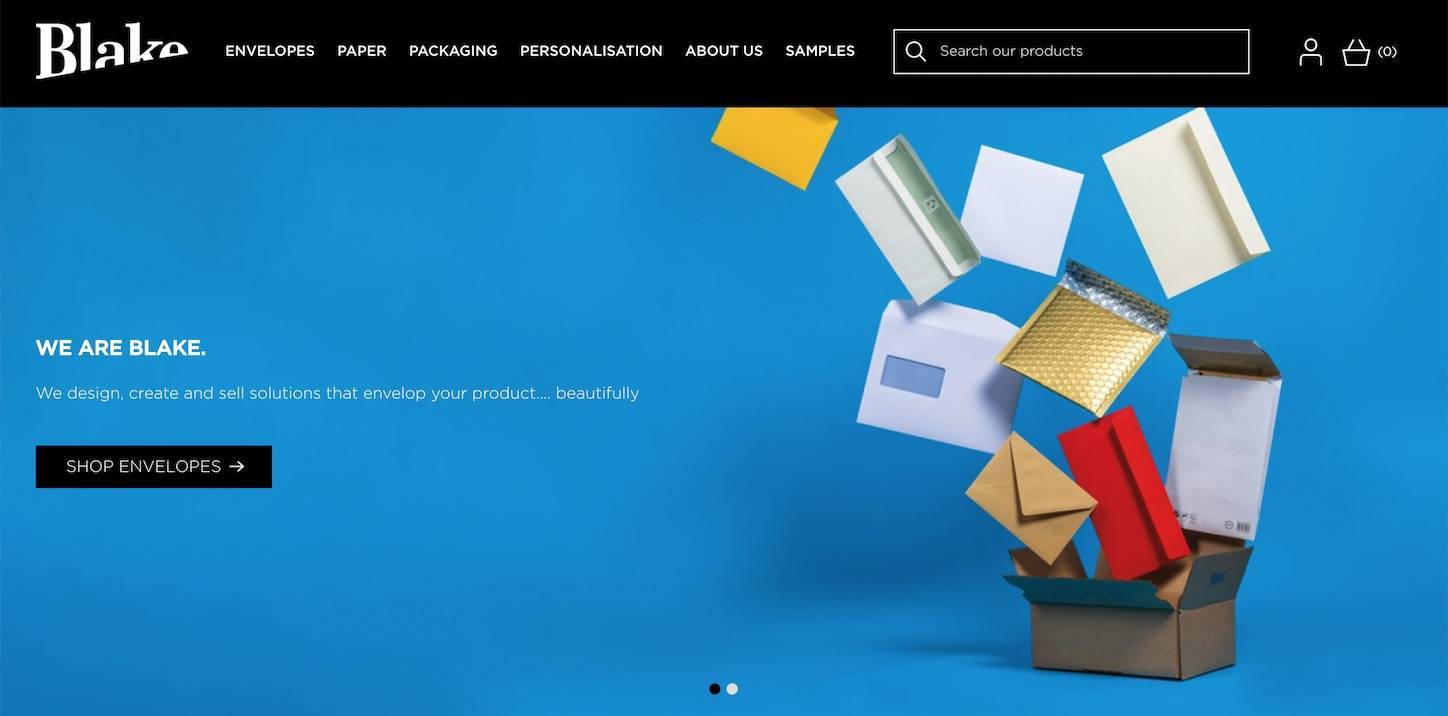
The Blake Envelopes website uses vibrant colors and images to convey product quality
Emphasize the Quality of Your Product
On a list of the Most Exciting Products, "envelopes" probably doesn't even rank. However, you couldn’t tell by visiting Blake Envelopes. Their website has a vibrant, cheery feel, and captures the audience's attention by featuring a variety of their high quality products. The site's imagery uses visually appealing colors and movement to make passive products feel more active and alive, which helps to keep users engaged and interested in the brand.
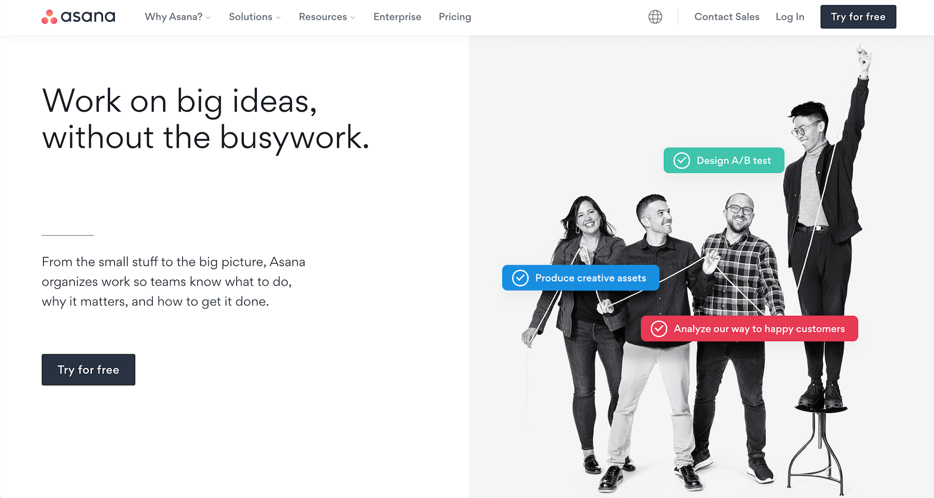
Asana's homepage Call to Action is followed by engaging animations and interactive elements as users scroll
Perfect Placement of CTAs (Calls To Action)
Asana does a great job directing their audience exactly where they want them to go. On their homepage, a giant call-to-action (CTA) waits in the "first fold" to convert their visitors into consumers. As users scroll, they see more CTAs positioned near animations of the product in action, including interactive design elements that prompt users to learn more and navigate to related pages.
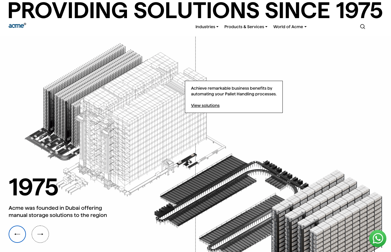
The Acme website's homepage does a great job of using minimalist design that is also functional
Functional Minimalism
Less is more. There is no need for clutter and chaos. Acme is a great example of this theory, improving their user experience with a minimalistic approach (a rare choice in B2B web design) to reduce load time and increase readability. When there is less content on a page, each element has a way of drawing more attention. Acme's homepage design is polished and simple, making small statements, like the centered and visibly prominent "Industrial Solutions Since 1975" tagline, more impactful and resonant with users.
What's equally impressive about Acme's minimalist web design is how it becomes more robust and intuitive as the user interacts with the page and navigates the site. The homepage is divided by subtle vertical lines so that each section links to interior landing pages; moving a cursor across sections of the page animates and reconstructs the background, rendering new imagery to show users where they will land when they click that area of the screen.
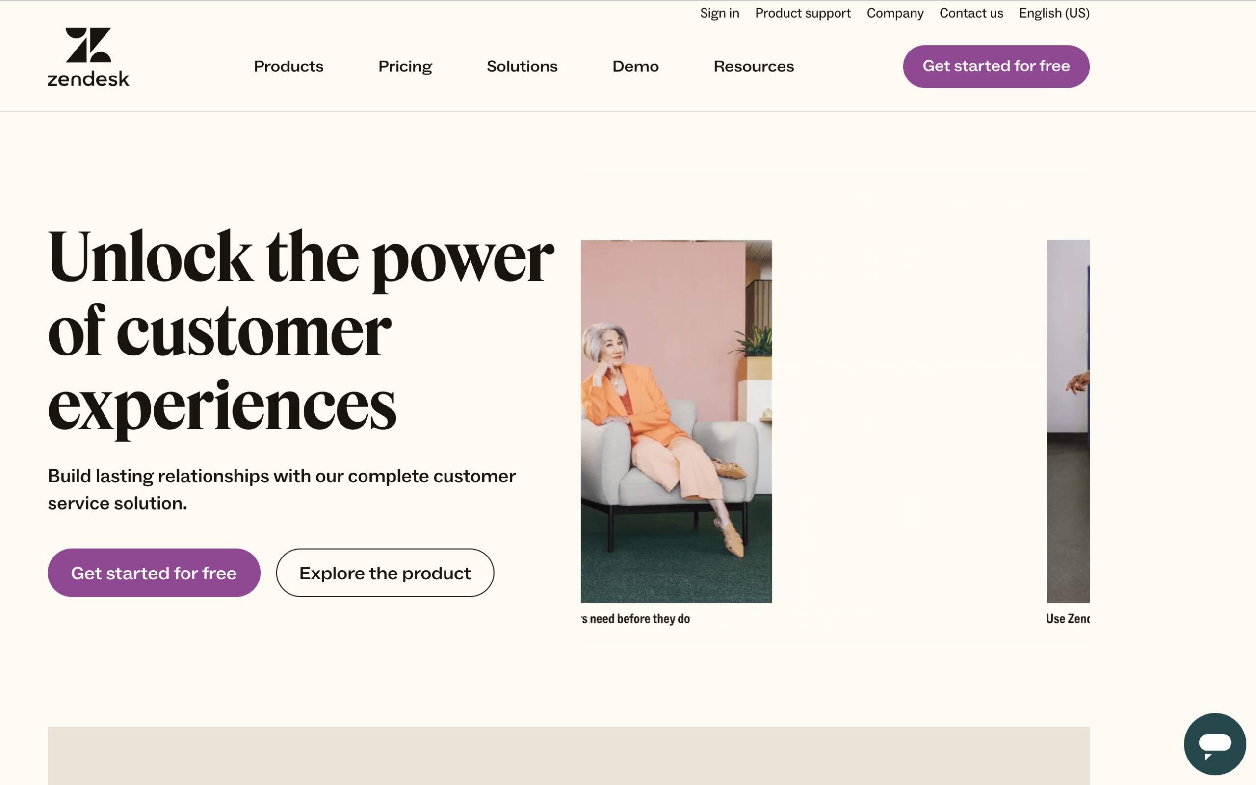
Zendesk's website design focuses on customers, much like their products and services
Customer Service
Zendesk has done an amazing job with their website by focusing the design on great customer support right from the jump. From the top fold of the homepage, site visitors can sign up for a free trial, watch a demonstration of the software, and click to chat with a live sales representative while getting the full experience at the tip of their fingers.
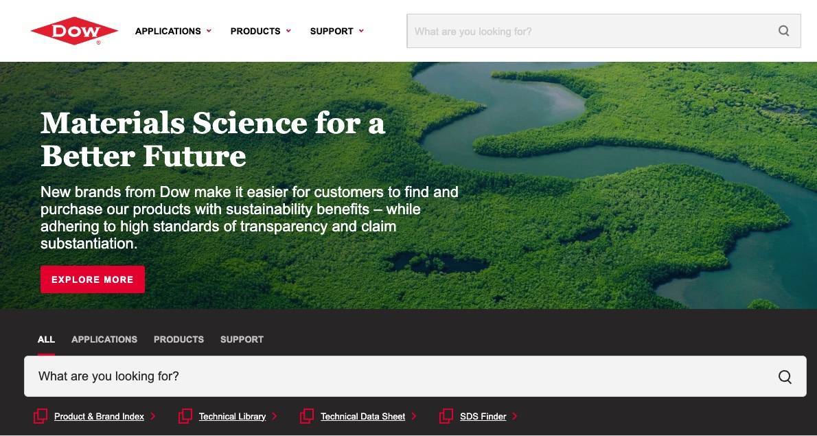
Dow states its value proposition in the top fold of its homepage.
Define Your Value Proposition
What are you offering? The audience should be able to instantly identify the company’s purpose and how it will deliver. Rather than excessive attempts to drive buyer motivation, focus the design on addressing how your company will provide solutions, the way Dow does on their homepage and throughout their website.
At the top of their website's homepage, the headline gives enough detail that the company's value proposition is clear: The company helps other businesses seeking more sustainable solutions within materials science.
Below the top fold, Dow's homepage also includes helpful visuals and links to other content demonstrating how Dow provides value to their customers. This web design technique is effective because even if a site visitor does not read or engage with content in the top fold, scrolling down the page will reveal even more content and links that help them navigate and understand how the company provides value.
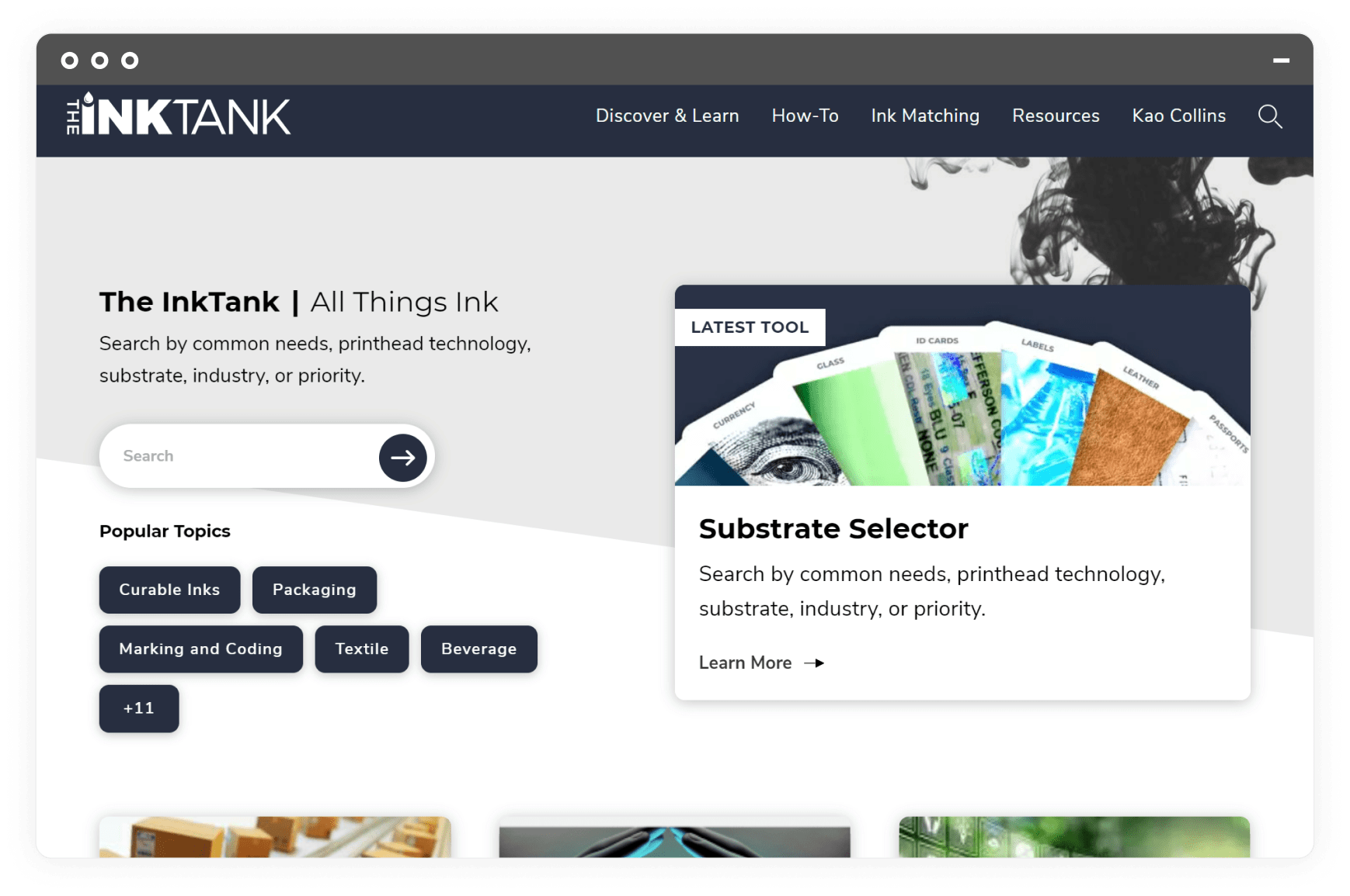
Kao Collins's InkTank uses vibrant colors and motion graphics to promote the blog's high-quality features and articles.
Interactive Tools & Content
Offering vibrant, interactive content to users will engage them and build positive sentiment towards your brand. Going even further and building interactive tools that help users explore your brand and business offerings increases the likelihood of generating leads.
Kao Collins, a global ink engineering and manufacturing leader, recognizes the impact great content has when combined with great B2B web designs. The front page of their Ink Tank blog leads with captivating visuals and features links to blog content and other resources within an appealing user interface.
The Ink Tank's design also prominently features Ink Answers, a robust interactive search tool built to help website visitors browse and find the right ink for printing on certain materials or achieving specific results. These kinds of interactive tools help your website visitors understand and even customize your solutions according to their needs.
Learn more about how we designed websites for Kao Collins and InkTank View Our B2B Portfolio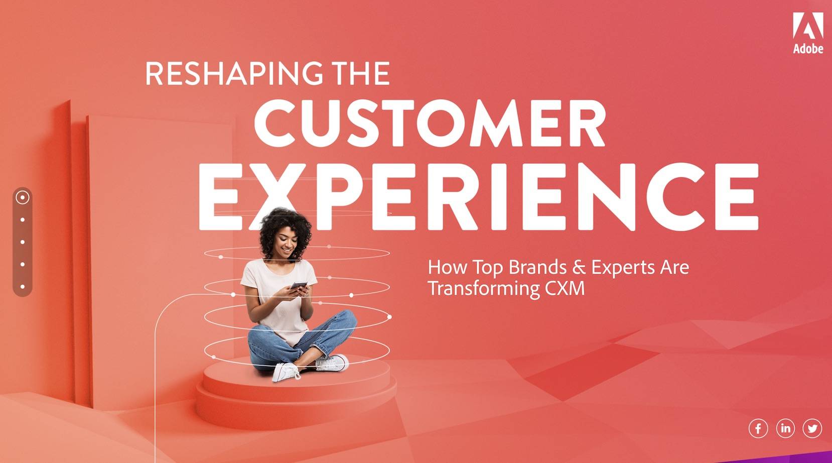
Adobe's CXM site effectively uses web design to lead visitors through a story about its product offerings
Design That Tells a Story
Instead of directing users through complex navigations and category pages, B2B sites should use a web design that takes visitors on a journey.
This approach, as seen on Adobe's CXM website, incorporates conversational marketing and interactive elements, rather than traditional static web content. As users scroll down the Adobe CXM homepage, the animated text and graphics explain how the company and its products help customers, including testimonials from industry experts.
This website demonstrates that conversational marketing on a B2B website is about more than chatbots and live support–it's about also using web design to help visitors discover your brand story and intuitively navigate to the pages, content, and information they are most interested in.
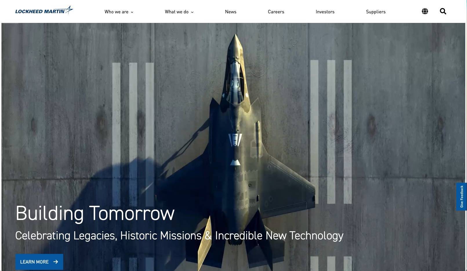
Lockheed Martin's website uses videos to demonstrate its brand position as an innovative B2B manufacturer.
Captivating Videography
Lockheed Martin leverages captivating videography to illuminate their website with a story of "who they are" as a B2B manufacturer producing innovative, high-tech solutions for industries such as aerospace, defense, and space exploration.
This web design trend is popular on B2B websites because videos are often more effective at conveying the nature and mission of a brand "at hello" rather than forcing website visitors to read excessive written content on "About" pages.
Tips for Writing Great B2B Website Content
A beautifully designed B2B website with poor content will fail to capitalize on many valuable business opportunities for your company. We recommend following these best practices when producing B2B content:
Briefly explain products and/or services upfront.
Visitors need your copy and messaging to get straight to the point. At the first sign of ambiguity, they will feel frustrated and bounce from the page, likely to visit one of your competitors.
Promote the benefits of partnership.
What will customers be gaining if they decide to work with your business? Use case studies and previous successful partnerships to show, rather than tell. In B2B marketing, results speak louder than words.
Strategically place every pixel of content within your pages.
Every pixel matters. Thoughtful placement of website content is crucial to directing your visitors to strategically placed calls-to-action. Web designers can also create visual hierarchy to help your visitors prioritize the more important information.
Need Great Design for a B2B Website?
At DBS, we have over 20 years of experience designing and developing B2B websites that generate more leads and organic search traffic than our clients' top industry competitors. Take a look at our award-winning work for B2B clients.
Contact us today for a free consultation and custom quote for your B2B website project.
FAQs
- Emphasize the quality of your products.
- Have intentionally and strategically placed calls-to-action (CTAs).
- Design with functional minimalism to minimize clutter and confusion.
- Define your value proposition through branded messaging.
- Offer quality content and features that support your target audiences.
- Develop a design that tells the brand story.
- Include captivating imagery and videography that elevates the brand.
- Briefly explain your products and services upfront before offering a deeper dive or more technical information in the form of articles or downloadable data sheets.
- Promote the benefits of partnership with your business through content such as case studies and testimonials.
- Strategically place every piece of content within your pages. For example, include downloadable product information and related customer testimonials along with the product listings, rather than placing them on a separate page.
Related Posts