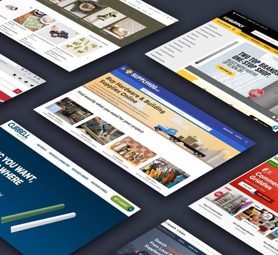

Great B2B Distributor and e-Commerce Website Examples
We feature the best examples of distributor websites that include e-Commerce features designed for selling B2B.
In recent years, nearly 68% of B2B firms have launched online storefronts or customer portals, and those embracing e-commerce have seen significant revenue growth. Even traditional distributors have shifted quickly. Fastenal, for example, now generates roughly 30% of its sales through online channels.
High-performing distributor websites stand out by delivering intuitive user experiences, accurate and detailed product data, fast performance, and deep integration with back-end systems. Below, we outline what defines a robust distributor e-commerce site and review several leading examples.
What Makes a Great B2B Distributor e-Commerce Website
Leading B2B distributor sites share a consistent set of characteristics.
-
User-Friendly UX: Clear navigation, robust search and filtering, mobile-responsive design, and efficient checkout and reordering flows.
-
Comprehensive Features: Customer-specific pricing, real-time inventory visibility, quick order tools, and quote support.
-
Data-Driven Content: Detailed product information and current stock data integrated from ERP systems.
-
Performance and Reliability: Fast page loads, minimal downtime, and a secure, modern technology stack.
- Integration and Personalization: Real-time links to ERP and CRM systems that enable account-based pricing and personalised content.
In practice, the best distributor e-commerce sites combine the usability standards of leading retail platforms with the depth of data and integration requirements of B2B environments.
Common Myths and Realities in Distributor e-Commerce The table highlights common assumptions and how they compare with current buyer behavior.
Great Distributor e-Commerce Websites
The following examples show how these principles are applied in practice.
1. Blue Diamond Attachments | Ecommerce Built for Dealers and Direct Buyers
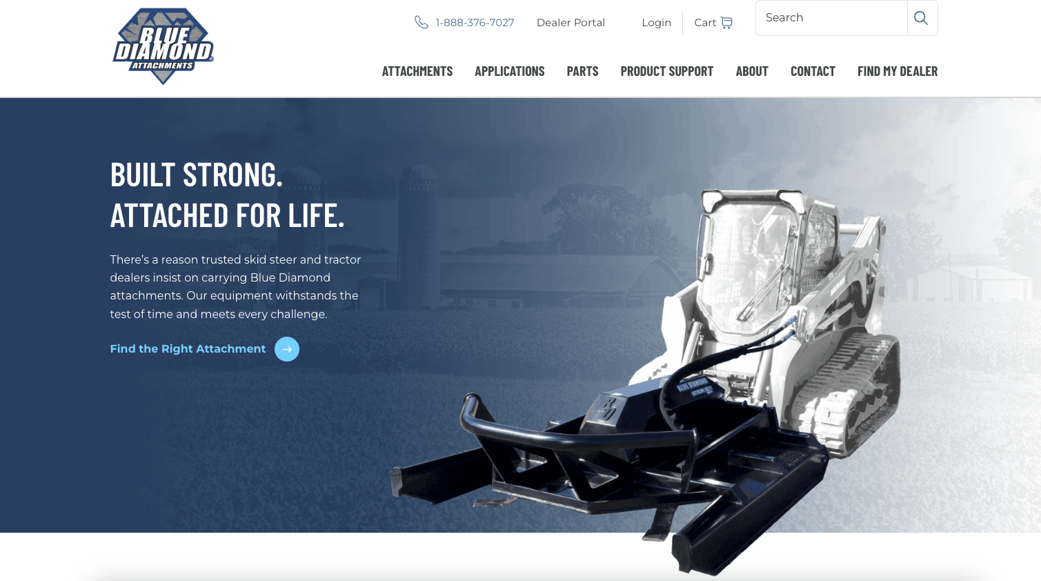
Blue Diamond Attachments delivers a strong e-commerce experience to equipment dealers and direct buyers. The site blends bold visuals, organized product categories, and intuitive navigation to support a wide range of use cases.
Each product page includes technical specs, application imagery, and supporting downloads. Dealers can access account-based resources, while direct buyers benefit from simplified checkout and lead generation forms. The homepage and category pages are optimized for fast scanning, guiding users to high-demand equipment quickly.
The e-commerce flow is built for flexibility, with quote request workflows, promotional banners, and product support callouts. The site balances visual appeal and transactional depth, supporting growth across B2B channels.
CMS: Craft
2. Fastenal | Search and Self‑Service Benchmark
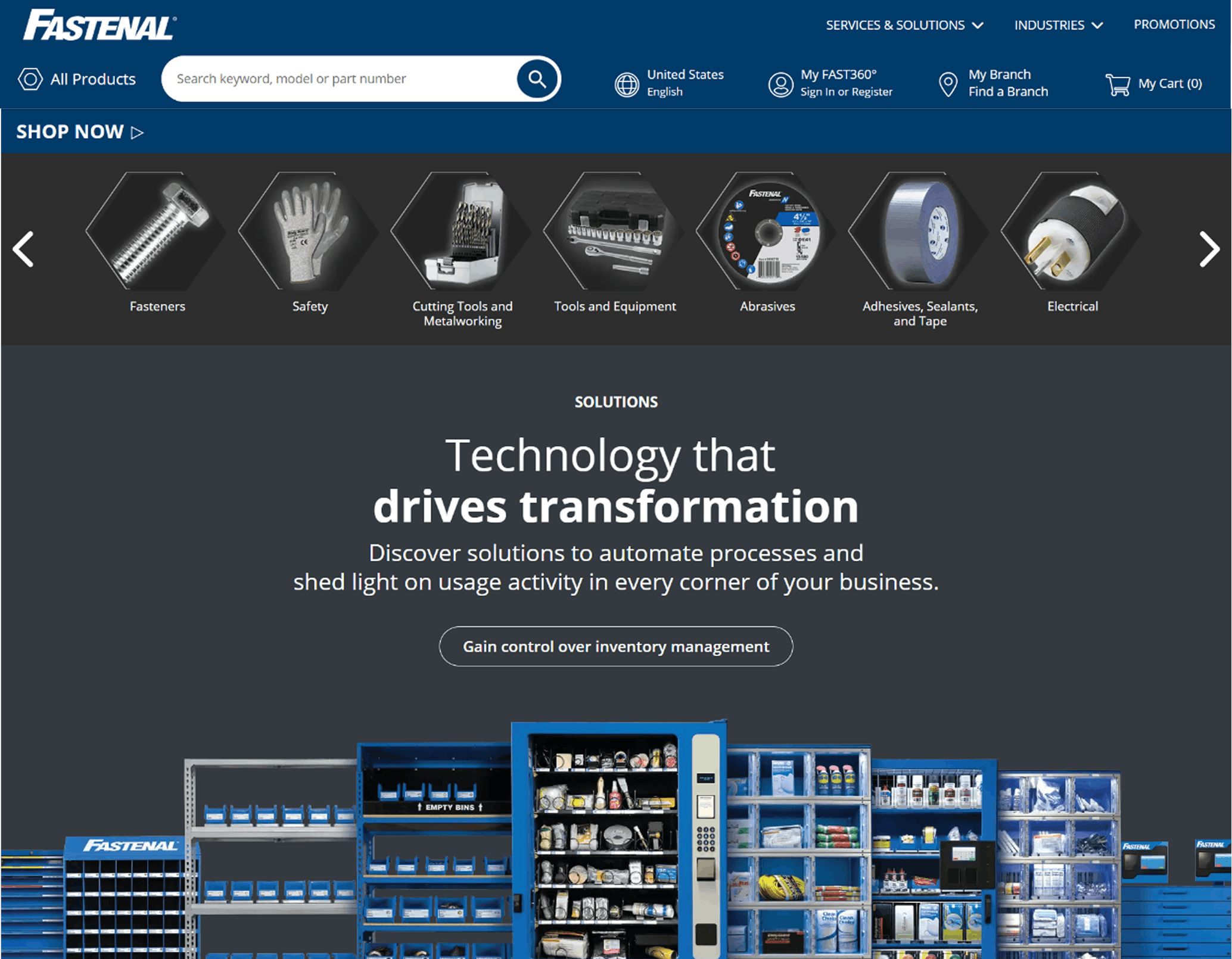
Fastenal’s e-commerce site remains a benchmark in B2B distribution. While it hasn’t undergone a major visual redesign recently, the platform stays current, fast, and reliable. Search and filtering are particularly effective, allowing users to navigate large MRO catalogs with ease.
The self-service portal enables quick reordering, access to account history, and customer-specific pricing once logged in. The visual design is straightforward and familiar, reinforcing the idea that a proven interface does not need constant reinvention.
CMS: Crafter CMS
3. Transcell | Focused B2B e-Commerce Execution
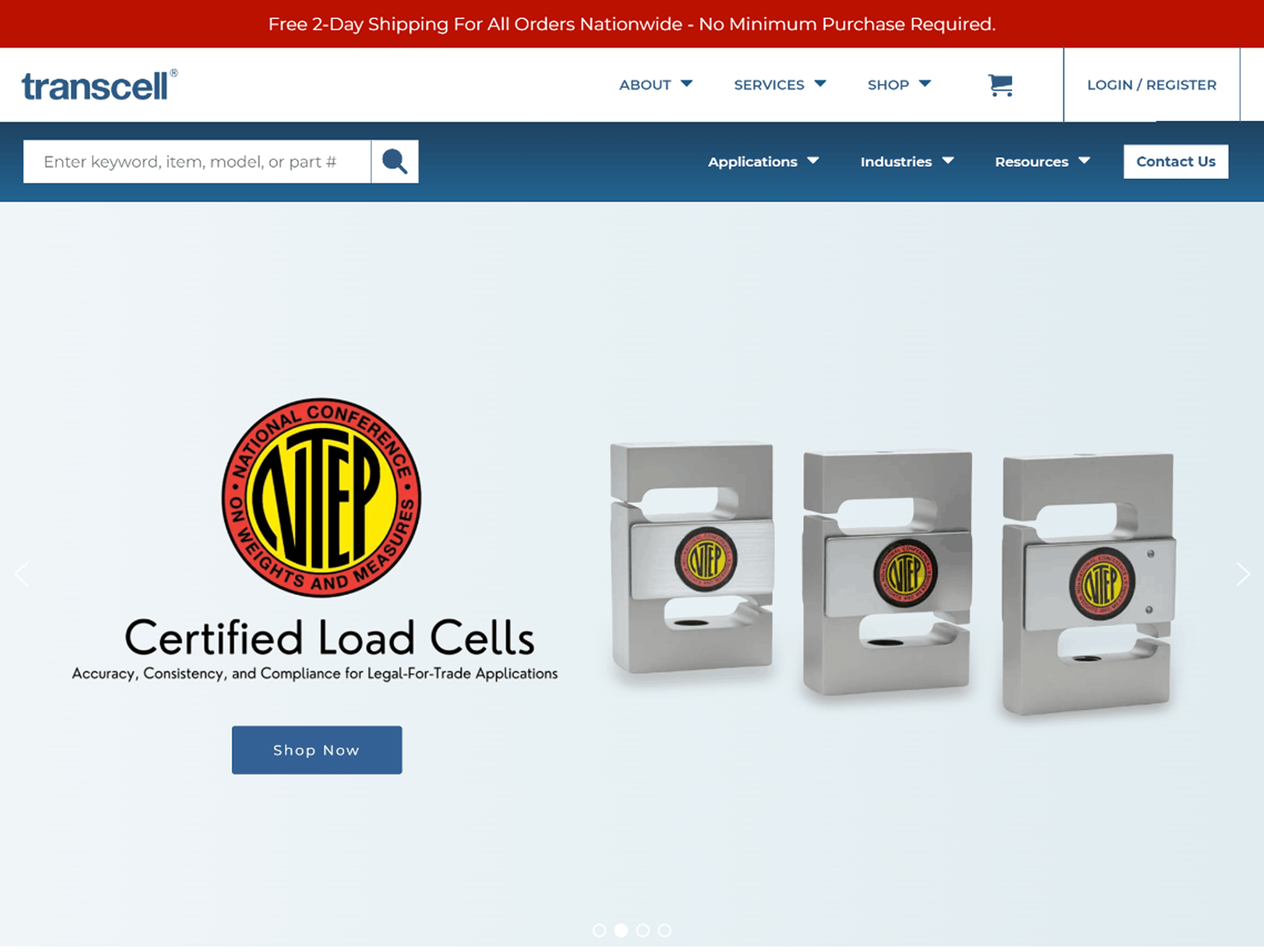
Transcell Technologies offers a strong example from a more specialised manufacturer. Its e-commerce site serves both distributors and customers through a clean interface and clear product categorisation.
The platform combines marketing content with transactional functionality. Features such as fast nationwide shipping are clearly communicated, and the underlying technology stack feels current. Transcell demonstrates that smaller industrial firms can deliver polished, effective B2B e-commerce experiences.
CMS: WordPress
4. Grainger | Expanding a Market Leader’s Capabilities
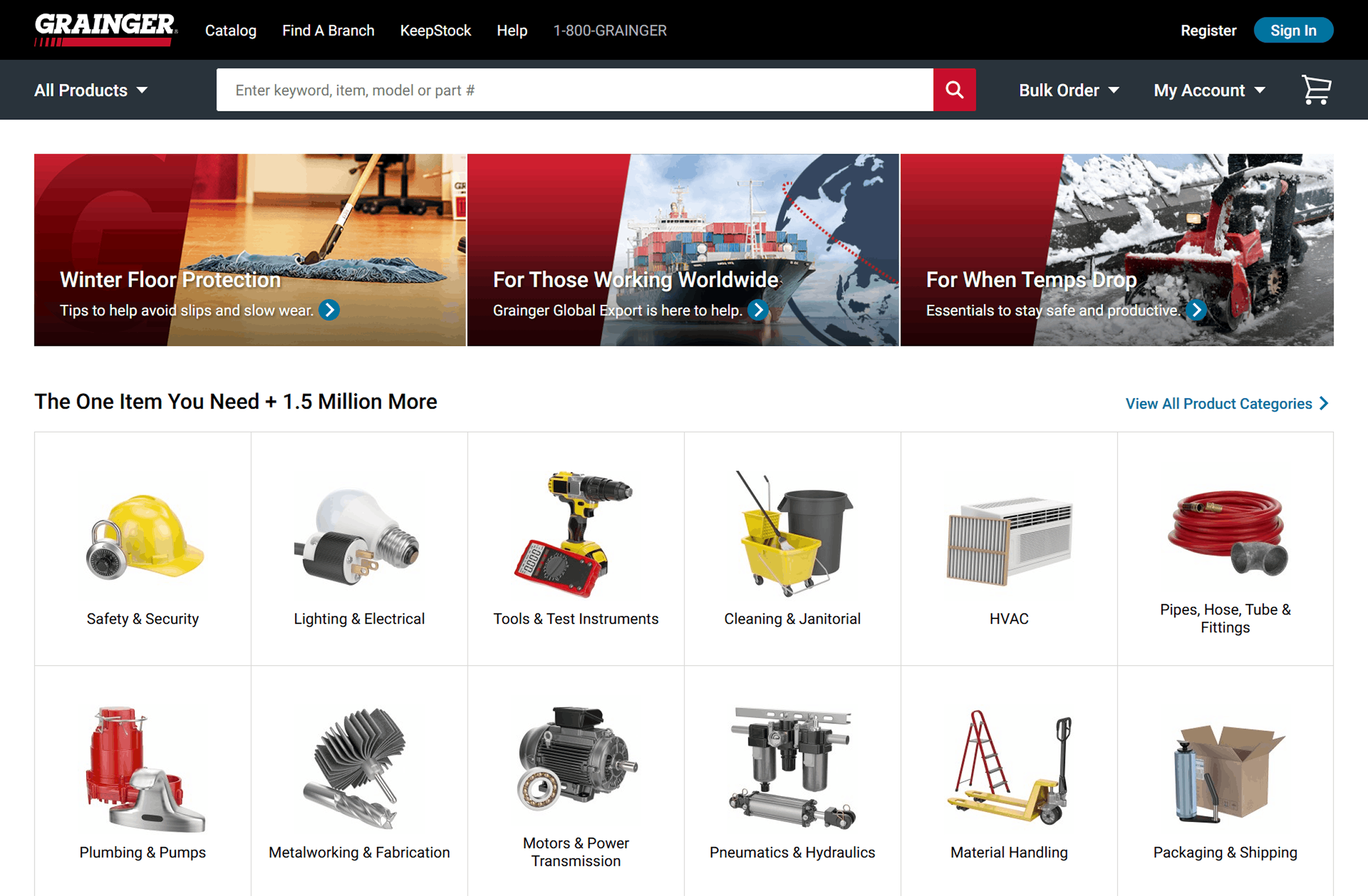
Grainger continues to refine one of the most established B2B e-commerce platforms in the market. Recent updates introduced a refreshed interface alongside further expansion of online resources and product content.
Despite the size of its catalog, navigation remains clear and performance is consistent. Extensive product data, guides, and media assets help buyers evaluate options efficiently, keeping Grainger among the top examples of B2B e-commerce UX.
CMS: Adobe Experience Manager
5. McMaster-Carr | Product Data Excellence
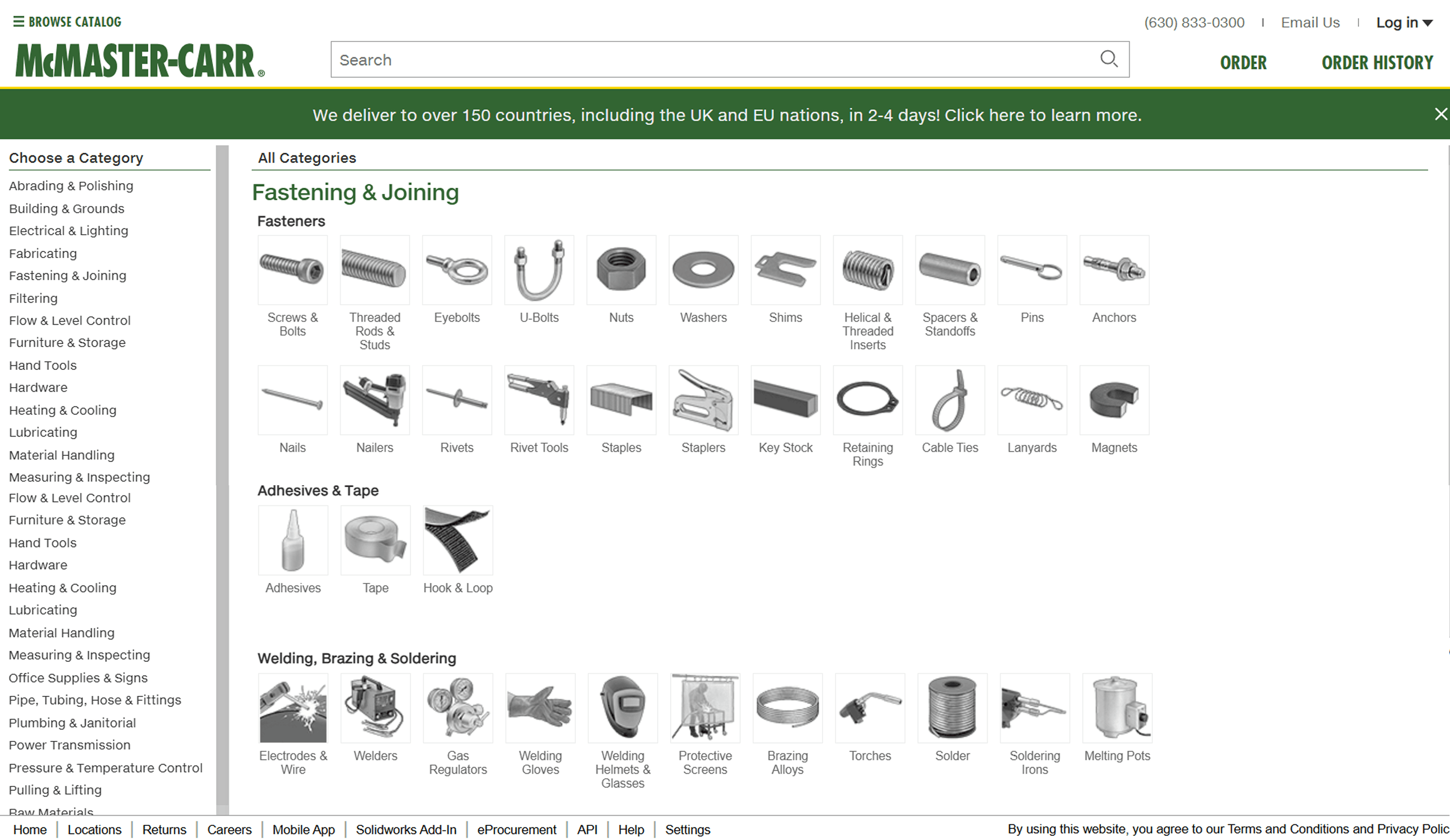
McMaster-Carr is known for its utilitarian yet highly effective website. True to form, McMaster-Carr has no major redesign to report, and that’s expected. The site avoids unnecessary visual elements and focuses on speed, structure, and data accuracy.
Each product page includes detailed specifications and, in many cases, CAD drawings, all organised through a highly efficient taxonomy. Search performance remains exceptionally fast and accurate. The result is a site that demonstrates how disciplined product data and information architecture can deliver a highly effective buying experience without visual complexity.
CMS: WordPress
6. MSC Industrial Supply | Steady UX Improvements
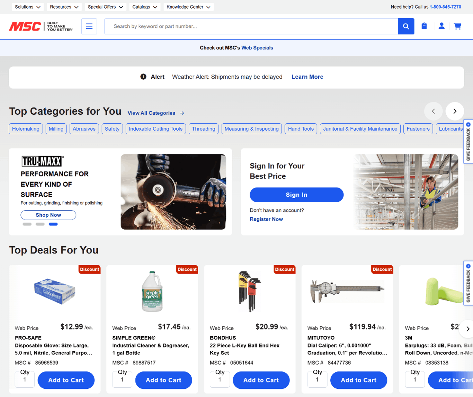
MSC Industrial has been making incremental enhancements to its e-commerce experience. Recently, MSC significantly improved its mobile UX. The site is now easier to navigate on a phone, which is critical as more procurement happens in the field.
Search has also been upgraded. Autocomplete suggestions are more accurate, helping users find products with fewer keystrokes. These updates, along with a light design refresh, keep the site competitive. The changes are practical, addressing pain points and reflecting ongoing iteration.
CMS: WordPress
7. Ferguson | Blending Pro and Consumer Features
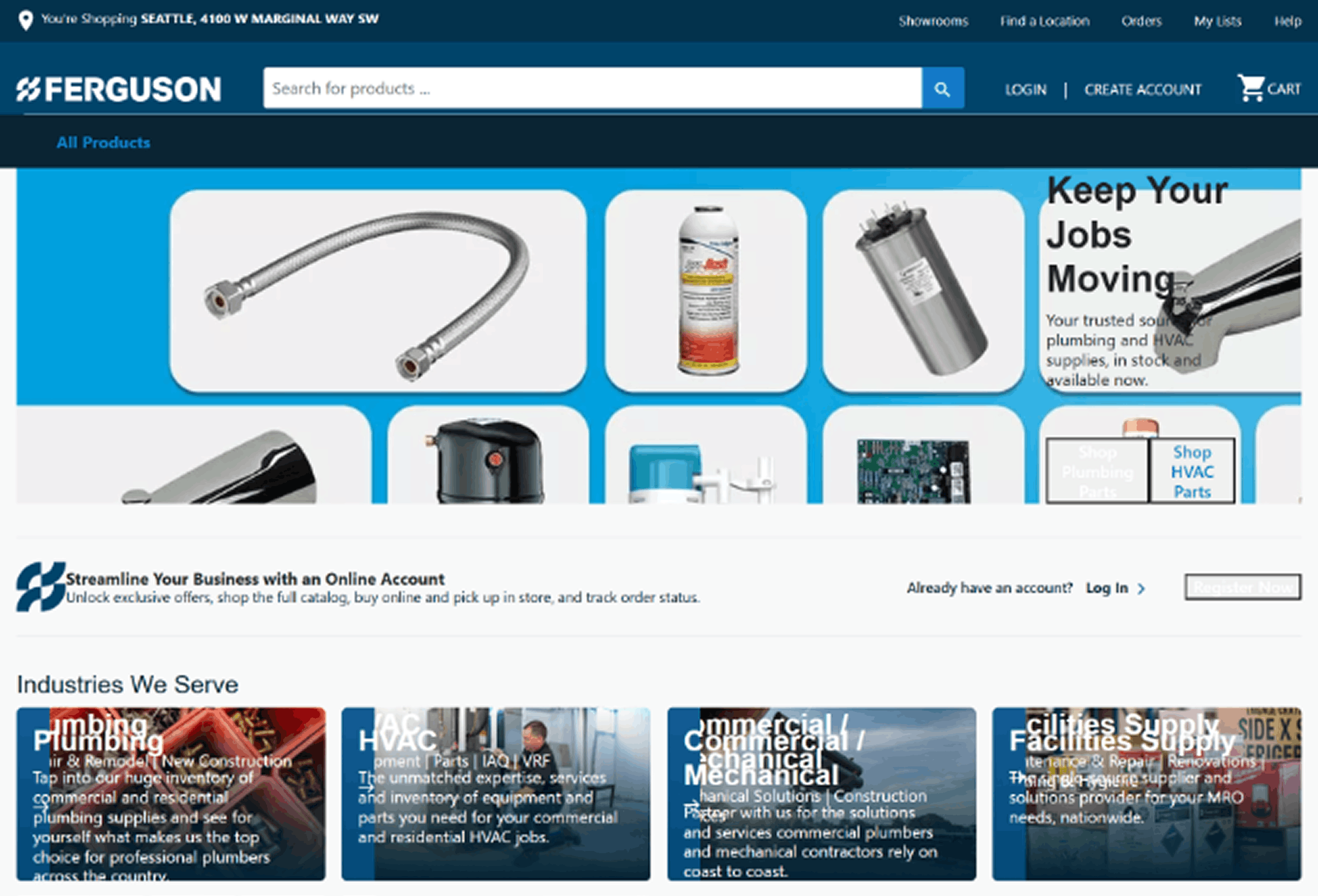
Ferguson serves both professional contractors and consumers, and its site reflects that dual focus. Consumer-facing pages see frequent updates, while the dedicated Pro Portal is familiar and stable.
On the distributor side, Ferguson offers excellent inventory visibility, store pickup integration, and account-based pricing once logged in. The site handles two audiences well: a more visual, inspiration-led experience for consumers, and a functional, inventory-focused experience for B2B users.
CMS: Salesforce
8. Applied Industrial Technologies | Product Page Updates
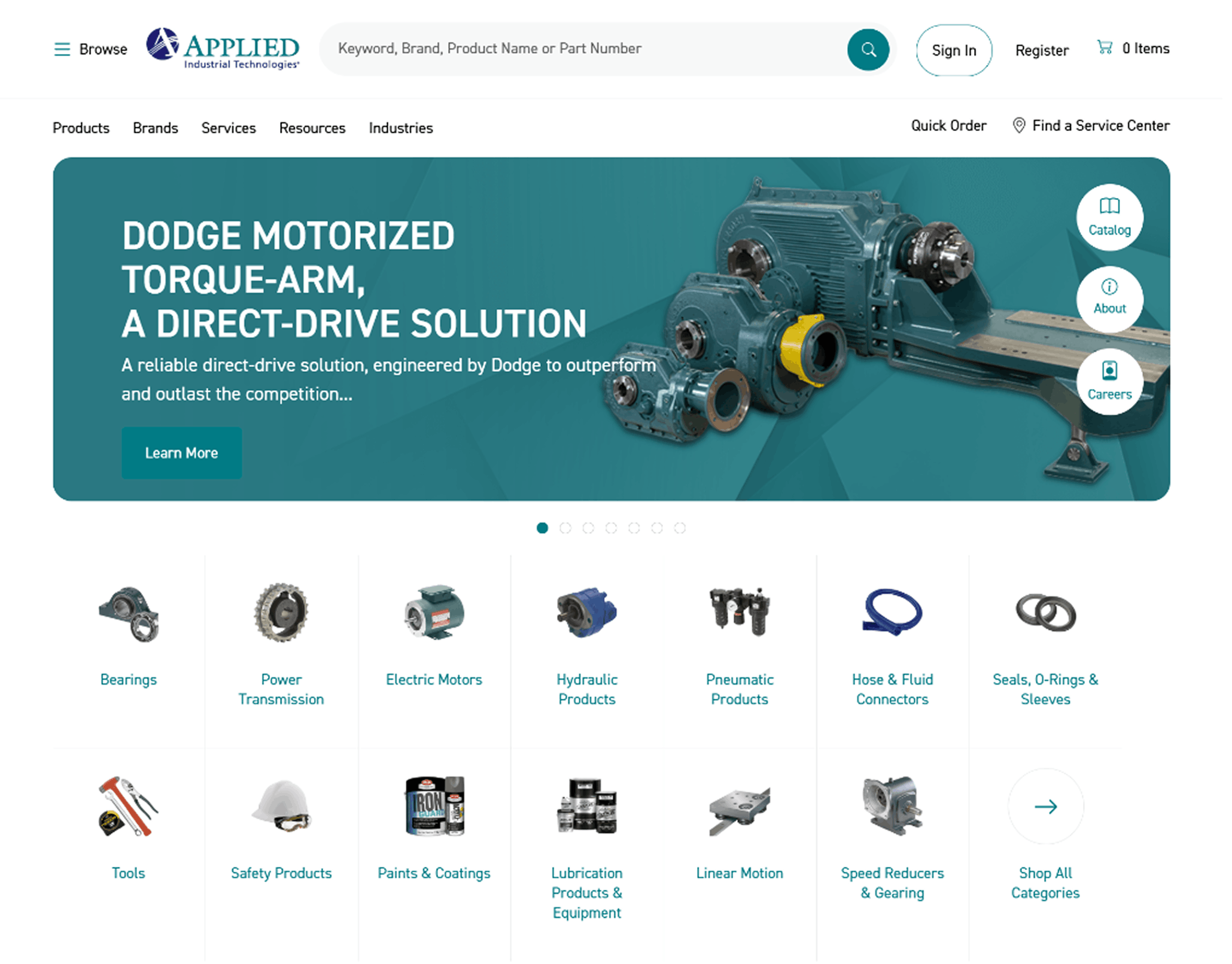
Applied Industrial Technologies recently refreshed its product detail pages. Specifications and availability are cleaner, with additional tabs for documents and related products. These updates help engineers and procurement teams find information quickly.
The site may not prioritise visual flair, but it delivers on core needs. A broad catalog, functional search, and e-procurement features keep the platform effective. Recent updates focus on usability where it matters most.
CMS: SAP Commerce Cloud
9. Motion Industries | Modern and Mobile-Friendly
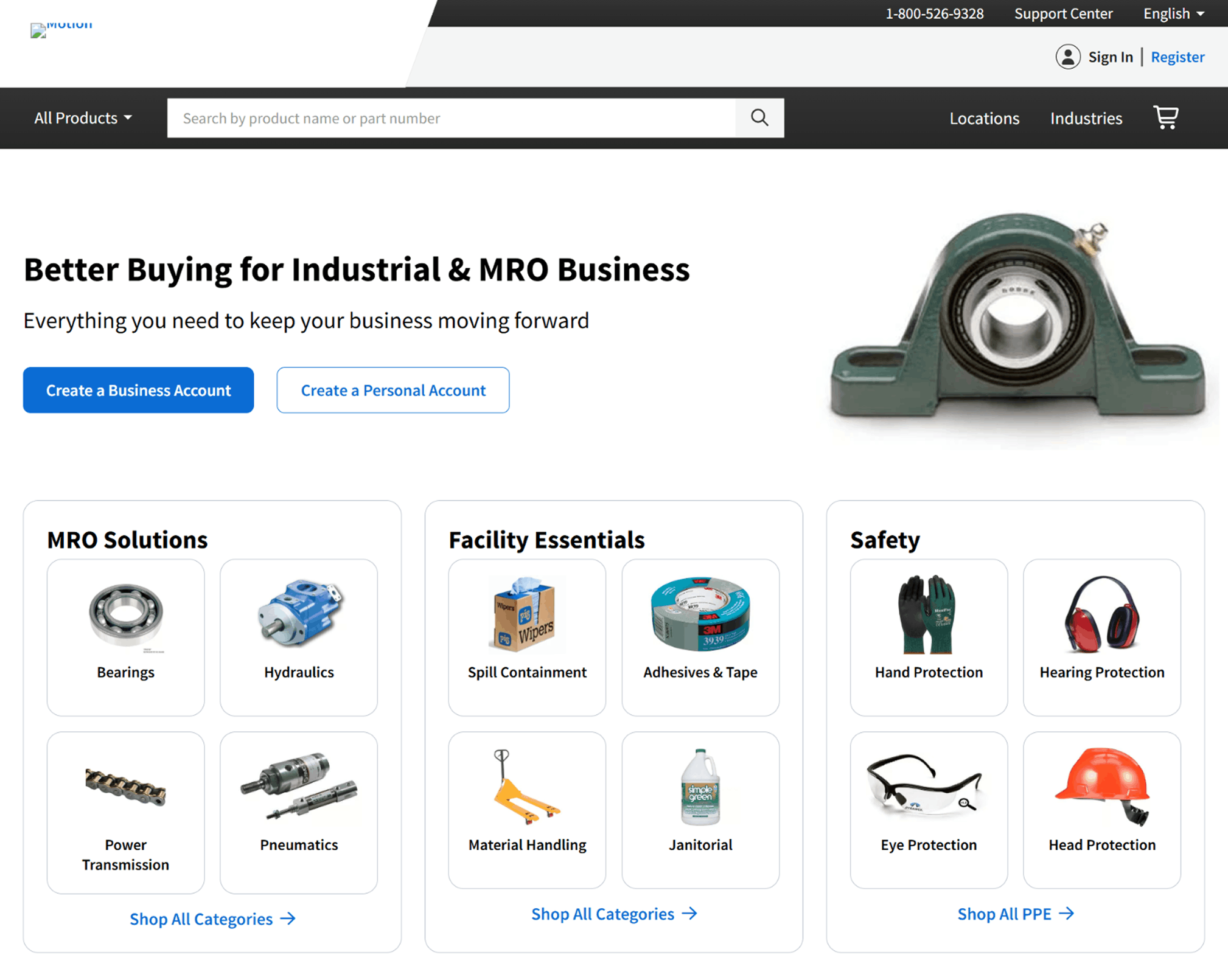
Motion Industries, now branded simply as Motion, has undergone a noticeable design update. Visuals, typography, and color usage feel more current, paired with a cleaner interface.
Mobile usability was a clear priority. The site works well on smaller screens, reflecting how maintenance teams and buyers often work in the field. Product comparison tools have also been improved, allowing users to evaluate specifications side by side.
CMS: Next.js
10. Graybar | Depth of Content
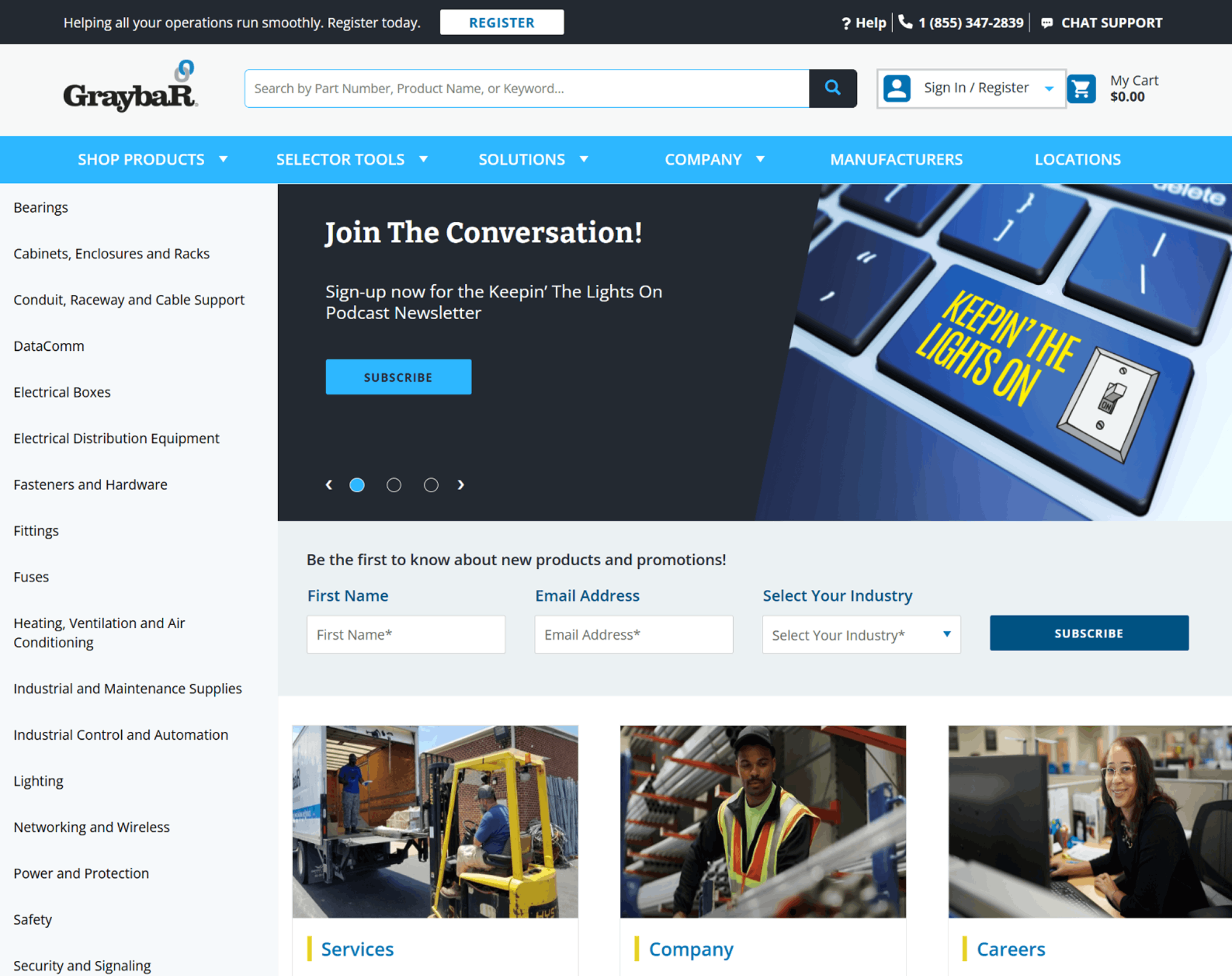
Graybar’s website gives industrial buyers what they need most: depth, clarity, and reliable access to information. Its extensive, well‑organized catalog and strong technical documentation make it easy for procurement teams and engineers to find the specifications and resources they need.
The site also shines in how it supports large accounts. Customer portals, contract pricing, and account‑specific tools reflect a clear focus on operational partnership and the realities of industrial purchasing.
Navigation is straightforward, product pathways are predictable, and the overall structure reinforces Graybar’s reputation for reliability and service. For a distributor with a large catalog and national reach, that consistency is a real advantage.
CMS: SAP Commerce Cloud
11. HD Supply | Refreshed Layout and Clear CTAs
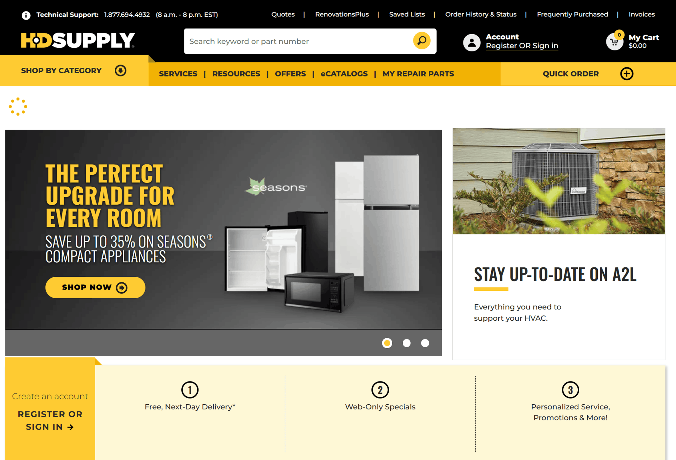
HD Supply’s e-commerce site has been refreshed with a more current layout. Navigation tiles are clearer, imagery has been updated, and primary categories are easier to access from the homepage.
Calls to action are more prominent, guiding users toward popular products and solutions. Behind the scenes, the platform continues to integrate account pricing and advanced search features, with the visual updates improving usability rather than changing functionality.
CMS: HCL Commerce
12. Lawson Products | Detailed Product Pages
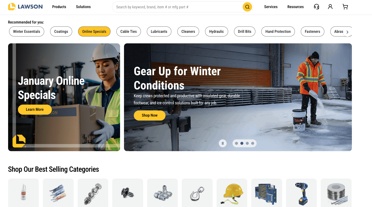
Lawson Products continues to perform well in core e-commerce areas. Product detail pages include multiple images, specification sheets, and real-time stock information.
Category and inventory pages are well structured, making it easy to drill down by part type or application. The site focuses on procurement workflows, with ordering tools, reorder lists, and account features clearly available.
CMS: Shopify
13. Global Industrial | Incremental Updates and Strong Taxonomy
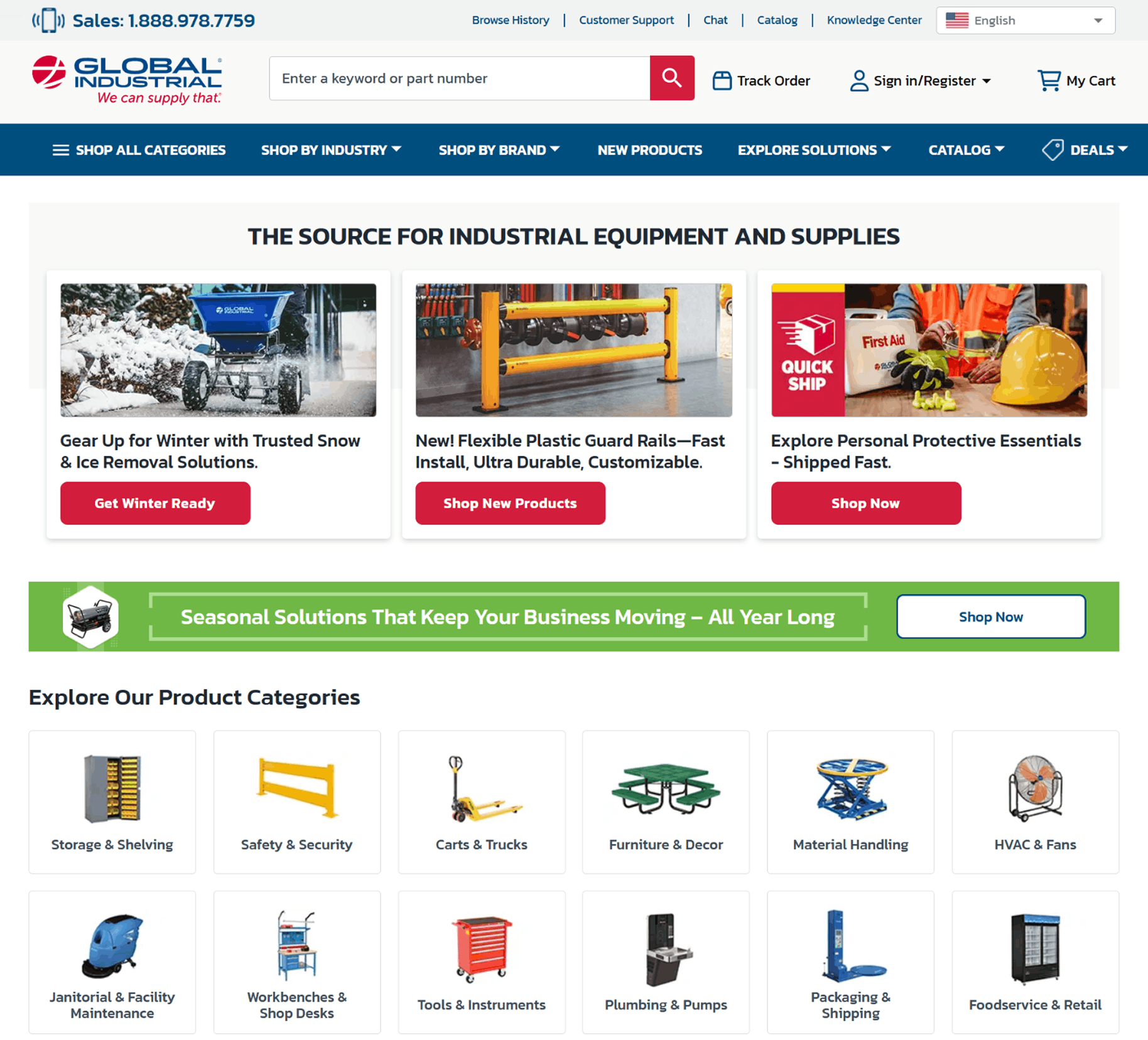
Global Industrial has introduced incremental improvements without a major redesign. Navigation and filtering have been refined, while the overall interface remains familiar.
The product taxonomy remains a standout strength. Filtering and categorisation work well across a wide range of product types. Content depth supports both SEO and buyer research. While the interface could be modernized in the future, the site continues to perform its primary task effectively.
CMS: Next.js
B2B Ecommerce Solutions
See how our work helps you increase B2B online sales.
Distributor e-Commerce Feature Checklist
Every distributor-focused e-commerce site should offer a core set of features that cater to B2B buying needs. Below is a practical checklist of essentials.
-
Quick Reordering: Allow customers to reorder past purchases or use saved lists. Frequent buyers want to add items to the cart in just a few clicks.
-
Customer-Specific Pricing: Show logged-in customers their negotiated pricing and volume discounts. The site should handle complex pricing tiers and contracts, not just MSRP.
-
Advanced Search and Filtering: Provide a robust search experience with autosuggestions and detailed filters. B2B buyers often know exactly what they need, so fast, accurate search matters.
-
Bulk Order or BOM Upload: Enable bulk ordering through CSV uploads or pasted SKU lists. This saves time when placing large or repeat orders.
-
ERP Integration: Connect the website to ERP systems for real-time inventory, pricing, and order status. This ensures accuracy and reduces manual handling.
- PIM and Product Data Management: Use a Product Information Management system to centralize and enrich product data. Consistent, detailed information improves onsite search, filtering, and SEO.
Free Download | Website Redesign Checklist
Best Practices for Distributor e-Commerce Websites
These best practices reflect common patterns across high-performing B2B distributor sites.
UX Best Practices
-
Keep it Intuitive: Use clear navigation, logical menus, and a prominent search bar so users can find what they need quickly.
-
Prioritize Mobile UX: Ensure the site works well on phones and tablets. Many field professionals place orders on mobile devices.
-
Self-Service Focus: Design with the logged-in users in mind. Make account access visible and surface useful information on dashboards.
-
Accessibility: Follow WCAG guidelines so all users can navigate the site. Proper contrast, alt text, and keyboard support benefit everyone.
Performance Best Practices
-
Fast Load Times: Optimize pages to load quickly. Buyers may tolerate complex negotiations, but not slow websites.
-
Use a CDN: Deliver static assets through a content delivery network to improve speed across regions.
-
Optimize Assets: Compress images, minify CSS and JavaScript, remove unnecessary scripts to keep the site lightweight.
- Scalability and Uptime: Use a reliable infrastructure that can scale. Downtime during business hours damages trust.
Eliminate Every Millisecond of Drag
SEO and Product Data Best Practices
-
Rich Product Content: Create unique descriptions and include detailed specifications for every product.
-
Structured Data: Implement schema markup to help search engines understand your content and improve visibility.
-
Optimized Category Pages: Ensure category and subcategory pages include relevant introductory text and optimized metadata.
- Long-Tail Keywords: Use detailed product data to capture searches for part numbers and niche product terms.
Turn Product Data into a Competitive Advantage
Conversion Optimization Best Practices
-
Streamlined Checkout: Reduce steps and enable saved addresses, payment methods, and credit terms.
-
Clear CTAs: Use visible “Add to Cart,” “Add to List,” and “Checkout” actions. Include quote options where appropriate.
-
Live Support Options: Real-time assistance can resolve questions that might otherwise block a purchase.
- Testing and Iteration: Use A/B testing to refine layouts, messaging, and features over time.
Remove Friction, Increase Revenue
Technology and Platform Best Practices
-
B2B-Friendly Platforms: Choose CMS solutions that support multi-user accounts, custom pricing, and punchout catalogs.
-
Integrated Systems: Connect e-commerce with ERP, CRM, and other core systems to reduce manual work and errors.
-
Security and Accounts: Support secure logins, role-based permissions, and authentication options where needed.
- Modular and Scalable: Use headless or modular approaches so components can be updated independently.
Choose Tools Built for Complexity, not Retail
Content Strategy Best Practices
-
Education and Resources: Supplement product listings with guides, videos, and technical documentation.
-
Personalized Content: Tailor content based on user behaviour and purchasing history.
-
Up-to-Date Information: Refresh content regularly and remove outdated material.
- Consistent Messaging: Maintain a clear value proposition across product, category, and company pages.
The DBS Advantage for Distributor e-Commerce
Building and optimizing a distributor e-commerce site is complex. DBS helps distributors design, build, and refine e-commerce platforms that align with how B2B buyers purchase today.
Our team supports e-commerce development, platform selection, performance optimization, and technical SEO. We design intuitive interfaces for large catalogs, integrate ERP and PIM systems, and help implement structured data and scalable content strategies.
If you’re planning to improve or rebuild your distributor e-commerce experience, DBS can help you define priorities and execute with confidence.
Get Commerce Moving - Contact Us
FAQs: Distributor e-Commerce
Common options include Adobe Commerce, BigCommerce B2B Edition, Optimizely, Shopify Plus, and custom headless solutions. The right choice depends on catalog size, integrations, and business needs.
Yes. Procurement teams increasingly expect self-service ordering and reordering. e-commerce reduces friction and supports repeat purchases.
Customer-specific pricing, quick reorder tools, bulk upload options, saved lists, and streamlined quoting.
Product data underpins search, SEO, filtering, and buyer confidence. Many distributors rely on PIM systems to manage it effectively.
Major refreshes typically happen every 3–5 years, with smaller improvements made continuously in between.
