
Great Examples of Chemical Company Websites
The Best Chemical Industry Websites
Studies show that 53% of users abandon a site if it takes more than three seconds to load; that’s how vital speed and functionality are. Whether it's a chemical website update or a complete chemical website redesign, optimizing for performance and user experience is key.
This article examines several chemical company websites, focusing on what's immediately visible and what's happening under the surface.
What You See - Navigation, animations, visual design, and interactive elements
What You Don't See - Performance Metrics and Accessibility.
To understand what makes a chemical website great, let's analyze some examples of the best websites for chemical companies, highlighting some specific characteristics that make them great website designs.
1 - Zeon SMI - Turning Technical into Tangible
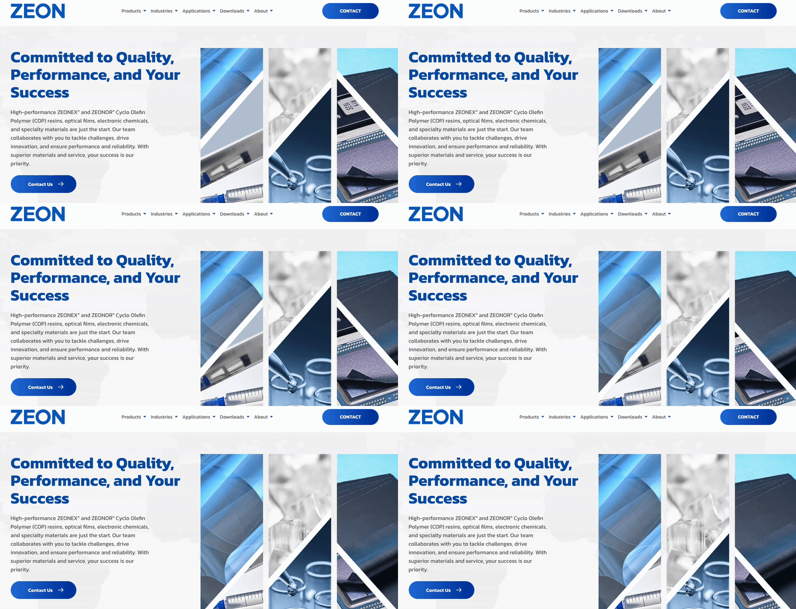

ZEON Specialty Materials Inc. (ZEON SMI) presents a strong example of chemical industry web design that blends technical credibility with visual clarity. As a leader in Cyclo Olefin Polymer (COP) technologies for electronics, optics, and healthcare, ZEON SMI’s uses its website to reflect a high-tech brand identity.
The clean layout, sharp photography, and restrained color palette reinforce the advanced nature of its materials.
The site organizes complex technical content into clear pathways for engineers, researchers, and procurement teams. Visitors can quickly access product data, safety documentation, and industry-specific insights.
ZEON SMI structures its content into intuitive sections for Products, Applications, and Industries, making it easy to locate relevant information without friction. This clarity supports buyer confidence and positions the brand as a trusted source for high-performance materials.
Built on Craft CMS, the site shows how a chemical manufacturer can achieve design sophistication without sacrificing scalability.
The platform enables fast content updates, mobile responsiveness, and reliable performance across devices.
ZEON SMI’s site demonstrates how disciplined UX and strong engineering can communicate technical excellence to a global audience.
CMS: Craft CMS
Lighthouse Scores
| Metric | Mobile | Desktop |
| Performance | 97 | 97 |
| Accessibility | 100 | 100 |
| Best Practices | 100 | 100 |
| SEO | 100 | 100 |
2 - Exxon Mobil | Great Messaging and Navigation
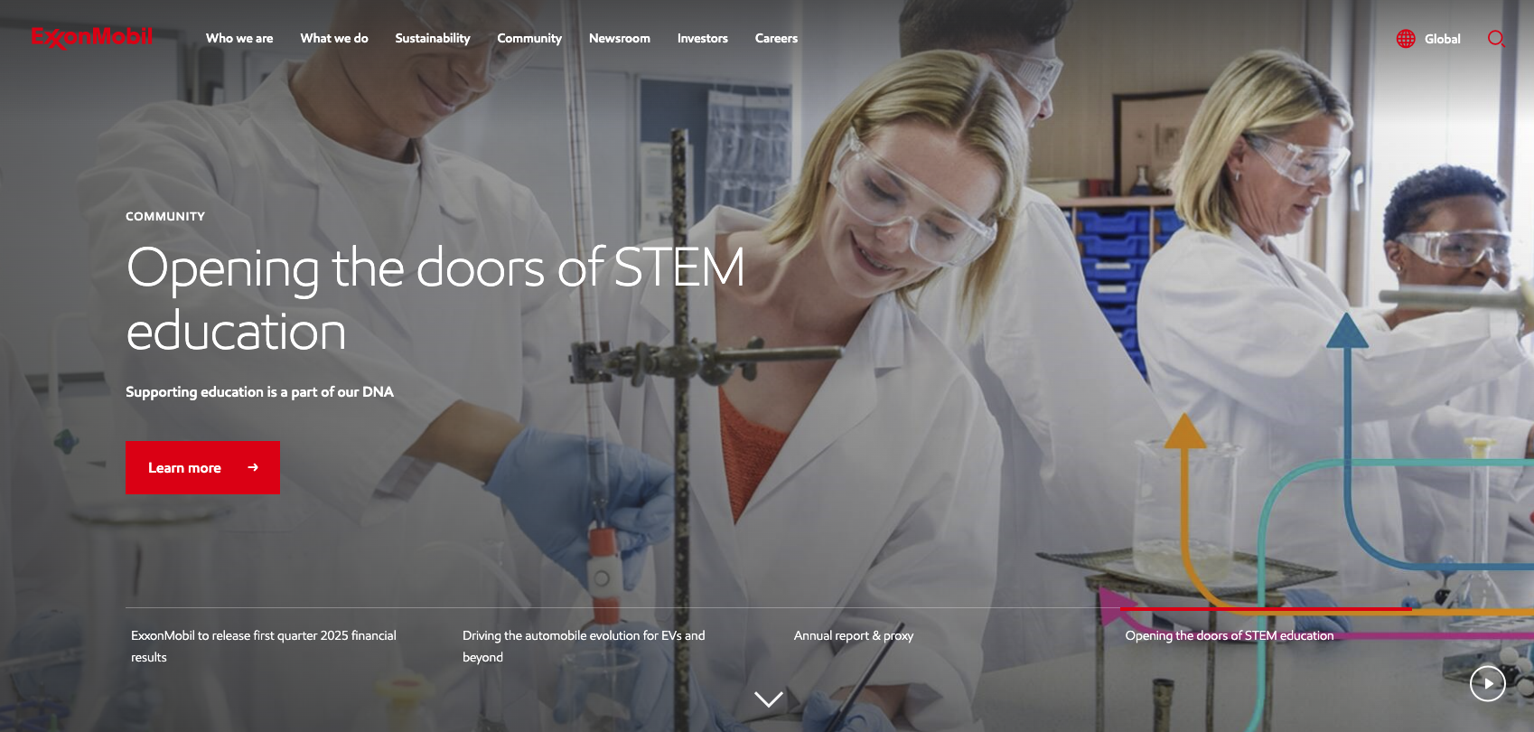

Great messaging stands out on ExxonMobil's corporate website
ExxonMobil’s corporate site immediately conveys its focus through strong messaging. The homepage headlines make it clear that this chemical business is prioritizing sustainability and innovation in energy.
Navigation is kept simple despite the site’s size.
This intuitive menu and well-structured sitemap make it easy for users to find information without feeling lost.
The clean and professional visual uses ExxonMobil’s classic blue and white branding with high-quality imagery that doesn’t overwhelm the message.
The site retains its clarity on mobile with a responsive design that collapses the menu into an easy-to-use toggle.
The core branding and climate-forward messages are still front and center on smaller screens.
ExxonMobil’s site is built on a robust enterprise CMS that supports its extensive content and multiple language versions.
This CMS enables modular content updates:
- Useful for a global company that frequently publishes news and reports.
- ExxonMobil’s mobile performance is lower due to heavy content. Desktop scores show better optimization.
- Accessibility and SEO scores are high, indicating a well-built site despite its complexity.
CMS: SiteCore
Lighthouse Scores
| Metric | Mobile | Desktop |
| Performance | 50 | 80 |
| Accessibility | 88 | 91 |
| Best Practices | 89 | 89 |
| SEO | 90 | 90 |
3 - Mosaic Chemical | High-Quality Imagery
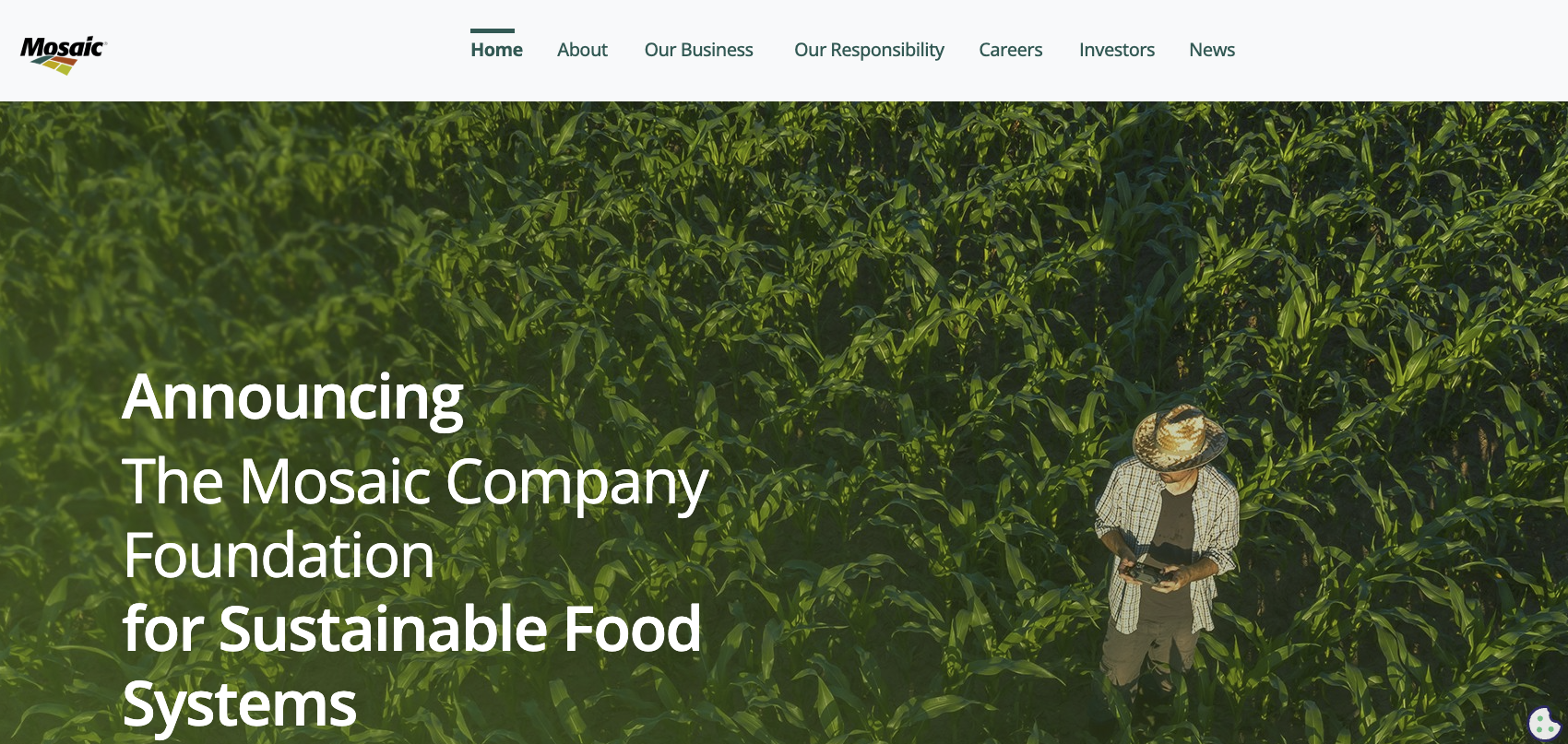
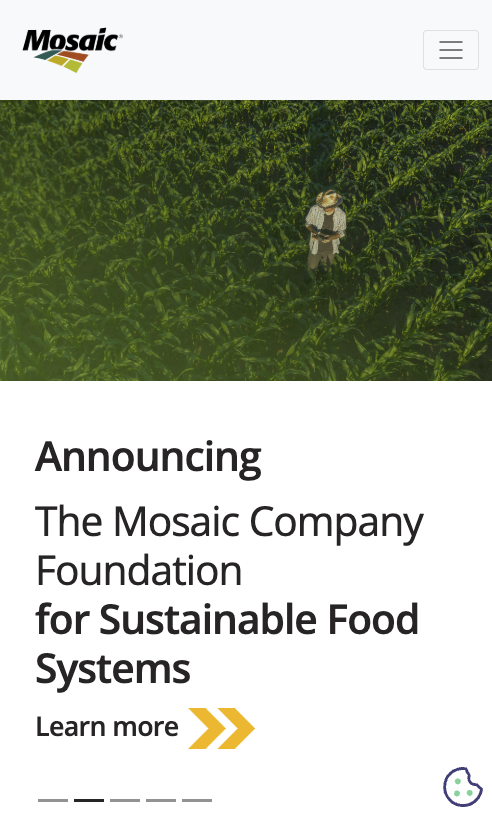
Eye-catching visuals are the first thing that stands out when visiting the Mosaic Company website
As a global leader in the crop nutrient industry, Mosaic uses vibrant photos of farms and fields that reinforce its mission: “We Help the World Grow the Food it Needs.”
Uniquely, Mosaic’s visual identity balances beauty with function – large banner images and subtle scroll-triggered animations guide the visitor’s eye down the page.
Despite the rich visuals, the layout isn’t cluttered; text overlays are placed on faded background images, ensuring the messaging, like “Advanced Crop Nutrition That’s Proven to Perform,” stands out clearly. This creates a memorable story for the user without sacrificing readability.
From a user’s perspective, Mosaic’s site is engaging but easy to navigate.
The top menu is straightforward, and calls-to-action (CTAs) are sprinkled logically through content sections, prompting visitors to “Learn More” about key products or initiatives.
Mosaic’s site remains impressive on mobile – the imagery scales down nicely and the essential messages are still prominent.
High-quality and faded background imagery within the website's main content supports storytelling about the organization. This leaves a lasting impression on the user by not distracting from the messaging, allowing text to stand out in the right places to attract the reader's eyes and attention.
The mobile navigation condenses into a hamburger menu, which is simple to use.
The CMS was not evident, though the site is built with PHP. There are a number of reasons the CMS could not be determined, including blocking, front-end frameworks, private or self-hosting, etc.
The important performance for mobile devices lags behind desktop performance,
Lighthouse Scores
| Metric | Mobile | Desktop |
| Performance | 70 | 92 |
| Accessibility | 85 | 88 |
| Best Practices | 93 | 95 |
| SEO | 91 | 91 |
4 - Dow Inc | Smart Calls-to-Action
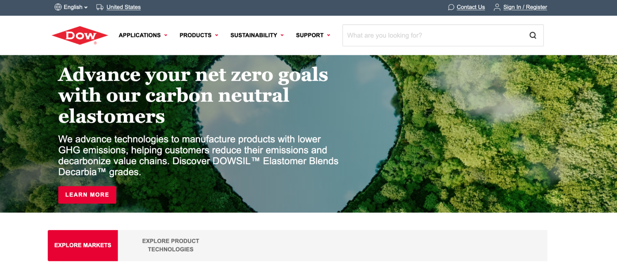
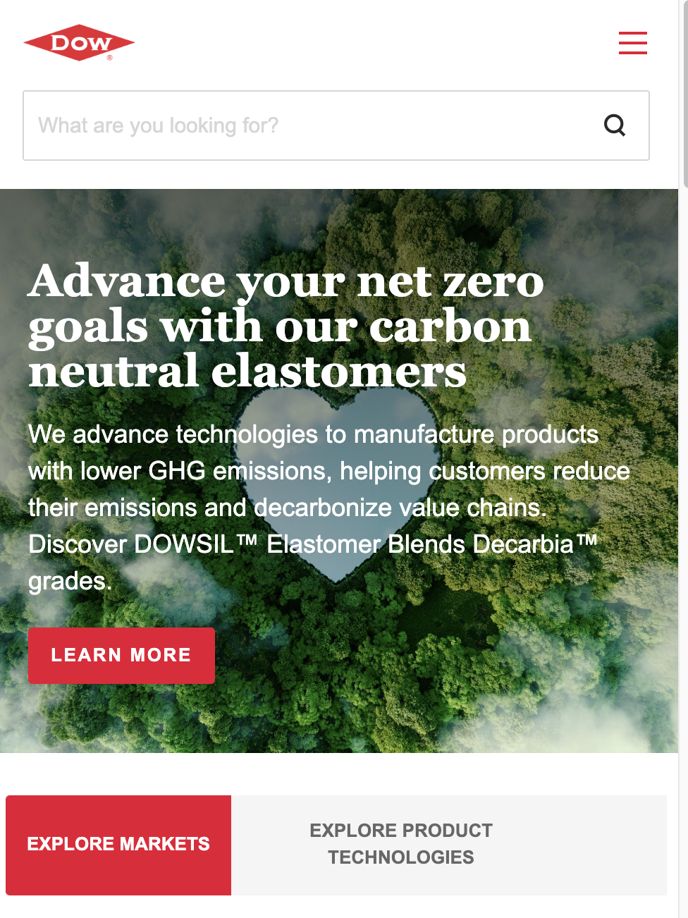
Dow’s website stands out for its strategic use of calls-to-action. Every page on Dow’s site is designed with conversion in mind – CTAs like “Learn more” or “Contact us” are placed at natural stopping points in the content.
These encourage visitors to dig deeper into the site rather than bounce.
The visual design is sleek and industrial, using Dow’s signature red accents for buttons and icons so they catch the eye. One unique element is how Dow subtly integrates storytelling with CTAs. For example, a page section might describe a solution for liquefied natural gas technology and invite users to explore related products.
The company’s key selling points are communicated clearly. The messaging tone is straightforward and technical, appropriate for a science-driven chemical company website.
Dow.com incorporates an extensive navigation menu, a collapsing accordion-style menu to keep things tidy.
The site uses Adobe Experience Manager (AEM) as its CMS, which is common for large manufacturers.
AEM gives Dow’s team modular templates and language support – critical for maintaining a consistent brand across Dow’s global presence.
CMS: Adobe Experience Manager
Lighthouse Scores
| Metric | Mobile | Desktop |
| Performance | 60 | 82 |
| Accessibility | 90 | 92 |
| Best Practices | 86 | 88 |
| SEO | 94 | 94 |
5 - Kao Collins | Content that Drives Leads
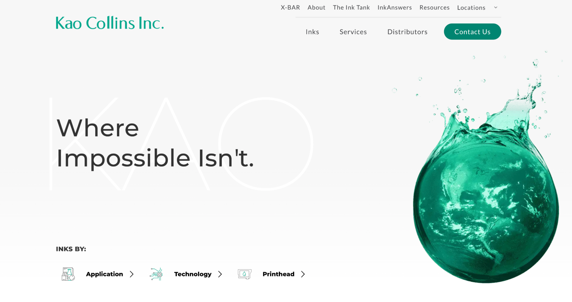
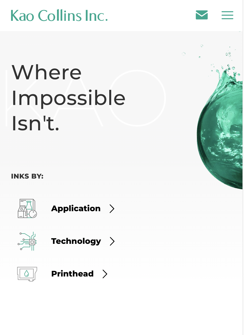
Kao Collins’ website is a success story in chemical B2B website design, not least because DBS Interactive designed it.
This site puts content marketing front and center. Kao Collins, an industrial ink manufacturer, features a knowledge base called “The Ink Tank” – a microblog with informative articles about industrial printing.
By sharing industry expertise, the site positions Kao Collins as a thought leader while offering visitors real value. The tone of the content is helpful and educational rather than salesy, which helps attract organic traffic (and likely boosts SEO for niche keywords in printing).
The homepage is clean and minimalistic, with impactful messaging and clear callouts that guide users toward the content they need.
Rather than immediately overwhelming visitors with product specs, it invites you to explore guides and solutions – a smart approach for lead generation.
A unique interactive feature is “InkAnswers,” Kao’s custom search tool for finding the correct ink based on your printing needs. This tool is useful and engaging, exemplifying how a chemical site can incorporate app-like functionality to assist customers.
The user experience is smooth and intuitive.
Navigation is straightforward with clear sections for Products, Solutions, and the blog.
Kao Collins’ site performs exceptionally on mobile devices—the design remains crisp, and the content is easily readable on smaller screens.
CMS: WordPress
Lighthouse Scores
| Metric | Mobile | Desktop |
| Performance | 93 | 99 |
| Accessibility | 100 | 100 |
| Best Practices | 100 | 100 |
| SEO | 100 | 100 |
6 - DuPont Chemical | Targeted Video Content Answer
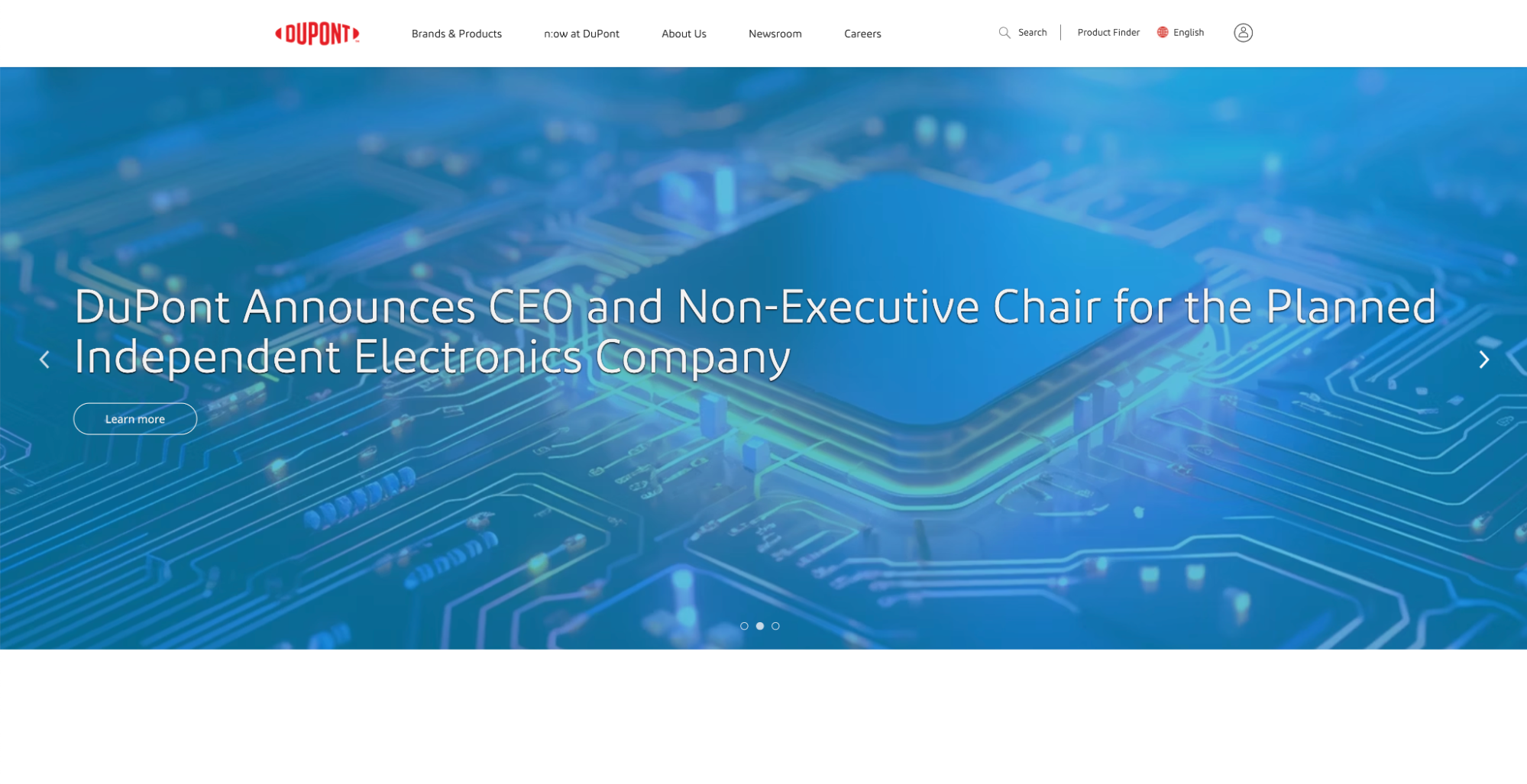
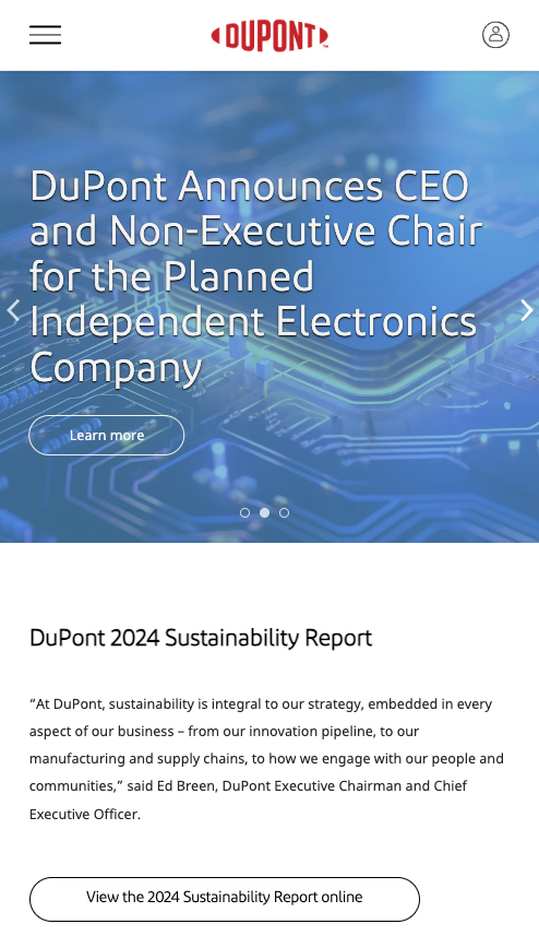
DuPont’s website leverages multimedia and concise messaging to engage audiences.
As a science and engineering powerhouse, DuPont uses emotionally targeted video content on its site to form a connection with visitors.
For example, a background or featured video might showcase how DuPont materials enable technologies in everyday life, resonating with investors and customers.
What’s special about DuPont’s site is how every tagline is sharp and memorable. For example, this: “95% of today’s smart devices are enabled by DuPont’s materials,” or “Here's how we’re inventing a better now. Right now.”
That’s powerful.
The lines immediately capture attention and communicate DuPont’s impact and innovative spirit.
The visual identity is modern and clean. DuPont’s signature red logo is present, but the site emphasizes white space and light typography so that videos, images, and products take the spotlight.
Clear content segmentation enhances user experience. You’ll find separate sections for industries, products, sustainability, etc., each with quick links or cards leading deeper.

The main menu is comprehensive but well-organized, reflecting DuPont’s broad range of businesses without overwhelming the user.
The video-intensive elements in the browser version gracefully transform to static images or shorter clips, ensuring the performance doesn’t suffer.
Navigation on mobile is via a hamburger menu for easy scrolling, with expandable sub-menus for detailed sections.
CMS: Adobe Experience Manager
| Metric | Mobile | Desktop |
| Performance | 55 | 85 |
| Accessibility | 84 | 85 |
| Best Practices | 90 | 93 |
| SEO | 92 | 92 |
7 - Ecolab | Persuasive Visuals, Global Reach
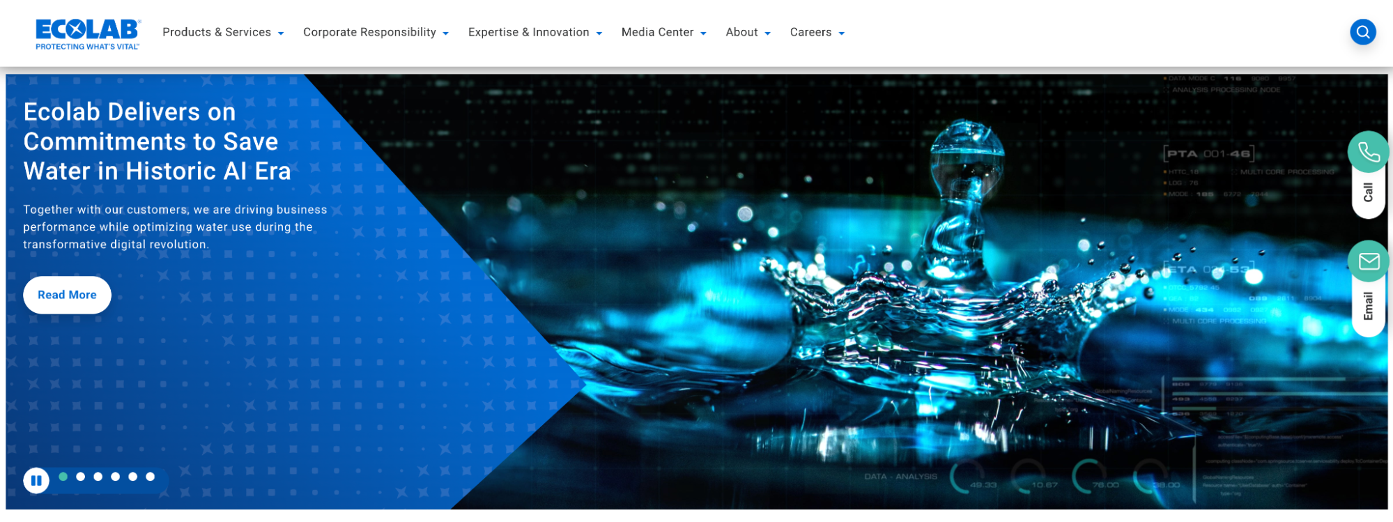
Ecolab’s website establishes what matters to its target audience through visuals and content positioning.
Ecolab provides water, hygiene, and energy technologies, and its site uses imagery and headlines to position the company as a solution provider for varied industries (from restaurants to power plants).
For instance, you might see a photo of a food service kitchen with a tagline like “Creating Value, Protecting Resources”– a message that speaks directly to their clients' sustainability and cost-saving concerns.
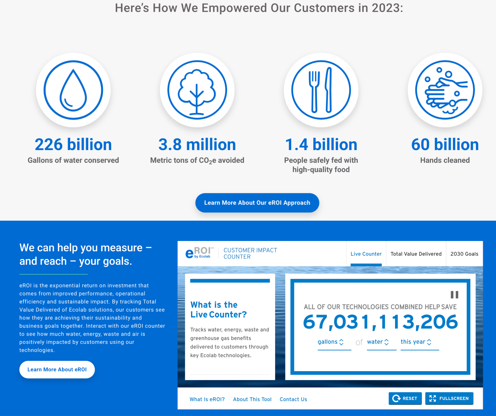
Ecolob uses statistics to convey the value proposition.
Another notable feature is how Ecolab highlights its global leadership, mentioning “3 million customer locations in more than 170 countries” alongside self-descriptive videos.
This builds trust and shows scale, which is important for a B2B audience.
The user experience is informative. The homepage and sector pages often include short stats or case snapshots, such as how much water a customer saved, to convey impact quickly.
Ecolab also maintains consistency across its various sub-brands and regional sites – you’ll notice that the branding is cohesive whether you navigate to Nalco Water or an Ecolab subsidiary.
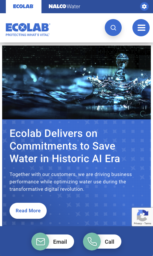
On mobile, Ecolab’s site remains user-friendly.
The visuals resize important messages correctly, like the company's tagline and calls-to-action, remain prominent without scrolling.
There’s a slight difference in navigation – on desktop, there might be dropdown menus with many links, while on mobile, these condense into an accordion menu you tap to expand.
Still, finding a specific solution or resource on your phone is straightforward.
Lighthouse Scores
| Metric | Mobile | Desktop |
| Performance | 68 | 90 |
| Accessibility | 90 | 93 |
| Best Practices | 89 | 89 |
| SEO | 95 | 95 |
8 - Chevron Phillips | Interactive Design Experience
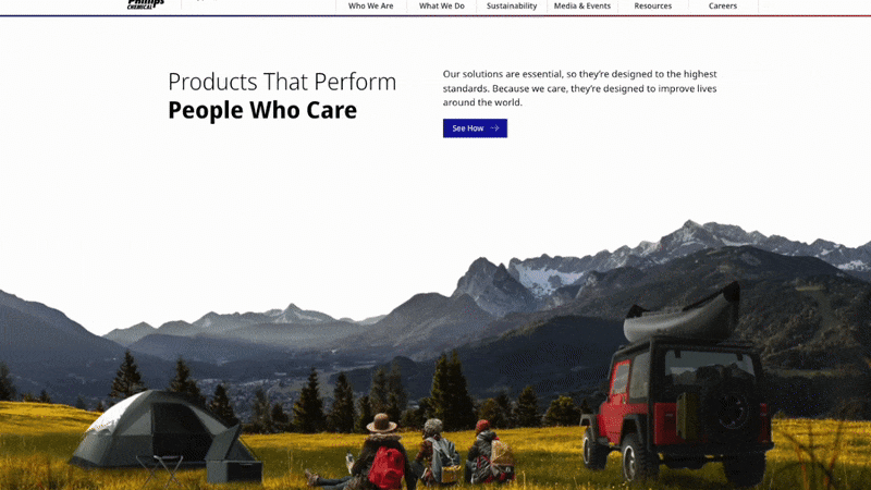
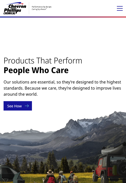
Chevron Phillips Chemical’s website offers an interactive experience that effectively communicates the company’s value propositions.
What’s immediately striking is the messaging that takes visitors on a “journey” of how Chevron Phillips’ products improve daily life.
For example, the site openly acknowledges the environmental aspect: “Our solutions are essential. Because we care, they’re designed to improve lives around the world.”
The company addresses the fact that it produces plastics but frames it in a positive, socially responsible light.
This kind of narrative-driven design is clever. Even the navigation supports the brand story by placing Sustainability adjacent to “Who We Are” and “What We Do” in the menu.
It shows that CPChem values sustainability as much as its products, which likely resonates well with visitors.
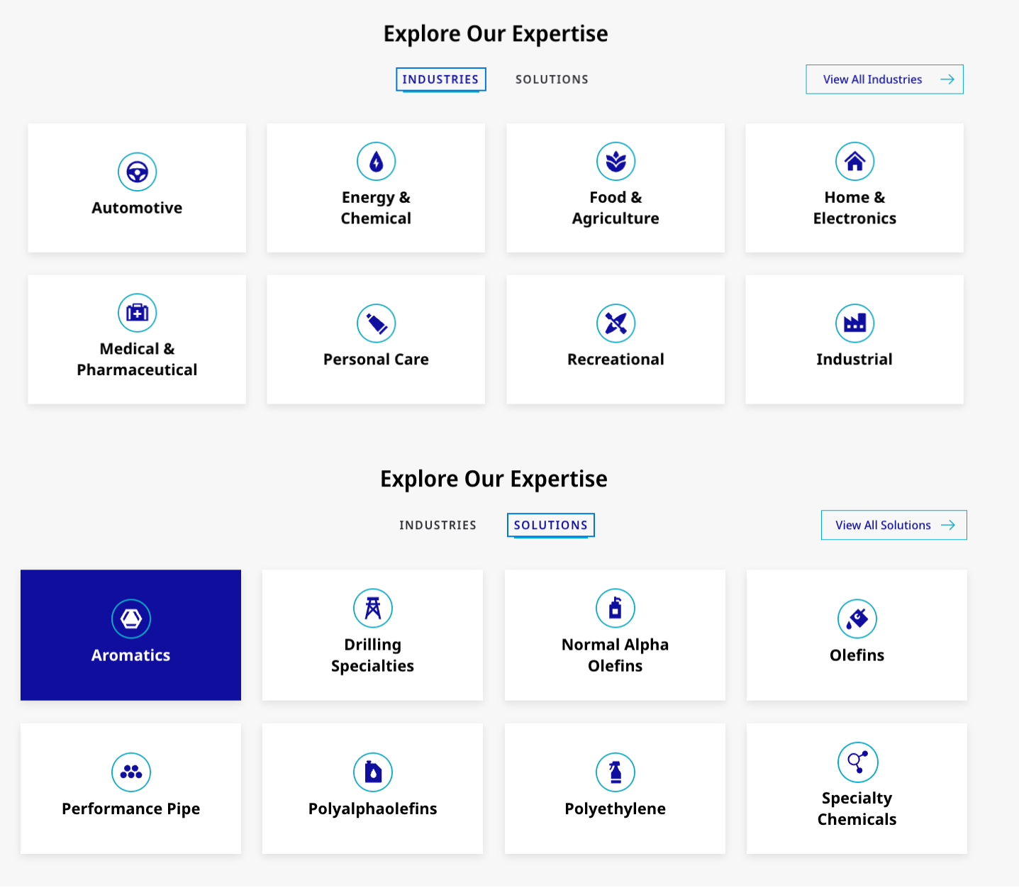
Visually, Chevron Phillips’ site uses sharp, high-resolution imagery that gives a real-life feel – refinery workers in labs, manufacturing plants, etc.. This humanizes the brand.
They’ve even made typically dry sections like Careers more engaging with compelling visuals (the careers page makes you feel like you’re standing in a lab alongside an employee).
The user navigation is intuitive: product information is categorized clearly, and technical data (like safety datasheets) is easy to find.
Chevron Phillips provides quick access to data sheets and technical documents at the top of the user journey, eliminating the “paradox of choice” for engineers who just want to grab information fast.
The interactive elements, like carousels or animated numbers, are optimized on mobile to ensure smooth performance.
The site remains interactive, allowing users to quickly tap to download a data sheet or watch a short video about their initiatives.
CMS: Drupal
Lighthouse Scores
| Metric | Mobile | Desktop |
| Performance | 60 | 85 |
| Accessibility | 82 | 85 |
| Best Practices | 88 | 90 |
| SEO | 91 | 91 |
9 - Formosa Plastics | Straightforward and Technical

Formosa Plastics keeps its website straightforward, focusing on the technical audience that needs information quickly. Compared to others on this list, the design is minimalistic. You won’t see autoplay videos or elaborate animations.
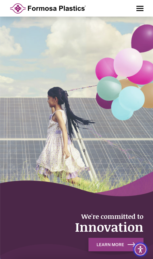
Instead, Formosa Plastics, a major polyvinyl chloride and petrochemical supplier, uses a traditional layout with a prominent hero image or banner and a news ticker or updates section.
The visual identity leans on Formosa’s logo and primary blue and white corporate colors. The site content emphasizes reliability and industrial expertise, featuring headlines like “Innovating PVC for Over 60 Years” paired with a photo of a manufacturing facility.
It’s not flashy, but it’s clear and confidence-inspiring.
Formosa’s WordPress site shines in providing technical content in an organized way, splitting into sections like Products, Sustainability, Careers, and Community.
Within Products, the site a secondary mega menu to jump between product categories, such asolefins, polyolefins, vinyl, and specialty polymers. Each product page is detailed, often providing spec sheets, application info, and contact links for sales.
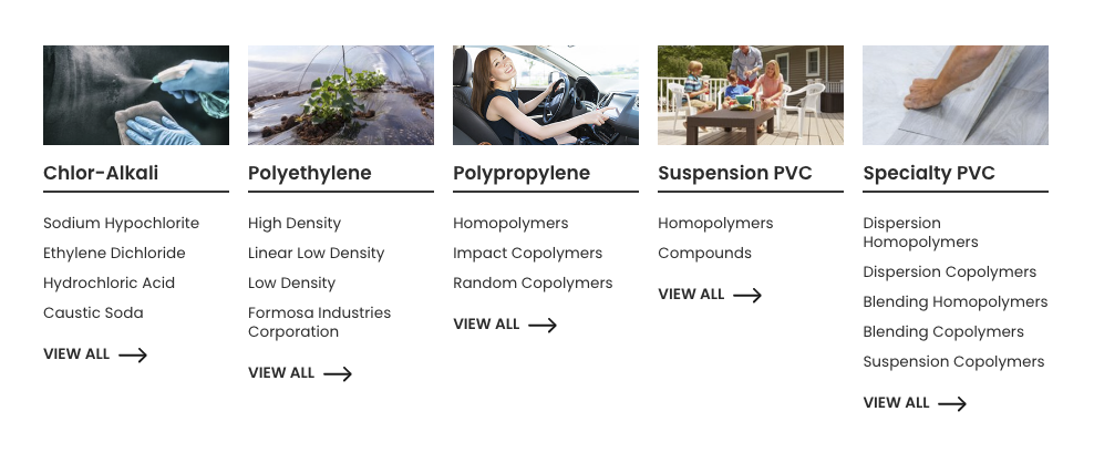
The site also includes a secure customer portal link for existing clients, common for B2B chemical sites.
The user experience is utilitarian but effective – essentially, “just the facts.”
On mobile, the site functions well, albeit without some of the modern polish others have.
The menus collapse, and the text remains readable, but due to a less dynamic design, mobile users may need to scroll or zoom more on tables of data.
CMS: WordPress
Lighthouse Scores
| Metric | Mobile | Desktop |
| Performance | 45 | 75 |
| Accessibility | 80 | 85 |
| Best Practices | 78 | 82 |
| SEO | 89 | 91 |
10 - PPG | Bold Design for a Diverse Portfolio

PPG, a global paints and coatings company, has a website that matches its colorful brand. The bold design uses vibrant imagery of cars, airplanes, and buildings coated in PPG products.
One glance at the homepage will tell you that PPG is all about color and innovation in materials.
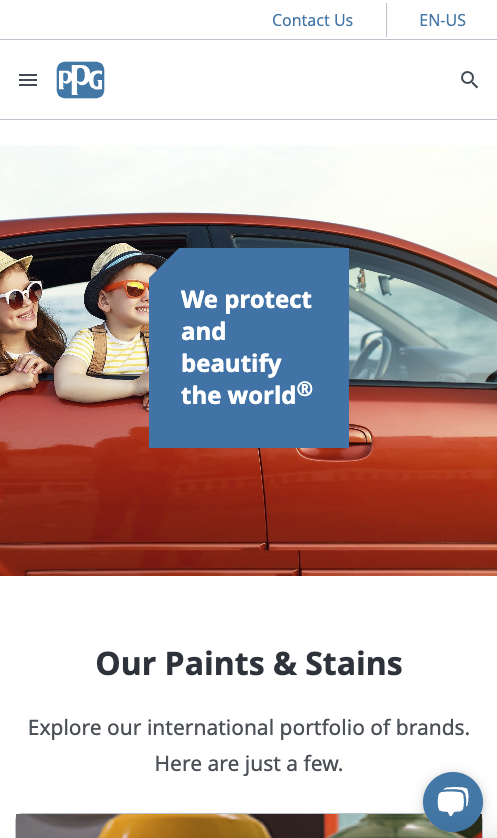
A functional design element is using color-themed sections – for example, the site might scroll through sections tinted with the shades of PPG’s latest color trends, which is a clever way to showcase their paint expertise subliminally.
PPG’s concise and confident messaging: “We protect and beautify the world” might be a tagline you encounter.
User experience is tailored to a diverse portfolio.
The site has audience-specific pathways: one for consumers, one for industrial clients, and one for corporate info.
This could be implemented via an initial choice or clear menu labels like “Consumers” vs. “Industries.”
Despite serving different user groups, the site maintains consistency with a cohesive design.
Interactive elements include product finders, a store locator for consumers to find PPG paints near them, and perhaps industry solution wizards for B2B visitors.
On mobile, PPG’s vibrant visuals stand out, and the site remains navigable through a clean hamburger menu system.
Because PPG has so many offerings, the mobile design smartly uses expandable menus and large tap targets, so users don’t get frustrated trying to tap small links.
CMS: The site integrates several content management systems, including Kontent.ai, Kontico, WordPress, Shopify, and Umbraco.
Lighthouse Scores
| Metric | Mobile | Desktop |
| Performance | 50 | 80 |
| Accessibility | 86 | 90 |
| Best Practices | 84 | 88 |
| SEO | 93 | 93 |
11 - INEOS | Distinctive Branding Display
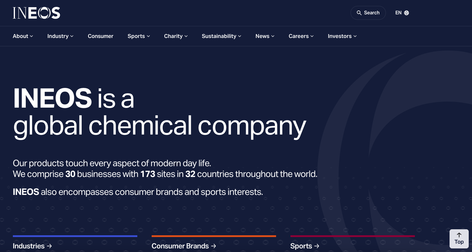
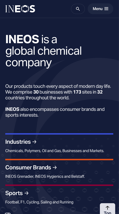
INEOS is a massive chemicals conglomerate with businesses ranging from petrochemicals to sports.
They own a competitive cycling team. Despite this diversity, the website presents a unified brand.
The design is clean and modern, consistently using the INEOS logo’s distinctive font and a black, white, and purple color scheme.
A key aspect of the combined e-commerce and CMS Episerver site built on Microsoft ASP.net is consistency and simplicity.
No matter which part of the company you’re browsing, the pages share a similar layout and navigation structure.
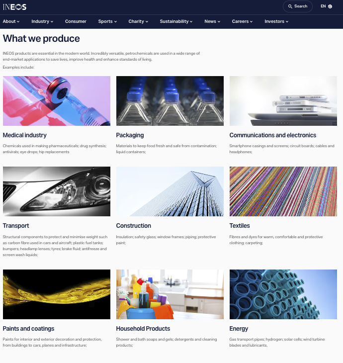
This is important because INEOS has grown through acquisitions, and the site brings together all those pieces in one place.
The homepage typically features high-impact photography, like industrial plants or product close-ups, with short headlines like “INEOS advances circular economy in plastics.”
The straightforward content features top-level pages for each business segment; within those, news updates and project highlights show innovation.
INEOS also emphasizes its ethos and leadership, for example, showcasing founder Sir Jim Ratcliffe’s initiatives.
The About section is richly developed with stories and leadership profiles.
Navigation uses a mega-menu that lists INEOS’s many ventures, but it’s organized logically.
There’s also a global map or selector because INEOS operates in 29 countries.
The site might direct you to region-specific pages or provide contact info tailored to your region.
For a chemical company website with such breadth, it’s surprisingly easy to use—a testament to good UX design, which makes complexity feel simple.
On mobile, INEOS’s menu condenses but remains extensive – users can scroll through the list of businesses.
Smartly, each section is collapsible, so you can expand only the part that interests you.
CMS: Episerver
Lighthouse Scores
| Metric | Mobile | Desktop |
| Performance | 65 | 88 |
| Accessibility | 83 | 87 |
| Best Practices | 90 | 90 |
| SEO | 91 | 91 |
Why Website Performance Matters For Chemical Sites
Website performance isn’t just a nice-to-have technical metric. It has a tangible impact on user experience and search rankings. Combined with other signals, performance helps companies land on the first page of Google or even the coveted top three positions.
Optimizing performance is crucial for chemical company websites, which often contain heavy data sheets, videos, and detailed content. Faster load times lead to a smoother user experience, especially for busy engineers or buyers accessing your site on the go.
A high-performing site engages users with smoother interactions and reduces bounce rates, meaning they’re more likely to stay and explore. On the flip side, a slow site may frustrate visitors, no matter how good your content is, especially in international markets with subpar network connectivity.
From an SEO perspective, Google now uses page speed and other performance signals (like Core Web Vitals) as ranking factors. In other words, a faster site can help you rank higher on search engine results pages.
How to test your site using Lighthouse
Search engines favor fast, user-friendly websites. Many examples above, like Kao Collins and Zeon, show that even content-rich sites can achieve high performance scores with the right optimizations, such as compressing images, using efficient coding practices, and leveraging caching.
The payoff is twofold: better UX and better SEO. A site that loads quickly on mobile (often the tougher test) will make a strong first impression on potential clients and satisfy Google’s algorithms for mobile-first indexing.
If you want to explore performance's impact on success more, check out our blog post on achieving a high Lighthouse performance score and its benefits for UX and SEO.
In short, prioritizing performance in your chemical website design can lead to more engaged users and higher organic traffic – a win-win for your business.
Considerations When Redesigning a Chemical Company Website
Redesigning a chemical company website is a significant project that can significantly boost your digital presence if done effectively.
Primary Attention
- User Experience (UX) & Responsive Design: Ensure the site offers intuitive navigation and looks great on all devices. A clear menu structure and responsive layout are critical. A primary audience of technical professionals values a straightforward, logical flow of information. Focus on mobile responsiveness and a timeless design that will still look good years from now.
- Content Strategy: Plan content with your audience’s needs in mind. This means creating pages or blog posts that address common questions, providing detailed product information, and keeping content up-to-date. Regularly updating content keeps it fresh and relevant and signals to search engines that your site is active. For example, starting a knowledge base, like Kao Collins’ “Ink Tank”, can position your company as an industry thought leader.
- Features and Functionality: Identify interactive tools or functions that benefit your users. This could be a product finder, an ROI calculator, a technical document library, or a live chat for customer support. Modern chemical B2B websites often include portals for customers or distributors.
- Consistency & Branding: If your chemical company has multiple divisions or products, maintain a consistent brand and visual experience across all site sections. Use a coherent style guide for colors, fonts, and imagery so that it feels like the same company, whether a user is looking at your polymers page or your investor relations page. Consistency also builds trust and recognition. Internally, getting leadership buy-in on the redesign goals can ensure everyone aligns with the long-term vision, reducing the need for frequent changes.
- Technical SEO & Performance: Incorporate technical SEO best practices from the start of the redesign. This includes optimizing page load times, using proper meta tags, ensuring your URLs are search-friendly, and implementing schema markup where relevant. Also, build the site on a scalable, SEO-friendly platform or CMS. Optimizing for performance helps SEO but also means you won’t have to redesign again in a couple of years due to poor performance. Invest in a solid foundation now – clean code, good hosting, and security – to future-proof your site.
While these are some of the elements that create great chemical company websites, there is much more needed for websites to perform in search engines and generate more leads.
Discuss how we can create a chemical website that increases your organic search traffic and website leads to drive growth for your business.
FAQs
The key elements of a compelling call-to-action are valuable incentives, sense of urgency, and an emotional or enthusiastic tone.
A great chemical website includes compelling CTAs, attractive and interactive design, assists in lead generation and overall business goals, and has high-quality, informative content.
Navigation is one of the core website pillars that will assist and lead your visitors through the site to find the information they need in the simplest and quickest way possible, with the ultimate business goal of converting them into qualified sales leads.
Creating a high quality website that includes relevant information and content that qualifies the user, paired with compelling CTAs that draw the user to conversion, will help your website generate leads for your sales team.
