What is a Call-to-Action Button?
Call-to-action (CTA) buttons are on almost every website, often displayed as clickable boxes that invite users to "Sign Up" for a newsletter or contest, "Download" a product or guide, or "Learn More" about a topic. Because these buttons are often linked to a site’s core goals, focusing on their design can increase your website’s conversion and goal completion metrics. Businesses use CTAs to drive customers further into their marketing funnel, directing them to high-priority pages and actions.
We spend a lot of time designing CTA buttons for our clients, so we know a good CTA when we see one. Here’s seven great examples we found that you can use for your own inspiration:
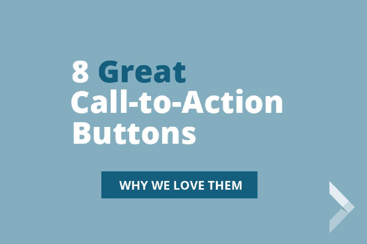
8 Great Call-to-Action (CTA) Examples
1. Big Ass Fans

Why we love it: Clever and concise copy. These three CTA buttons make use of compelling action verbs (“learn,” “calculate,” and “see”) but still keep it short and sweet. When designing your own calls to action, try going beyond bland phrasing like “Sign Up Now” or “Download Today.” A more unique button is more likely to pique your user’s interest.
2. Wishpond
Why we love it: This CTA button from Wishpond makes great use of the first-person personal pronoun “my.” We love seeing buttons that invite users to “Tell Me More” and “Show Me How.” It reminds the user that they are receiving a benefit too. Many nonprofits and cause-based organizations have seen great results from buttons like “I agree,” because they encourage the user to align their values or goals with the organization.
3. Dropbox
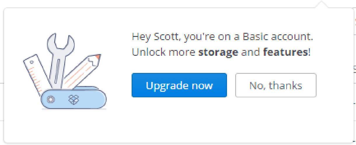
Why we love it: Personalization. Adding your customers’ names into your CTA can make your button stand out. We’ve seen marketing automation techniques like this used for years in email marketing with great success, and a growing number of digital marketers are using similar techniques to customize users’ web experiences, too!
4. Thrive Market
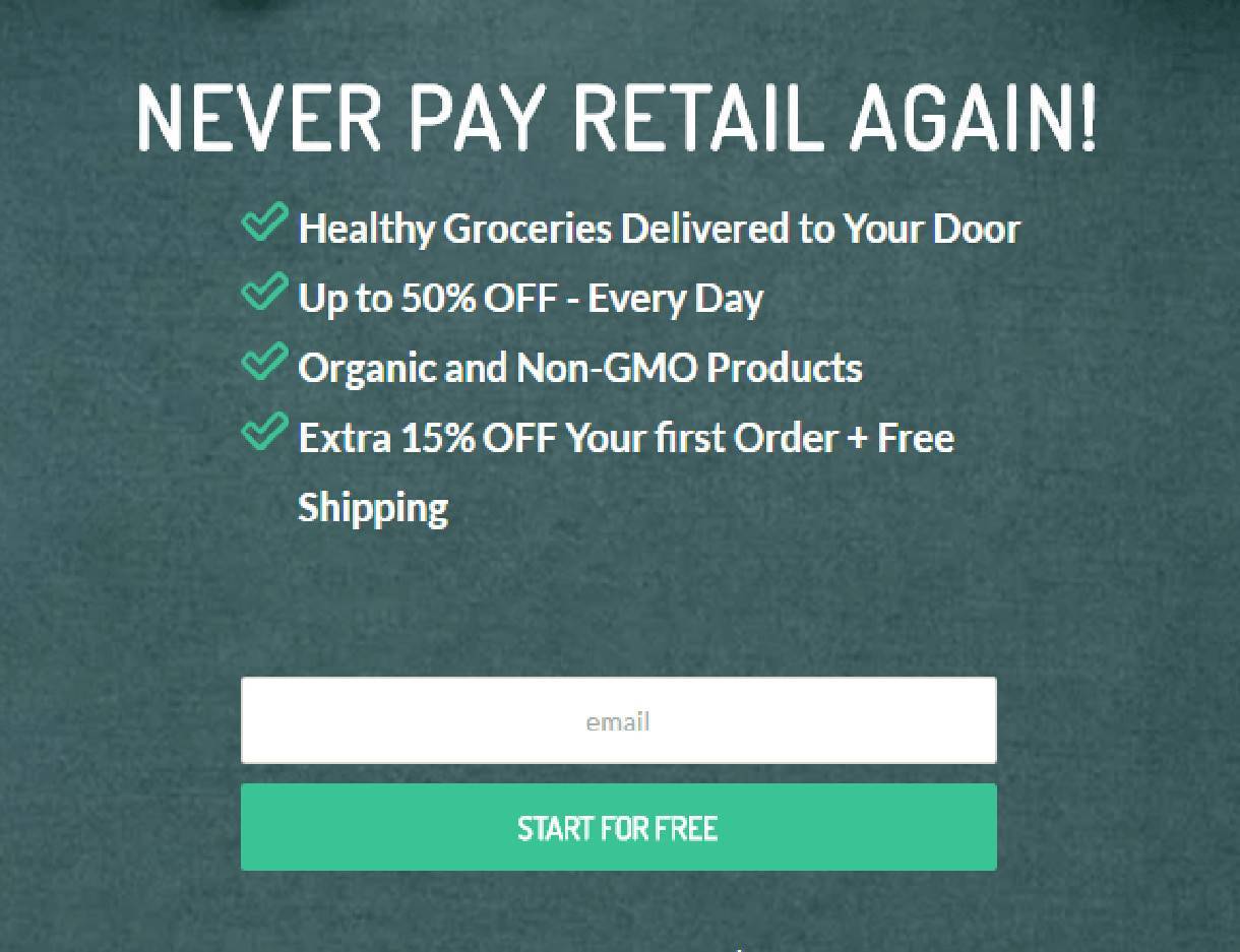
Why we love it: This call to action highlights the benefits the customer gets from entering in their email address. If you’ve got an email request form on your website that’s not getting great conversions, try clarifying benefits your customer can get from offering up their email. Changing “Sign up for our cooking newsletter” to “Sign up for weekly healthy recipes” gives your customers a clear reason to let you send them emails!
5. Charity: Water

Why we love it: Less is more. This call to action takes advantage of negative space to highlight a short message and simple CTA button. We love that the button is defined only by a simple white border. It’s unobtrusive, and it works. Charity:Water also creates a clear hierarchy of information, drawing your eye down from the larger headline, to the short explanation, and finally to the CTA.
6. PetSmart
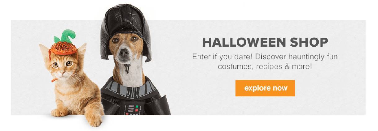
Why we love it: Color matters in design. Research from Kissmetrics shows that orange is a top-performing choice for CTA buttons. Orange not only stands out on most web pages, but also is a very high-energy button. Try switching up the colors of your CTA buttons to add more contrast from the rest of your website’s color scheme.
(And if all else fails, maybe putting a kitten in a pumpkin hat next to your CTA button.)
7. Bombfell

Why we love it: It’s king of the page. Bombfell’s homepage CTA button is large, prominently displayed, and not competing with anything else. Some websites overuse their CTA buttons and offer 3 or more options for their site visitors. In some cases, this might a strong strategic choice, but it runs the risk of confusing users. Decide the single most important action you’d like your site visitors to perform and turn it into a CTA. Don’t let other, less important actions cannibalize your conversion rate.
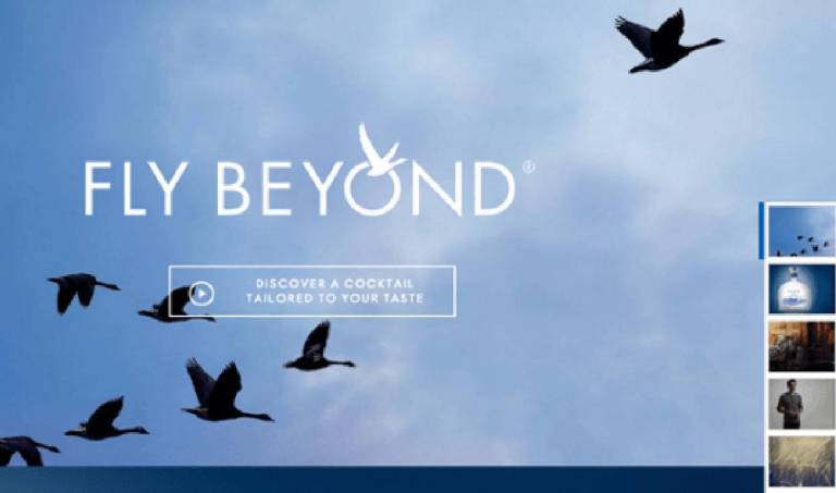
8. Grey Goose Vodka
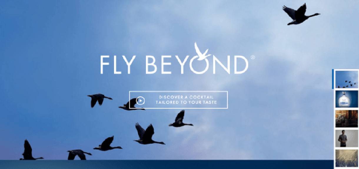
Why we love it: the background image naturally draws the eye from the bottom left of the page to the top right, and the CTA button sits directly in that path. Try placing your CTA buttons in areas of your site that get the most “eye traffic” or using images that draw the eye in a certain direction.
Best Practices for Designing CTA Buttons
Designing an effective call-to-action button doesn’t have to be difficult. If you keep in mind a few best practices, you can be sure to increase conversions on your website. The top four keys to keep in mind are language, context, design, and location.
- Language - keep it short, but make it unique. Use strong action words and consider adding in first-person pronouns that invite visitors to click. Try to keep the button text to less than five words. Avoid common phrases like “Sign up now” and “Download” that visitors may have been trained to ignore.
- Context - give your audience a reason to click. Clearly define the benefits of your service directly above your CTA button to provide helpful context to your button.
- Design - make good use of negative space. A button in the middle of a cluttered web page is less likely to be clicked. Make your button a color that contrasts with the background, and if you aren’t sure what color to make your button, try orange!
- Location - place your button on area of your page that people are likely to look at. Draw your readers’ eyes to your button through good image design or by creating a hierarchy of content that draws eyes downward to your button.
Also: Remember to constantly improve your CTA buttons. Try using different colors or different copy and see if it leads to an improvement in conversions. You’d be surprised how much one simple change can increase your results!
A Call-to-Action Button Checklist
When adding CTA buttons to your site, follow this short checklist. There are so many different elements that go into good CTA button design, but if you can answer “yes” to these five questions, then your CTA button is probably good to go:
- Does my CTA button have less than five words?
- Does my CTA begin with a strong, unique action verb?
- Is it clear the value a user gets from clicking on my button?
- Is my CTA button displayed prominently on the site?
- Is my CTA button free from competition from other CTAs on my page?
Additional Call-to-Action Resources
If this guide wasn’t enough, here’s some other great places to go for call-to-action tips, tricks, and examples:
Call-to-Action Best Practices from HubSpot Academy
5 Call-to-Action Best Practices that WILL Make People Click from LeadBoxer
Related Posts