The demand for quality health and medical information highlights the need for intuitive and informative websites. According to a recent Pew Research Center study, nearly 80% of all internet users have searched for medical and health information online.
In healthcare, websites must overcome several challenges to stand out in the marketplace and deliver an optimized user experience, including:
- Branding and logos for health and medical companies tend to look similar, making it hard for the website design to stand out.
- The industry is heavily regulated, so healthcare marketers often “play it safe” with website content.
- Companies overlook website accessibility, critical for delivering the optimal user experience and legal compliance.
- Healthcare websites tend to offer a larger-than-normal amount of content.
Despite these challenges, many successful healthcare organizations stand out with websites that follow best practices for healthcare website design.
Here we review eight of the best examples of excellent healthcare web design:
8 Examples and Best Practices for Great Healthcare Websites
Click to jump to any section highlighting an example below:
- Simple Clean Design and Messaging | AthenaHealth
- Robust Website Search | Mayo Clinic
- Website Accessibility | Rest Assured
- High-Quality Imagery | Maven Clinic
- Engaging Website Videos | Hartford HealthCare
- Medical Info Delivery | MedLink Neurology
- Engaging Health Content | HealthLine
- Single-Minded User Journey | HealthMatch
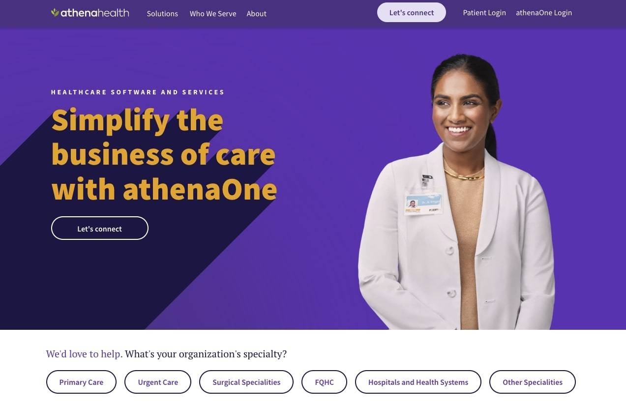
Starting at the top fold of their homepage, athenahealth's website design conveys simplicity.
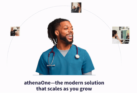
Motion design elements help athenahealth illustrate their value proposition.
The athenahealth website features a clean, straightforward information architecture.
The navigation menu has only three primary links and three secondary logins. We’ve seen healthcare websites with more than 20 items competing for attention in the top navigation bar.
Athena’s use of simple navigation, combined with the prominent display of the search function, greatly enhances the usability of its website design.
In an industry as complicated as healthcare, athenahealth plants a flag in the healthcare software and services sector with a website supporting its brand proposition of simplifying the care business. From the top of the home page to the bottom, athenahealth tells their product story through crisp messaging and animation packaged in clean design.
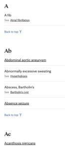
The website breaks down search results with initial letters for quick scanning.
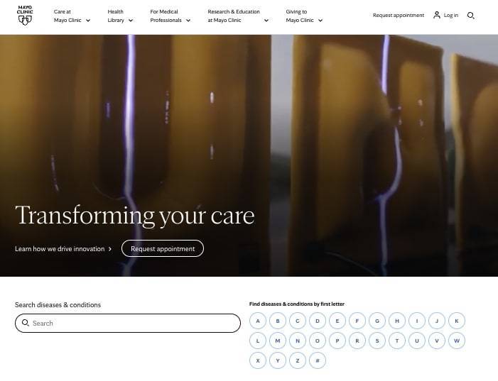
The Mayo Clinic website features prominent search functions on the home page, allowing users to manually enter and search for information on any disease and their conditions. Their search tool goes beyond search tools commonly found in navigation bars.
The robust search is further enhanced by an alphabet display for narrowing results based on the initial letter. The search bar on these landing pages autocompletes to limit results for the name of any disease or condition.
The search results for each disease and condition are grouped in the menu bar as Symptoms & Causes, Diagnosis & Treatment, Doctors & Departments, Care At Mayo Clinic or just simply Request An Appointment.
As a healthcare website, Mayo Clinic demonstrates that a robust website search function is crucial for users to quickly find specific information or services they are seeking. The prominent search bar, autocomplete and suggested words, and advanced filtering options, along with clear and detailed results, save critical time and provide accurate information for visitors.
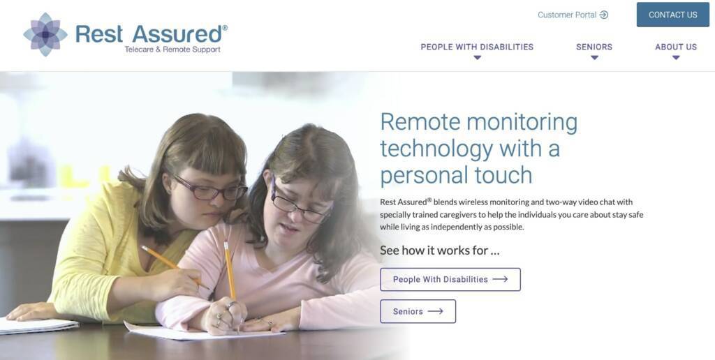
Rest assured offers accessibility features such as large button targets.
Rest Assured® caters to seniors and individuals with disabilities. They demonstrate their commitment to ethical principles by offering a website designed and built to WCAG 2.2 AA level of accessibility compliance, opening the website for all users.
The site incorporates key elements of accessible web design such as large, high-contrast fonts, easy-to-use keyboard navigation, and large button targets to support clicking. The company understands its primary audience and their challenges when using a website.
The Rest Assured site also makes excellent use of alt text on all images, which supports visitors browsing the site using screen reader equipment and other text-to-speech software often used to support users who may be visually impaired.
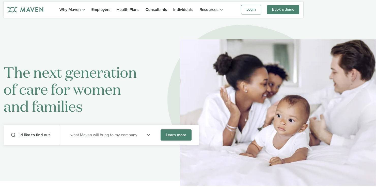
Maven Clinic uses original photography, which helps establish credibility.
The Maven Clinic website immediately establishes credibility using original photography carefully produced to match the site’s pleasant color scheme. No stock images here.
The consistent use of rich, colorful photography also helps promote a sense of excitement and optimism. A deep, vibrant green color for the search box is a particularly good choice to promote health and well-being. The type within the search box has a greener contrast to enhance readability when the user selects the particular option.
The quality of imagery seen throughout Maven's website demonstrates an understanding of the brand and design vision.
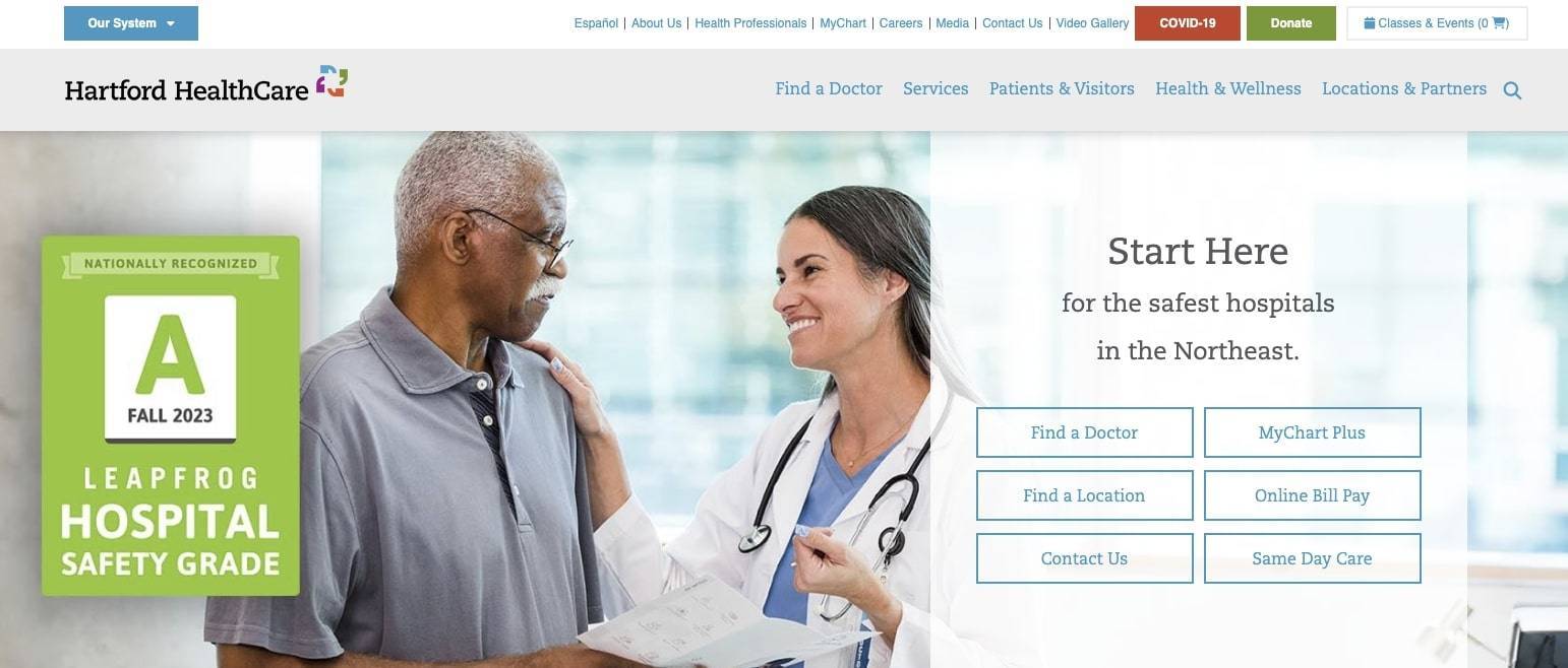
Hartford HealthCare uses video to support the brand and convey medical information.
Hartford Healthcare showcases a variety of video storytelling. Unlike many websites featuring video, Hartford gives full control to the users. There is no fast-paced, auto-playing video. The site embraces video for storytelling and information delivery, such as facility tours, provider interviews, and treatment videos that rank highly among prospective patients.
The website does a tremendous job telling its story through engaging videos. These informative videos, found throughout the site, captivate the viewers and promote the feeling that Hartford Healthcare has the solution to their health issues.
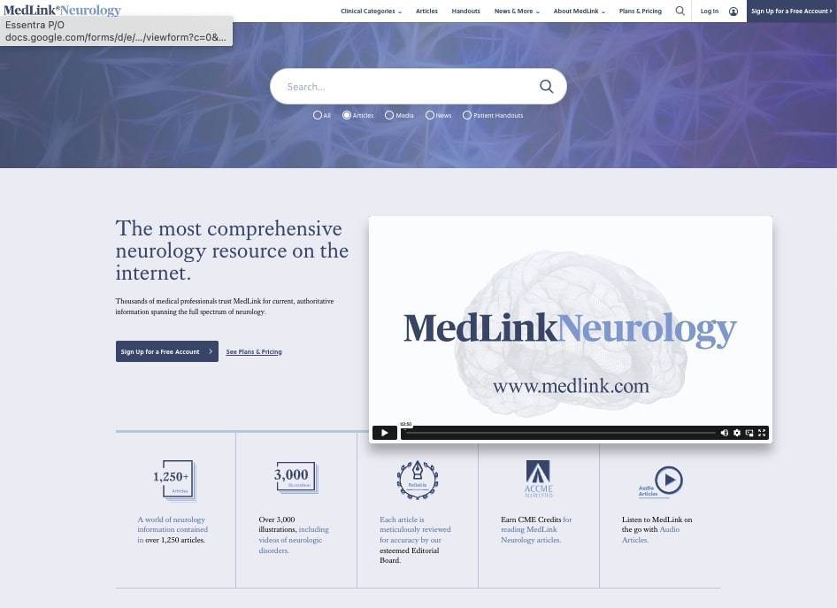
The MedLink home page offers many ways to discover content.
Long recognized as one of the top online neurological resources, the MedLink website supports the commitment to quality information. MedLink® provides users with an extensive and well-defined navigation making it easy for visitors seeking academic health information, actionable health information, or guidance regarding their medical condition or treatment protocols.
This authoritative information is conveniently spread across thousands of audio/video articles, illustrations, and patient handouts, which also benefits health providers and medical professionals.
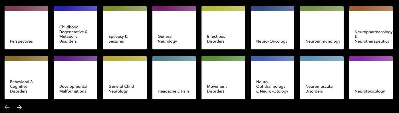
MedLink color codes category topics that correspond to the color scheme of the related landing page.
The website’s design supports information discovery subtly and effectively. For example, the “Clinical Categories” section in the navigation presents a window with simple color-coded tiles for various medical topics. The color accents on the tiles match the color scheme on each landing page. This provides a level of continuity on the user journey.
Similarly, the site strives to convey information in as few words as possible, which is important for any website, and more so on a site swimming in complex information.
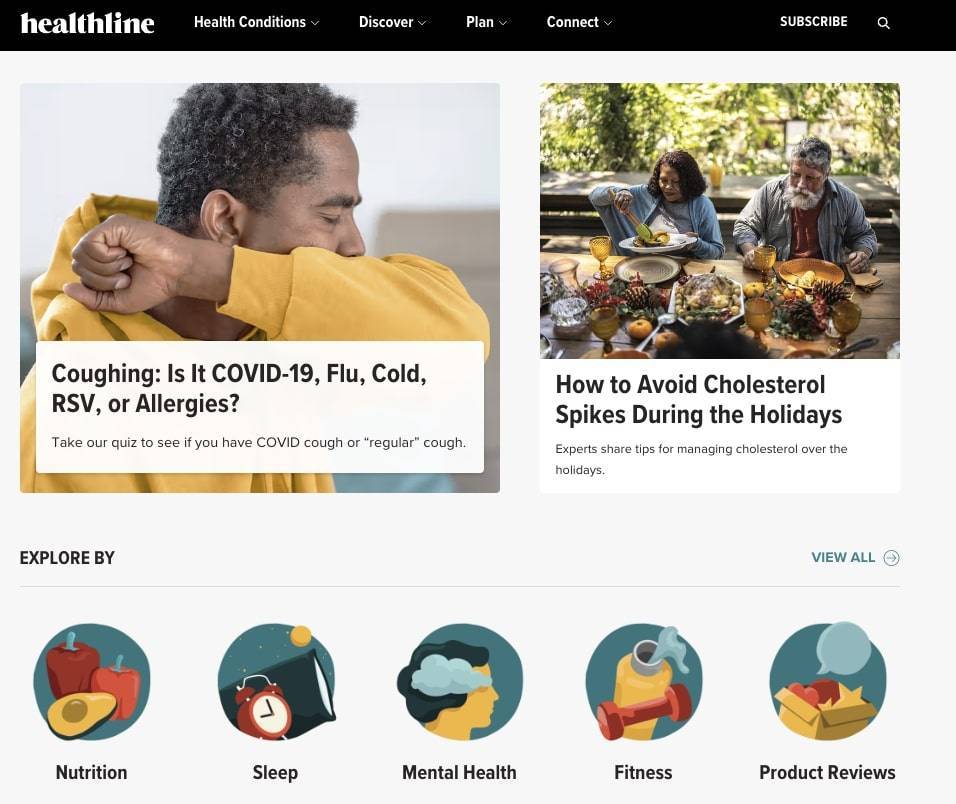
In addition to producing expert-reviewed content, the Healthline site uses an effective color palette to guide visitors.
Healthline provides its consumer audience with engaging and timely health-related content. With an easy-to-navigate site, Health Line uses well-written articles on subjects ranging from health conditions to organizational news and articles on health-oriented events, including highlights of their social media posts.
The site uses various methods to attract attention, including images, icons, videos, and well-defined page sections. The colors, while rich, are not offensive. They have a warm and grounded feel to them. The palette used for the icons and illustrations is frequently incorporated in the limited use of photography.
The health contents range from nutrition, sleep, mental health, fitness, and more, which engage the audience to spend more time on their website.
The organization of the site supports a clear understanding of user interests and needs.
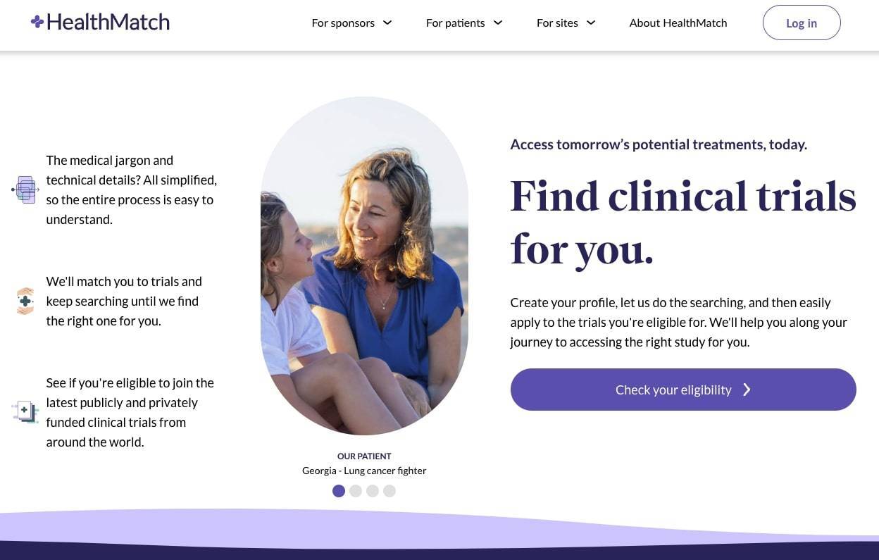
HealthMatch understands their audiences and helps guide visitors on their user journey.
HealthMatch handles the challenge of appealing to three unique audiences. Many companies and organizations face similar hurdles. HealthMatch must appeal to organizations needing help managing clinical trials and consumers exploring participating in clinical trials.
The HealthMatch website excels at the single-minded user journey. The homepage is uncluttered, featuring a prominent "Check your eligibility" button as the primary call-to-action (CTA) for the consumer audience. Attracting and engaging consumers is vital for the company’s successful signing up organizations wanting eligible participants.
The navigation bar offers straightforward options like "For Sponsors," "For Patients," "For Sites," and "About HealthMatch." Each section provides concise, relevant information about the user's intent for clinical trials.
This approach keeps the user focused on their primary objective - managing clinical trial details and participating in a trial. Ensuring every step on the website aligns with the user's intent, the design streamlines the journey, reducing confusion and encouraging users to complete the desired action effortlessly.
How to Design Great Healthcare Websites
A high-performance healthcare website drives business results and offers a superior user experience.
Creating an outstanding healthcare website involves a thoughtful blend of several crucial elements, ensuring an enriching experience for visitors and establishing trust and credibility. Here's a closer look at the key aspects that contribute to the success of healthcare websites:
Only include website features that are useful.
A successful healthcare website offers more than just basic information. Interactive tools like symptom checkers, appointment scheduling systems, and telemedicine options enhance user engagement.
Incorporating features like online forms for patient registration and feedback forms for gathering opinions enhances the user experience.
Keep your website navigation and site search functionality simple.
Navigation should be intuitive and effortless. A clear menu structure, logically organized sections, and prominently placed calls-to-action help visitors find information quickly.
Implementing a powerful and user-friendly search function ensures that users can quickly find and access the content they want, rather than clicking several times through navigation menus or landing pages.
The best designs won't work without engaging and informative content.
Effective, high-quality content is the cornerstone of any website's success, no matter the industry. Furthermore, ongoing production of fresh, credible content supports search engine optimization, organically increasing traffic to the website from online search results related to your content.
In healthcare specifically, a website that includes comprehensive information about services, treatment options, and health conditions fosters trust. Multimedia elements such as videos, infographics, and interactive presentations convey complex medical information in an engaging and easily digestible manner.
A regularly updated blog with articles on health-related topics demonstrates expertise and keeps visitors returning for reliable information.
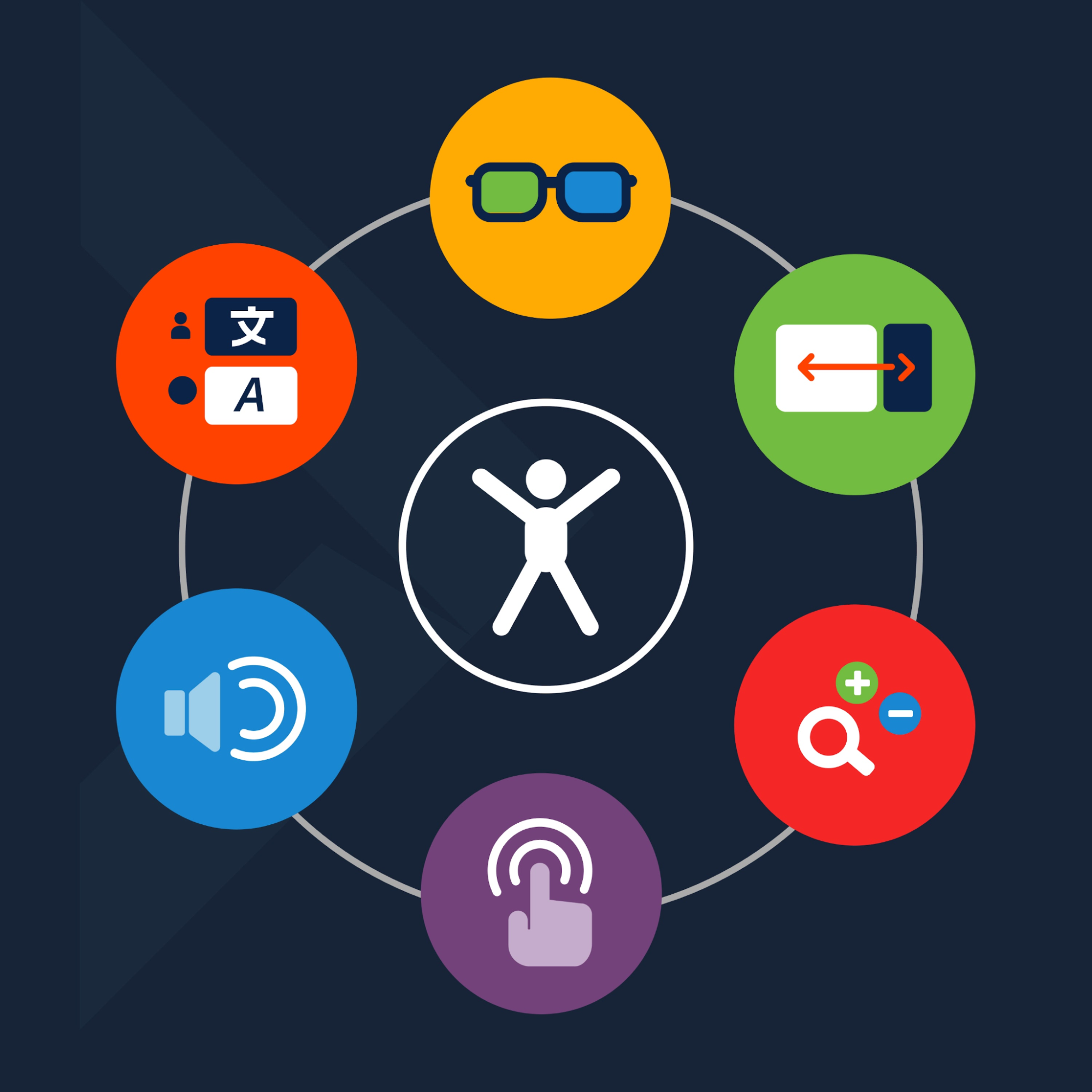
Make sure your website is accessible and ADA-compliant.
Ensuring your website is accessible to all users, including those with disabilities, is ethical and essential. Adhering to WCAG guidelines ensures your users with various disabilities can use the website.
Avoid visual clutter by using clean design elements.
A clutter-free and visually appealing design is vital to the success of health and medical websites. Consistent branding elements, easy-to-read fonts, and a pleasing color scheme with adequate contrast all contribute to a professional look.
Also consider the variety of devices your audiences use to access the website. Mobile responsiveness is crucial, as many users more often access websites from smartphones and tablets. A responsive design ensures a better, more consistent user experience across all devices, enhancing usability and satisfaction.
Get the Best Web Design for Your Healthcare Company
With approximately 4 out of every 5 internet users seeking health-related information online, an exceptional website becomes a powerful tool for your healthcare organization. It delivers valuable information and leaves a lasting impression, making visitors more likely to choose your services and recommend your organization to others.
Agencies that specialize in healthcare websites, like DBS Interactive, have experience creating a great web experience for visitors while fostering confidence in the medical brand by integrating best practices.
For over 23 years, we have designed and developed high-performing websites for hospitals and medical health organizations. Check out our portfolio for examples of our website design work, and connect with us to get a free consultation and a customized quote for your healthcare website project.
Portfolios |
||
|---|---|---|
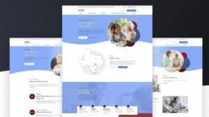
 Content on the ADA-compliant site emphasizes the information for key audiences. Content on the ADA-compliant site emphasizes the information for key audiences.
|
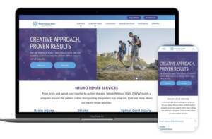
 Design streamlines pathways for patients, loved ones, and partners. Design streamlines pathways for patients, loved ones, and partners.
|
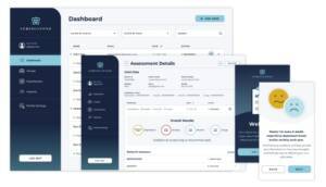 User experience takes center stage on this private mental health assessment site. User experience takes center stage on this private mental health assessment site.
|
| Rehab Without Walls Portfolio | Regency Integrated Health Services Portfolio | Springstone Portfolio |
Related Posts