It’s a myth that web design and user experience suffers when websites are built (or rebuilt) to comply with the ADA, which mandates that websites must be accessible to individuals with various disabilities or impairments. It’s also a myth that websites lose ideal, user-centric functionality when they become ADA-compliant.
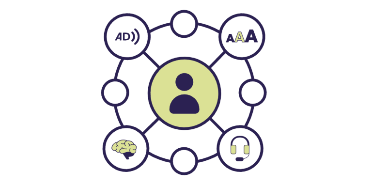
Web accessibility addresses the needs of every website visitor to achieve an optimal level of usability and ADA compliance. Many people browsing the web have a permanent disability (visual, mobility or neurological impairment), or a temporary impairment such as a broken arm, broken or lost eyeglasses, and so on. Many baby boomers have aging-related issues that make using the web more challenging, and they're not alone–about 20% of the U.S. population has an identified disability.
Luckily, the international nonprofit World Wide Web Consortium (W3C) produces recommendations for making websites fair and equally accessible for the highest number of people possible. Their Web Content Accessibility Guidelines (WCAG) 2.1 offer clear guidance for web developers to achieve ADA compliance.
Just like anyone in the physical world can use an automatic door or ramp that makes a building accessible, in the digital world an ADA-compliant website benefits all users.
"The power of the Web is in its universality. Access by everyone regardless of disability is an essential aspect.”

Sir Tim Berners Lee (photo: Paul Clark)
Timothy John Berners-Lee, considered to be the father of the World Wide Web, says that "the power of the Web is in its universality. Access by everyone regardless of disability is an essential aspect.”
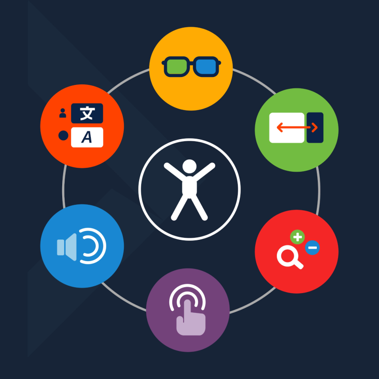
A great designer––whether of buildings, roads, advertising, or websites––considers how all users interact with their designs. Consider your website's diverse audience of users and how your site can offer them an optimal experience as you review the following examples of accessible web design:
10 Examples of ADA Compliant Accessible Web Design
Jump to an Example
1. Proper Contrast Ratio

Examples of hard vs. easy to read type on images
Some people with visual impairments may find it difficult to read text without high contrast against the background, whether a plain background or text embedded within an image.
A movie with subtitles provides an easily understood example. The text often appears without anticipating the background. It happens when white text appears in a brightly lit scene. It is unreadable, and the audience is left not knowing the dialogue.
WCAG 2.0 requires a contrast ratio of at least 4.5:1.
2. Don’t Rely on Color
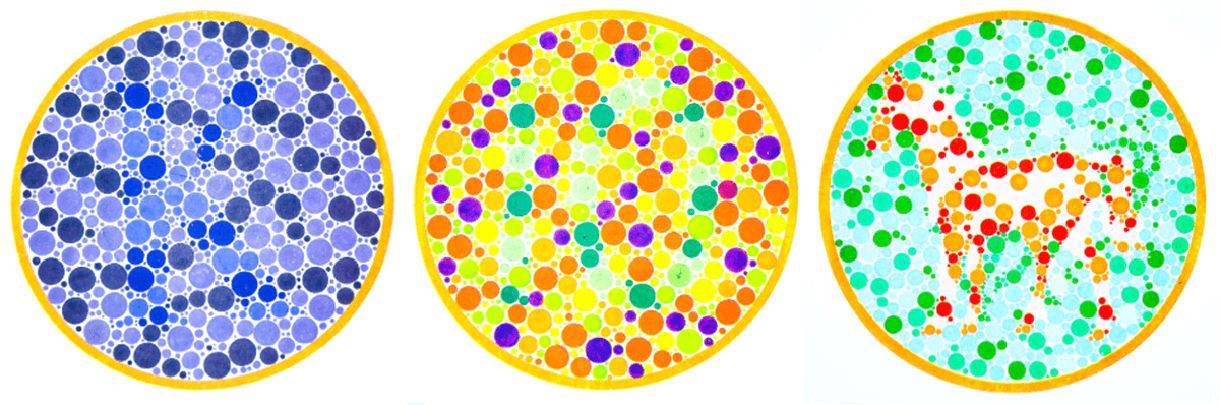
These images are not accessible to those who are colorblind
Green means go. Red means stop. Yellow means slow down.
But if you can’t discern color, you might not know whether you are stopping or going. Likewise, design that relies only on color limits engagement for users unable to discern color differences.
On a traffic light, the activated light in the respective position offers an individual with color blindness the necessary information (brightness and position) to go or stop. Likewise, a stop sign features the word STOP, the shape, and the color–three different ways to identify it as a stop sign.
The bottom line: Color alone does not provide enough information to be considered accessible web design. Go beyond color and use accessible design tactics to identify website elements and help all your users.
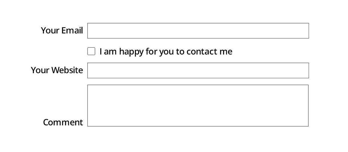
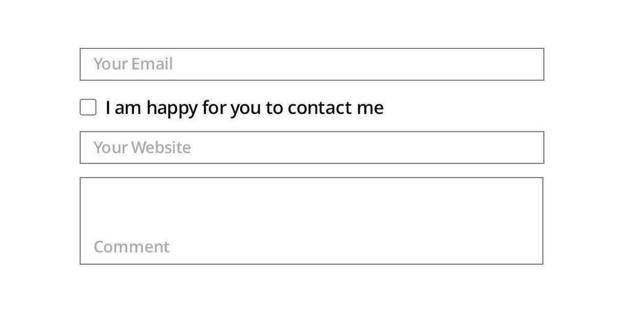
3. Label Forms Clearly
Provide descriptive labels for all form fields. There may be a temptation to place the label words inside the form field. Resist. Screen readers may miss these labels. Further, users with cognitive disabilities may lose track of the form field's intent.
DO THIS:
In this ideal example, labels are outside form fields
DON’T DO THIS:
In this example of bad accessibility, labels are inside form fields
4. Provide Feedback for Errors and Omissions
People make mistakes. So do your users.
Nothing feeds frustration and anxiety more than making a mistake and not knowing why or how your effort failed. That's why you should make it easy for users to quickly correct errors and omissions as they interact with your website.
Alert users to errors with text messaging, symbols, and colors––but not colors alone. (Review the above section on color).
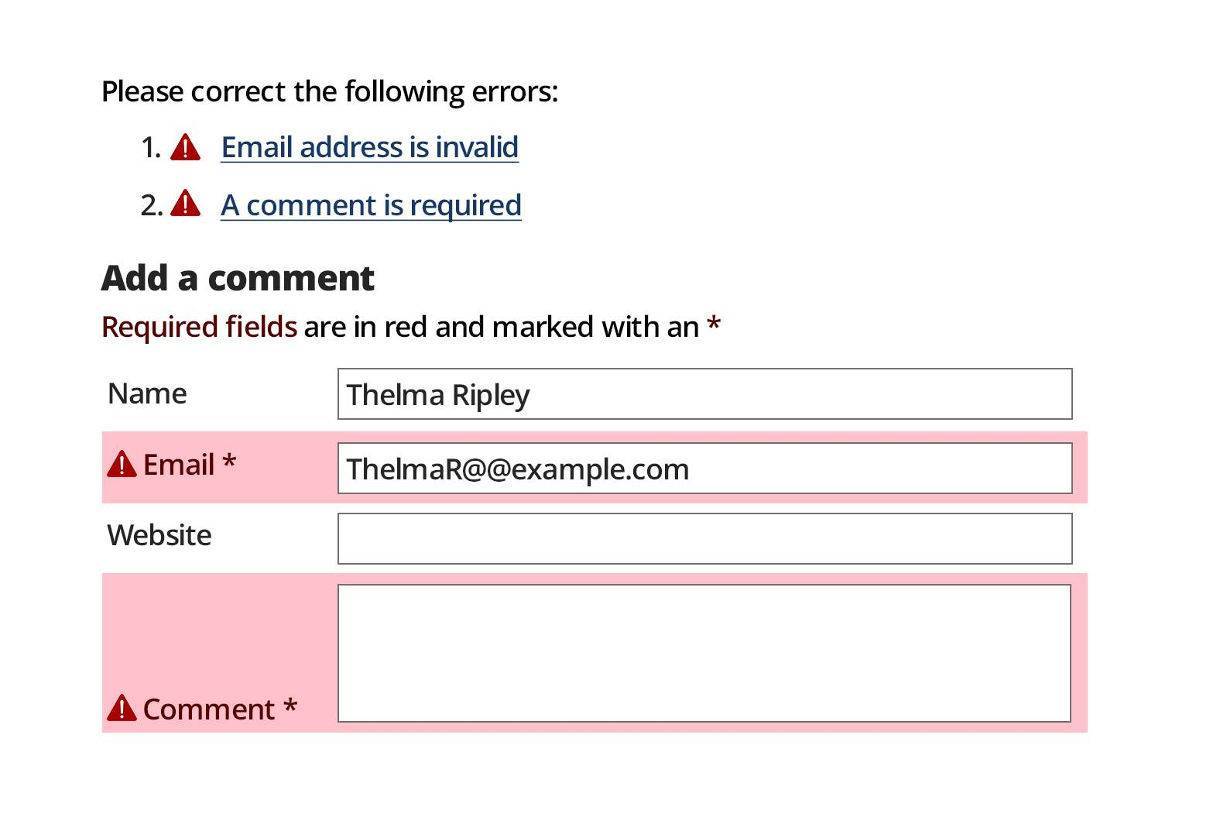
An example of form fill errors being explained to your user
The example above highlights two errors in the form:
• First, the email address entered by the user is formatted incorrectly.
• Secondly, the comment field, which requires input, has not been completed by the user. The form’s design indicated required fields with an asterisk, but for whatever reason, the field was empty.
Providing feedback not only highlights the location of the error, but also provides explicit instructions for correcting the mistakes. This helps you avoid losing valuable web conversions, whether they are sales, comments, or newsletter signups.
5. No Mouse, No Problem
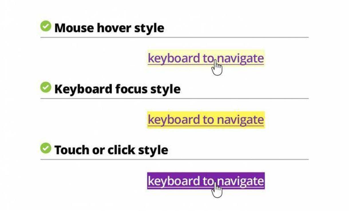
An example of link highlighting styles
Few people may be aware their keyboard provides web page navigation options in addition to their mouse. For keyboard navigation to be accessible, links must be indicated using color and design variation for the activation state: mouse over, keyboard focus style, and touch or click style.
Using the keyboard tab key, users must quickly recognize which link is active, and what is happening with the link.
Keyboard navigation may be necessary for users with limited mobility, such as someone who has suffered a stroke. However, it's not just health that limits a user's mobility–consider the scenario of a mouse battery losing its charge. In these and similar cases, any user could still rely on their keyboard to navigate through your website.
6. Consistent Navigation

An example of our own website navigation breadcrumbs
Whether driving on an expressway or surface road to your destination, we rely on consistent signage - speed limit signs, warning signs, and stop signs. Travel would be a mess without these guideposts.
Just like driving, there are often multiple ways to get from point A to point B on a website, with some routes faster than others.
That's why you should provide web users with consistent navigation, such as site search and site maps, making sure that your labels, styles, and positions are consistent. Breadcrumbs and clear headings provide further aids for understanding.
Users with cognitive or neurological challenges depend on these consistent design elements to avoid becoming lost or frustrated.
7. Simple Headings and Spacing
Good design guides the user’s eye to recognize your hierarchy of information. Help them understand the relationship of headlines to your text, graphics, and images.
Consider that users with cognitive conditions such as ADHD may have difficulty navigating content that is not presented clearly and directly. Beyond that, many users are crunched for time and will sooner give up trying to figure out any poorly-presented content.
Expert use of heading styles, white space and placement of elements reduces clutter, making content more accessible. Considerable time and effort, which translates into dollars, goes into creating content. An effective design makes it easier for your customer to read and then act on your valuable information.
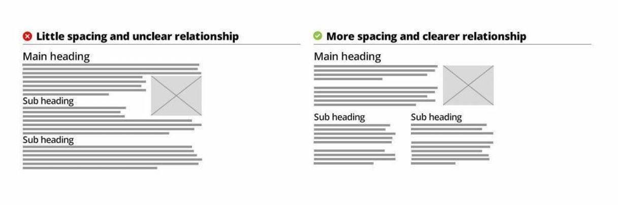
Examples of good and bad spacing of content
8. Design for Various Devices, Views, and Screens
Google rewards mobile-optimized websites, but that doesn’t mean ignoring desktop and other platforms.
For mobile and other narrow views, structure primary content in one or two columns, and offer secondary content through icons and links.
Conversely, a desktop offers the opportunity to present information in multiple columns with links and visible navigation. Optimize the text line widths and type size in this view for maximum readability. Users with cognitive or visual impairments may not finish tracking a long line of body text.
Keep in mind the previous discussion about simple design that communicates clearly and quickly.
MOBILE vs. DESKTOP
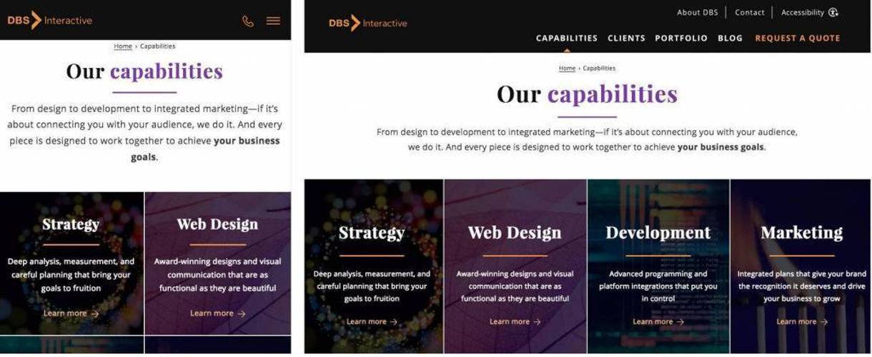
Example of one webpage designed for mobile vs. desktop
9. Offer Alternatives for Consuming Media
Creating content in different forms offers users with various disabilities equal access to information. Transcripts of audio and text versions of complicated graphics make content more engaging for users with hearing or visual disabilities. If your content team already produces alternative forms of content, bravo!
Make it easy for all users to access your content by including links to alternative formats. Links to audio transcripts, audio described versions of videos, and captions or text explanations of complicated designs or tables should be easy to locate.
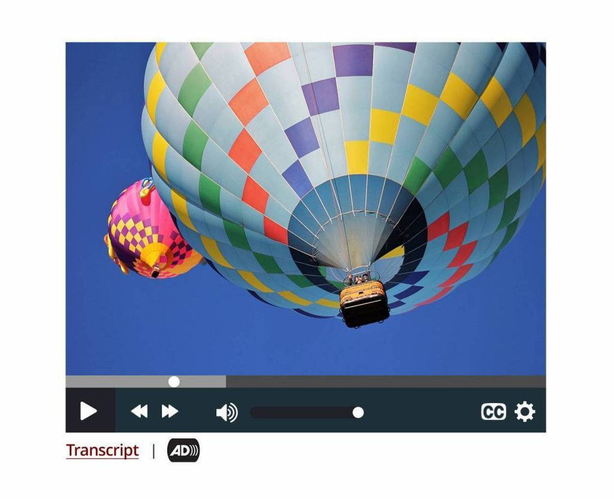
Example of links to transcript and audio alternatives
10. Give Users Control
That carousel or image slider on your site looks beautiful. That stunning video on autoplay may have cost thousands to produce. Users with cognitive limitations, however, may not comprehend your information quickly enough before the view changes or your video ends. Other users may want to start over, or go back and review something they saw or heard.
Whether the site features auto-playing audio and video or carousels, give users controls to replay, advance and pause any media on your web pages.
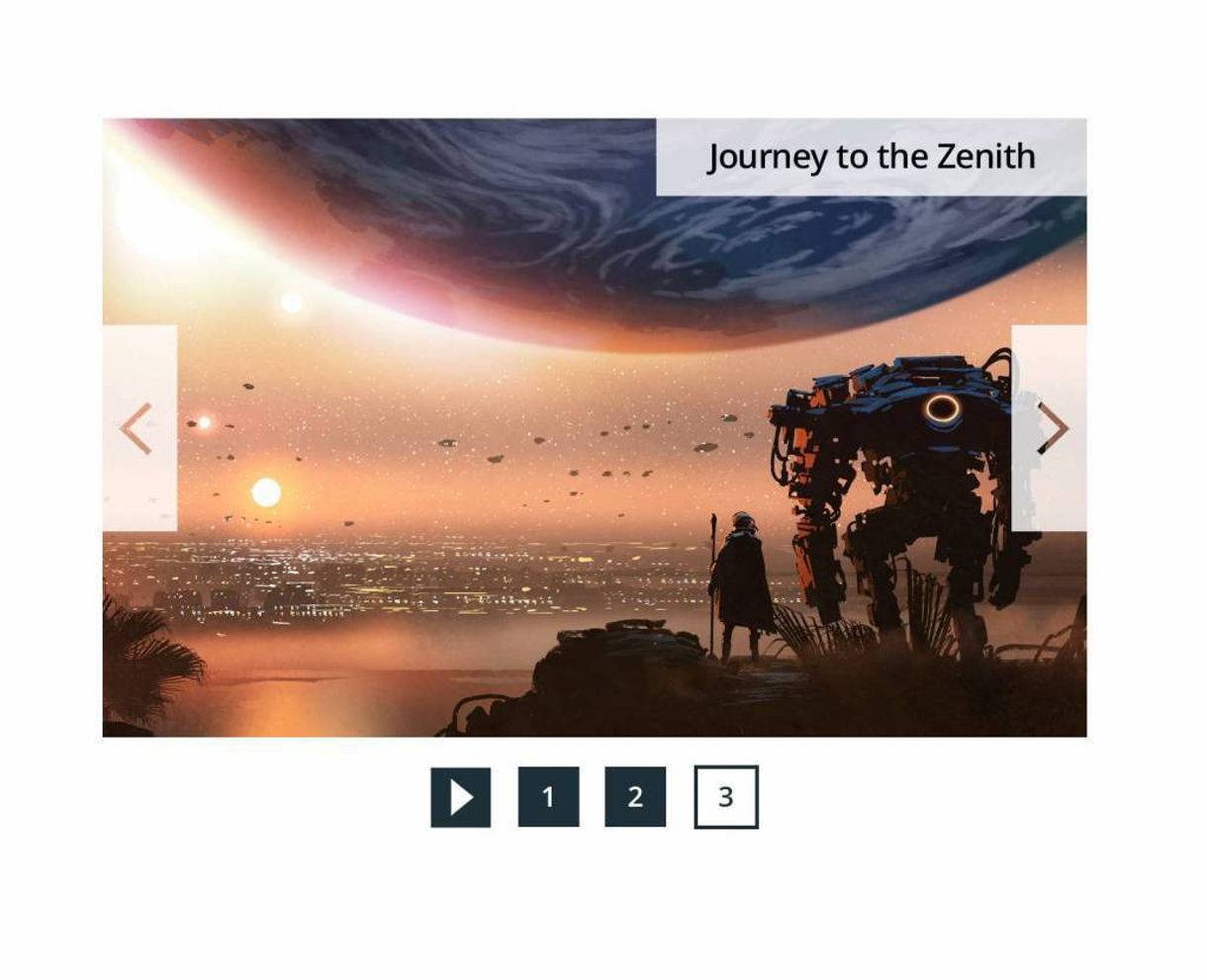
User controls here allow for jumping and playing slides/tiles
Benefits of Accessible Web Design for ADA Compliance
In the end, all users benefit from accessible web design, just like we can all use automatic doors and other accessibility features often found in the physical world.
Consider your user's intentions, and find ways to align their website behaviors with your business goals. Pizza with pineapple may not be the most popular order at your pizza restaurant, but all of your website visitors should able to order one easily, whether or not they are impaired. Providing accessible web design and supportive functionality for all users is the ultimate goal of ADA compliance for websites.
Here at DBS, we are a W3C Member Organization that designs and develop accessible websites that meet or exceed your ADA compliance needs based on WCAG 2.1 AA standards for website design and functionality.
Contact us for a free risk assessment and sample audit report that will demonstrate how we can help you reach more people with Web Accessibility.
Related Posts