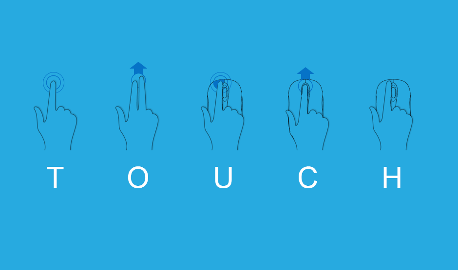

Mobile Touch Optimization
At this point it is common knowledge that people with touch devices, smart phones and tablets, are the fastest growing group of users on the internet. It won’t be long before mobile devices are the primary source for people to connect to the internet. That means designing websites to be touched. A click with a mouse isn’t all that different from a tap with a finger. But, just like in life, touching makes things complicated.
To further complicate things, mobile browsers must deal with sites that were never designed explicitly for touch devices. So they must somehow handle mouse events, like “scrolling”, “hovering” or “clicking” on things that were never optimized for this task. On mobile browsers there actually are typically two events fired when the browser detects a “tap”. First, the true “touch” event fires, and then shortly after that, the browser fires a “click” event for backward compatibility sake.
It’s easy enough to enhance the user experience for desktop with mouse or a true touch device. But doing equal justice for both is tough and often requires writing comparable code two different ways.
Here are some challenges we've faced when optimizing websites for touch enabled devices.
Layout Issues
Fingers are not as precise as mice are. This is especially true on smaller screens. Touch targets should be large enough and separated enough that even the most fat fingered among us can reliably select their chosen option on the first shot. There is nothing quite like the frustration of having to try several times to finally touch what you want. No one wants to feel like they have to be accurate as a Marine sniper just click a buy button. And you don’t want anything to make it more difficult for your customers to give you money.
Gestures
Something that doesn’t really exist on traditional desktops with mice is gestures. We are all used to “pinch to zoom”, “swipe”, and “pull to refresh” on phones and tablets. Most of these have no equivalent on desktops, but with a little thought and planning can make for a much improved touch device user experience - a more app-like experience. If users don’t have anything to interact with, they don’t interact with it. Meanwhile if they get to feel like they’re living in the future sifting through your content with swipes, pinches, and pulls they’ll think even more positively about how awesome you are. Interacting with something directly with your hands makes it more personal and creates a different relationship than with a digital arrow.
300 millisecond delay
The double tap is a common gesture used for zooming, but is actually a performance killer. When a user wants to single tap, they may experience a 300-400 millisecond delay before the browser reacts. This delay is implemented by the browser so it can check if there is a second tap coming, resulting in a sluggish website. One way to avoid this is by telling the browser to disable zooming.
<meta name="viewport" content="width=device-width,user-scalable=no">
This eliminates the need for a 300 millisecond delay and makes your website appear to respond quicker. The downside to this is that is disables pinch zooming as well, so it's important to make sure everything is exceptionally legible. A new version of Chrome for Android has removed this delay without disabling pinch zooming. Because the folks at Google are nothing if not change happy.
Other ways to avoid this penalty is to include the fastclick.js JavaScript library. There are other JavaScript libraries as well that do the same thing. You also code your own touch event handlers and remove the second click event that causes that annoying delay.
Hover events
One action that is essentially nonexistent on touch devices is “hovering”. While using a mouse, items such as tooltips or drop down menus are easily accessible by just moving the mouse over something. But how do you access that information on a touch device? Fingers can’t hover … they just “touch”. Devices that can detect your finger hovering over the screen are rare, but there are ways to handle hover states for touchscreens. Someone will introduce a simple and elegant solution to that problem someday, something no one had ever thought of, they’ll be lauded as a genius and make a ludicrous amount of money. But right now they haven’t done it yet (get cracking, folks at Google).
You can eliminate hover effects all together on touch devices, or use JavaScript to provide alternate functionality for CSS hover states. There is not an easy translation path though, and will require writing additional code.
Scrolling
Scrolling on a traditional desktop is typically done with a mousewheel, or with a common UI element -- scrollbars. On touch devices it’s done with a finger (welcome to the future folks)! Which is also used to “click” (aka “tap”) events. Scroll events just don’t fire the same way on non-touch devices as they do touch devices. They can fire later and this tends to produce jumpiness, known as “jank”, and other sub-optimal user experiences. This is another potential complication where techniques that make perfect sense on one device are less so on another. This is all the more bothersome since on true native “apps”, scrolling tends to be both smooth and fast. This can sometimes be caused by the device or the browser itself where they are coded to try and pause some actions on scrolling to lessen the processing power that the browser or device is using. There isn’t a cut and dried solution to all these problems (because if there was we would have told you about it just now) but keeping the right tools in mind when starting your project and making sure your foundation is started with touch optimization in mind will help ensure that your user experience can be all it can be.


