For factories, knowing how to design and develop a good website is essential for successful growth, awareness, engagement, and operations. Business websites have been getting more advanced for every organization, big or small, serving as a powerful tool for factories.
With so much competition in the market, factories will earn more business when they make great first impressions with a well-designed website.
An excellent factory website is more than outstanding web design. And the challenge of making a factory website work well and look great requires more than a talented web designer.
Every component of a factory’s website, from the user experience (UX) and user interface (UI) to the product or service listings, plays a significant role in the site’s success or failure.
Adding to the complexity, multiple internal and external stakeholders in the business have distinct needs that must be served by the website’s design, functionality, and UX. Understanding and accounting for their needs is critical to the success of any business website.
Successful integration of design and user experience results in a website with effective navigation, audience-centric content supporting the marketing funnel, efficient technical optimization for faster pages, and brand-aligned messaging.
Some of the best factory websites shine as examples of UX and web design principles.
The Best Factory Websites
To understand what makes a factory website great, let’s analyze some examples of the best factory websites, looking at characteristics that make them great website designs for factories.
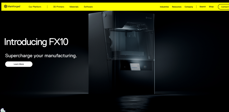


Once clicked, the Markforged homepage’s visible main navigation bar expands into a mega menu.
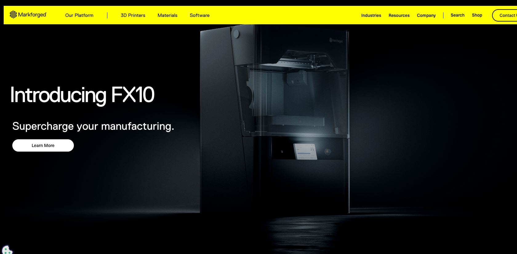
The Markforged website masterfully showcases its product line of 3D printers. The website has an ultra-sleek, dark-themed design, high-quality graphics, and a tech-forward bold typeface.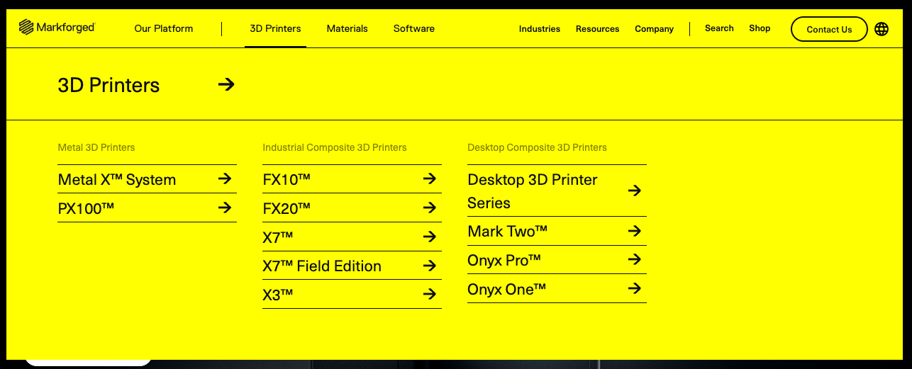 The site uses “mega” navigation menus. Mousing over certain navigation links reveals a complete list of related subpages. Excellent navigation provides a clear and logical structure, a simple and accessible menu, and a helpful and visible search function. Markforged’s website navigation achieves that.
The site’s design also creates a compelling user experience. The black field of the hero or “top fold” of the page conveys a message of strength. The starkness of the black background transitions into gray and finally into somewhat traditional content and image components on a white background. This reduces any visual shock from abrupt contrast shifts.
The mobile-responsive site also features a minimal, clean design with large type, making selection easy. Friendly messaging balances the tech theme of the site to make the company more welcoming, often an oversight of less self-aware companies.
CMS: Craft
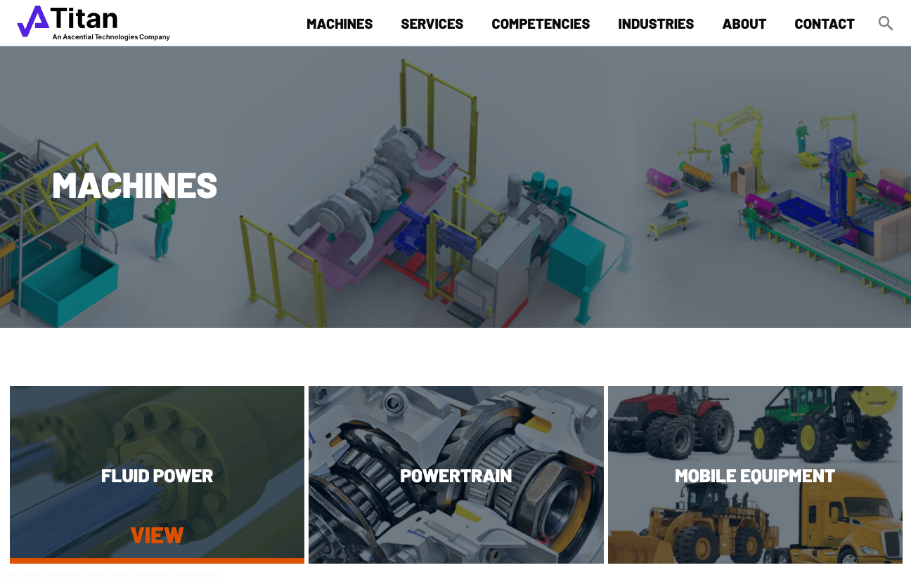
Titan’s homepage design demonstrates the effective use of color
Titan Systems seems to understand that its audience knows a thing or two about its business sector, so it can use a Lego-like image in the hero to reflect a certain simplicity in the company’s complicated solutions. The illustration matches the brand colors.
A clearly defined structure and hierarchy guide users through the company’s offerings and value proposition. The homepage has a clear headline and subhead that state the company’s mission and vision.
A clean, straightforward navigation system supports intuitive browsing. Colors correspond to second and third-level pages to create a consistent user journey. For example, the powertrain visual navigation tile incorporates a green line repeated on navigation on the subsequent landing pages.
For visual appeal, the website uses lots of high-quality images to showcase the company’s projects and capabilities and create visual interest and appeal.
CMS: WordPress
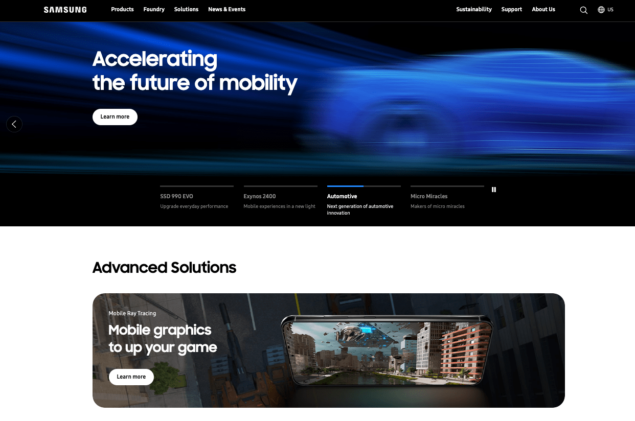
You would expect a worldwide technology company to have a well-designed and engineered website.
And Samsung’s website for its semiconductor division delivers.
“Meticulous” is a word that can be used to describe their site’s design.
The website has a logical, user-friendly structure and hierarchy that organizes information in a way that is easy to understand and navigate.
The website uses a top menu that categorizes the pages into four main sections: Products, Solutions, Support, and About Us. The website also uses a breadcrumb navigation that shows the users their current location and path within the website.
The website creates a great user experience, from the hero to the footer. The first section covers many topics users want and need. The video does not get in the way of the message, first because there are few words, and second, the video is appropriately paced.
Browsing further into the page, the sections anticipate what users may want next. While there are often several options for clicks, there is no paradox of choice.
CMS: Adobe Experience Manager
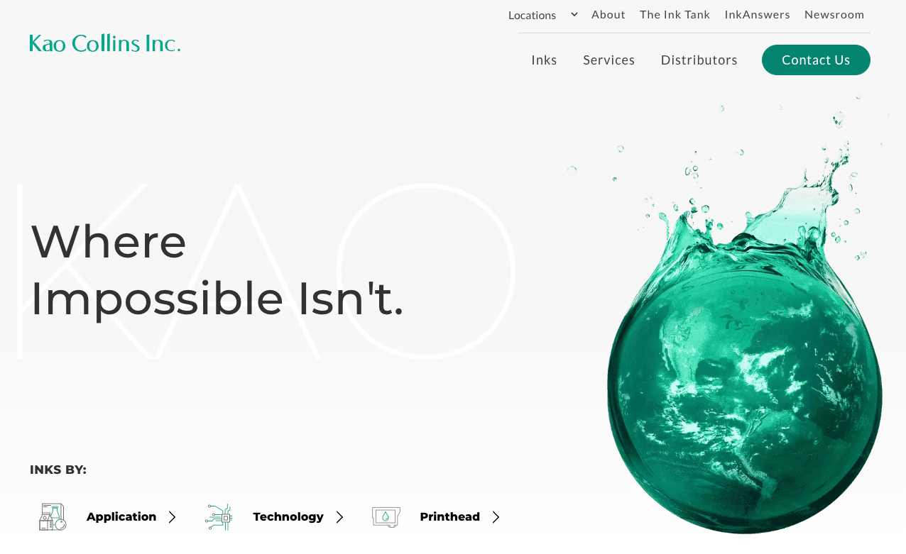
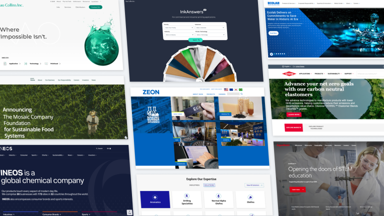
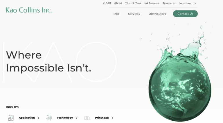
The Kao Collins website supports its brand story with messaging and design. The industrial inkjet ink manufacturer wholeheartedly supports sustainability. The white space and lighter colors convey a “clean” look that aligns with how many of us feel when we think of sustainability.
The website’s clear and concise messaging communicates the company’s vision, mission, and value proposition to the users. “Where Impossible Isn’t” is a powerful message that Kao Collins will find a way to make something real, even if it seems unrealistic or out of reach.
The website also uses catchy headlines, subheadings, and slogans that highlight the company’s strengths and differentiators, such as “Inkjet Partners with Great Chemistry,” “Ink Responsibly,” and “Your Label. Our Ink. Your Secret.”
The website prioritizes performance with customers worldwide, so it works in countries with less reliable network connectivity. Since it’s built as a progressive web app (PWA), the site’s speed and smooth interactivity enhance the user experience.
CMS: WordPress
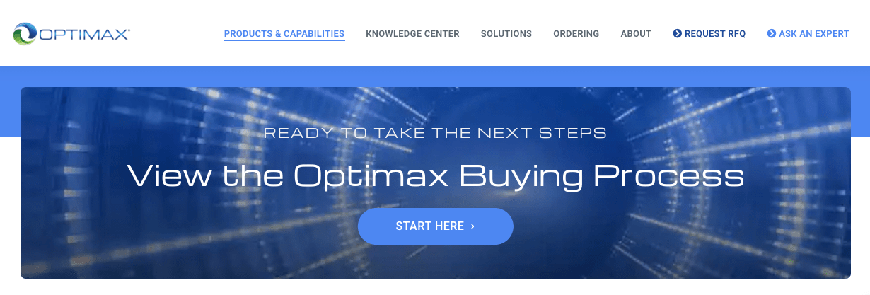
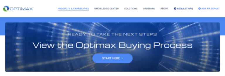
Everything on the Optimax Systems home page focuses on the buyer’s journey.
The primary navigation presents the steps in the journey from left to right, the most logical order visitors will likely follow. On the page, large callouts set users on the path to purchase.
If that’s not focused enough, a section near the bottom links users to a page to learn about Optimax Systems’ buying process.
Subtly, the singular focus supports what people expect from optical products: Clarity.
The product page showcases the company’s portfolio of optical products, such as aspheres, coatings, cylinders, domes, and more. The product page also provides detailed specifications, features, benefits, and applications of each product, and a tool that allows users to compare different products and find the best one for their needs.
Visitors interested in becoming a customer can find social proof and other information on the solutions page, which features case studies, whitepapers, and videos.
The Optimax website demonstrates that simple design can support complicated products.
CMS: WordPress
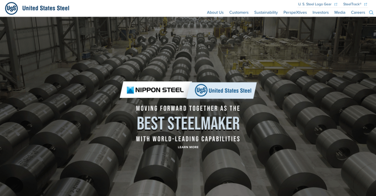
For a brand that has been around since 1901, the United States Steel website doesn’t have to do much to explain the products.
Naturally, this company wants to sell steel. Today, the company is focused on its factories’ new future under the ownership of a new company, Nippon Steel.
Accordingly, this website focuses on the two companies’ shared vision with phrases like “Moving Forward Together.”
Words and images on the home page support the key messages that focus on sustainability and customers in a clean design.
The website uses a consistent and appealing color scheme of blue, gray, and white, which matches the company’s logo and branding. The blues and gray tones reflect the steel color, while the greens remind users of the company’s commitment to sustainability.
Keep an eye on the website to see how it may adapt to the interests of the new owners. The site begins taking users down a rabbit hole through a link in the hero that opens a new website: bestdealforamericansteel.com. Links at the top of this page take users to the Nippon Steel and United States Steel sites, respectively.

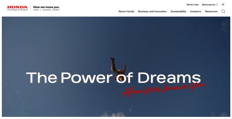
The Honda global website doesn’t offer car buyers the immediate option to kick some tires and explore luxury add-ons. You can eventually get to that.
The website has clear messaging highlighting the company’s competitive advantages and value propositions. The global site plays the aspirational card with messages “The Power of Dreams” and “How we Move You.”
The website uses headings, subheadings, icons, and images to organize the content and make it easy to read and scan. The website also uses animations, videos, and interactive features to showcase the company’s products, technologies, and stories.
The Honda global website looks beyond how consumers think of mobility: cars and motorcycles. Through the lens of this website, mobility may be more about attracting movers and shakers like business partners, reporters, and investors.
CMS: Adobe Experience Manager

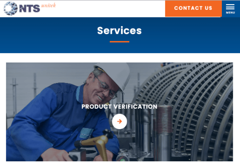
The NTS Unitek website focuses on creating a mobile-first experience. The site does not sacrifice the desktop browser experience. They chose a straightforward, no-frills approach to make mobile browsing easy.
The site uses large buttons, simple icons, and subtle animation for touch or mouse over events. Also, the limited menu items reduce decision-making for all users.
For potential customers, there is one choice: Services.
In addition to the mobile-first approach, the site puts users in control. An interactive homepage section lets users navigate brief descriptions of services at their own pace rather than display the items in an automated carousel.
CMS: WordPress

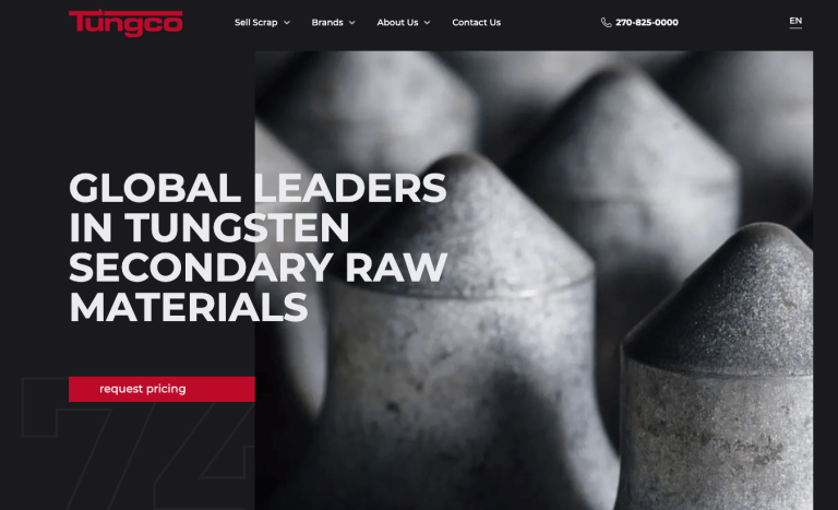
Users expect to see lots of color on a website – sometimes a dizzying amount. The idea behind this theory is that colors will make the design more vibrant and engaging.
The Tungco website flips that idea on its head, instead greeting visitors with black-and-white images on a black background, adding a touch of color to the calls to action.
This effectively focuses the eye on the headline, CTA, and simple navigation. High-quality black-and-white images make the tungsten scrap recycled by Tungco’s factories look like art.
Eventually, the site will introduce users to color images of people in a section titled “Why Work With Us.” The color purposefully brings this section to life.
Elsewhere, the designers created a simple interactive timeline to showcase their company history.
The sophisticated execution of website design on Tungco’s site conveys professionalism and a singular focus on its business offerings.
Many websites use video to create action and motion, thinking it improves engagement. More often, background video gets in the way of reading copy–a distraction at best that can leave viewers feeling motion sickness.
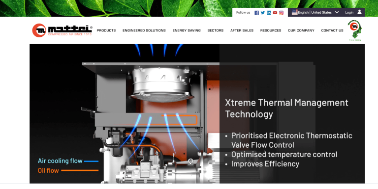
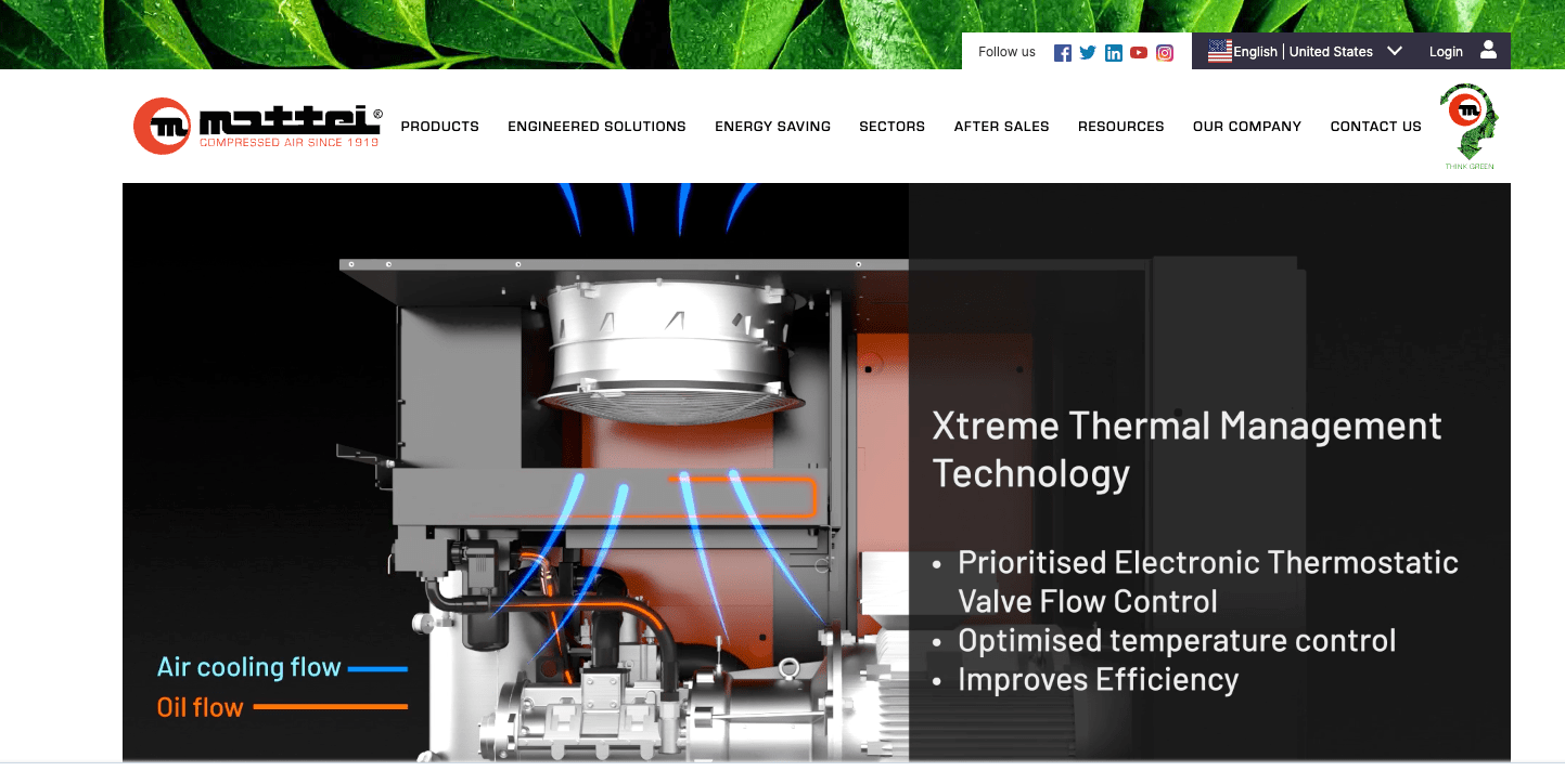
The Mattei website is different. It uses video to do work function over fashion. But in Mattei’s case, it is function and fashion because the use of video is well executed.
The hero features one of the company’s products, animating in stages to bring website visitors inside the equipment, showing how it works.
The video acts as a “motion infographic” that captures and holds the viewer’s attention as technical details appear throughout the animation.
The remainder of the home page presents information in simple, uncluttered designs.
Overall, Mattei’s website offers a complete buyer journey, from introducing products, benefits, resources, and service navigation items.
The site also features a portal for registered users, something useful for many factory websites where visiting customers are trying to order materials, check the status of their orders, or manage their accounts.
CMS: HubSpot
Hire Factory Website Design Experts
Discover how we can create similar award-worthy factory websites that win you more organic search traffic that turns into new business and brand awareness that drives growth.
Related Posts