When planning a new B2B website, businesses can't afford to play by the B2C rules – exactly.
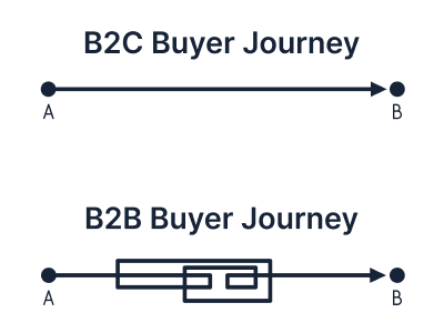
While the goals of making a sale are universal, the stakes are higher for B2B websites. The sales cycle and decision-makers are all different. B2B buyers demand depth, clarity, and proof, not just sizzle and speedy checkouts.
Still, too many B2B companies fall victim to the B2C allure, orienting the website's look and feel towards consumers and missing their mark with audiences that want more substance.
But here's the twist: while B2B and B2C sites operate on fundamentally different wavelengths, B2Bs can learn from the best of B2Cs, including intuitive navigation, mobile-first design, and the kind of user experience that keeps visitors engaged. The smartest B2B sites blend these strengths with strategies tailored for complex buying journeys and group decision-making.
This article explains the 8 key differences between B2B and B2C website design.
You'll see why prioritizing B2B-specific strategies can lead to better results and why those flashy B2C tricks aren't always a silver bullet for a business audience.
Comparing B2C vs. B2B Website Design
1
 Single Customers vs. Audience Groups
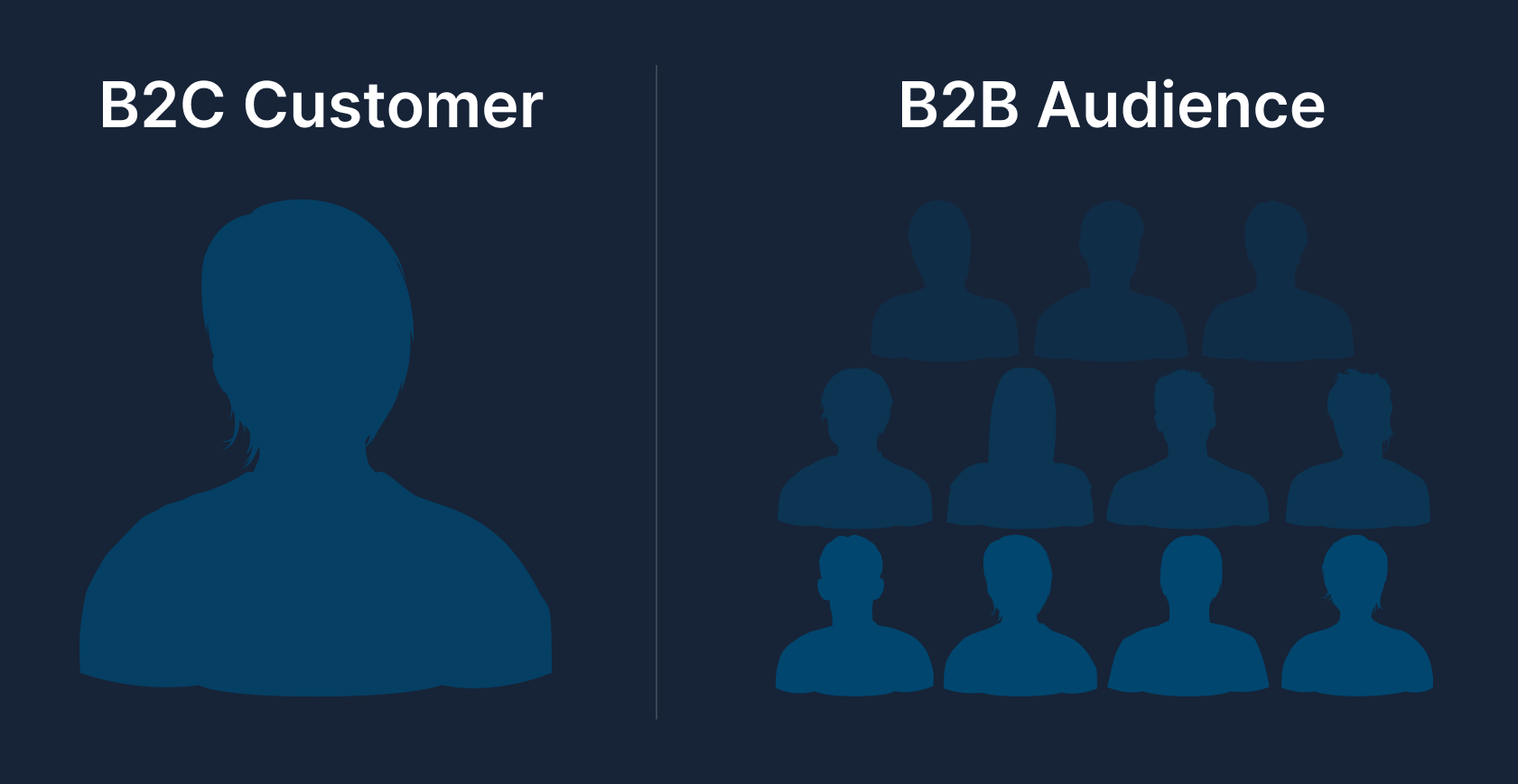
B2B Audience Groups and Buying Teams vs. B2C Single Customers and Decision-Makers
B2B websites must address multiple audience segments and support complex buying teams, whereas B2C sites typically focus on a single consumer who is both the user and decision-maker.
In B2B scenarios, purchasing decisions are rarely made by one person.
Instead, an average of 11 stakeholders from different roles, such as technical users, managers, finance officers, and executives, contribute to the decision. Each stakeholder has unique interests and questions, from technical specifications and integration details to ROI and budget approvals.
B2B Best Practices
- Define and segment buyer personas, such as end-users, technical evaluators, and executives. Create targeted content addressing their specific needs, such as engineering specs, production lead times, or financial benefits.
- Structure site navigation and content architecture to find relevant information by industry, role, or application.
- Provide tools for internal advocacy. Offer downloadable brochures, slide decks, and datasheets to help champions within the buying team persuade other stakeholders.
- Personalize the user experience where possible, using account logins or cookies to display content relevant to a visitor's industry or past behavior.
- Include leadership bios and team profiles to build trust and credibility among decision-makers who want to know who they'll work with.
- Anticipate varied questions by addressing technical, financial, and operational concerns through FAQs, case studies, and product pages.
- Use segmented testimonials and case studies that resonate with different stakeholders, such as CTOs or CFOs, highlighting relevant benefits like technical performance or cost savings.
B2C Best Practices
- Focus on a primary user, the individual consumer, and craft messaging that speaks directly to their desires or pain points.
- Streamline the user experience with simple navigation, a prominent search bar, and filters that help consumers find products quickly and easily.
- Leverage personalization and recommendation engines to suggest products based on browsing or purchase history, making the individual feel like a VIP.
- Use broad-appeal content such as reviews and ratings to build confidence for any shopper.
- FAQs should be relevant and straightforward about individual concerns like shipping, returns, and warranties, removing friction from the buying process.
- Streamline messaging to focus on a single, clear value proposition that resonates emotionally or practically with the consumer.
Example | Zeon Chemicals
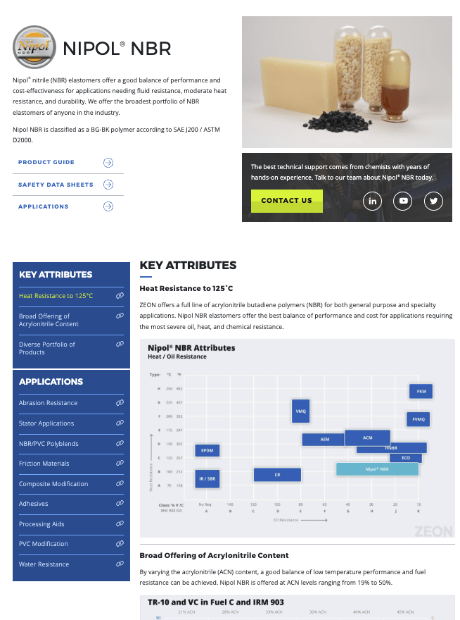
The website for Zeon Chemicals, a manufacturer and supplier of synthetic rubber products, demonstrates how to address multiple stakeholders on one site.
The product pages balance technical specs and details to keep engineers and machine operators informed with clear statements of business value that persuade operations managers and executives.
For instance, the company's Nipol® NBR page features text highlighting the value proposition and links to product guides and applications. Further on the page, technical information offers details and relevant information for many product applications.
In a pure B2C scenario, such dual-layered content isn't necessary.
In a pure B2C scenario, such dual-layered content isn’t necessary. A product page for a consumer gadget can focus solely on convincing that one user of its features and lifestyle benefits, without needing to provide materials for internal discussion or sign-off.
2
B2B Education vs. B2C Impulse Buying
B2B purchases are rarely impulsive. They're research-driven and carefully considered.
The average B2B buyer reviews 13 pieces of content before deciding, often over months or even longer.
B2C consumers often make quicker, emotion-driven decisions. At some point, 84% of all shoppers have made impulse purchases.
This means B2B websites must prioritize education and information, whereas B2C sites excel by triggering emotion or urgency.
B2B Best Practices
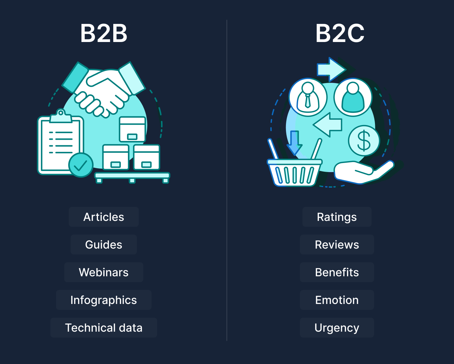
- Invest in rich and varied educational content, including blog articles, in-depth guides, videos, infographics, case studies, webinars, and FAQs that help business buyers learn. B2B buyers actively seek insight and want to self-educate, so give them a knowledge base that positions your company as an expert.
- Produce and organize content for the three stages of the buyer journey. Offer high-level thought leadership for early-stage visitors, e.g., industry reports, how-to guides, and technical specifications or ROI calculators for those closer to a decision. Thanks to valuable content, many B2B buyers are 70% of the way to a decision before contacting sales.
- Publish data and proof points liberally. Incorporate statistics, research findings, and transparent case results to build credibility. Business buyers respond to logic and evidence, showing complex numbers can tip the scales.
- Consider gating premium content like e-books or whitepapers behind a lead form to capture interested prospects. This way, education content also feeds your sales pipeline, though be sure the content is valuable enough to warrant an exchange of contact info.
B2C Best Practices
- Emphasize visuals and emotional triggers that support impulse tendencies. Use high-quality photos, videos, and persuasive copy that connects with desires, e.g., lifestyle imagery that makes consumers feel what it's like to own the product.
- Create a sense of urgency or FOMO for consumer purchases. Limited-time offers, flash sales, countdown timers, and phrases like "Only 2 left in stock!" can spur quick action.
- Keep product descriptions concise and benefit-focused. Most consumers won't read a 10-page whitepaper – they want to know "how this product will make my life better, right now." Bullet points highlighting key benefits or specs work well.
- Leverage social proof: prominently display reviews, star ratings, or "#1 Best Seller" badges. Seeing that others have purchased and liked the product can trigger an impulse buy by sparking the sense of "if it worked for them, it'll work for me!"
B2B Example | Kao Collins
This industrial ink manufacturer illustrates the power of education in B2B design. Their site features "The Ink Tank," a resource hub of articles and technical insights about ink technology and printing solutions.
By providing expert content, like guides for choosing the correct ink for different applications, Kao Collins informs its B2B audience of OEMs, print engineers, etc., and builds trust long before a sales conversation. This content-driven approach nurtures a thoughtful purchase process.
A B2C equivalent site, for example,y for consumer printer ink cartridges, would likely not need such extensive education. Instead, it might focus on bright graphics, simple comparisons, and a quick "Add to Cart" that appeals to a shopper who just wants a good deal on ink and fast checkout, without delving into whitepapers on ink chemistry.

3
B2B Custom Pricing vs. B2C Fixed Cost
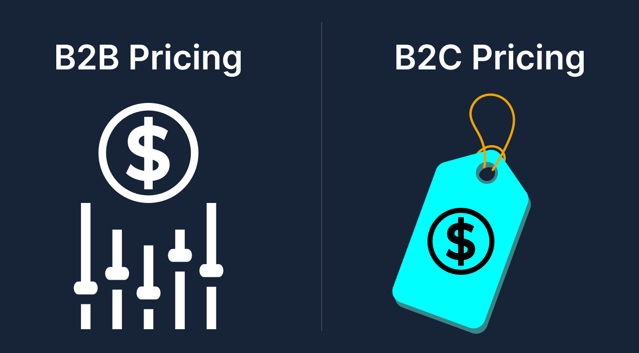 How prices are displayed is a significant difference between B2B and B2C websites. B2C sites almost always list fixed prices for products. Consumers expect to see a price tag and would be turned off if they couldn't find one.
B2B pricing, however, is often more complex. Deals might involve volume discounts, custom quotes, or negotiated rates. It's common for B2B sites to say "Contact us for pricing" or require an account login to reveal prices.
But here's the rub: today's B2B buyers increasingly want transparency. In one recent survey, 69% of B2B buyers said they're frustrated by vendors' lack of transparent pricing, and 64% expect any custom-negotiated pricing to be available online via their account. So while B2B pricing may not be one-size-fits-all, your website strategy must balance flexibility with the modern demand for clarity.
B2B Best Practices
- Show pricing when you can. If your product or service can be sold in standard packages or tiers, consider publishing those prices or at least starting prices. Even in complex industries, showing "Starting at $X" or a price range for typical scenarios can build trust. Remember, B2B buyers are just as price-conscious as B2C, and they use your website to budget.
- Offer a configurator or price calculator if applicable. For example, let users select options or quantities and get an estimated quote. This interactive approach provides a ballpark figure and engages the user without committing you to a fixed price in all cases.
- If exact pricing truly must be custom, be transparent about the process. Use phrasing like "Pricing varies by solution – request a quote for a tailored cost estimate," and ensure the request quote process is easy and prompt. Also, consider publishing sample pricing scenarios to at least set expectations.
- For B2B e-commerce with repeat customers, like distributors or wholesalers, integrate a secure login where those customers can see their negotiated account-specific rates. This will help meet the expectation of seeing custom pricing online and help streamline ordering for returning clients.
B2C Best Practices
- Always display prices clearly. The cost and any current discounts should be among the first things visible on a product page. B2C shoppers typically won't call for a quote if they can't see the price; they'll likely bounce to a competitor.
- Be upfront about additional costs. Show shipping costs, taxes, or any fees early in the checkout process to avoid surprises that cause cart abandonment. Transparency is key to maintaining consumer trust during a purchase.
- Highlight sale prices as an enticement, using visual cues like a strikethrough on old price vs. new price in red, and possibly anchor pricing by showing a higher MSRP crossed out next to your lower price to signal a deal. These tactics play into consumer psychology for quick conversions.
- If offering multiple versions like product models or service plans, present a simple pricing table or comparison so consumers can easily pick which option fits their budget. The emphasis should be on making the decision easy. B2C buyers will not spend hours analyzing pricing options, so spoon-feed the Good-Better-Best feature and price differences.
Example | Blue Diamond Attachments
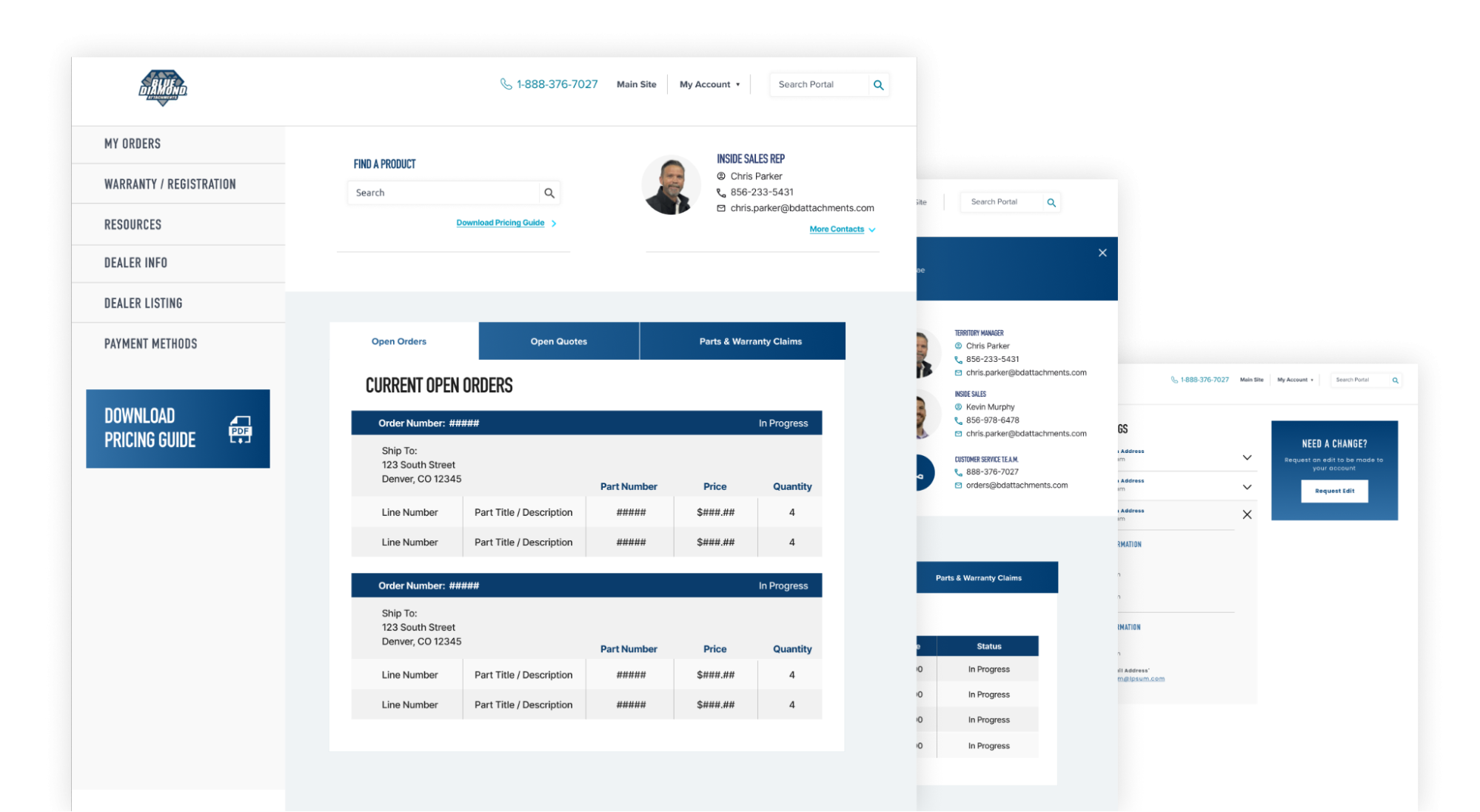
Blue Diamond Attachments, a manufacturer of heavy equipment attachments, faced the classic B2B pricing challenge. They sell to a network of dealers and end-users with varying order sizes and negotiated discounts. For their website overhaul, DBS Interactive integrated a custom e-commerce and dealer portal solution in their website overhaul.
This means that a regular visitor can browse products and see information. Still, to see pricing and purchase, authorized dealers log into a portal where their specific pricing is displayed to see pricing and purchase. This approach respects the B2B custom pricing model.
Each dealer sees their agreed-upon wholesale prices while still offering an online purchasing workflow. Blue Diamond provides clear calls to action like "Find a Dealer" or "Request a Quote" for end-users on the consumer-facing site.
In a pure B2C context, say an online retail store for phone cases, the site would simply list a fixed price and an "Add to Cart" button for everyone – no login needed, no price variations.
We Can Build It
4
B2B Relationship Building vs. B2C Immediate Selling
B2C Websites
Another difference between B2B websites and B2C websites is the presence of fixed pricing. In the B2C environment, pricing is generally very straightforward.
Customers looking to purchase a new computer visit a website and are presented with various computers, all with a clearly stated, fixed price.
B2B Websites
However, for many B2B organizations, prices are customized and often negotiable for many B2B organizations. A corporate buyer may be looking to purchase 2,000 new business computers, which may include technical support, and perhaps even system integration.
How do these differences affect web design? Websites advertising custom pricing should think about:
- Content that helps address your value (Are you "low-cost"? "High-quality"? "Expensive but worth it"? etc.)
- A promise of quick turnaround – let potential customers know you'll get back to them quickly to answer any questions they may have
- Using short lead generation forms – don't ask questions that your sales team already plans to ask in the follow-up process.
- When possible, offer price calculators – if your "custom pricing" is really just a formula dependent on a few inputs like location and quantity, you can give a quote using an interactive calculator, which also helps qualify your leads.
B2B commerce is often about forging long-term relationships rather than quick one-time sales.
A corporate client might be worth far more over years of renewals or repeat orders, so the tone of a B2B site is geared toward building trust, credibility, and partnership.
In fact, 55% of business decision-makers say they vet potential vendors by examining their thought leadership content and industry presence, indicating that they choose partners who demonstrate expertise and reliability.
B2C, on the other hand, is usually a more transactional play. The website's job is to grab attention and convert as efficiently as possible. If a B2C customer doesn't buy on the first visit, they might never return, so immediacy is key. While B2C brands certainly care about brand loyalty, the initial website interaction is focused on prompting that immediate sale or sign-up rather than laying out a years-long partnership.
B2B Best Practices
- Establish authority and trustworthiness through your site's content. Publish thought leadership, blog posts, whitepapers, and research that helps solve industry problems, which in turn positions your company as a knowledgeable partner. Understanding the visitor's business challenges goes a long way in relationship-building.
- Use a consultative tone with calls to action like "Speak to an Expert" or "Schedule a Consultation." This invites a conversation rather than a hard sell, and B2B buyers often prefer vendors who act as advisors.
- Highlight long-term customer success stories and testimonials. Include logos of notable clients and case studies describing multi-year engagements or measurable results over time. This signals that you focus on delivering ongoing value, not just making a quick buck.
- Provide avenues for engagement beyond the initial sale. Offer newsletters with valuable insights, invite visitors to webinars or events, and make it easy to follow your company on LinkedIn or other professional networks. These keep the relationship going and nurture leads who aren't ready to buy yet. The goal is to stay on their radar until they are ready.
B2C Best Practices
- Design for conversion-first. Prominent "Buy Now" or "Sign Up" CTAs, simplified product pages, and easy checkout all facilitate an immediate purchases. The faster a consumer can go from browsing to buying, the better.
- Create emotional appeal to forge a quick personal connection. Use quick, engaging storytelling, imagery, or even humor to make the brand likable. Consumers often buy from brands they feel an affinity with, even if that feeling is formed within minutes.
- Incorporate limited-time deals or incentives for first-time buyers, "10% off your first order if you purchase today!" This can prompt immediate action by leveraging the fear of missing out on a deal.
- While you should still have customer reviews and highlight brand values, these elements in B2C serve to build enough trust to close the sale right now. For example, a clothing website might show a few customer photos and a blurb about quality, but it's all aimed at reassuring the shopper so they hit the checkout. However, excellent service can turn them into repeat customers.
Example | itel Inc.
The redesigned itel website exemplifies relationship-focused design. Rather than immediately pushing a "Buy Now," which wouldn't make sense for an enterprise service, the site emphasizes Itel's role as a partner in the insurance claims ecosystem. There's extensive content on how itel's solutions remove friction in claims processing, an entire section for thought leadership to elevate itel as an industry authority, and calls-to-action like "Request a Consultation" instead of "Purchase."
The messaging speaks to building trust.
Itel wants visitors to see them as the go-to expert in property claim data. This nurturing, credibility-first approach encourages prospects to engage with a rep, start a conversation, and eventually form a business relationship.
If we compare this to a typical B2C site, say an electronics retailer, that site would be much more direct, featuring product promotions, "Shop Now" buttons, and maybe a sales countdown. The B2C site essentially says "Buy this now," whereas the B2B itel site says "We understand your business, let's work together."
5
B2B Navigation Support vs. B2C Self-Directed Search
B2B websites often contain deep and complex content, multiple product lines, solutions for different industries, technical documentation, resource libraries, etc.
As a result, they need robust navigation and guidance to help users find what they need.
In usability studies, easy finding products and information consistently ranks as a top priority for B2B buyers, even higher than flashy design or videos.
While B2C sites can also be large, they are typically optimized for self-service. Consumers use search bars, category filters, and instinctive browsing to navigate independently, with fewer layers of content to dig through beyond product categories.
In short, B2B web design should proactively steer diverse users through the site's content, whereas B2C design can often rely on intuitive, shopper-led exploration, provided the basics like search and menus are straightforward.
B2B Best Practices
- Use mega menus or detailed drop-downs to present the breadth of offerings in an organized way. B2B menus might include multiple layers, "Products by Category," "Solutions by Industry," "Resources," etc. Make these labels clear and the menu easy to scan.
- Implement breadcrumb navigation on multi-level pages so users always know where they are and can backtrack if needed. This prevents feeling "lost" in a large site.
- Provide guided search tools if applicable. For example, a B2B equipment site might have a search tool: "Not sure what you need? Use our Product Finder," which asks a few questions and suggests the right product. This kind of guidance can replicate having a salesperson guide the user on the site.
- Ensure your on-site search function is robust. B2B products/services may have technical names or codes. Your search bar should handle abbreviations, alternate terms, and common misspellings. Consider faceted search results that allow filtering by criteria relevant to B2B, like filtering case studies by industry or products by capability.
B2C Best Practices
- Keep navigation broad and straightforward. Often, just a set of top categories, such as "Men, Women, Kids" for apparel or "Electronics, Home, Toys" for a department store, is enough since the consumer will click through progressively. Too many layers deep can frustrate B2C users, who prefer shallow navigation where possible.
- Make the search bar prominent. Many B2C sites put a big search box front and center, especially if the inventory is extensive. Consumers are very accustomed to using search on retail sites. Ensure your feature autocompletes popular queries and returns beneficial results with product thumbnails.
- Utilize filtering and sorting options on category pages so users can narrow results themselves by price, popularity, ratings, etc. This gives shoppers control over finding what matches their personal criteria.
- Include clear universal elements like a shopping cart icon, account/login link, and perhaps a wishlist. These standard navigation aids help users orient themselves. B2C users generally don't need many explanatory navigation labels. Standard icons and words like "Shop, Sale, Contact, FAQ" suffice, and anything more intricate could just be noise.
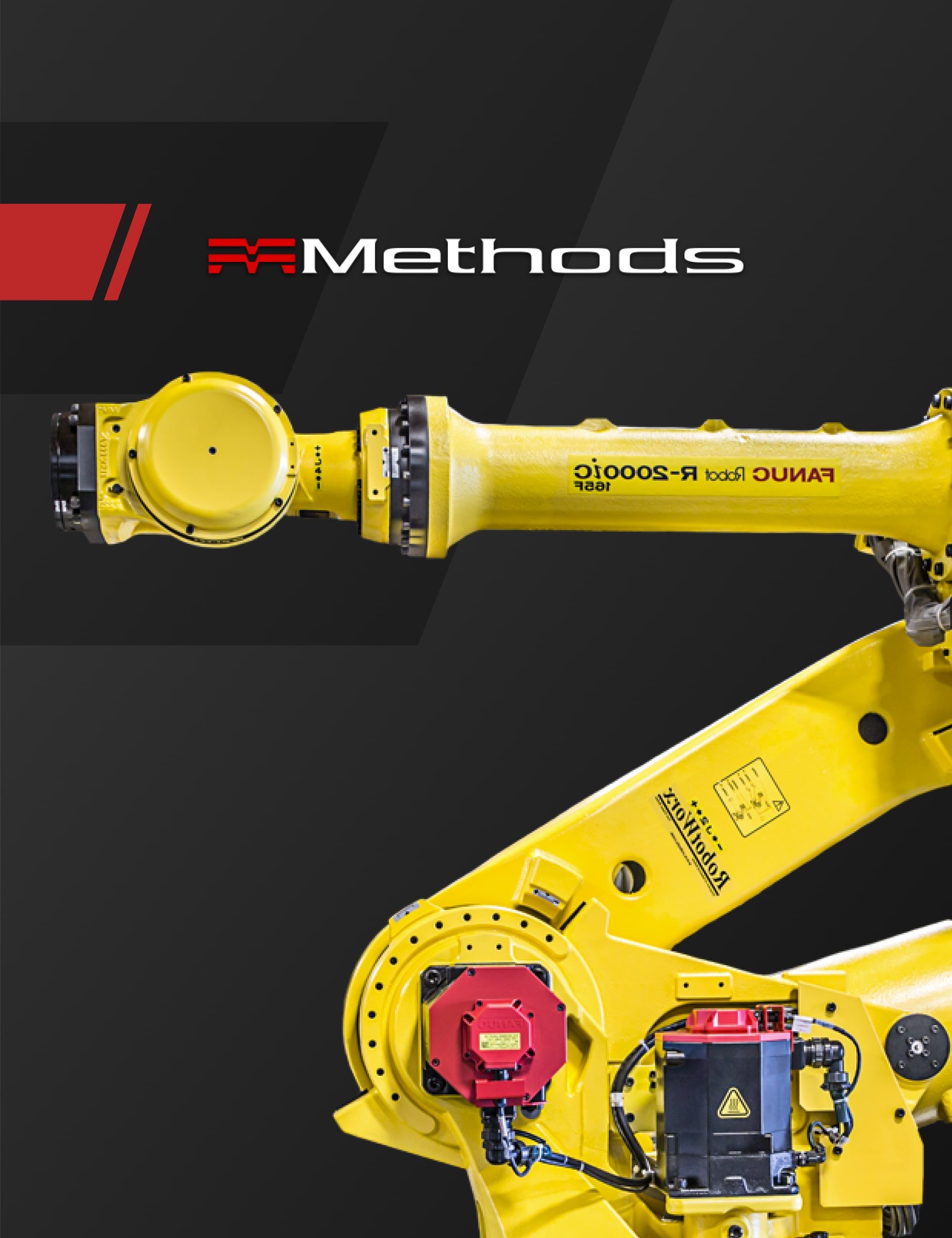
Example | Methods Machine Tools
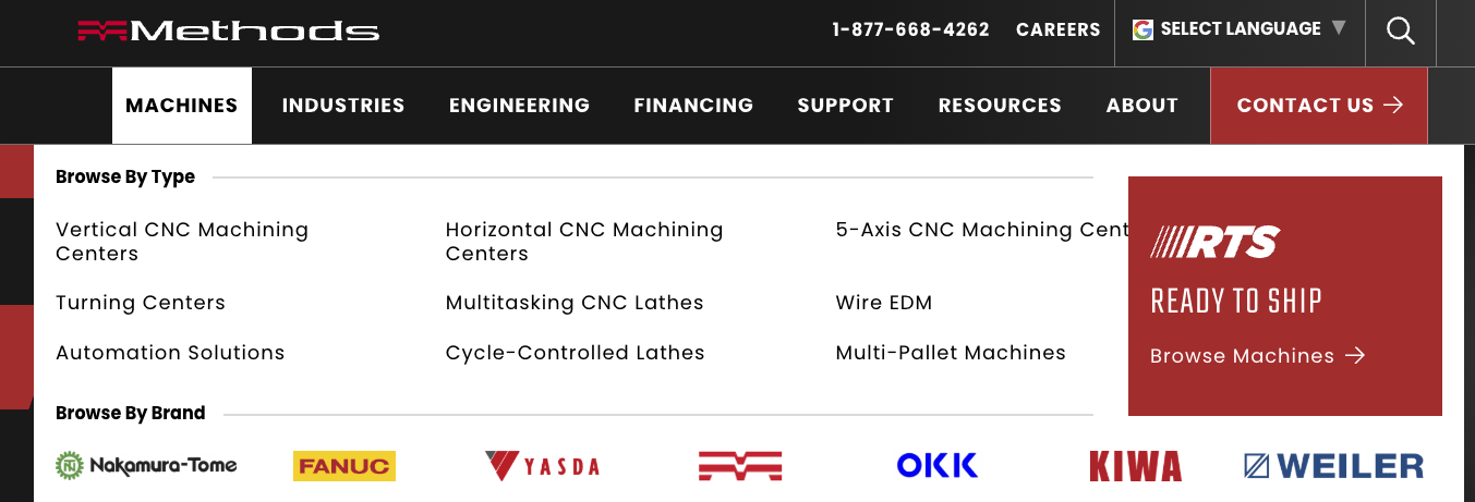
The navigation on the Methods Machine Tools site is a great case of B2B navigation support in action. Upon landing on the homepage, a visitor is greeted with menu options that segment the site by what they might be looking for: "Machines," "Industries," "Engineering," "Support," and so on.
This aligns with the various intentions a B2B user could have and guides them accordingly. Methods mapped out user personas and optimized menus and page layouts so that visitors can reach their goal in one or two clicks, a deliberate design choice to prevent frustration on a content-heavy site. Additionally, the Methods site includes customer success stories that an evaluator can forward to their team as proof of ROI.
On a typical B2C e-commerce site, you might see something much simpler, like "Shop All > Category > Subcategory," and many users will go straight to the search bar to find a specific product. B2C navigation assumes the user generally knows what they're after: "I'm looking for running shoes, let me go to that section," whereas B2B navigation often needs to cater to exploratory visits: "I'm seeing what this company offers for my type of business."
6
B2B Multi-Step CTAs vs. B2C One-Click Actions
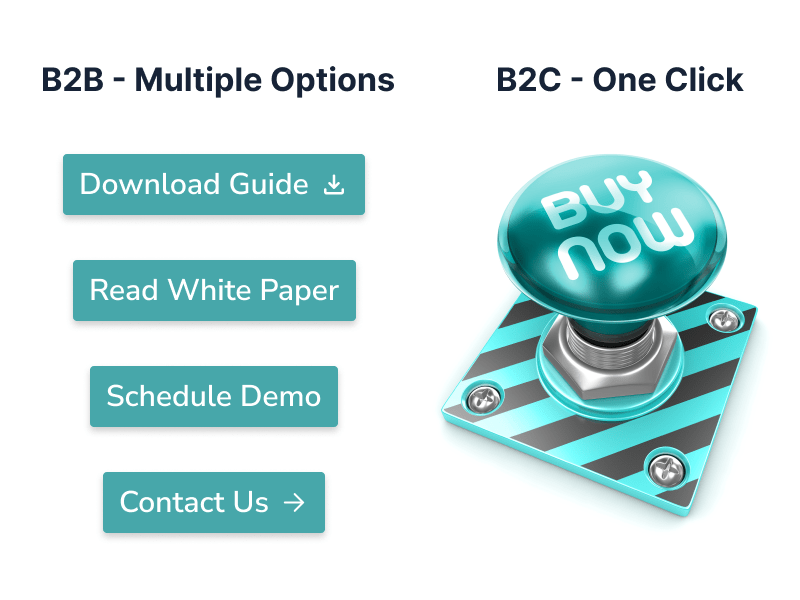
The desired actions on a B2B website typically involve multiple steps before a deal is closed. A visitor might fill out a contact form, schedule a demo, and then go through a proposal process, all of which are reflected in the site's call-to-action (CTA) strategy. In fact, the B2B buyer's journey is so multi-touch that 42% of B2B companies report their customers use more than 11 different touchpoints (website visits, calls, emails, webinars, etc.) before making a purchase. In contrast, B2C sites often aim for the one-click or one-session conversion: add to cart, enter info, place order, done. The CTAs on B2C sites are therefore direct, using "Buy Now" or "Subscribe Now", whereas B2B CTAs might be softer or sequential, such as "Download Report," then nurture, and then "Contact Sales." Designing for these conversion paths requires a different mindset.
B2B Best Practices
- Define your primary CTA based on your sales process. Common B2B CTAs are "Request a Quote," "Schedule a Demo," "Contact Us," or "Get a Free Consultation." This is rarely a purchase on the spot, but rather the start of a conversation. Make this primary CTA highly visible on every key page, often in the header navigation as a button and at logical points in content.
- Offer secondary CTAs that match the visitor's readiness. Not everyone is ready to contact sales immediately. Provide options like "Download our Product Brochure" or "Watch a Case Study Video," actions that are easier commitments and allow you to capture leads or track engagement. These CTAs can act as stepping stones in a longer funnel.
- Use lead forms wisely. Keep forms as short as possible, requesting only the info you need at that stage, and consider progressive profiling over multiple interactions. For example, first ask for a name and email to download a white paper, later, if they want a demo, ask for the company and title. Multi-step doesn't mean you should burden the user simultaneously – break it up.
- Thank you pages and follow-ups are part of the journey. After a user submits a form, don't drop the ball – direct them to further content ("Thanks for signing up! Check your email for the e-book. And meanwhile, see how our solution works for companies like yours.”) This keeps them engaged. The B2B site should treat every click not as an end, but as the beginning of the next step.
B2C Best Practices
- Streamline everything toward the purchase funnel. When a consumer clicks "Add to Cart" or "Sign Up," the remaining steps should be as few and easy as possible. To reduce friction, enable features like guest checkout, social logins, or saved payment methods for one-click purchasing.
- Use clear, bold CTAs like "Buy Now," "Add to Cart," or "Checkout" at point-of-decision moments. These should stand out visually, and there should be little doubt about what the user should do next.
- If the product or service allows it, consider a one-click purchase option (like Amazon's 1-Click ordering) or quick-pay integrations (Apple Pay, PayPal, etc.) to let repeat customers convert literally with a single action. The idea is to shorten the path, not elongate it.
- Limit the number of steps or screens in checkout. Each additional page or form field can drop conversion rates. Many top B2C sites put the entire checkout on one page or use a wizard that shows progress (e.g., Step 1: Shipping, Step 2: Payment, Step 3: Review). The user should always know how close they are to completion and feel it's easy to finish right now.
Example | Blue Diamond Attachments
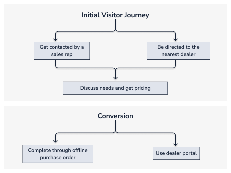
The calls-to-action on the Blue Diamond Attachments site, the calls-to-action reflect the multi-step nature of their B2B sales. A prospective customer doesn't simply click "Buy Attachment" and enter credit card info for large industrial products sold through dealers.
Instead, CTAs include "Find a Dealer," "Request a Quote," and a secure Dealer Portal login for their partners. For a first-time site visitor, the journey might be: fill out a quote request form → get contacted by a sales rep or directed to an appropriate dealer → discuss needs and get pricing → then purchase through an offline invoice or via the dealer portal.
The website's role is to initiate and facilitate contacts (and track them as conversions), rather than completing a sale in one session.
In a B2C context, say buying a laptop from an online store, the expectation is inverted: you can complete the entire transaction on the spot with "Add to Cart" and checkout in a few clicks.
Thus, Blue Diamond's site is a prime example of how B2B CTAs are about starting a process and supporting a relationship, whereas B2C CTAs aim to finish a transaction immediately in as few clicks as possible.
7
B2B Data Visualization vs. B2C Imagery-First Design
Both types of websites leverage visuals heavily, but the kind of visuals and their role can differ. B2C sites are often imagery-first, using large photos, videos, and graphics to create an emotional connection or lifestyle appeal. Think of a fashion website with full-screen images of models selling an aspiration. B2B sites, while not devoid of aesthetic appeal, often lean into data visualization, diagrams, and informational graphics to communicate value. Sites may also include animations or images that support the brand's value proposition.
B2B buyers seek insight and evidence, so visualizations like charts, infographics, process diagrams, or interactive data tools can be more persuasive than glossy photos. This doesn't mean B2B sites can't be beautiful. They just tend to use visuals to clarify complex information. Interestingly, research shows visual content profoundly boosts engagement across the board: for instance, content with visuals gets 94% more views than text-only content. The difference is what those visuals are – a pie chart vs. a lifestyle pic – and why they're used.
B2B Best Practices
- Translate key data or advantages into a visual format. Instead of a paragraph about your solution's impact, consider an infographic like a chart showing "Implementation of our software cut costs by 30% over 6 months" or a timeline graphic that illustrates your process. These make data points more digestible and memorable; people retain information better when it's paired with imagery.
- Use diagrams or schematics for complex products/services. If your B2B offering is technical, a simplified diagram can help non-technical stakeholders grasp how it works. For example, a network security company might show an architecture diagram highlighting where their product sits and what it protects, giving a quick visual summary of a complex concept.
- If possible, incorporate interactive visuals, such as data explorers, ROI calculators that output charts, or dynamic infographics. These engage users by spending time interacting and also let them see personalized data. Interactive data visualizations can set B2B sites apart and efficiently convey information.
- Maintain a professional visual style that aligns with B2B brand expectations. This usually means a clean design, consistent use of company branding/colors, and visuals supporting the content rather than just decorating. Every chart or image should have a purpose (to clarify, provide evidence, or guide the eye), keeping the focus on information.
B2C Best Practices
- Invest in high-impact imagery that resonates emotionally. Whether it's stunning product photos, aspirational lifestyle shots, or playful graphics, B2C visuals should instantly grab attention and make the user feel something about the product.
- Use visuals to tell a story about the brand. Many B2C homepages use hero videos or image carousels to showcase the experience of their product with people using it, before-and-after transformations, etc., aiming to create a vibe that text alone can't.
- Prioritize consistency and quality. Poor images immediately reduce credibility. Choose professional photography and design for everything from product images to banners. Consumers might not consciously process the implicit message that high-quality visuals build trust.
- Don't be afraid of whitespace and simplicity around visuals. B2C design often follows a magazine-ad kind of model: a striking image or two and a bold tagline can be more effective than an overload of text. The visuals carry the weight of persuasion, with text in a supporting role (reversing the typical B2B balance).
Example | Kao Collins
Kao Collins found a compelling mix of data-driven and aesthetic design. On their site, you'll find custom icons and graphics that simplify technical concepts, for instance, icons representing different ink technologies and their applications.
Rather than showing generic product photos of ink bottles, Kao Collins presents visuals that explain and reinforce product capabilities, another type of data visualization.
They also use clean, modern design elements, lots of white space, and a minimalist layout, so that charts and infographics stand out and are easy to read. This communicates sophistication and lets the factual content shine.
In a pure B2C scenario, say a cosmetics website, the visual strategy would be entirely different: you'd see glossy photos of models wearing the makeup, dynamic color swatches, maybe video tutorials – all geared toward inspiring the individual consumer's desire.
Kao Collins' site instead inspires confidence through information clarity. The visuals say "we know our science and we can prove our product's performance," which is exactly what a B2B buyer in that industry wants to see.
Strategy First, Whether B2B or B2C
Designing a website for a B2B and B2C audience requires a thoughtful strategy that acknowledges these fundamental differences. Everything from the content presentation to how you guide users, to the tone of your calls to action should align with the user's mindset and goals.
B2B sites succeed by educating, building trust over time, and guiding multiple stakeholders toward a solution, all while providing enough transparency and ease of use to meet modern expectations.
B2C sites thrive on appealing to the individual, simplifying the buying journey, and creating an emotional pull that converts visitors into buyers on the spot.
Ultimately, no matter who your target audience is, the key is to know your customer and cater to their decision making process.
For B2B, that means asking "What will help a whole team say yes to us?"
For B2C, it's more about "What will make this person click 'Buy' right now?"
Answer those questions for either audience with your design and content, and you'll be well on your way to an effective website.
This isn't about one approach being "better" than the other. It's about choosing the right approach for your situation and the purpose of your website. By understanding the contrasts outlined above, you can approach your next web design project with more clarity. A well-thought-out strategy at the start leads to a site that truly supports your goals.
Our team specializes in B2B websites. Contact us today to schedule a consultation.
FAQs
For B2B company websites, you’re not just selling a product, you’re building trust with a business over time. For B2C, it’s about the individual feel good and confident about their purchase decision, with transparent pricing, persuasive visuals, and streamlined navigation that removes any barriers to conversion.
B2B buying decisions may involve 11 or more stakeholders with unique bottom-line interests. Effective B2B sites segment content by role, industry, or application to meet diverse needs.
B2B sites should define and address personas with unique content, such as case studies, testimonials, and segmented navigation.
B2C sites always display fixed prices clearly. B2B sites may use custom pricing, configurators, or require logins, but should strive for transparency and set expectations where possible.
Modern B2B buyers expect clarity, and many are frustrated by a lack of transparent pricing. Even if pricing is custom, explain the process and provide starting points or sample scenarios.
Use CTAs like “Request a Quote,” “Download Brochure,” or “Contact Sales,” and provide tools for internal selling (e.g., downloadable datasheets for team review).
B2C sites use limited-time offers, countdown timers, and “Only X left in stock!” to drive quick decisions and impulse purchases.
Challenges include addressing multiple personas, balancing technical depth with usability, and providing enough information for group decision-making without overwhelming users.
Offer resources for every buyer journey stage, including thought leadership for early research, technical specs for evaluation, and ROI calculators for final justification.
Segment navigation by audience type, industry, or solution, making it easy for each stakeholder to find relevant information quickly.
B2C navigation is streamlined, with prominent search bars and filters to help individual shoppers find products fast.
Feature case studies, testimonials from various client types, and data-driven results to build credibility with diverse stakeholders.
Overemphasizing flashy visuals or urgency can alienate B2B buyers who need depth, clarity, and logical proof rather than emotional appeals.
Prioritize clear layouts, intuitive navigation, and accessible resources while maintaining a professional, trustworthy appearance.
B2C sites highlight broad-appeal content like ratings and reviews to build trust and encourage individual purchases quickly.
Related Posts