Have you ever noticed how those old sayings your grandmother taught you still seem to hang around and make sense, regardless of social or technological progress? An adage like "a picture is worth a thousand words" is, in varying forms, found in cultures across the globe. Because it's true!
We use flash cards to teach our children. At work we use charts and graphs to illustrate complicated data. Road signs and billboards are pictures that quickly tell motorists everything they need to know of upcoming attractions. Even our earliest forms of written communication were done with pictures: pictographs and hieroglyphics. A picture is easily understood and can have tremendous impact.
90% of data that is processed by our brains is visual. Over 90% of communication is non-verbal. The human mind processes images 60,000 times faster than it can read text... 60,000 times faster! Pictures and graphics help us to retain information and give us visual cues to recall it from memory. They excite our emotions and our imagination. In today's online marketplace, a good picture, a good infographic (opens in new window), can be invaluable. The question then becomes what kind of picture do we need to best convey our message? What picture is going to be worth our thousand words and remain cost effective?
The whole idea behind an infographic is much the same as the previously mentioned flash cards and charts. Its purpose is to take a complicated idea or a set of data and present it in a form that will be quickly and easily understood by the viewer. To do this we make use of different types of infographics. There is no industry standard for categorizing infographics, but we generally define them as static or interactive. Interactive infographics come in many forms, as outlined below. Which style of infographic we will choose is ultimately dictated by the content and the budget.
Infographics start with research and writing, the cost for which doesn’t vary much between static and interactive options. The more detailed and complicated the project, the more time is involved in researching the subject. Development time is where the big difference lies. Let's take a look at some examples of these different types of infographics, the time it takes to produce one and the reasons for their use.
Static Infographics
First, let's look at static infographics. The use of the word static to describe something usually makes us think of that something as rather... well, boring. Static doesn't go anywhere, it stays in place. In terms of infographics, static just means that there is no significant functionality built into the piece. So while it may not be as flashy as an interactive infographic and doesn’t physically engage the user, a static infographic is usually the most time efficient and the least costly to produce. It generally takes only between 20-30 hours to research, write and develop a static infographic. Plus, they can be as cool as the subject matter, so there’s a lot of room for creativity.
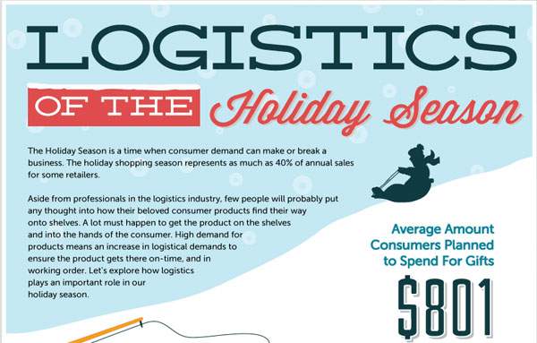
When our clients at Derby Supply Chain Solutions (opens in new window) wanted to demonstrate the importance of logistics during the holiday season we could have written a blog to illustrate the relationship. Instead, we took the same information that we would have used in a blog post and turned it into 50 data points set within a collage of images and created an infographic called Logistics of the Holiday Season (opens in new window). By relating the information in the form of a static infographic we were able to better inform and entertain the viewer, as well as make a bigger footprint in our client's SEO than we would have by simply using a blog to convey the same message. Yes, static infographics are cool!
Interactive Infographics
On Scroll Type
The on scroll type are infographics whose components are animated by either using the arrow keys on the keyboard or scrolling with the mouse wheel. These can just move with the scrolling or arrows, or can be enhanced through the use of parallax effects. It’s more complicated to optimize these for mobile devices and tablets, and they are more expensive than a static infographic in terms of time, but they are very engaging, garner more links and have a broad appeal for viewers.
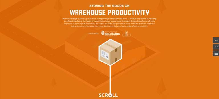
Some on scroll infographics are vertical scrollers, where content is animated vertically, up and down the page. Some are side scrollers, where content is animated horizontally across the page. The choice of whether to use a vertical or a side scroll is largely dictated by the content itself. When developing our piece, Warehouse Productivity, it was obvious that the flow of the content (i.e. the truck pulling into the loading dock) was best illustrated by designing for vertical scrolling. Likewise, when we put together A Visual Guide to the Kentucky Derby (opens in new window), the content, which features a running horse, dictated the flow of the animation should move horizontally across the screen.
However the activity on the page, like a horse running, is not the only action occurring with these infographics. The viewer must physically interact with the computer in order animate the horse, creating additional engagement from the user. The more interaction, the more engagement.
Fully Interactive Type
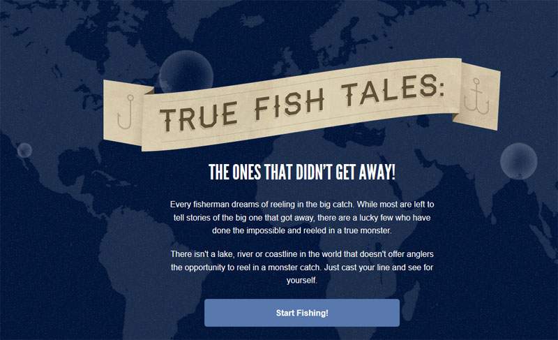
A fully interactive, or on click infographic increases viewer engagement. True Fish Tales (opens in new window), a fully interactive infographic we developed to highlight fishing records from around the world, is a good example of this style of infographic. The user must click on, and interact with, the elements of the infographic to animate them and navigate the page, thereby heightening engagement. This could almost be classified as a microsite.
If your goal is to provide even more opportunities for user interaction, we can of course create a hybrid of the on scroll and fully interactive types to combine the actions of both. It naturally requires more development time, but the engagement level rises accordingly. A good example of a hybrid infographic is The METHod and the Madness (opens in new window). This infographic informs the viewer of the prevalence and dangers of methamphetamine use by having them click and scroll their way through a great deal of information in an engaging and entertaining way.
Touch Optimization
A drawback to some of the ways users interact with infographics involves the use of hover states, which doesn’t work in mobile and tablet devices. Therefore an alternative “touch optimization” is necessary to give the user a way to tap the screen to view the information that a mouse hover would produce in a desktop view. Another consideration is the way that some devices respond to the touch/scroll gesture, which has to be tweaked a little to give them a similar experience to the mouse or sidebar scroll, or arrow touch, that the desktop version provides. Any interactive infographic can be touch optimized for tablet and mobile - it just adds some time, roughly 10-20%, to the work.
An example of a touch optimized infographic would be our own Year of the Cardinal (opens in new window), which can either be scrolled through with mouse and arrow keys or by simply brushing your fingertip across your cell phone. Currently, 50% of web traffic is coming from mobile devices, and this number is only going to grow. Even now, Google is beginning to penalize sites in search rankings for not being responsively designed for mobile platforms. So, touch optimization is not just the coolest kid on the block, it's becoming a necessity.
The Answer: It Depends
In the final analysis, all of these types of infographics provide a terrific way to more effectively communicate with visitors. Which type of infographic you should use is going to depend upon your content, your goals and your budget. The one thing you can be sure of is that, if properly produced and marketed, a picture can be worth far more than a thousand words.
Related Posts