Make no doubt about it–there’s an abundance of content on the internet. With every brand creating and publishing content such as blogs, infographics, podcasts, livestreams, and case studies, only the highest quality content will stand out. Many organizations are experimenting with data visualization to give their content a unique look and feel that makes it more memorable and compelling to audiences.
Data visualization–charts, graphs, and more–has long been a mainstay for designers who create static infographics, but emerging programming technologies have really opened new opportunities for more complex and interactive data visualizations that digital marketers can leverage to drive brand awareness, thought leadership, and of course, lead generation.
What is Data Visualization?
Data visualization is the art and science of displaying information, or data, in visual form. The term is more generally used to describe the act of summarizing and translating complex or nuanced information to produce simple, artful, and meaningful images that accurately represent the data.
Why Use Data Visualization?
Data is interesting, and people like to learn. Visualizing data in an attractive and compelling way provides unique insights into your company, your industry, your product, or your market "at a glance."
This marketing strategy is particularly effective in a time when prospects have less free time and are being bombarded with more information than ever before. In today’s data-abundant world, finding ways to extract human insights from voluminous data sets is a key challenge and a critical skill. The amount of information coming at us is insane. It’s overwhelming. That’s why data visualizations are typically built to support two main goals:
- Get people's attention. When you’re fighting for attention–whether it’s on your own website, on your LinkedIn post/Twitter feed, or even in an office presentation–the right visuals can captivate your audience and get them to explore and engage with the information you’re visualizing.
- Distill complex information for a wide audience. Today’s visualizations often simplify vast and comprehensive data sets that would otherwise be very difficult for the average person to understand. Consider the challenge of trying to understand the addiction crisis in America; there are so many people saying so many things about addiction, so a visualization like this one (visual no longer available) from Addiction Care Recovery Services is an effective way to make sense of that wide mix of data, ideas, and information.
The bottom line: Powerful data visualizations allow you to tell a strong story through palatable, shareable, and branded content that can support your marketing goals and other digital marketing efforts online.
Examples of Great Data Visualizations
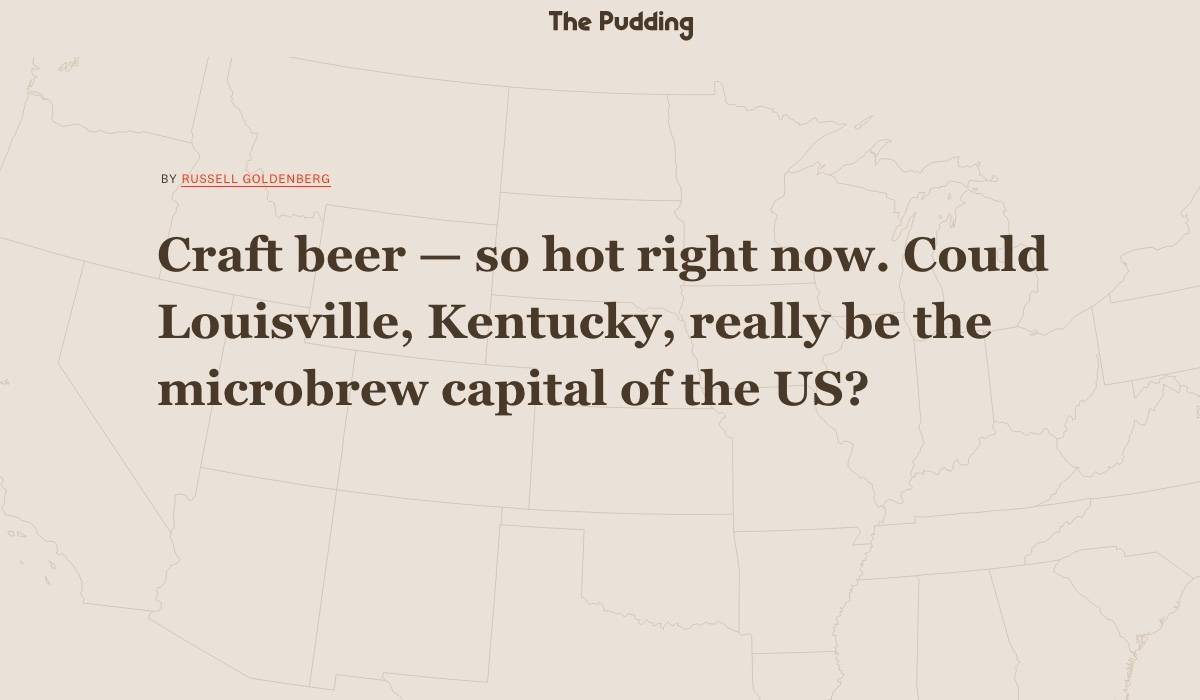
1.What city is the microbrew capital of the U.S.? – The Pudding
The Pudding has a long track record of creating awesome data visualization pieces, but we particularly love this recent one on microbrewing.
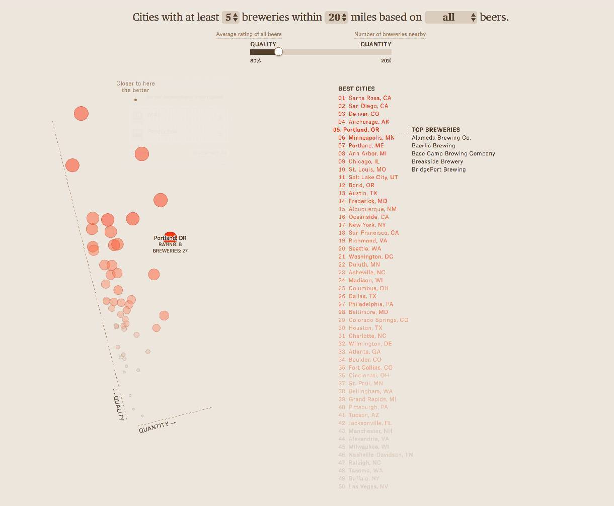
The infographic opens with a personalized message based on your location
It starts strong - using geolocation to have an introductory sentence that is personalized to each person (talk about drawing someone in from the beginning!) and only gets better from there. We particularly love the interactive section that graphs U.S. cities on the quality and quantity of their beer.
Although The Pudding is a publisher, this visual content would have worked excellent for any brand in the craft beer industry.
2. Track Covid-19 Cases in Your Area – NY Times

NY Times readers can build their own visual Covid 19 dashboard by typing in cities
This data visualization from the New York Times puts the audience in the driver’s seat. Readers are asked to choose which state, city, or metro area they would like to add to a personalized dashboard for tracking data on the number of Covid-19 infections and deaths in those areas.
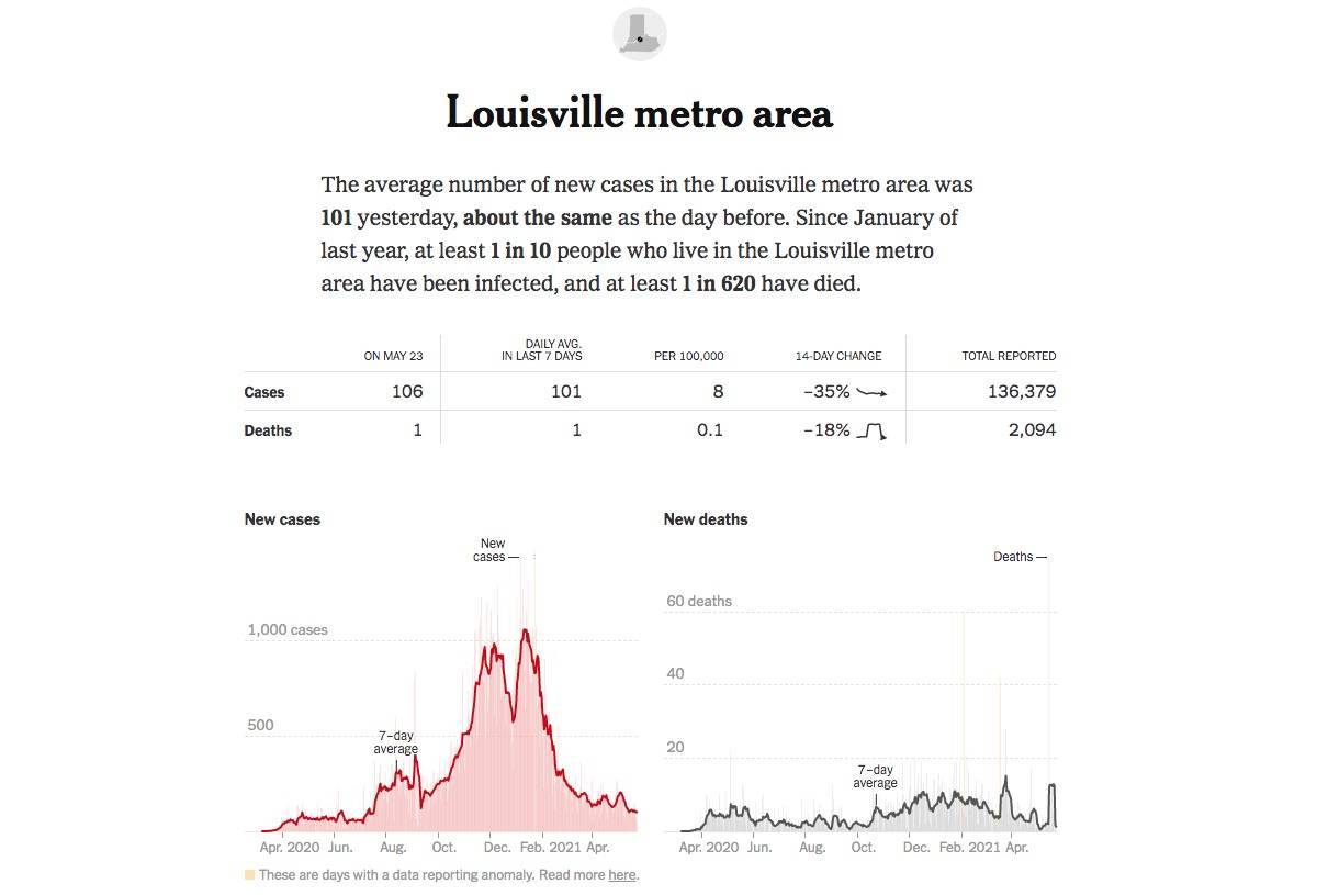
Readers get a detailed view of the cities they add to the dashboard
We love the interactive component of this Covid-19 visualization from the NY Times; it’s a really strong twist on traditional data visualization pieces, and it allows the viewer to prioritize the information that's most important to them.
Brands who can offer relevant and interesting data visualizations like this one, that readers can customize to their liking, are on the right path for successful content marketing.
3. Logistics of the Holiday Season – Derby LLC
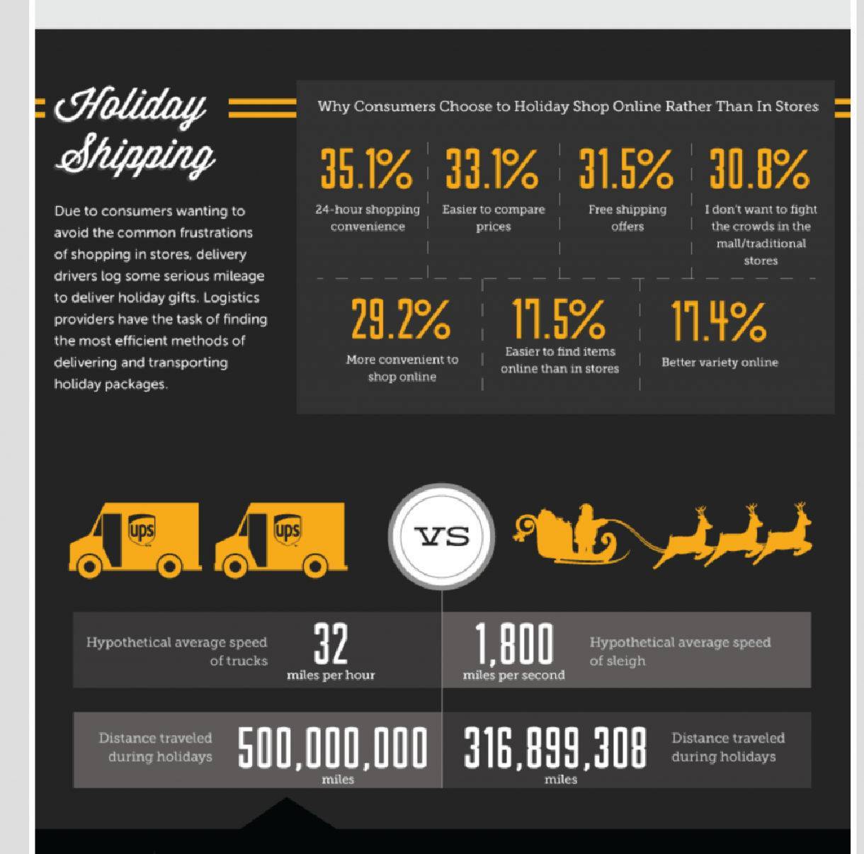
This section of Derby LLC's infographic focuses on shipping data
We love how on-brand this static data visualization from Derby LLC is. It was released seasonally to take advantage of the interest surrounding events of the holiday season, and designed with visual cues related to holiday themes.
By staying on-brand in this data visualization piece, Derby is able to connect their logistics expertise to well-presented data and visual content that demonstrates just how complex the logistics of shipping and delivering packages during the holiday-season actually are.
4. Based on a True Story – Information Is Beautiful
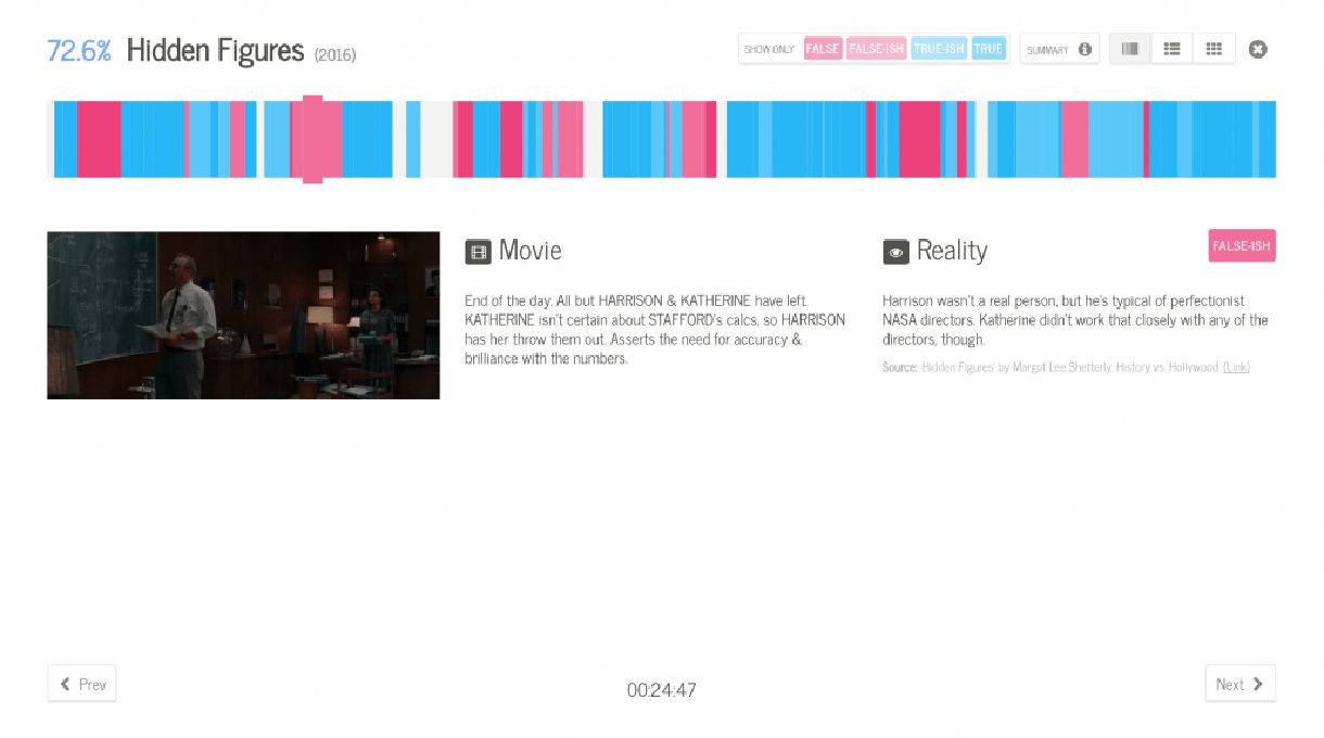
Information is Beautiful has been creating quality data visualization pieces for years now, but this piece is one of our recent favorites.
The interactive visual breaks down a number of “based on a true story” movies from the last several years. Each scene is rated on its veracity, giving a really beautiful picture of how accurate many of these beloved movies actually are, according to known facts.
Brands with really storied histories, or those selling products with really complicated production processes, could benefit from a similar approach that allows viewers to easily follow a linear progression through high quantities of informative content.
5. The British Diet in Data - The Open Data Institute
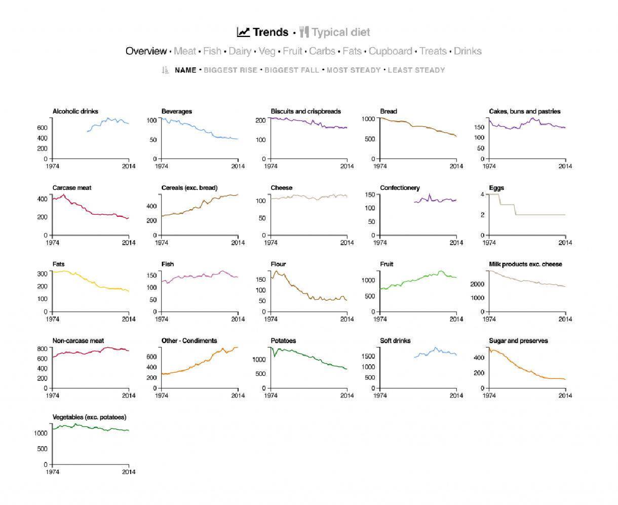
We love this piece from the Open Data Institute because it takes a huge data set and makes it into a clear, digestible (pun intended) format.
In our opinion, this is one of the harder data visualization formats to pull off, simply because of its scope, but it works well here. Informative, educational, and interactive. By giving the user the ability to choose the “highest” and “lowest” changes, they can subtly point to what are likely the most interesting pieces of data.
Businesses that have either large numbers of products, or products with a large number of attributes, might benefit from creating data visualizations similar to this one.
6. Universcale - Nikon
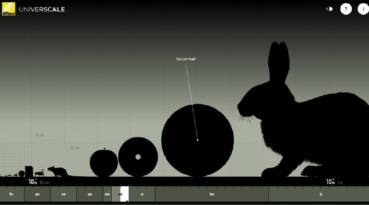
Nikon’s Universcale is a pretty famous data visualization because it works so well for their brand. It allows users to scroll up and down to compare the sizes of everything from a bacterium to a rabbit. Each item is categorized by size, starting with micrometer and ending with a light-year.
Because Nikon sells lenses that allow you to zoom into great detail, this data visualization is perfect for associating the visual content with their product. Many readers who encounter this content will think about Nikon's brand every time they are asked to understand "the scale" of something, making this visualization especially impactful and effective.
What makes for effective data visualization?
David McCandless, author and creator of Information is Beautiful, has done a great job of using a visual to explain what comprises an effective data visualization (clever, right?)–as you can see in his visual explainer graphic, great visualizations adhere to four best practices:
- Information (or Good Data) – How accurate is the data you’re working with? Only use validated data from trusted sources.
- Story (or Concept) – Is your visualization presenting information to make a point (or several points) that couldn’t be made as effectively using a grid table or normal, written sentences? Just like with all web content in marketing, visuals need to be interesting in order to engage your audience.
- Goal (or Function) – Other than presenting information, what is the reason for your data visualization? Data visualizations are a significant investment, so making sure each one is aligned with your digital marketing goals is critical.
- Visual form (or Metaphor) – Is your data visualization beautiful? If you don’t immediately answer “yes” then there’s probably room for improvement. Bad design might be hard to objectively define, but it’s easy to spot. Bottom line: There’s a lot of bad charts and graphics out there–so make sure yours are good.
Best Practices for Data Visualizations
Presenting data in visual form is most effective when designers follow established best practices. Communicating data or information clearly in the most visually appealing way is key to success, as bad data visualizations will do the opposite and confuse or frustrate readers.
The following checklist can help any designer create data visualizations that support their content marketing:
1. Optimize your data visualization for mobile.
Complex, information-packed bars, charts, graphs, etc. are great for spicing up reports, blog posts, presentations, and more. But they’re not always the best for mobile viewing. To optimize your data visualization for mobile viewing, use one focus chart or icon along with big, legible font.
You can also create a series of mobile-optimized infographics to share multiple data points in a super original and attention-grabbing way. However, be sure that all graphical images in your visuals are also mobile-optimized.
2. Tell a compelling story with your data.
Data visualizations like infographics give you the space to combine data and narrative structure in one page. Visuals like icons and bold fonts let you highlight important statistics and facts.
3. Avoid distorting the data or misleading viewers.
While data visualizations are an opportunity to show off your creative design chops, function should never be sacrificed for fashion. The chart styles, colors, shapes, and sizing you use all play a role in how the data is interpreted. If you want to present your data accurately and ethically, then you need to take care to ensure that your data visualization does not present the data falsely.
4. Avoid cluttering up your design with “chartjunk.”
“Chartjunk” refers to the use of unnecessary or confusing design elements that skew or obscure the data in a chart. Mistakes like this are common when designers try to put style before function.
5. Combine different types of data visualizations when it helps.
While you may choose to keep your data visualization simple, combining multiple types of charts and diagrams can help tell a more rounded story. Quite often you can combine charts, pictograms and diagrams into one infographic. The result will be a data visualization infographic that is engaging and rich in visual data.
6. Use icons to emphasize your important points.
Icons are perfect for attracting the eye when scanning a page as a visual cues. If there are specific data points that you want readers to pay attention to, placing an icon beside it will make it more noticeable.
7. Use bold fonts to make textual information engaging.
A challenge people often face when setting out to visualize information is knowing how much text to include. After all, the point of data visualization is that it presents information visually, rather than a page of text. Even if you have a lot of text information, you can still create present data visually. Use bold, interesting fonts to make your data exciting.
8. Use colors strategically in your design.
Colors are often used to categorize data within the same image. In design, colors are as functional as they are fashionable. You can use colors to emphasize points, categorize information, show movement or progression, and more. Contrast is important, too–you should use light-colored text and icons on dark backgrounds, or dark text on light backgrounds, to make each element stand out.
9. Focus on the most compelling statistic(s).
If your visualization is made to support a presentation, it’s best not to try and cram too many visuals into one slide. Instead, on each slide focus on one awe-inspiring statistic and make that the focus of your visual. Limiting visuals to one statistic per slide gives each statistic even more impact.
Related Posts