The Box Model Explained
What is the box model?
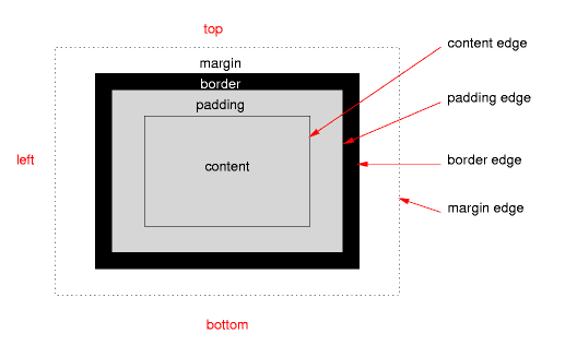
Designing for the web requires two frames of mind. The rational side of the brain writes out the code, in the order it should appear in the final project. Next, the creative side determines how the elements of a web page appear. Without styling, a website appears to be nothing more than text in predefined sections. These sections can be a heading, paragraph, image, etc, but the browser considers each element a box. As a default, these boxes have a set amount of spacing, or margins, insuring that no element overlap. However, the box model includes more properties than just the margins.
CSS allows us to define the width and height of a box, no matter what the content may be. Padding is included to push the content further inside the elements box, keeping the total size of the element the same. Finally, giving the box a border will also add space to the element. It sounds somewhat confusing, but visually spelled out it is a simple concept to understand.

Total Area
Each of these properties effect the overall size of the box, and when used together, can be tricky to find the desired size. For example, start out with a box with a defined width 100px each. (In this example we will only consider the width, but the same ideas apply to the height of an element as well.) The final element will be exactly 100px wide. Adding 20px of padding would make the content of the box a total of 60px. The box occupies 100px of space, leaving 20px of blank space on either side. When a border of 5px is added, the content stays the same size while the total occupying area becomes 110px, adding 10px of space on the outside.
Box Harmony
Margins are used to provide space between the elements. So, a margin on our box of 10px would ensure that it is at least 10px away from any other element on the page. Thus the total space taken up by the box would be:
100 + 5 + 5 + 10 + 10 = 130px (total occupied space)
It is important to control the size of the elements to present the content properly and the more elements that are in a page, the more tricky things become. The most overlooked idea behind the box model is the idea of collapsing margins. If two elements are set next to each other, the one with the higher margin value takes precedence over the lower value; that is, element A's margin of 20px would knock out element B's margin of 10px. The distance between the two would be 20px, not 30px; there is still 20px of margin for element A and 10px of margin from element B.
The Problem
Sounds like a pretty solid sizing system, but what if the content is more than the predefined size of it's containing box, or the parent-box? With the growing popularity of systems like Wordpress and Drupal, the web is becoming a much more dynamic place. When designing a site's layout, we must take into account the amount of content-variety any one section might have to contain. New content could completely alter the entire page if the size is too big or too small. Not to mention the hours of resizing and tweaking that could be necessary to get the final layout just how you want it.
Flexible Boxes
The new idea of a flex-box is a more simple way of organizing elements without worrying about gaps of space and overflowing content. In this new box model, the tag is given a new property of 'flexbox.' A flexbox is a more intuitive system that automatically adjusts the spacing to insure that all of the child-boxes stay with within a parent-box. Now, our containers will always contain completely the element inside it.
In addition to containing elements, assigning fluid widths are more simple with box-flex ratios. If we have three boxes and a bunch of white space in the parent, we can use box-flex to adjust the width of each box with a single number. Box-A is given a value of 2, while box-B & box-C are given a value of 1. So we have a ratio of 2 : 1 : 1. This means that box-A would grow by 2px for every 1px box-B and box-C grow. Box-A is now 2/4 of the parent and box-B and box-C are ¼, filling out parent-box automatically.

The flexbox model is still not compatible in all browsers, and most still require browser hacks to display properly. However, this single concept gives us a nice view into the ever changing world wide web. The days of hard coding everything are almost gone and dynamic web design is the future.


