 4 Min Read
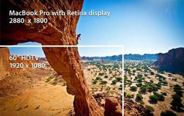
Although Apple has made the Retina display a household name the term “retina quality” can roughly be applied to describe screens with resolutions exceeding 300 pixels per inch. These ultra high-resolution screens have transformed the way users experience the web, offering 3 million more pixels than your average HDTV.
But are these huge resolutions an improvement for web designers? Sure, they have their benefits, but are the advantages great enough to outweigh the apparent challenges of designing for a post-retina Internet?
More Pixels for Your Retina
To begin this discussion, let us first look at the positive aspects of Retina displays. The obvious benefit is that large resolutions mean that large images and fonts look crisper, allowing for a much greater amount of detail and sharpness. To understand why, you must realize that any time you resize an image from its native resolution; you irrevocably damage its quality and sacrifice some sharpness.

With modern cameras that are capable of shooting at resolutions that exceed 5000px at their longest edge, this is an important point as photographers have always had to resize their images to standard web resolutions. With Retina technology, monitors are now capable of displaying these images closer to their native resolutions.
Controlling vs. Complicating the Experience
The obvious disadvantage of the Retina display is that its creation has lengthened the divide between new and old technology. As a web designer that is trying to deliver the best quality experience for ALL devices, it is important to not alienate users of older technologies by adopting the new ones.
Alienating users of old technologies is a significant problem being that historically, web technologies have changed at a faster rate than the technologies that browsers support. If we as web designers must conform to the limitations of older browsers, than we cannot also be expected to adopt all the new technologies.
Bigger Images: Good for Design, Bad for Experience
As mentioned previously, larger resolutions create the opportunity to utilize larger imagery in our designs. In order to reduce the amount of time a page needs to load; most images on the web are saved at a lower quality. This process of image optimization is used to show the best image with the least amount of data.
Fast page load speed is an important consideration when evaluating user experience and as of more recently, has become an important factor in regards to search engine optimization.
If you choose to include high res images on your website, you should expect to have much slower page load times, which could likely result in lower page ranking and more frequent bounces from your website.
Conversely, if you use low res images on your website, the new high resolution displays will make the low quality images stand out like a sore thumb. It is somewhat of a pick your poison situation.
Solutions for Retina-Centric Design
Use @media queries: Media queries allow designers to not only target specific device classes, but to actually inspect the physical characteristics of the device rendering their work. We’ve talked about them before in regards to their application in mobile web design.
Just as we use media queries to detect and selectively adapt our designs for smartphones, we can also use them to detect and adapt our designs for Retina screens. The code to switch out an image based on a Retina’s aspect ratio would look like this:
/* Stylesheet for Retina */@media screen and (-webkit-min-device-pixel-ratio: 1.5), screen and (min-device-pixel-ratio: 1.5) { img#logo { content: url([ URL for Retina image ]); }}
The problem with this solution is that it is still lacking support for older browsers. CSS3 and media queries are not supported in versions of Internet Explorer prior to IE9. On the bright side, it is very unlikely that a computer with a new Retina screen would be utilizing an older browser, especially one owned by Microsoft.
Use javascript: Some people are using javascript resources to detect the different resolutions of devices and then changing image source based on the device it finds. A great example of this solution is actually used by Apple. Read up more from Jason Grigsby on how Apple.com serves Retina images to new iPads.
Prioritize your images: If neither of the above options is possible, you should consider prioritizing your images to keep page load speed down. Choose what images are most important and serve those up as higher quality and leave the others to scale the best they can.
Key Takeaways
The range of varying resolutions designers must now consider ultimately boils down to one point. The greater the complexity, the more costly development will need to be to support the vast number of differing media types. Simpler designs that allow for more flexibility without extra work may be the preferred option.
Related Posts


