Once you perform enough web accessibility audits, it becomes painfully clear that automated testing alone cannot reliably catch and identify every inaccessible feature of a website. That’s why we always perform manual audits in addition to automated testing of websites.
What’s neat about our manual audits–beyond helping organizations fully comply with digital accessibility laws and the Web Content Accessibility Guidelines (WCAG)–is when they uncover examples of web accessibility enhancements that go beyond legal requirements. These are features that work to make a website truly accessible, rather than only making them accessible enough to be compliant.
Here are some examples of impressive website accessibility enhancements that do more than what's required by law:
5 Examples of Great Web Accessibility
- Swiss Air | User Navigation
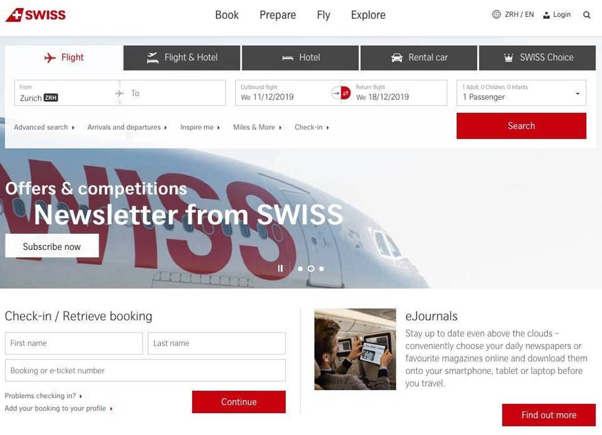
Swiss Air's website has implemented great user navigation and focus states
User navigation is integral to the manual audit process, and Swiss Air’s website is a noteworthy example of accessible website navigation. The airline has prioritized user navigation on their site, with emphasis on three specific elements:
- Keyboard-access to all elements on the site
- Helpful skip-to links
- The clearest focus state on the internet
The site also provides an example of accessible popup functionality. Throughout the site, new content appears in a popup when triggered by user interaction (such as hovering or clicking/pressing). When keyboard users activate the popup, the focus state is immediately redirected to the content for user interaction. The content can be dismissed (closed) either by clicking outside the window with a mouse, or by pressing the "esc" key on the keyboard.
- Bleacher Report | Access to Legal Information
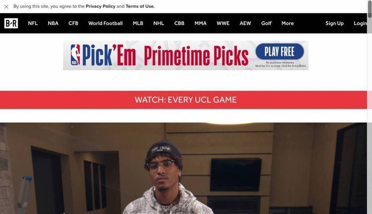
Bleacher Report's cookie policy is the first content users encounter at top of the page
-
- Among the most egregious missteps of website accessibility is obstructing a user's proper access to legal information. This is a growing problem as cookie policy notifications have now become standard on private and public-sector websites around the world (though they are not yet fully required in the U.S.).
Cookie notifications are common accessibility issues because they are often placed at the bottom of pages, which means site visitors browsing with screen readers will reach them last–assuming their screen readers find them at all. Vision-impaired users could potentially browse the entire website without consenting to cookies or knowing how it uses cookies. That presents a complex legal problem at best, especially in countries with strict online privacy laws.
The sports website Bleacher Report ensures that the important (legal) things are taken care of first. Their cookie policy statement is the first thing "seen" (navigated to) on the site, allowing all users to be aware of the policy before browsing or interacting with the web page.
Visit our Web Accessibility resource page
- Jack Daniel's | Accessible Complex UI Elements
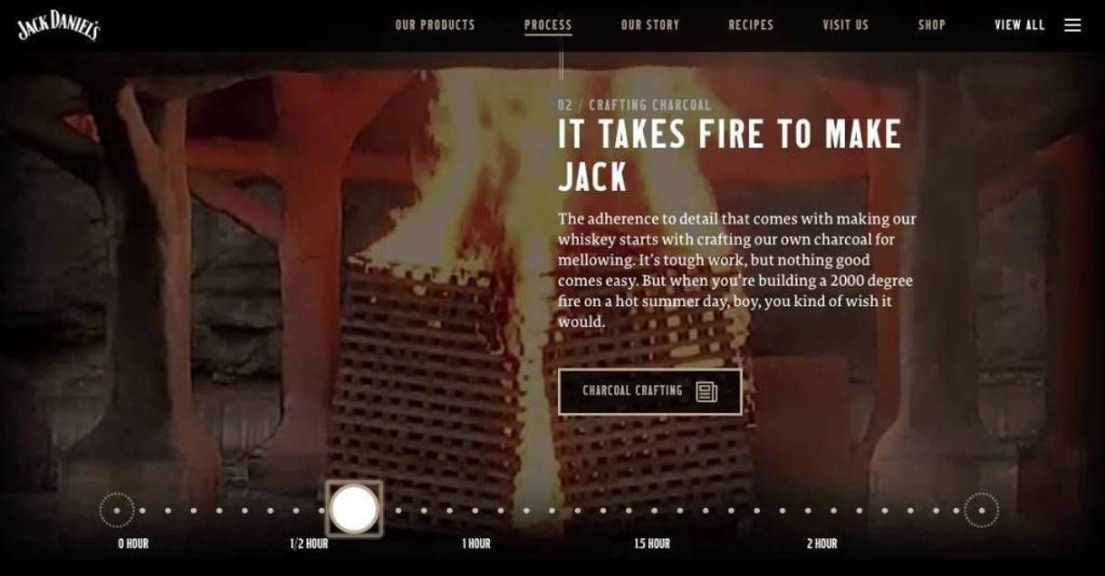
The Jack Daniel's website includes content with a draggable, interactive timeline
There’s a fundamental need to make the complex elements of a website accessible. Otherwise, these elements can prevent many site visitors from accessing all of the content on webpages.
Websites typically include complex elements for one of two reasons:
-
-
- Adding simple functionality, like navigation
- Adding unique features that enhance user experience
-
A common example would be navigation menus, which are “simple” elements of a website’s User Interface when keyboard users can tab through them with no problems or barriers to the rest of the page’s content. However, once a sub-menu is added, those nav menus become complex elements that must be designed for accessibility.
The timeline component on whiskey-maker Jack Daniel’s website is designed to be a “draggable” timeline for users to interact with as they navigate the site. This element is keyboard accessible, allowing the use of arrow keys to move up and down the timeline, as well as the legend hour markers being buttons to skipping up and down the timeline.
Walmart | Intentional + Temporary Entrapment of Focus
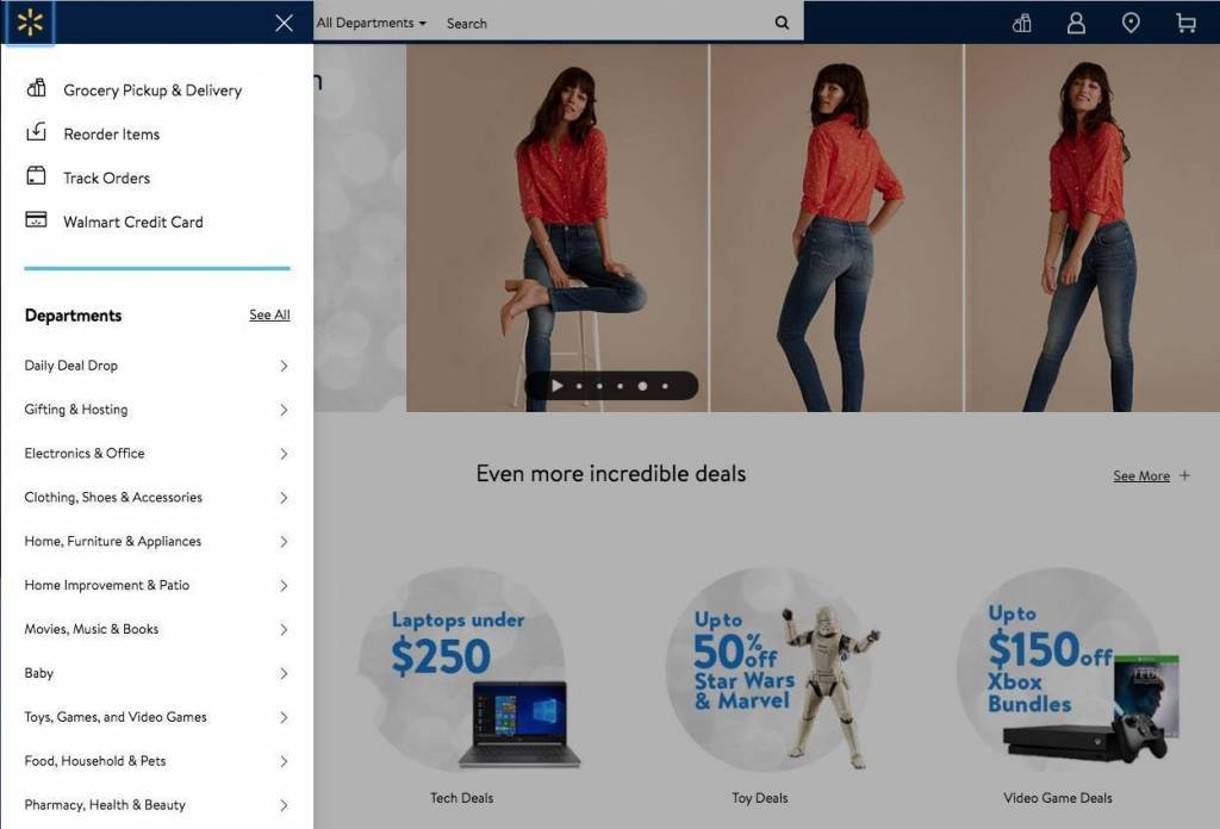
Walmart's temporary entrapment of focus states makes their UI + content more accessible
Permanently entrapped focus is an accessibility issue for websites because it directly conflicts with WCAG criterion. When users who browse websites with keyboards or screen readers are "trapped" in focus states, they are unable to leave focused content and continue browsing the site.
The temporary entrapment of focus can be a powerful tool, if used intentionally and correctly–for example, if we do not entrap focus to cookie notification popups, then site visitors browsing with assistive technology like screen readers might continue navigating a page in the background while being blocked by the popup.
Once opened, the Walmart website’s main navigation menu keep focus contained until closed by the user. This strategy prevents the user from navigating down the page while the menu is open, which could involve focusing on elements hidden behind the opened menu.
- Oksana Masters USA | Using More Than Color
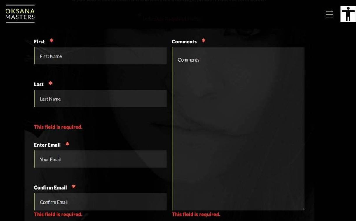
Users submitting improper forms on Oksana Masters' website get error messages
Forms are notorious for only using color to display errors to users. This is an immediate accessibility failure, primarily because it ignores colorblind users. Error messages must consist of more than a simple change of color.
For example, a contact form's required fields are often indicated with asterisks. Upon an erroneous form submission, the user should see validation error text that indicates the content needed for a successful form submission.
Read More: 10 Examples of ADA Compliant Accessible Web Design
Go the Extra Mile for Accessibility
In a world where over 97% of the top million website homepages fail basic accessibility tests, and large corporations are appealing web accessibility lawsuits all the way to the Supreme Court, these websites have made exceptional efforts to accommodate the disabled and impaired users who visit their websites.
We specialize in designing and building accessible websites–not just for the sake of legal compliance, but also to be more inclusive and offer the advantages of our digital world to everybody. Please reach out to our experts and let us know how we can help you make web accessibility happen for your business or organization.
Related Posts