How the New EOSYS Site Proves Technical Mastery Without the Jargon
We centered the experience on clear ROI, operational stability, and total confidence in a solid partnership.
Website Goals and Objectives
EOSYS needed a website that clearly showed who they are. The company solves complex problems for manufacturers across industries, including food and beverage, chemical, CPG, spirits, pulp and paper, metals, energy and utilities, and automotive.
The team works closely with customers, uses simulations to build trust, and operates as an employee-owned organization. The previous site did not reflect this.
DBS focused the project on three primary goals: increasing lead generation, improving recruitment, and clarifying EOSYS’s market position. The site also needed to support long sales cycles, trade shows, PR activity, and offline conversations, while giving sales teams a reliable tool to use with prospects.
Five Core Objectives
- Improve usability and user experience through modern design, intuitive navigation, and tailored paths for different user types
- Clearly communicate EOSYS’s problem-solving approach, ownership culture, and way of working
- Make it easier to share videos, downloads, case studies, and technical resources
- Ensure strong accessibility, performance, and search visibility
- Make the site simple to update and manage internally
Strategic Discovery and Planning
The discovery phase revealed a consistent pattern. EOSYS tackles complex problems thoughtfully and collaboratively, but the previous website was unable to convey this.
Internal stakeholders described the employee-owned company as built one built on careful engineering and openness, yet the site told a generic story that could have applied to many firms.
Perspective customers often entered sales conversations without a clear understanding of what EOSYS did or how the team worked.
![]()
Interviews highlighted several issues. Visitors struggled to see what differentiated EOSYS from competitors.
Navigation was difficult to use, and the content did not reflect the breadth of services or industries supported.
Hiring teams also noted that engineers and co-op students rarely engaged with the site because it failed to communicate culture or ownership.
DBS identified six core users. Ryan, Mark, and Alex represent decision-makers and technical experts who need clear information and evidence.
Ingrid represents the marketing manager who needs a site that is easy to update and manage.
Corey and Callie represent engineers and co-op students looking to understand the work, culture, and career opportunities.
Their needs shaped the site’s structure and content.
Branding work confirmed EOSYS’s archetype as The Catalyst. This identity combines courage, curiosity, technical rigor, and steady guidance.
It informed the visual system, messaging, and structure of the site, ensuring every page reflects who EOSYS is and how the team works with customers.
Key Challenges
|
|
||||
|
|
||||
|
|
UX Architecture
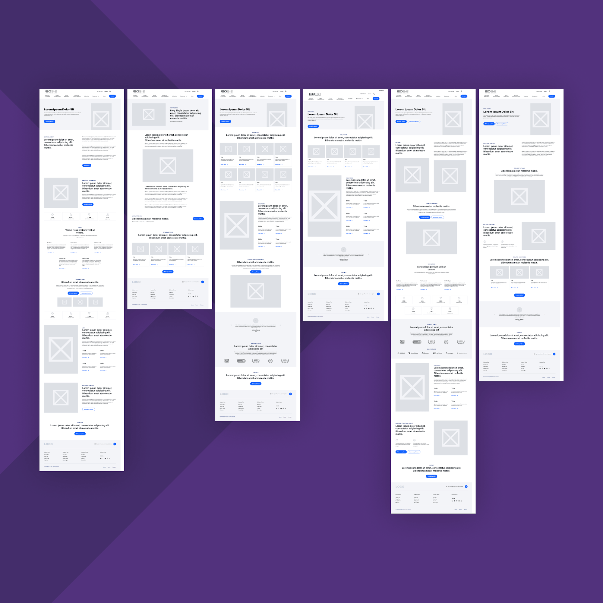
The UX architecture focused on reducing friction and guiding different audiences to the information they need.
User Flows and Wireframes
The user experience workshop translated planning into a clear structure.
Primary user needs came from leaders seeking a quick overview of capabilities, engineers requiring technical depth, and candidates interested in the work and culture.
Each audience followed a defined path through the site.
Wireframes established the layout and hierarchy. Headlines set context, and action buttons were placed deliberately.
Services and industries were grouped in a logical way.
Solution pages followed a consistent structure: overview, capabilities, proof, and next steps.
Wireframe Foundation
- Clear headline hierarchy
- Strong CTA placement
- Logical grouping of services and industries
- Visual cues for navigation
- Templates aligned with CMS components
Mobile behavior shaped many decisions. Menus needed to collapse cleanly, content sections needed to stack without losing meaning, and buttons needed to remain easy to find without crowding the screen.
The result is an intuitive experience that helps users move forward and accommodates long sales cycles.
Content Strategy and Messaging
The content plan focused on customers, making EOSYS clients central to the story. Complex solutions were explained in a clear, accessible way that connects directly to the problems manufacturers face.
Each page was designed to meet users where they are and guide them to the next step in their decision-making.
Messaging was shaped around six primary user types, ensuring the site addresses real goals and challenges rather than assumptions.
Language remained simple and direct. Content was organized into clear sections explaining what EOSYS does, why it matters, and how the team works with customers.
Pages were designed to be easy to scan, using clear headlines, short paragraphs, and relevant proof points. Users can understand the value EOSYS brings without feeling overwhelmed.
The result is messaging that feels clear and trustworthy, reflecting how EOSYS communicates in real conversations.
It aligns the company’s problem-solving culture and ownership model while remaining focused on customer outcomes. The content system allows for future services, new case studies, and ongoing expert content.
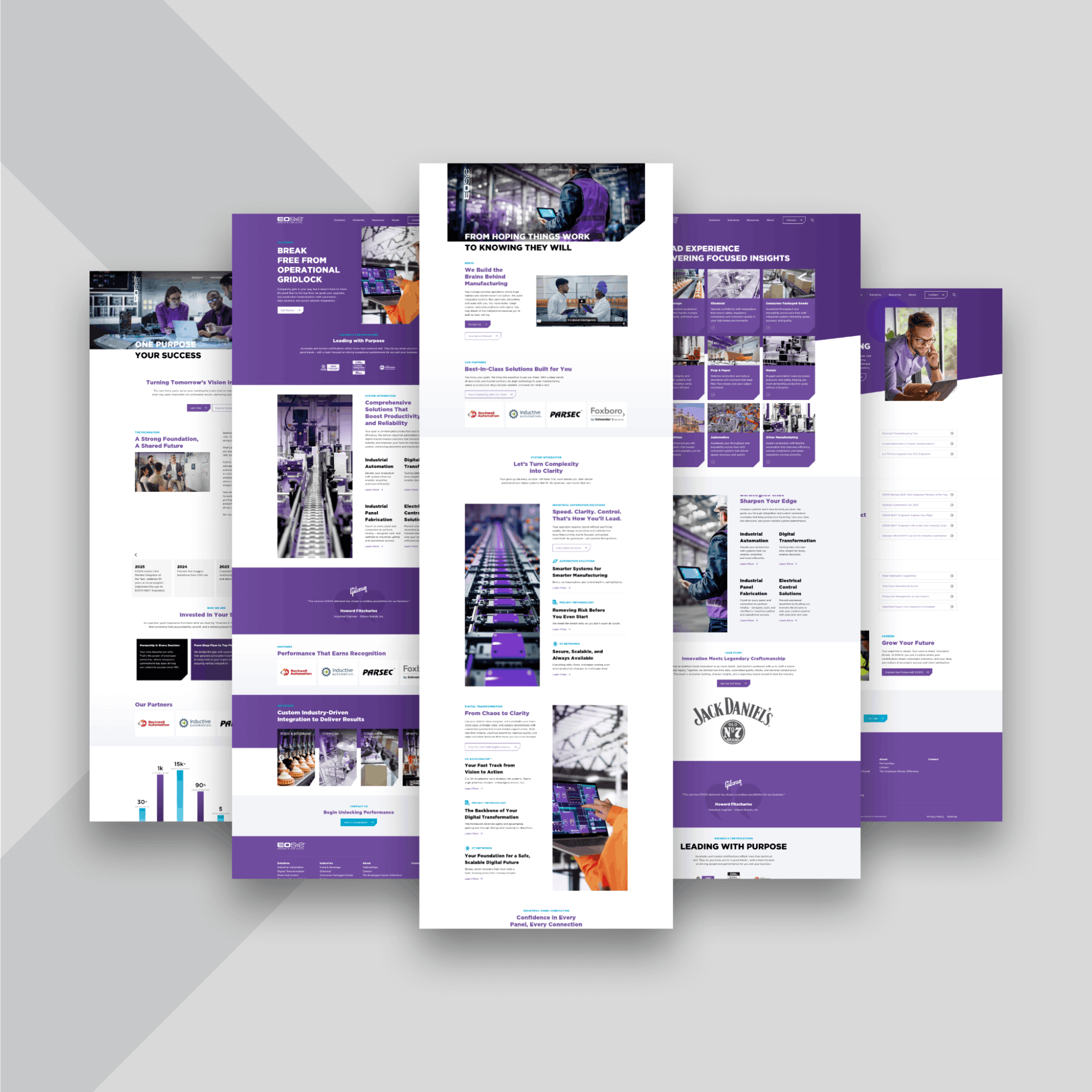
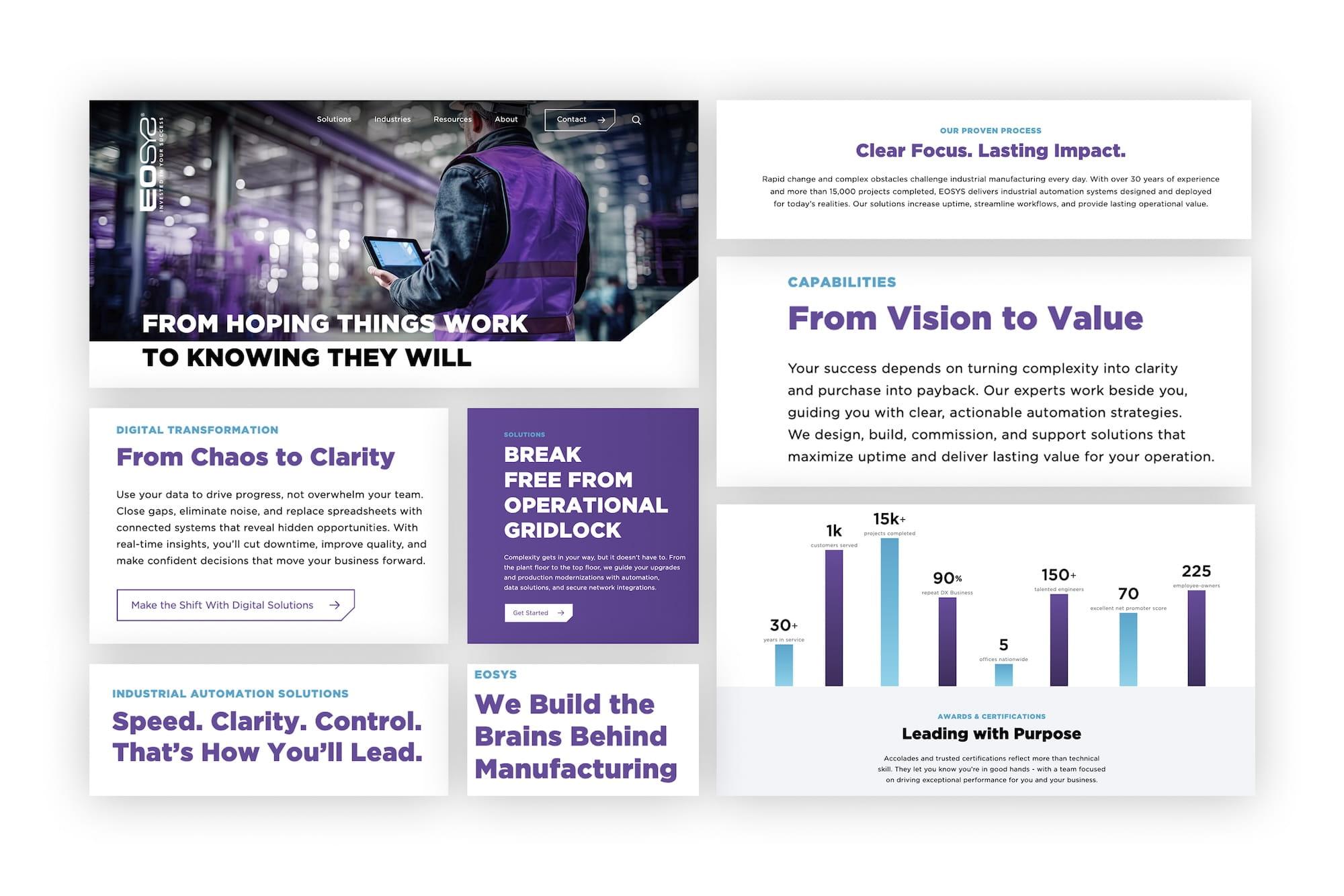
Visual Design System
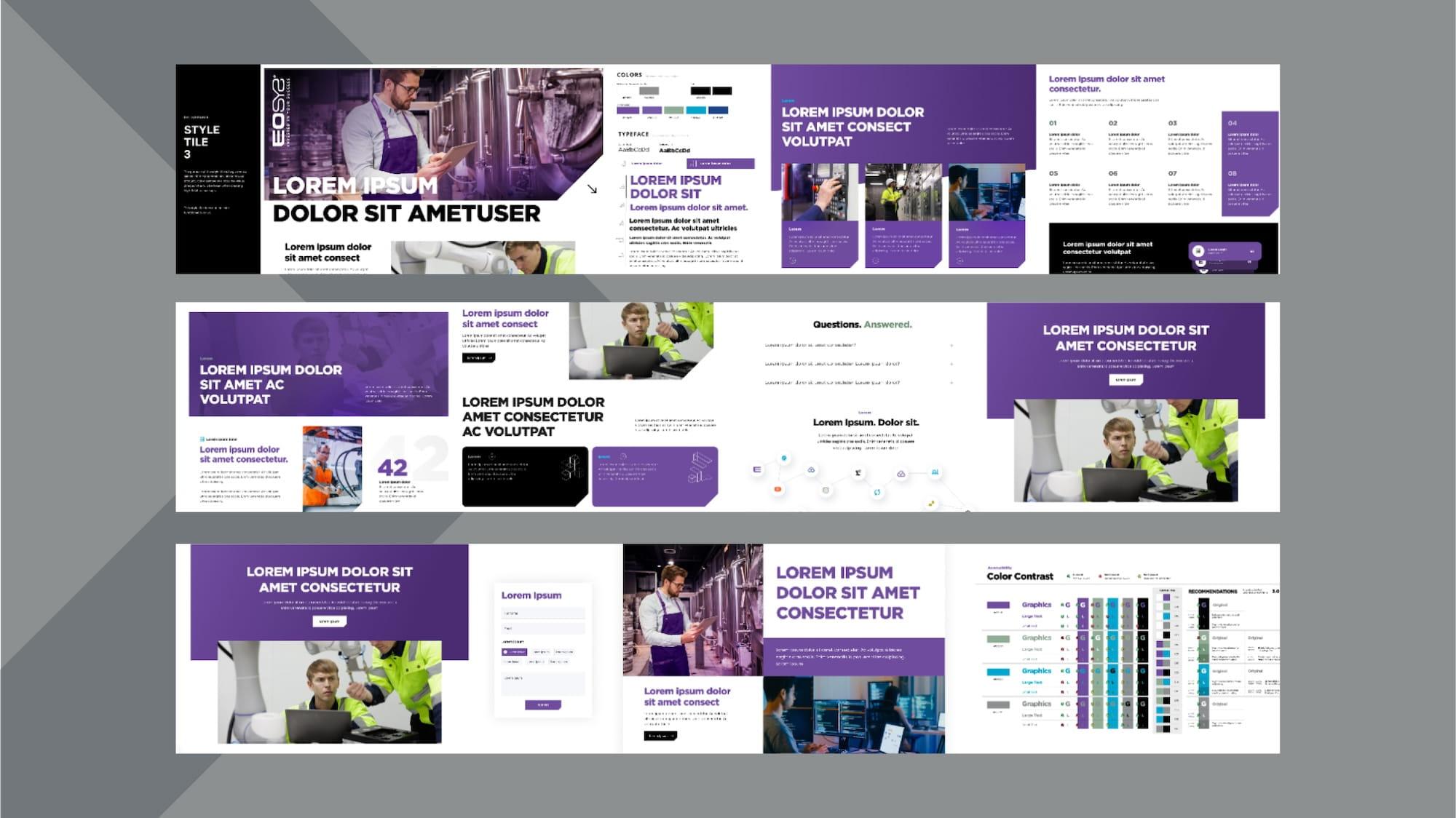
The design needed to present EOSYS as professional, modern, and approachable. Confident without feeling formal.
Mockups confirmed spacing, structure, and CTA placement.
They showed how present complex solutions could be presented using organized sections, simple icons, and repeatable patterns.
Key Visual Elements
- EOSYS brand colors
- Clean gradients and ample whitespace
- Industry-specific imagery with a consistent look
- Typography designed for clarity
The final design is precise and approachable.
Development
The development phase focused on turning strategy, UX, and design into a reliable, maintainable platform.
Performance, Security, and Scalability
Development translated the UX and design work into a stable, high‑performing, mobile-friendly site. The focus was on creating a fast, straightforward platform that the EOSYS team could manage independently.
Key Technical Decisions
- Craft CMS
- Progressive Web App (PWA) architecture
- WCAG 2.1 AA compliance
- Technical SEO foundations
- Optimized performance through clean code and caching
The setup allows teams to manage videos, downloads, media, and campaign pages, with room for future tools and features.
Launch Outcomes and Impact
The launch marked a clear change in how EOSYS presents itself. The new site replaced confusion with clarity, giving each audience a direct path to the information they need. Internal teams note that the site now reflects how EOSYS works and how customers evaluate solutions.
Performance improved immediately. Pages load faster, mobile usability is smoother, accessibility improvements broaden usability, and the content system allows the team to manage updates effectively.
Key Outcomes
- A modern experience tailored to each persona
- Clear articulation of EOSYS solutions and industries
- Brand credibility and differentiation
- Clearer pathways for recruitment and co‑op candidates
- A scalable content platform for thought leadership and SE
Evergreen Foundation for Growth
The site was designed for long-term growth. Its structure, CMS, and design system allow EOSYS to publish thought leadership, case studies, videos, and technical resources without developer involvement. Modular components keep pages consistent as content evolves.
The platform can accommodate integrations, campaign landing pages, and expanded content without requiring a rebuild.
If your site isn't pulling its weight, it should be.
We can fix that.
Related Posts