How We Brought Zendesk’s CX Trends to Life Through Design, Motion, and Storytelling
The case study demonstrates how the microsite gave global audiences a direct path into Zendesk’s insights and the trends influencing modern customer experience.
Turning a Global CX Report Into an Immersive Digital Experience
Zendesk’s annual Customer Experience (CX) Trends Report is an important resource for CX leaders worldwide. For 2026, its focus on human-centric AI required a digital platform that was more dynamic and engaging than a static PDF.
The objective was to transform a complex global report into an immersive microsite that could reach diverse audiences, strengthen Zendesk’s brand, and generate qualified leads.
Zendesk partnered with DBS Interactive to mold the experience. Zendesk supplied the content, data, and visuals, while DBS led design, motion, and user experience to ensure the insights were accessible and engaging.
The primary goal was to make Zendesk’s insights easy to explore, engaging to use, and ready for action.
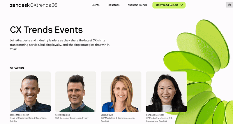
Making Complex CX and AI Insights Instantly Engaging
Large digital projects introduce risk. Success depends on identifying challenges early, setting clear goals, and adapting quickly.

For the CX Trends microsite, a tight timeline left no room for misalignment.
Insights from more than 10,000 respondents across 22 countries needed to be distilled into an approachable format.
Retail leaders, financial services executives, CX managers, and administrators all require distinct entry points. Clear storytelling and navigation were essential.
For Zendesk, the microsite became the primary platform for telling the annual CX Trends story.
Critical Requirements
- Deliver innovation without overwhelming users. Motion and interactivity needed to guide, not distract
- Serve customers and prospects by balancing depth with accessibility
- Support global audiences through localization across regions and languages
- Elevate thought leadership while driving lead generation
A basic download page could not meet these requirements. The microsite needed to demonstrate Zendesk’s leadership in AI-driven CX through a dynamic, interactive experience that guided diverse audiences with clarity and speed.
A Focused, Experience‑First Engagement
The project was collaborative from the outset, with clearly defined responsibilities.
That clarity was essential to maintain momentum and avoid duplication within a compressed timeline.
Zendesk provided brand voice, research, and content. DBS focused on user journeys, interactive storytelling, and motion design to shape how audiences experienced the site.
Division of Responsibilities
- Zendesk: Brand messaging, report content, research assets
- DBS: UX strategy, information architecture, motion and interaction design
This structure ensured accuracy, speed, and alignment, delivering an immersive microsite without delays caused by overlapping roles.
Prioritizing What Matters Most
Client workshops were essential for moving quickly and aligning on priorities.
These sessions defined homepage goals, audience paths, and the emotional tone of the experience.
The outcome was a clear plan. A homepage that welcomed diverse audiences, guided them intuitively, and balanced authority with approachability.
Key Outcomes
- Homepage priorities clearly defined
- User journeys mapped for multiple audiences
- Tone and storytelling established to carry the narrative
The strategy prioritized report downloads and event sign-ups, supported by storytelling. Interactions were included only when they improved clarity and flow. The focus remained on removing friction and maintaining momentum.
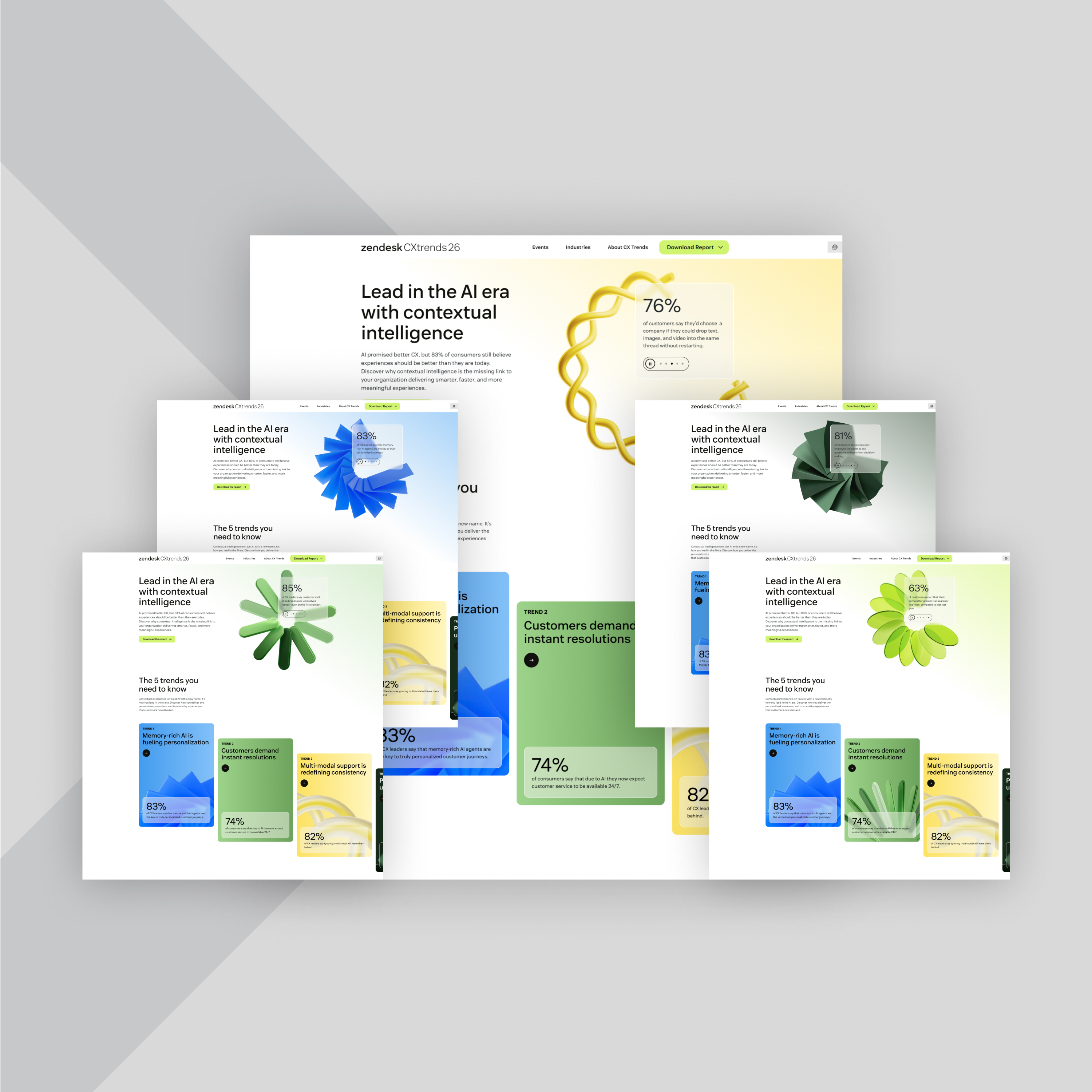
Visuals That Support Multiple Audiences at First Touch
The CX Trends microsite needed to make an immediate connection.
Visitors had to recognize relevance quickly, understand where to go next, and trust the content.
Clear audience paths were mapped from the start. Senior CX leaders sought strategic insight, managers needed benchmarks, administrators required workflow clarity, and industry stakeholders looked for relevant data.
Design ensured every audience could see themselves in the experience from the first interaction.
Designing for Different Entry Points
| New visitors: Clear brand introduction with authority | Existing customers: Deeper engagement to reinforce trust and extended value | Media and analysts: Accessible data and clear narratives for sharing |
Cohesion Through Color
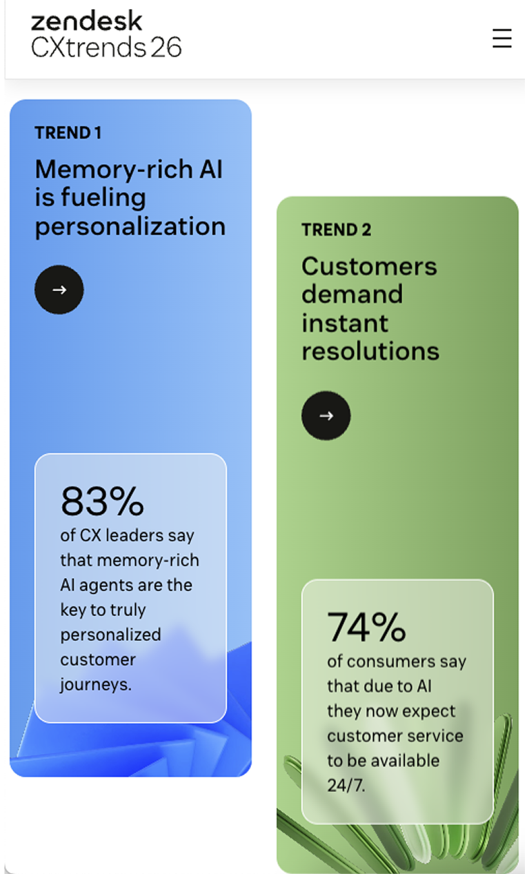
Color functioned as a structural system across the microsite. Each of the five CX Trends carried a distinct color from the hero through supporting sections, creating a visual language that guided recognition and navigation.
These cues improved cohesion across pages, devices, and languages, helping users track their place in the story.
How Color Supported the Experience
|
Global Readiness: Built to Perform

The microsite served as a global campaign hub for EMEA, North America, LATAM, and APAC. Language, localization, and regional relevance were essential.
Previous CX Trends sites suffered from hidden content and slow navigation.
This experience was designed for clarity and discoverability.
Nine core pages were translated into 15 languages. Regional events were surfaced appropriately, and legacy reports remained accessible for long-term value. Accessibility was built in across regions.
What Mattered Most
- Regional relevance across global campaigns
- Structured hierarchy to support SEO and discoverability
- Inclusive design balanced with performance
Development: Engineering for Scale
To deliver a global experience that worked reliably for every region, the microsite needed more than visual polish.
It had to perform across browsers, languages, and launch schedules.
This required solving technical challenges involving animation behavior, localization logic, data flow, and coordinated releases.
Every layer of the build supported scale, speed, and stability without sacrificing clarity or control.
Challenges Addressed
- Ensuring transparent video animation performed consistently across browsers
- Building a custom localization module based on user preferences
- Integrating Zendesk’s self‑hosted form via iframe while maintaining data control
- Coordinating launches across time zones using subfolder URLs
The microsite was built on Craft CMS multisite, enabling translation into 15 languages from a single platform while maintaining consistent design, compliance, and performance.
Bringing CX Leadership to Life
The CX Trends microsite was designed to showcase Zendesk’s leadership in AI-driven customer experience, automation, scalability, and omnichannel support.
The result was a platform that strengthened brand positioning, drove lead generation, and attracted media and analyst attention. For Zendesk’s Resolution Platform, it became a tool for lead quality, buyer education, and future campaigns.
What the Project Reinforced
- Experience design elevates strong content
- Interactivity should clarify, not complicate
- Focused scope enables outsized impact
The CX Trends microsite evolved into a long-term platform for insight, leadership, and growth, demonstrating how thoughtful design and storytelling can make complex content clear and meaningful.
Let’s build the experience your audience deserves, and the one your team can scale. Contact Us.
Related Posts