
 4 Min Read
When designing or redesigning a site, making decisions that improve site performance should be the number one goal. But with so many different choices to make and options at your disposal, it can be easy to forget the true purpose of your site. As a result, subtle things that can play a big role in your site’s success get overlooked. With this in mind, we’re here to provide these five key design tips that can improve your website’s performance.
1. Make Sure Your Site’s Style Is Consistent
Consistency is the key to any good design, but you’d be surprised just how many get this simple concept so wrong. First, be sure to select colors that compliment one another and then commit to those colors. Different pages may contain different features or layouts, but the style and colors used should be from a consistent palette. Same thing goes for your site’s typography. You’ll want to assign specific fonts and sizes to page titles, headers, subtitles, and main text. Once you make those decisions, it’s incredibly important to the look and feel of your site that titles appear uniform, headers appear uniform, etc. This will go a long way towards separating your website from that of your less detail-oriented competitor.
2. Design Your Navigation to Be User-Friendly
We are strong proponents of the belief that form follows function. When beginning the design or redesign process, you must first ask yourself what it is that you want users to do when on your site. Determining what an ideal session would look like to you should guide the finished layout of the site. With that motivation in mind, you should ensure that your site is created in a way that makes navigation intuitive and user-friendly. It should only take visitors a couple clicks at most to accomplish whatever it is that you want them to do. Less clutter and simpler menus encourage action on the part of these potential customers or clients. And never, ever underestimate the power of a good search box. Ideally, it should be featured prominently and easily located on just about every page.

(Source: colouredlines.com.au)
3. Make All the Text on Your Website Crawlable
Despite the amazing strides and innovations Google and the other search engines have made over the past decade or so, they still have their limitations. One of these is their inability to recognize text that is found in images. This is important to understand when designing your site and planning out how to incorporate text into your pages. Google, Bing, and the others perform crawls that allow them to read website text and determine the quality of each site. When your text is part of image, it isn’t picked up by the search engines which in turn causes the quality of your site to needlessly suffer. So, to encourage better search engine results, appear higher in the rankings, and boost your visibility to potential visitors, be sure to make all of your text separate from your images.
4. Consider Both the Size and Number of Images You Use
In addition to separating your text from images, the type of images you select for your site is important to consider as well. Understand that every picture, video, or audio clip you add to your site adds weight to your pages. Too much weight on a page and your site speed begins to drop significantly. This is a big deal when it comes to your website’s performance because slower sites get penalized in the search rankings. Keep this in mind when selecting the number of images and the type of images you plan to use. Fewer images mean shorter load times. And larger images mean longer load times, so incorporate these sparingly. Few things turn visitors off more than having to wait as images load on a page.
(Source: developers.google.com)
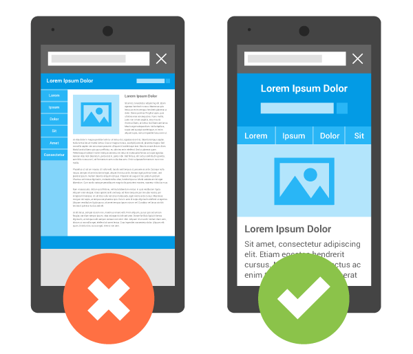
5. Check the Quality of Your Site on Mobile and Different Browsers
The value of mobile-friendly design cannot be stressed enough. Even if you consider your site’s design “complete”, it is quite possible that you have overlooked an important review process that ensures you are reaching the widest audience possible. You’d be surprised by just how many people fail to make sure that their website displays properly on mobile. Given that mobile users now outnumber desktop users, your site needs to look phenomenal on every platform. And if your site doesn’t currently look great on a smartphone, you need to correct that yesterday. In addition to checking the appearance and functionality of your site on mobile, you need to review it across multiple browsers as well. We encourage clients to look for issues on Chrome, Safari, Internet Explorer, and Firefox just to make sure there aren’t any browser specific problems present on the site. This occurs more often than you might think and can easily be overlooked, so schedule time for browser testing if you think it might have been missed for your site.
Designing a website that accurately represents your brand can be a truly fun process, but it’s important to make sure you dot your i’s and cross your t’s to ensure you’re getting the most out of it. By following these tips, you can make sure that your site is both beautiful and user-friendly.
Related Posts


