
Great Examples of Automation Website Design
The Top 12 Examples of Automation Website Design
Designing a high-performing website for an industrial automation or engineering firm is harder than it looks. Many struggle with poor UX, clunky navigation, and weak lead capture, treating the website like a static brochure instead of a growth engine.
A modern automation website has to do more. It must present complex solutions clearly, guide different audiences to what they need, and convert visitors into leads.
This roundup features 12 examples of automation website design, including four built by our team at DBS Interactive, that show how leading companies use their sites as strategic growth platforms. We also highlight key themes and best practices, providing practical tips that you can apply.
Automation Website Examples
We start with a few examples from our own portfolio. These four automation and industrial websites, designed and developed by DBS Interactive, solve common challenges in distinct ways. Each balances technical depth with user-friendly design, built for performance, scalability, and lead generation.
Bottom line: An automation firm’s website should be more than a brochure. It must serve as a living platform that evolves alongside the business.
1. Methods Machine Tools – Streamlined Product Navigation and Segmentation
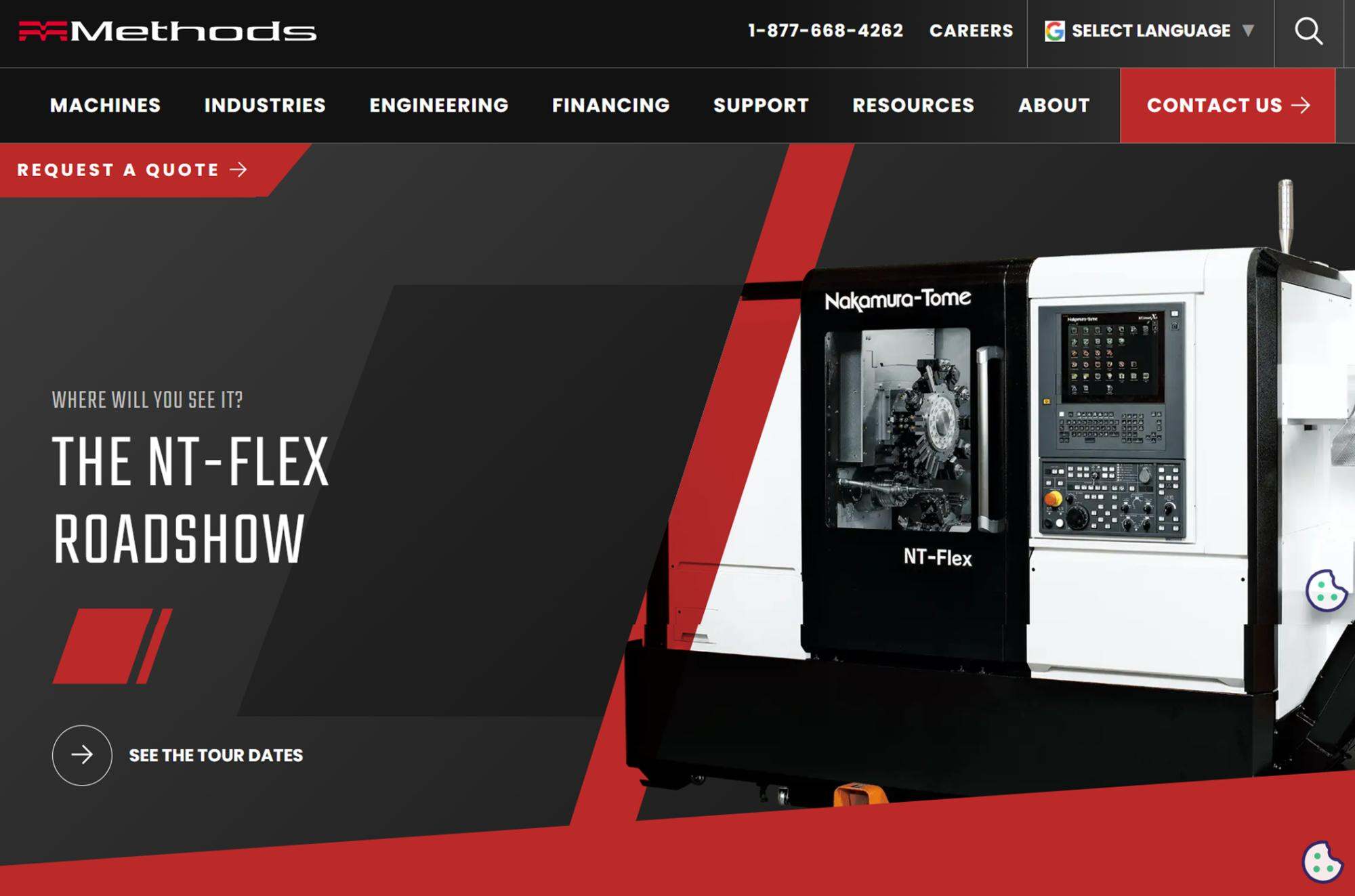
Methods Machine Tools is a global importer of CNC machining and automation equipment. Their site needed to organize a wide range of products and services for diverse industries.
Standout Feature
The website’s intuitive navigation makes it easy for different users to find what they need.
The main menu cleanly separates content by product type, brand, and industry, avoiding overwhelming mega-menus and endless flyouts. For example, visitors can browse CNC machines by category or filter by industry in just one or two clicks.
This clear structure guides engineers and procurement folks down relevant paths without confusion. The homepage highlights key segments with simple icons and snippets, so users immediately see where to go next. On-page callouts and links, such as Ready to Ship inventories or the ROI Calculator, further support quick and intuitive user pathways.
By simplifying a complex catalog into logical categories, the site provides a seamless user experience for a technical audience. Visitors aren’t buried under dozens of options. Instead, they get focused choices and clear labels. This keeps the user journey frictionless and ensures potential customers find relevant content with minimal effort. It effectively demonstrates how a large industrial website can remain detailed and user-friendly.
See our Methods Machine Tools case study for details.
2. PMi2 – High-Performance Design Built for Scalability
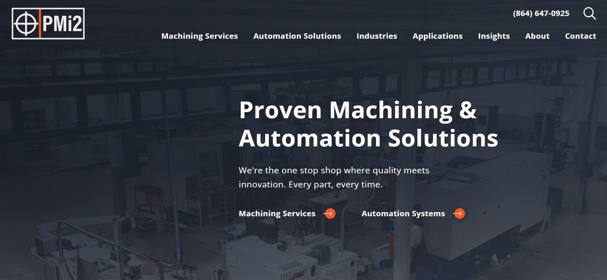
PMi2 is a precision machining and automation firm serving automotive, defense, and other industries. They needed a site that could grow with their business and showcase technical expertise.
Standout Feature
The PMi2 site combines technical performance with user-focused content.
It was built on a flexible Statamic CMS, allowing new services, industries, or case studies to be added easily as the business grows. The design is streamlined and focused, with navigation trimmed to just a handful of top-level options, allowing engineers and executives alike to find what they need quickly.
High-quality imagery of machinery and automation systems, along with clean icons and concise text, give the site a polished, credible feel without overwhelming users. Technical specs and success stories are just one click away, meeting the needs of detail-oriented decision-makers who prefer to scan and move on.
Under the hood, the site is built for speed. It launched with perfect 100/100 scores in Performance, Best Practices, and SEO on Google Lighthouse. It’s fast, accessible, and optimized for search from the start.
PMi2’s site proves that industrial websites can be attractive and high-performing. Users get the information they need without slow load times or clutter. The site's scalability means it’s future-ready and able to expand as the company grows.
See our PMi2 portfolio page for more.
3. EOSYS – Intuitive, Industry-Ready Navigation for Complex Services
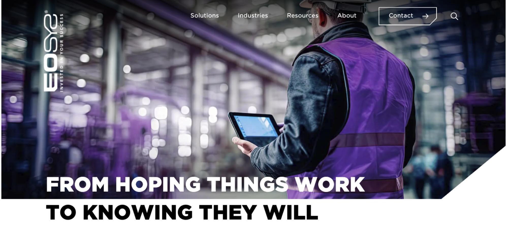
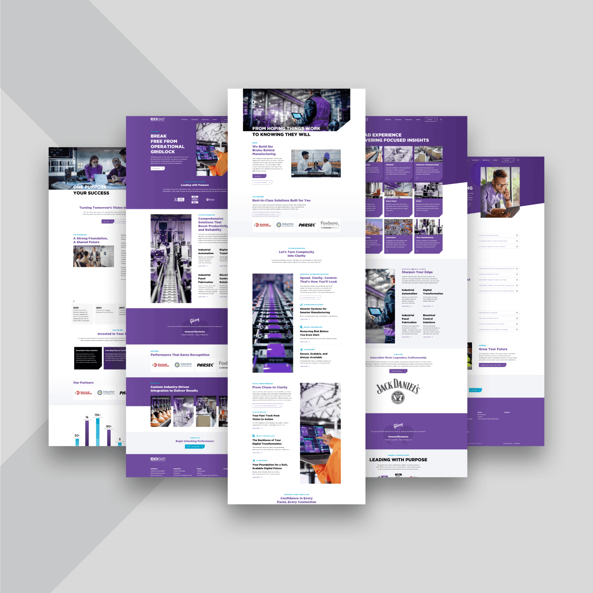
EOSYS is an industrial system integrator providing automation and digital transformation solutions across multiple manufacturing sectors. The website delivers a range of services and industry-specific expertise in a cohesive way, without overwhelming different types of visitors.
Standout Feature
EOSYS excels at guiding users through complex offerings with clear, user‑centric navigation and trust‑building content.
EOSYS’s site offers clear, user-centric pathways for anyone to find what they need. The main navigation is smartly divided into “Solutions” and “Industries”. This dual structure means an operations manager can browse by industry to see relevant capabilities and case studies, while an engineer can get straight into a solution area like OT Networks or Control Systems. Even on the homepage, EOSYS highlights key industries with brief descriptions and imagery, alongside core service categories with quick summaries.
The site also builds credibility at every turn. EOSYS prominently showcases its partnerships and certifications. Scrolling further, visitors find client success stories and a testimonial from a well-known manufacturer, which adds real-world proof of performance. A dedicated Resources section offers blog insights, case studies, and videos. Throughout the site, calls-to-action like “Let’s Talk” or “Get a Quote” are easy to spot.
EOSYS’s website demonstrates how a complex B2B company can make its content accessible and trustworthy. By combining intuitive navigation with broad offerings, strategic trust signals, and in-depth content, the site guides users through a wealth of information without friction. It’s a strong example of transforming a potentially overwhelming range of services into an inviting and confidence-inspiring user journey.
Check back soon for our EOSYS portfolio page.
4. Koma Precision – Clear Dual Audience Focus and Hero Messaging
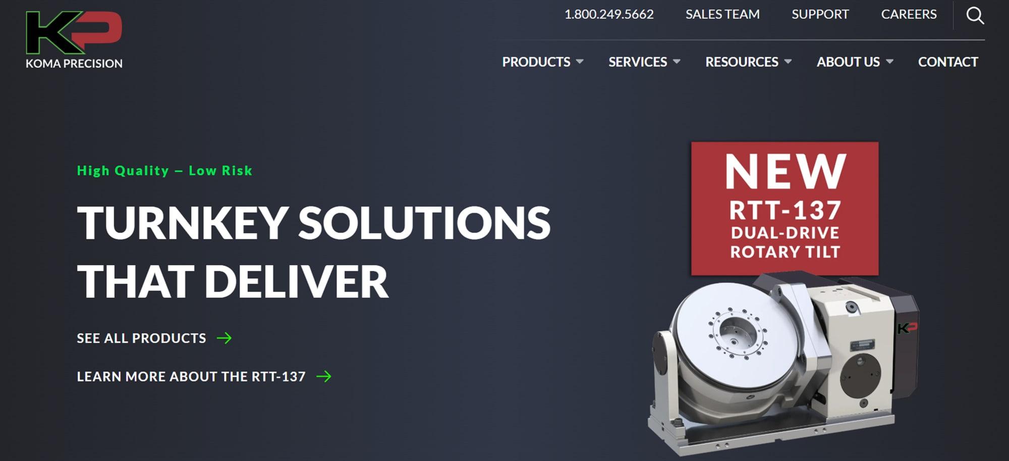
Koma Precision supplies CNC rotary tables, machine tool accessories, and automation solutions across North America. Their website serves two primary audiences: technical users and business stakeholders.
Standout Feature
Koma’s site demonstrates clear positioning through dual audience pathways.
Right from the hero section, the messaging is crystal clear: “High Quality – Low Risk. Turnkey Solutions That Deliver.” This tagline addresses decision-makers by focusing on risk and ROI, while imagery of precision equipment appeals to engineers who prioritize quality.
The homepage immediately offers two routes: “See All Products” for those who want to dive into technical product catalogs, and “Learn More about Solutions” for those interested in integration services or turnkey systems.
Navigation lets product-focused visitors drill down by category, while those seeking services or support find dedicated sections for Applications, Integration, and Support. Koma also humanizes the experience by providing quick access to sales and support contacts, recognizing that B2B buyers often need personal assistance while researching online. Throughout the site, credibility is reinforced through concise and impactful statements.
Koma’s website demonstrates how to address multiple audiences on a single platform without confusion. Its clear value proposition and well-structured navigation ensure engineers and procurement leaders find what they need quickly. The site feels trustworthy, performs reliably, and is responsive across devices.
View the Koma Precision project for more insight.
5. Vention – Interactive 3D Configurator Platform
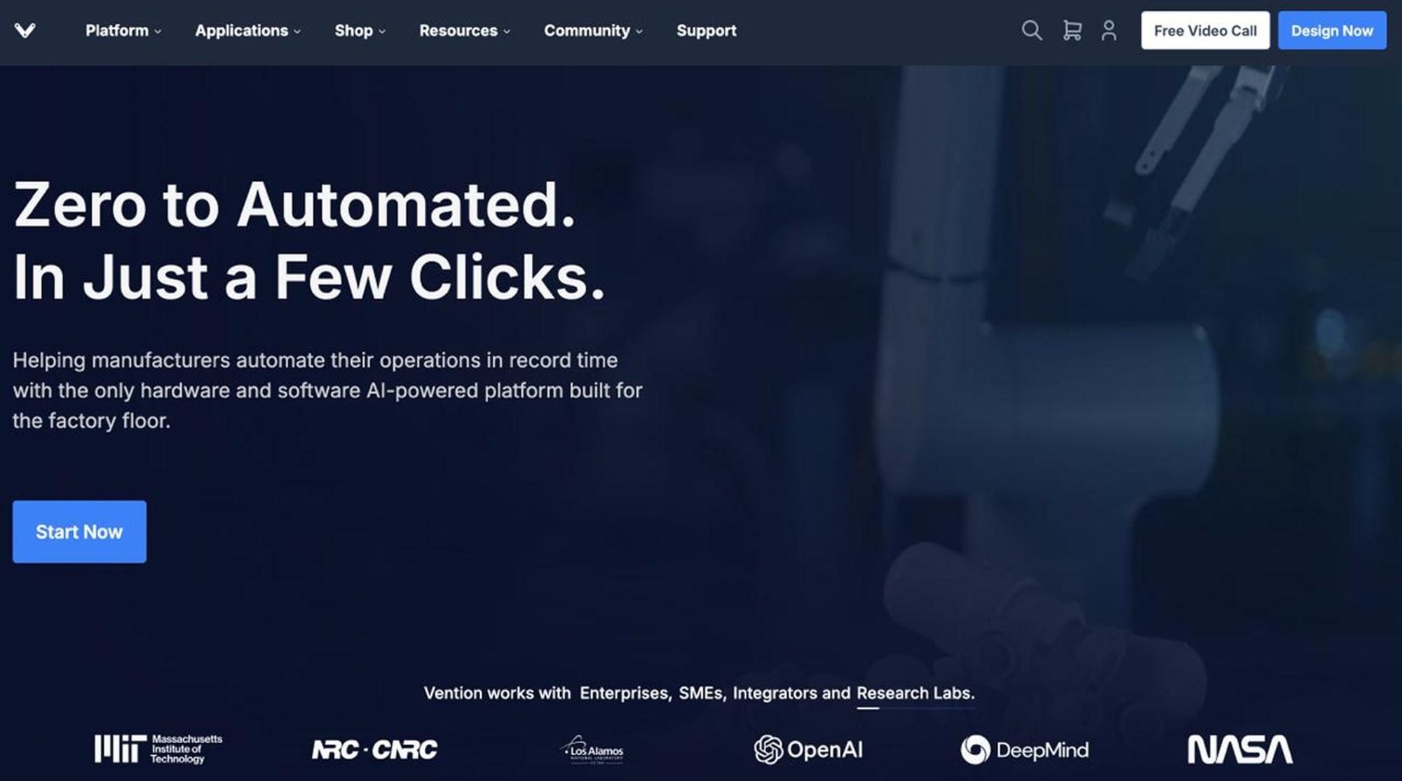
Vention is a Canadian industrial automation company offering a cloud-based manufacturing platform. They serve engineers who design factory equipment through a self-serve CAD and modular hardware system.
Standout Feature
Interactive product visualization and configurator.
Vention’s website stands out for its hands-on design tools, which are directly integrated into the browser. The site features a web-based 3D MachineBuilder that lets users drag and drop components to design their own automation equipment virtually. This dynamic visualizer isn’t a gimmick. It’s central to Vention’s value proposition of “manufacturing automation, simplified.”
The homepage immediately invites visitors to start designing or explore pre-made machine concepts. This interactivity keeps engineers engaged, letting them tinker with solutions in real time. It also shortens the sales cycle. Potential customers experience Vention’s capabilities first-hand, as the tool generates a bill of materials and pricing.
The rest of the site reinforces this with clear calls to action, such as ‘Design Now’ and ‘Start Building’, along with tutorials and customer stories. Fast-loading pages and a modern, minimalist design ensure that even with heavy functionality, the site remains user-friendly.
6. Control4 – Engaging Video Demos for Home Automation
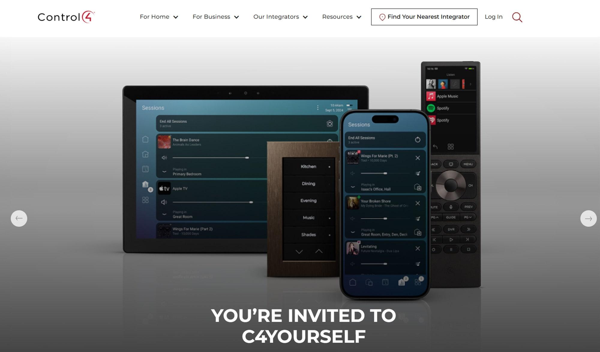
Control4 is a U.S. provider of smart home automation systems that integrate lighting, security, and entertainment into one platform for homeowners.
Standout Feature
Scenario-based demo videos and visuals that simplify complex solutions.
Home automation can be abstract to explain. Control4’s site effectively addresses this challenge by utilizing short videos and animated walkthroughs to demonstrate real-life scenarios. For example, on their homepage and solutions pages, you’ll find clips demonstrating “morning routine” automations or home security scenes. This helps users instantly grasp what a Control4 system can do.
Instead of reading bullet points about features, you see them in action. The living room’s lights dim, and the shades go down as a movie begins. It’s a much more impactful way to communicate value.
The site’s design is sleek and lifestyle-oriented, appealing to the emotional aspect of home automation. Navigation remains simple with clear sections for Solutions, Products, and Find a Dealer, allowing you to move easily between options. By telling stories through video, Control4 makes complex technology easy to understand and genuinely desirable.
7. ATS Automation – Bold Industry Segmentation on Homepage
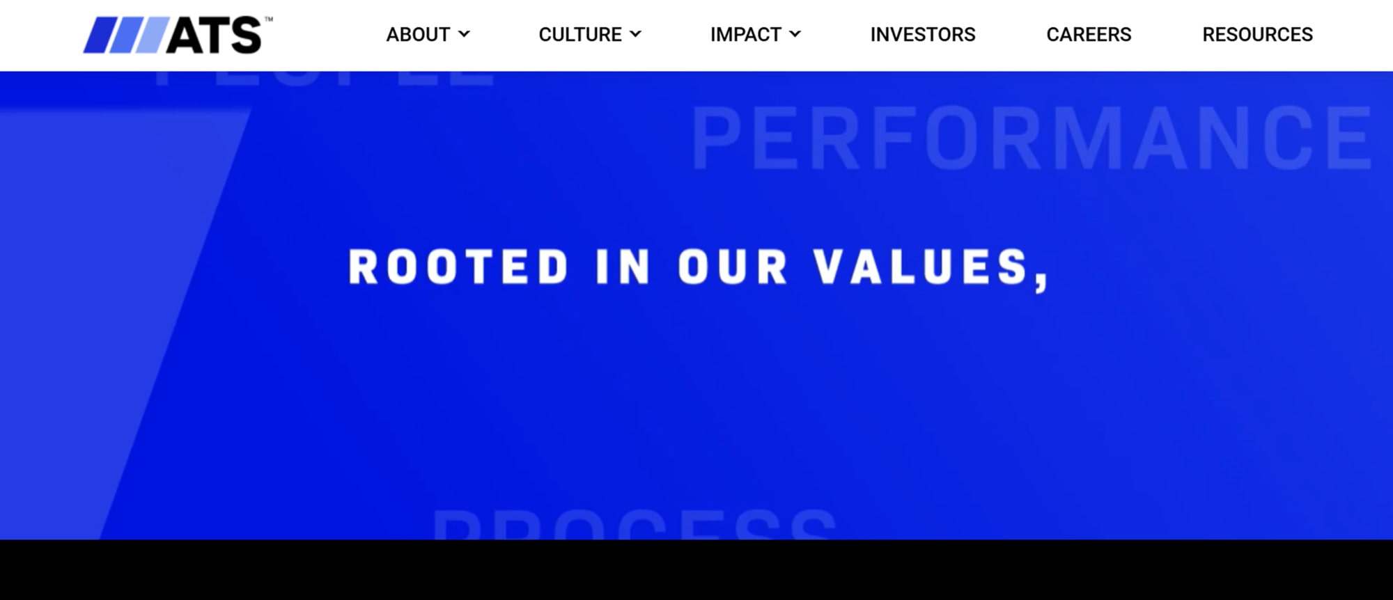
ATS Corporation offers industrial automation and engineering solutions globally, serving diverse sectors ranging from life sciences to automotive and energy.
Standout Feature
Bold hero messaging with clear industry segmentation.
ATS greets visitors with a powerful hero banner that immediately communicates scale and focus, using large text, such as “Industrial Automation for Life Sciences” or “Automation in EV Manufacturing,” paired with striking imagery. The homepage features a rotating series of industry-specific hero slides, each with a relevant message and CTA. This approach quickly funnels users into the section most relevant to their industry.
Beneath the hero, ATS showcases visually engaging case study highlights and stats that build credibility. The navigation also reflects segmentation. Under “Solutions” or “Industries,” you can jump straight into tailored content for, say, pharma automation versus automotive automation. The bold, high-contrast design conveys confidence and technical prowess.
The clarity in saying who they serve and how on the homepage is a lesson for any B2B site. Speak directly to your key markets.
8. FANUC – Minimalist Design for a Technical Audience
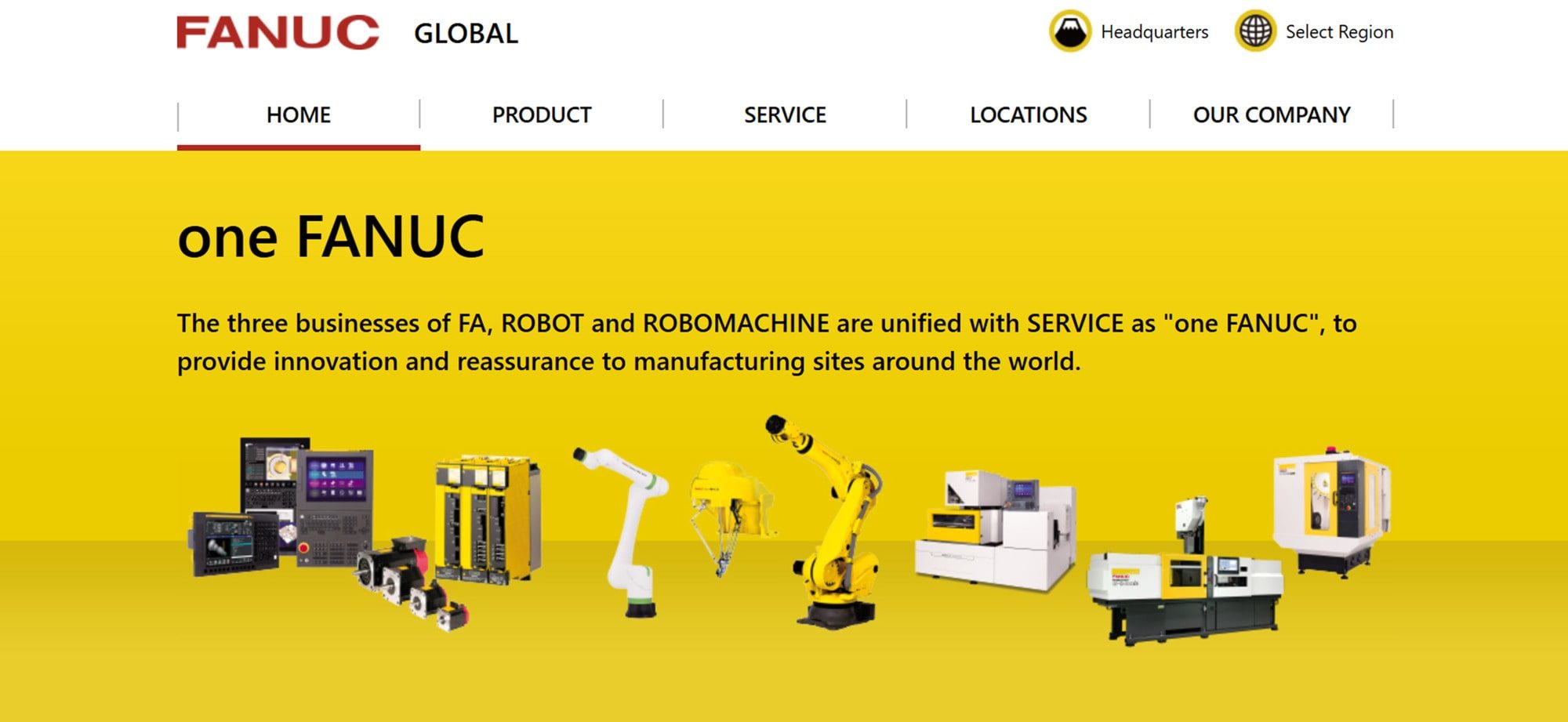
FANUC is a Japanese robotics and CNC systems manufacturer, known worldwide in factory automation. The site serves engineers seeking specific product details as well as investors and general visitors.
Standout Feature
Clean, minimalist grid layout with fast load times.
FANUC’s website takes a no-frills, information-first approach that fits its audience. The design is simple, featuring ample white space, a clean grid of product categories on the homepage, and crisp, sans-serif text. It might not look flashy, but it performs beautifully for quick navigation and speed.
Pages load fast, and the straightforward layout means nothing distracts from the content. In the “Robots” section, for example, you see a grid of robot model images. Clicking one opens a spec-sheet page with full technical details. Animations and media are kept to a minimum, helping pages stay lean and fast.
Typography and icons are used sparingly but effectively to guide the eye. This deliberate design choice suits technical users who value function over form. Even the color scheme aligns with the brand for a cohesive look. FANUC’s site proves that sometimes simplicity can be the most sophisticated choice.
9. HighRes Biosolutions – Storytelling with Subtle Animations
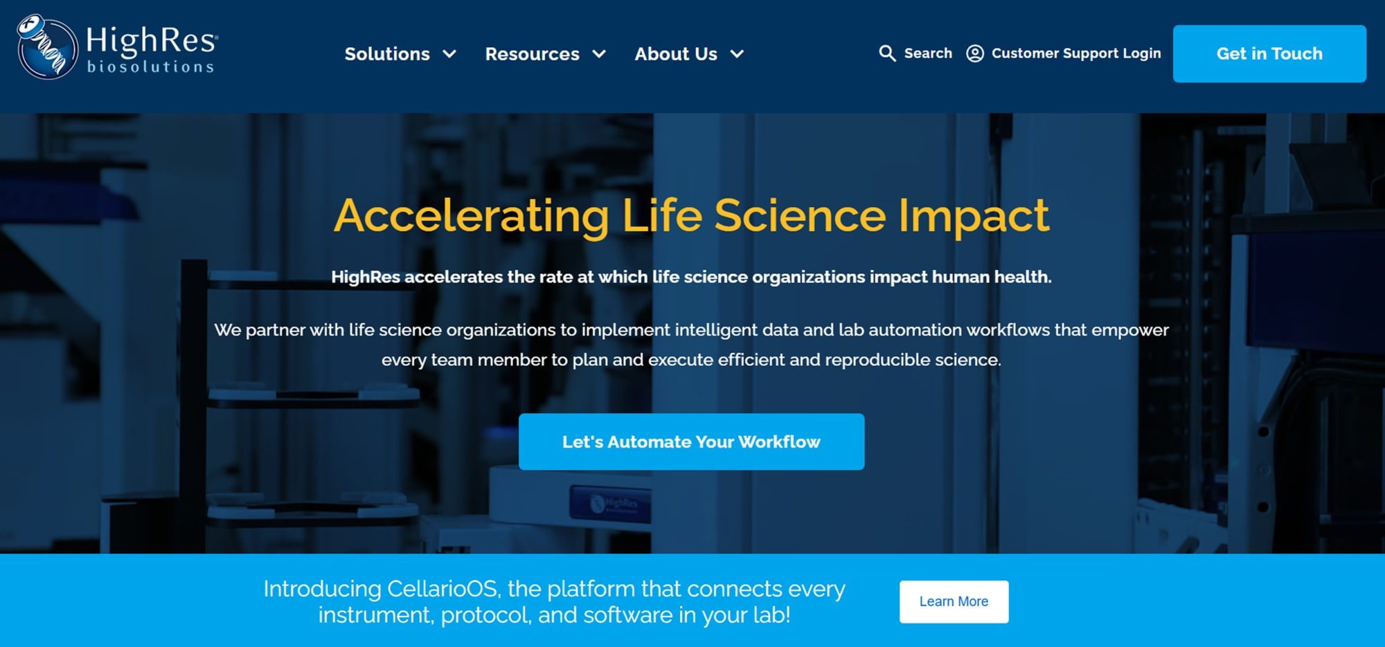
HighRes Biosolutions develops laboratory automation platforms, including robotic systems, for pharmaceutical and biotechnological laboratories. Their solutions are complex, so education is a big part of their marketing.
Standout Feature
Dynamic storytelling through animations and video loops.
HighRes utilizes subtle motion design to guide visitors through the functionality of their lab automation. As you scroll the homepage, elements slide in or short video loops play, for instance, a robotic arm arranging lab plates appears next to text explaining the workflow. These animated touches make the content more engaging and help explain concepts static images can’t.
The visual hierarchy is excellent. Big headlines like “Automation, Meet Flexibility” grab attention, followed by short paragraphs and calls to action like “See Our Platforms in Action.” Despite the rich content, the design stays clean and loads efficiently. This example shows how storytelling and animation can clarify complex value propositions while keeping users scrolling and learning.
10. South Shore Controls – Humanized B2B Design with Strong CTAs
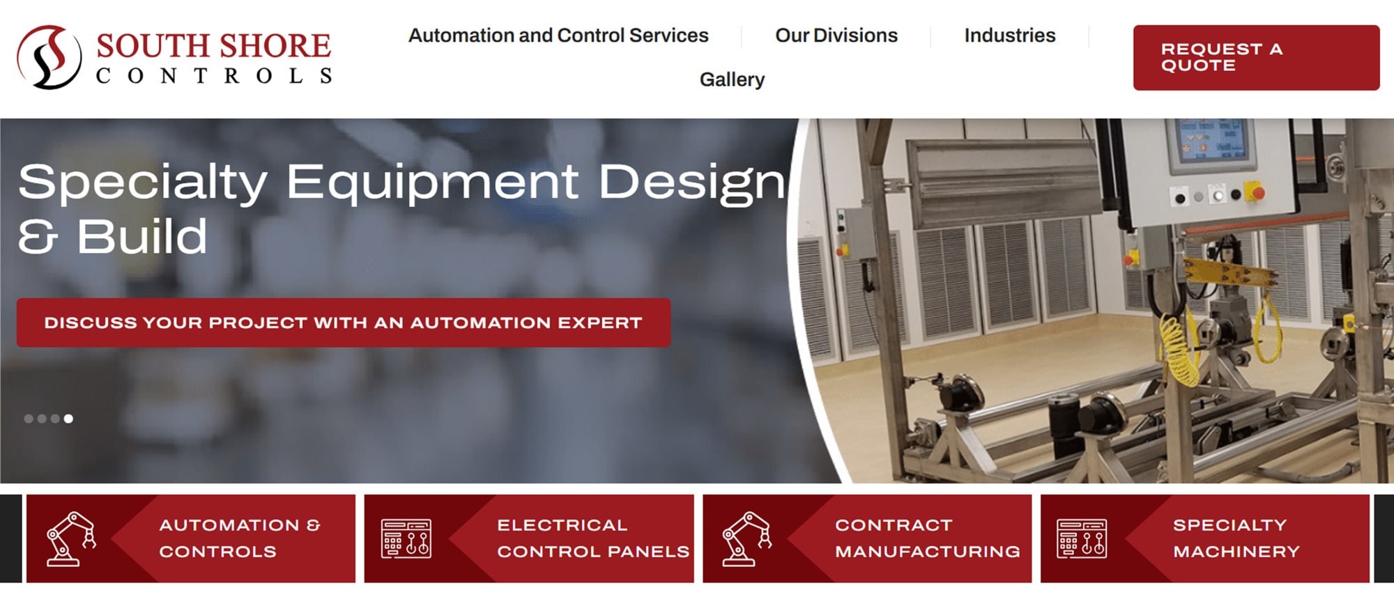
South Shore Controls is a regional industrial automation integrator based in Ohio, offering control panels, robotics integration, and custom equipment builds. They may not be a household name, but their site punches above its weight.
Standout Feature
A humanized, approachable design tone with clear conversion points.
Unlike many industrial sites that feel sterile, South Shore’s website puts people and personality front and center. The homepage features photos of their actual team and facilities, immediately building trust. The copy speaks in a friendly, straightforward manner about solutions, rather than just technical specifications. The service verticals are explained briefly, allowing any plant manager to grasp them easily.
Throughout the site, the calls to action are prominent. Nearly every page features a “Request a Quote” or “Talk to an Engineer” button in plain view. These CTAs use a contrasting color so they pop. Customer testimonials and project briefs add credibility.
The overall impression is of an approachable expert, knowledgeable and easy to work with. It’s a smart design move in a B2B space that can often seem impersonal. The naturally placed CTAs make reaching out dead simple.
11. Rockwell Automation – Enterprise-Grade Navigation and Resources
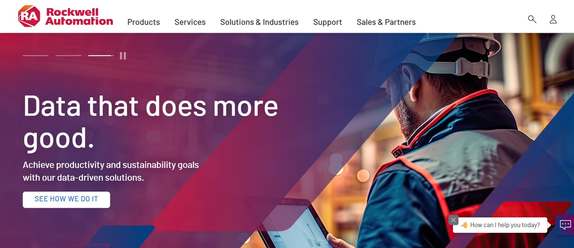
Rockwell Automation is one of the global leaders in industrial automation and information solutions. As a large enterprise, Rockwell’s website is vast, covering products, services, training, investor information, and more.
Standout Feature
Robust mega-menu navigation and resource hubs for a complex ecosystem.
Rockwell’s site showcases how to handle large-scale content in an organized way. The main navigation is a mega-menu that, when hovered, displays columns of options grouped logically. For example, under Products, you’ll see drives, controllers, and sensing devices, each with sub-links. It’s a textbook example of an effective enterprise UX pattern. Everything is accessible within two clicks despite the huge range of offerings.
The site also features consistent global elements, such as a site-wide search bar, which is helpful for technical users who know exactly what part number or topic they need, and a language selector for its worldwide audience. Rockwell also builds dedicated resource hubs. One is a library where users can find documentation, software downloads, or case studies filtered by industry.
The key is consistency. No matter where you navigate, the header and footer provide orientation and clear paths to jump elsewhere. The design remains clean and corporate, utilizing white backgrounds and Rockwell’s signature red accents to ensure readability.
12. Festo – Global Site with Modular Product Filtering
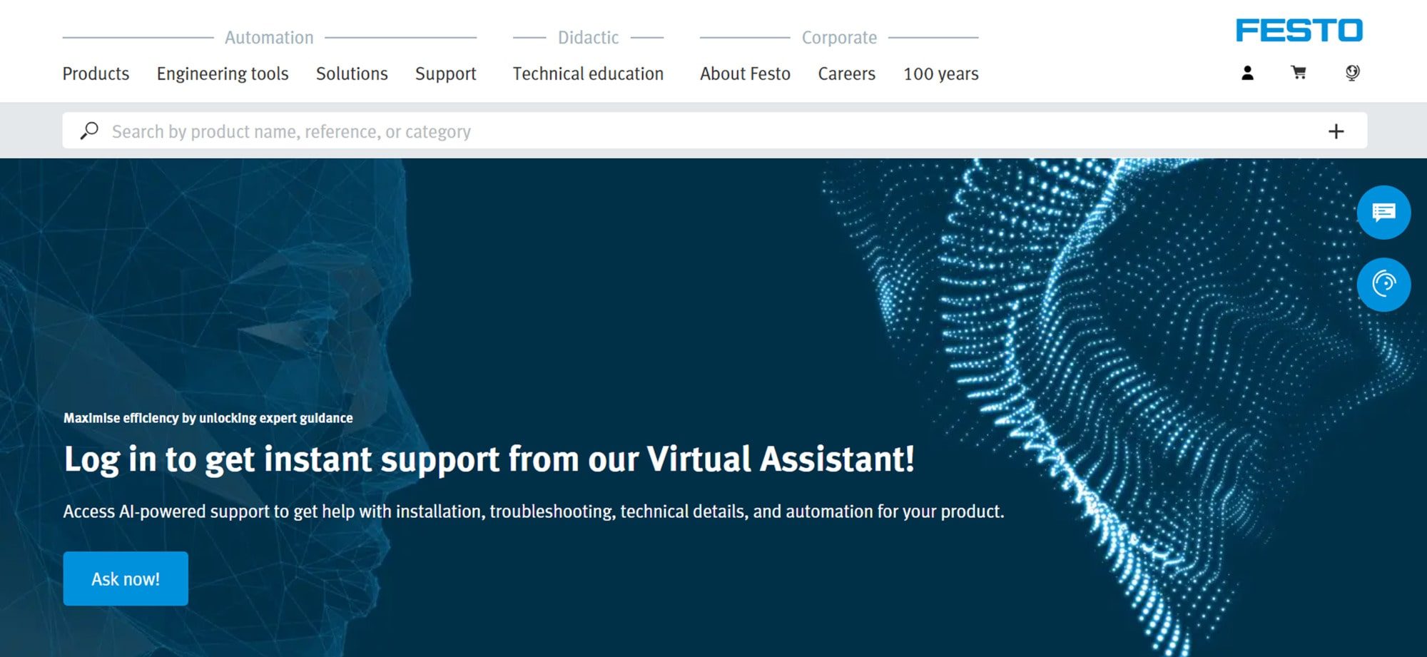
Festo is a German multinational company known for its pneumatic and electrical automation products, ranging from actuators and valves to didactic training equipment. Its site serves both industrial customers and educational users across many countries.
Standout Feature
Global-friendly design with structured product filtering and rich visuals.
Festo’s website tackles the challenge of a vast product catalog and multilingual user base with a smart, structured approach. The site is divided into sections for each country or language, but all share a consistent template. On the product pages, robust filtering and search tools let users narrow results by product type, specifications, or industry application. The interface is intuitive, featuring checkboxes and sliders that update results instantly without requiring page reloads.
Once you’re on a specific product page, the layout presents everything you need - description, specs, downloads, and even animated diagrams or videos showing the product in action. These visuals help users quickly grasp complex engineering concepts. The design strikes a balance between technical detail and clean aesthetics, utilizing Festo’s signature blue and white branding.
There’s also a clear split between Industrial Automation and Didactic/Training, so each audience segment finds relevant content. The modular design enables simple global updates. New product lines can be added across all language sites in a structured way. For international companies, Festo effectively demonstrates how to maintain a large, diverse site that remains coherent and user-centric.
Key Lessons and Patterns from These Examples
After reviewing all 12 sites, several themes and design principles stand out. Regardless of the size of your automation business, these takeaways can enhance your website’s performance and impact.
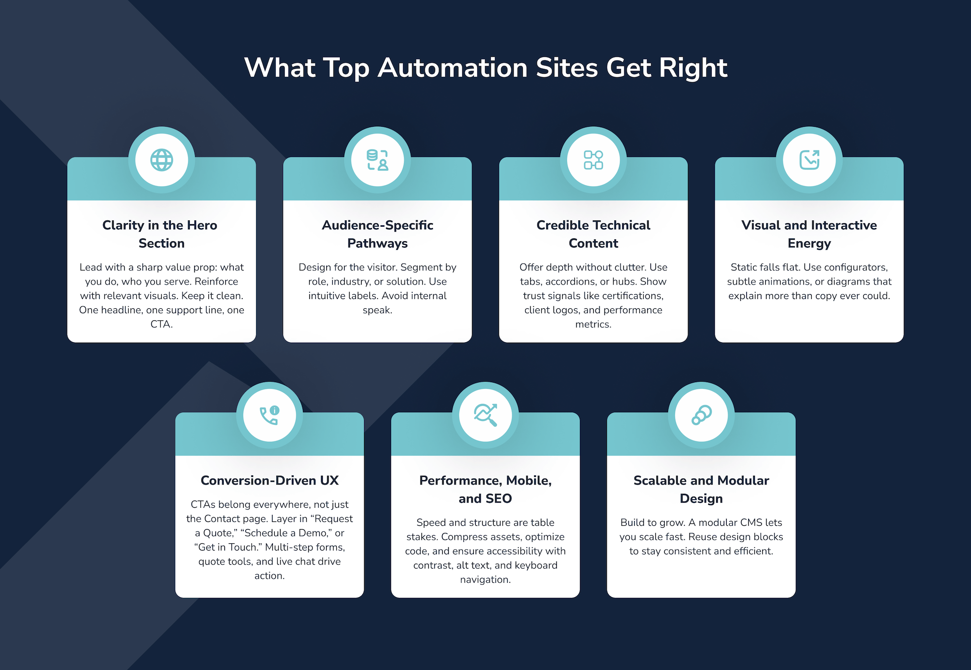
Best Practices for Designing Automation and Industrial Websites
A high-performing industrial site is more than a digital brochure. It’s a lead engine, a trust-builder, and a technical resource. Whether you're launching from scratch or refreshing an existing platform, these foundational elements consistently define what works
Discovery and Strategy
Start by understanding your audience and goals. Talk to stakeholders and customers. Identify what each user persona needs from the site. Audit competitor sites to spot opportunities and gaps. What can you do better or differently? This groundwork informs every design decision.
Information Architecture
Structure your site map logically. Group content by service type, product category, industry, or user type, whichever makes the most sense for your offerings. Keep the menu hierarchy shallow where possible. Use clear, descriptive menu labels to guide visitors and plan how they’ll flow between key pages.
UX/UI Design
Use visuals and clear design to communicate complex ideas. Diagrams, icons, and photos should complement the text. Maintain a consistent design system with brand colors, readable typography, and repeatable layout patterns. Design mobile-first, then scale up. Balance white space and content so each page encourages scrolling without fatigue.
Technical Infrastructure and CMS
Choose a technology stack that supports flexibility . Many industrial sites benefit from CMS platforms that let marketing update content easily. Optimize performance by compressing images, minifying code, and enabling browser caching. Apply SEO fundamentals: standout meta titles, structured headings (H1, H2, H3), and clean URLs. Don’t forget security and integrate analytics early to track user behavior.
Conversion and Lead Gen Strategy
Design with conversion in mind. Embed CTAs throughout the site, not just in the navigation. After you describe a service, include a “Get a Quote” button. Use downloadable resources as lead magnets, such as a white paper on “Improving OEE with Automation.” Multi-step forms improve completion rates. Add live chat or chatbots on key pages for quick responses.
Content Marketing and SEO Alignment
A website launch isn’t “set it and forget it.” Tie it into ongoing marketing. Plan a blog or news calendar that addresses industry pain points. Cross-link your content, for example, link a post on automation trends to your service pages. Internal linking boosts SEO and keeps users on your site longer. Keep content fresh with updated case studies, project galleries, and testimonials.
Post-Launch Optimization
Once your new site is live, continue to improve it. Use analytics to see how users behave, where they drop off, and what queries bring them in. This data guides iterative improvements. You might run A/B tests on essential pages. Also, schedule periodic reviews of site content. An outdated reference or missing product information can damage credibility, so keep everything up to date. On the technical side, monitor page speed and proactively address any issues.
Next Steps
In this roundup, we’ve looked at 12 notable automation websites and the elements that make them effective. From clean navigation and targeted messaging to interactive configurators and fast performance, the patterns are consistent. An automation firm’s website succeeds when it’s built around user needs and business goals.
As you plan your own web design or redesign, keep these examples as reference. Notice the recurring themes of clarity, interactivity, credibility, and conversion focus, and consider how your site measures up in each area.
An effective site is never just a “pretty face.” It needs the structure, content strategy, and technical optimization working together to drive results. If your current site isn’t delivering the traffic, conversions, or rankings you expect, it may be time for a professional audit.
DBS Interactive builds high-performance websites for industrial and automation companies, combining design, content, and SEO to deliver measurable results. Explore our industrial website design and industrial SEO services to see our approach, or read our study “Speed Matters: Automation Engineering Websites Lag in Vital Performance Test” for insight on why site speed impacts conversions.
Ready to see how your site measures up?
FAQs
Look for a team with deep experience in industrial and technical sectors, not just general web design. Ask for examples of automation or manufacturing sites they’ve built. Prioritize agencies that understand buyer journeys, lead generation strategy, and SEO for complex B2B offerings. If they offer audits or performance benchmarks upfront, that’s a sign they’re thinking beyond visuals.
Treating the site like a static brochure. A high-performing automation website should be a dynamic platform that evolves with your business, supports lead generation, and guides multiple audiences to the right content. Skipping strategy and jumping straight to design often leads to missed opportunities.
Segment by role or intent using personas. Use collapsible sections, tabs, or layered navigation to present deep specs without overwhelming casual visitors. Pair technical data with visuals, summaries, and clear calls-to-action. The goal is to let engineers dive deep while giving decision-makers a fast path to value.
Start with bounce rate, conversion rate, time on page, and form completion rates. Layer in SEO metrics like keyword rankings and organic traffic growth. Use heatmaps or session recordings to understand how users navigate. If engagement or conversions are low, it’s time to optimize.
Choose a CMS that balances flexibility with performance. Statamic, WordPress with custom blocks, or Craft CMS work well. The key is modular content control, so your team can update pages, add case studies, or launch campaigns without developer bottlenecks.
Review their navigation structure, messaging clarity, load speed, and lead capture tactics. Note how they segment content by audience or industry. Identify gaps like missing CTAs, slow loading, or an unclear value proposition.
Messaging sets the tone, builds trust, and drives action. Your hero section should clearly state what you do, who you serve, and why it matters. Avoid jargon. Speak to pain points and outcomes. Strong messaging guides users and supports SEO.
Even technical buyers browse on mobile, especially during travel or field work. A mobile-first design ensures fast load times, intuitive navigation, and readable content. It also boosts SEO and accessibility. Don’t assume your audience is desktop-only.
Build with scalability in mind. Use modular design systems, flexible CMS architecture, and templates that support new product lines or regions. Plan for multilingual support if global expansion is likely. A future-proof site adapts without needing a full rebuild.

