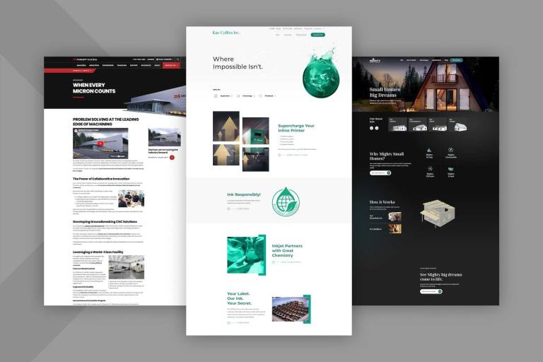
The Best Examples of Websites Designed for Distributors, Dealers, and End Users
For B2B businesses, a website is the virtual gateway to their brand and a primary touchpoint for potential customers and partners. A well-crafted website showcases a manufacturer's products and capabilities while communicating its brand identity, values, and commitment to excellence.
A strong online presence through a well-developed website enables manufacturers to tap into expanding online markets. With global retail e-commerce sales soaring to an estimated 5.8 trillion U.S. dollars in 2023, and projected to grow by 39%, surpassing eight trillion dollars by 2027, the opportunity for manufacturers to capture this market is immense.
B2B distributors can borrow a page from their already successful B2C counterparts, many of whom have mastered the art of excellent e-commerce website design.
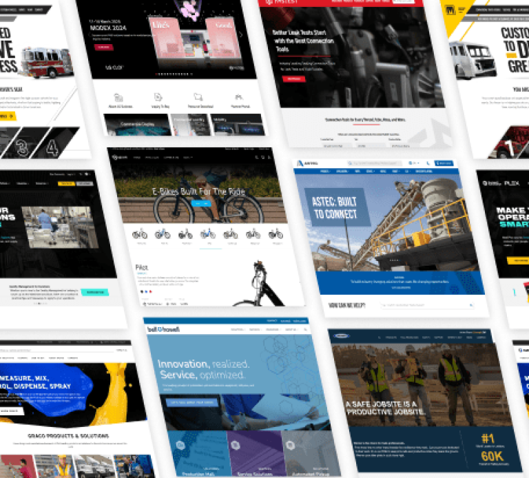
10 Websites that Support Distributors, Dealers, and End Users
To understand what B2B distributor websites with e-commerce need to be successful, let’s analyze some examples of the best websites for B2B distributors and examine the specific characteristics that make them great examples of web design best practices.
Retailers visiting B2B websites expect optimal experiences. They look for easy site navigation and a frictionless checkout process. They favor intuitive user interfaces that facilitate effortless product discovery. Additionally, retailers factor in the accessibility and responsiveness of a distributor’s e-commerce platform. An effective B2B distributor platform offers comprehensive product information, transparent pricing structures, and real-time inventory visibility.
Graco | Accessible and Uncomplicated
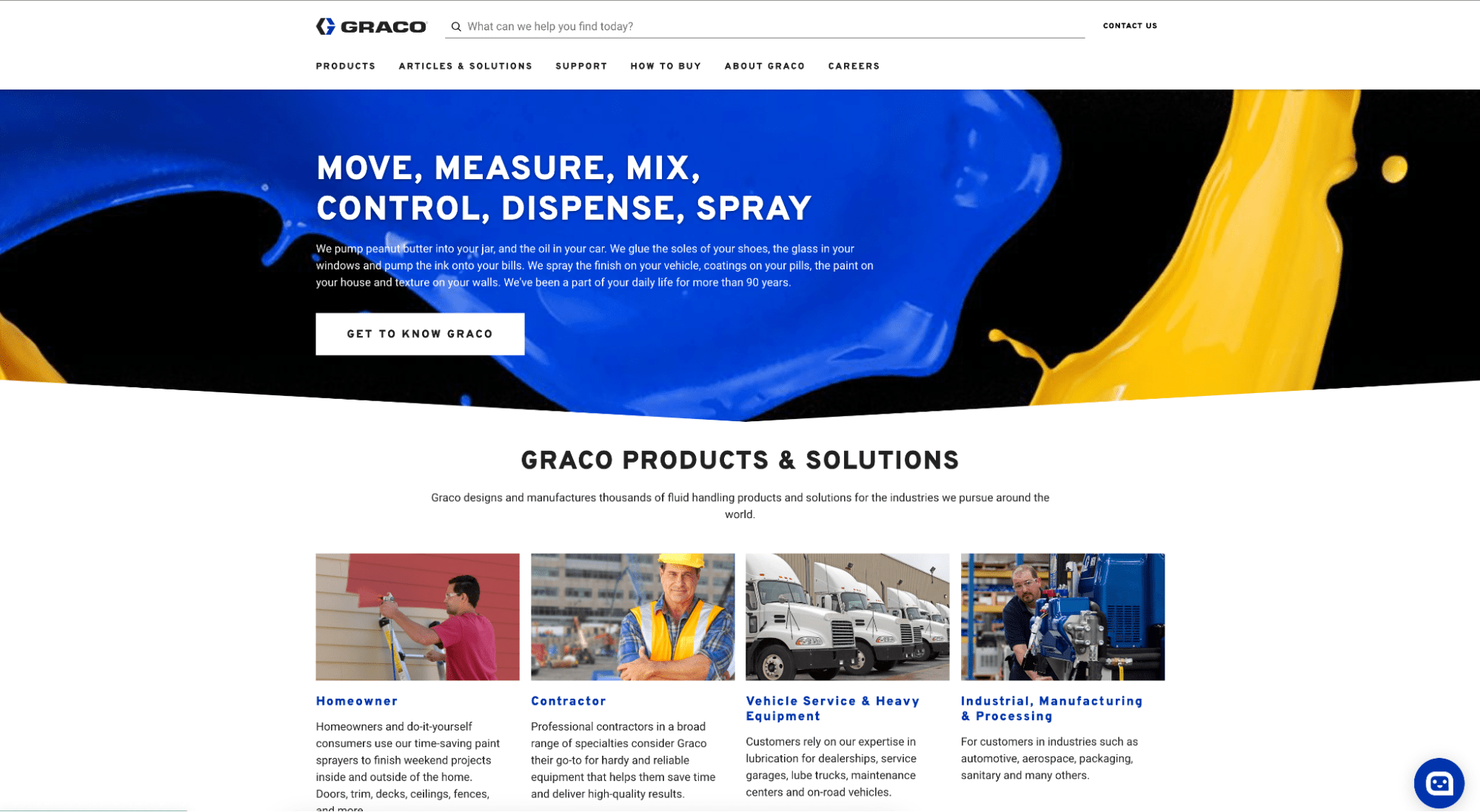
The Graco website offers entry points for various audiences.
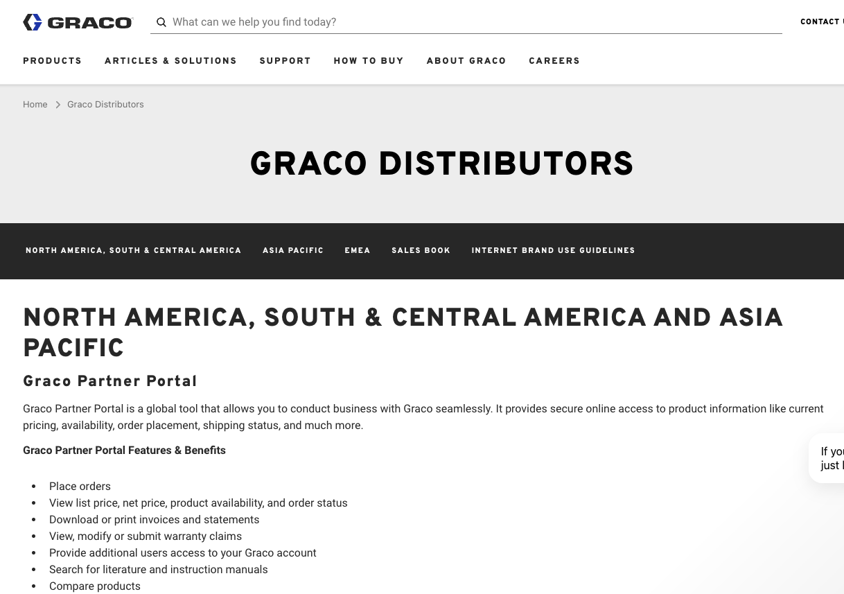
The landing page for the Graco distributor portal lists the features and benefits of the site.
Graco is built for accessibility. The website is designed and developed to ensure all users, including those with disabilities, can perceive, navigate, interact with, and understand its content effectively.
The website uses appropriate font sizes that accommodate even those with visual challenges. The search bar makes accessibility even better with the friendly phrasing: “What can we help you find today?”
With the search bar, visitors do not have to scroll through unnecessary pages. Typing a word could just get them to their destination.
Retailers’ experience is made even better through the distributor portal. Graco's Distributor Portal is a global powerhouse for B2B interactions. It offers a secure online gateway for distributors to conduct business effortlessly. The portal allows distributors to place orders, access real-time pricing and product availability information, and track orders.
The portal empowers retailers to manage their accounts efficiently, connect with Graco around the clock, and leverage the platform's versatility through mobile devices or computers.
Bell and Howell | Focus on Services
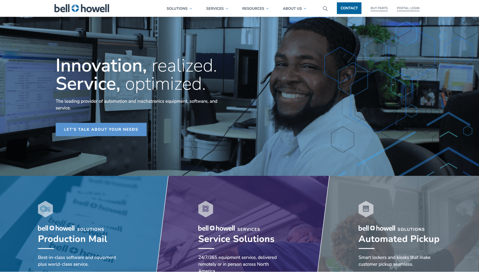
Bell Howell exemplifies a service-oriented approach to B2B distribution. From the moment visitors land on the homepage, the message is clear: "Innovation, realized. Service, optimized." This statement shows Bell Howell's commitment to excellence and customer satisfaction.
Notably, the homepage showcases various services available to retailers, including fast response times, real-time remote monitoring, highly skilled technicians, and comprehensive data analytics and reporting. This all-in-one package offers retailers a sense of reassurance, knowing that every aspect of their needs is addressed under one roof.
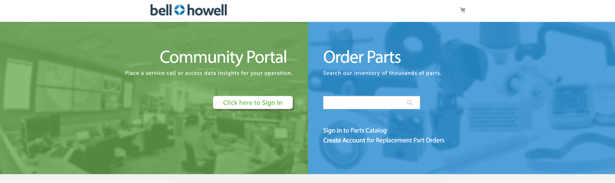
Users can schedule service calls and access information.
Furthermore, including an online form directly on the homepage streamlines communication, sparing retailers the hassle of navigating through unnecessary emails or making phone calls.
Bell Howell's "Buy Parts" section exemplifies its dedication to empowering retailers with convenient access to essential services and resources.
By providing a login portal to their community platform, retailers can seamlessly place service calls, access valuable data insights for operational optimization, or swiftly order parts from an extensive inventory.
Bullard | Strong Visuals, Headlines and CTAs
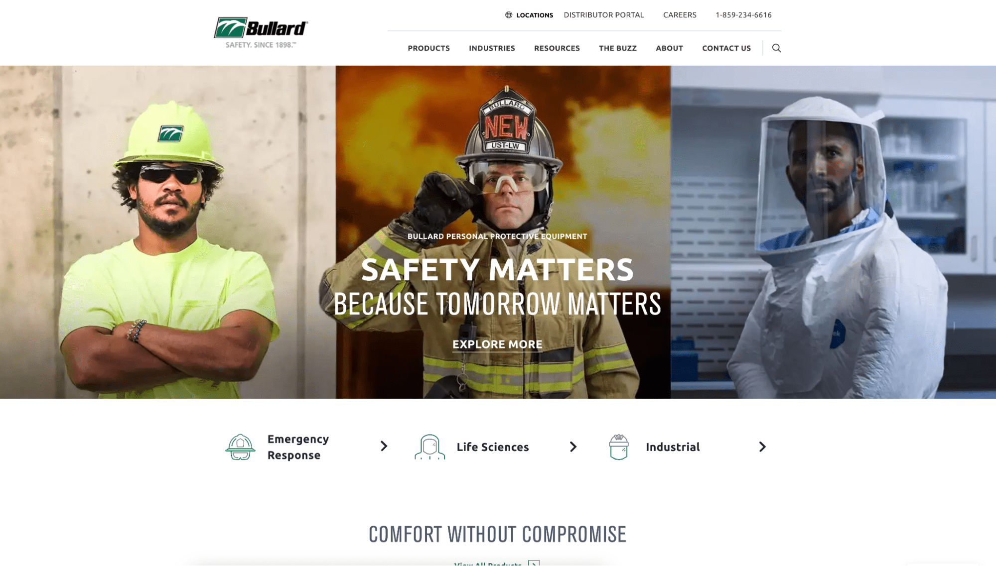
Bullard's website stands out for its strong visuals and headlines, which convey its commitment to safety and customer care. Headlines like "Safety Matters Because Tomorrow Matters" resonate with their target audience and effectively communicate the brand's core values.
The site sets a remarkable standard in B2B design with its effective use of call-to-actions (CTAs) and compelling visuals. Throughout the website, Bullard strategically places CTAs such as "View all Products," "Build Yours Now," "Learn more," "Become a channel partner," "Get started," "Follow us," and "Like us."
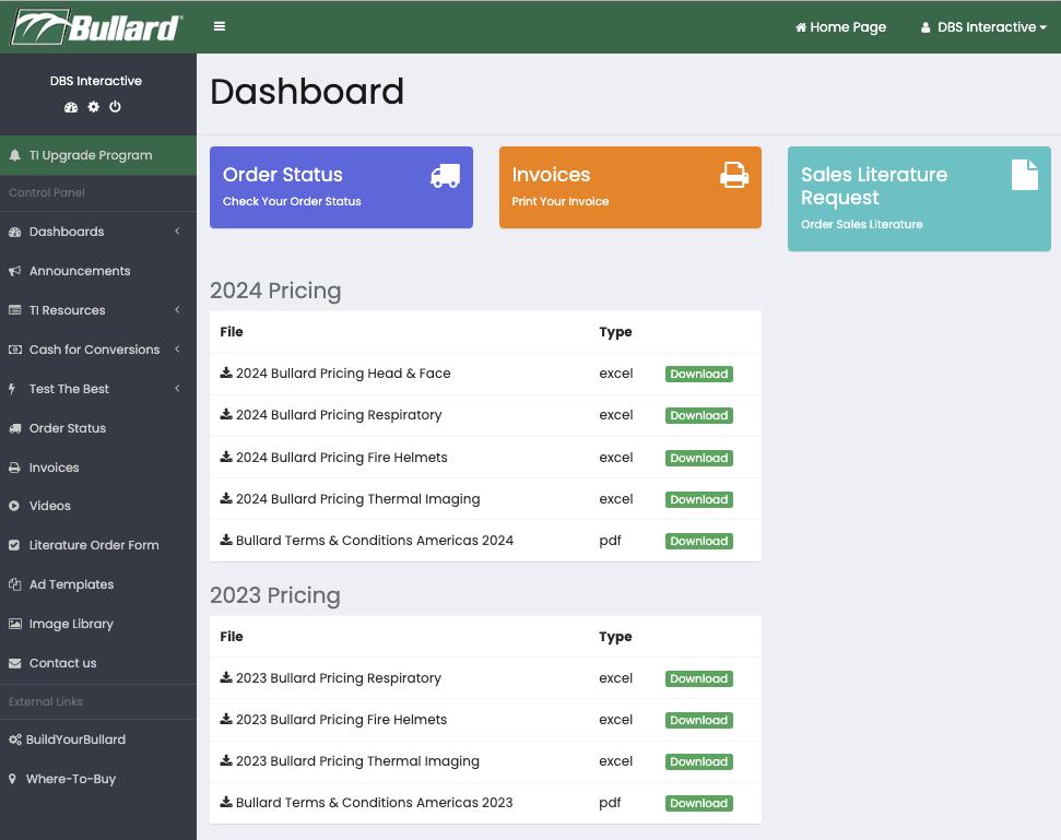
Bullard distributors can download pricing, view order status, request sales literature, and more.
These CTAs encourage engagement and guide visitors towards meaningful actions, whether exploring products, learning about partnership opportunities, or staying connected via social media.
Prioritizing clear and enticing CTAs ensures visitors can easily navigate the website and take desired actions, ultimately enhancing user experience and driving conversions.
Additionally, Bullard's distributor portal is a testament to their customer-centric approach.
Bullard facilitates seamless communication, order management, and support by providing a dedicated portal for distributors.
CMS: WordPress
Werner | Clear Value Proposition
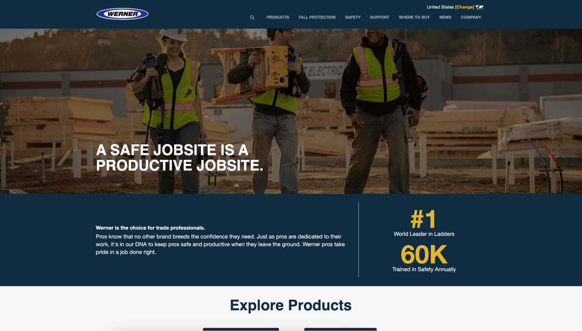
Werner exemplifies excellence in B2B website design through its effective value proposition strategy. From the moment visitors land on the homepage, Werner communicates a clear identity and product focus.
The homepage messaging, such as "A safe job site is a productive job site" and "Trusted everywhere, work gets done," resonates with their target audience and emphasizes Werner's commitment to safety and reliability.
Messaging immediately conveys the risks and benefits through messaging.
By aligning the value proposition with its core values and product strengths, Werner ensures visitors understand who they are and what they specialize in from the start.
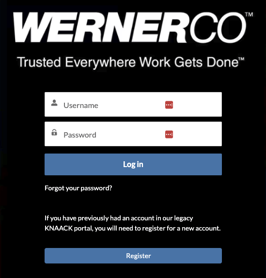
Furthermore, Werner leverages its website to facilitate transactions through partners.
The Salesforce-based distributor portal expands its reach and enables flawless purchasing experiences.
The site goes a step further with a section for partners to access materials to support the marketing and promotion of Werner products.
Main Site CMS: Sitefinity
Portal CMS: Salesforce
Plex | Clean and Interactive Design
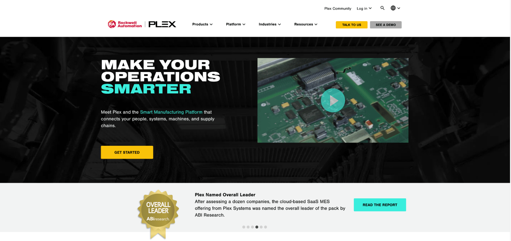
Multi media enhances the user experience.
Plex sets a high standard for B2B order portals with its clean and interactive website design. The website's clean layout and engaging visuals compel interaction and exploration from the moment visitors arrive.
Incorporating video adds a dynamic element that piques curiosity and provides glimpses into the platform's capabilities. This strategic use of multimedia enhances user engagement and effectively compellingly communicates Plex's value proposition.
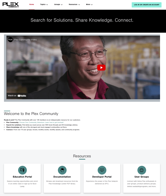
Plex's website features prominent callouts for downloads and case studies that provide valuable information for prospective customers. By offering easy access to informative content, Plex helps visitors make informed decisions and gain insights into how the platform can address their needs.
Additionally, Plex leverages chatbots to enhance user interactions and provide personalized solutions. By implementing chatbots, Plex ensures that users can receive immediate assistance and guidance.
Whether retailers have questions about the platform's features, need assistance with navigation, or seek solutions to specific challenges, the chatbots serve as valuable resources.
CMS: Drupal
LG | Intuitive, Straight-Forward UX
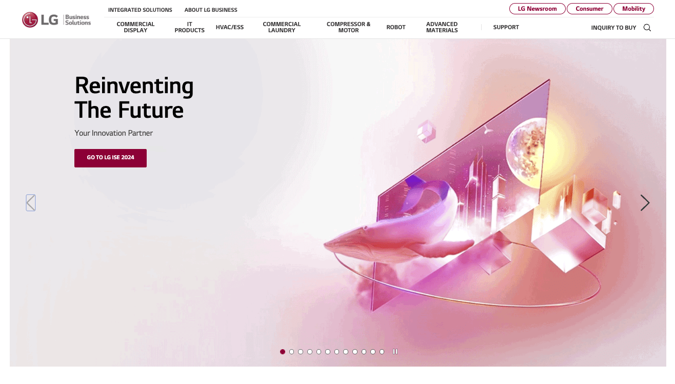
LG's website offers an intuitive and straightforward user experience (UX).
The intuitive and straightforward user experience (UX) on LG's website highlights a focus on clarity and efficiency. From the outset, visitors are greeted with a clean and direct interface that guides them easily toward their destination.
Captivating yet uncluttered imagery enhances visual appeal without overwhelming the user. LG understands the importance of streamlining the user journey. By providing clear pathways and limiting unnecessary pages, LG's website minimizes friction and maximizes user satisfaction.
Critical elements such as the partner portal, resource downloads, integrated solutions, and products are prominently featured on the homepage, eliminating the need for users to dig through layers of content to find what they're looking for.
Whether users seek product information, support resources, or partnership opportunities, LG's website delivers a seamless and efficient experience that prioritizes user needs.
FasTest | Great Messaging
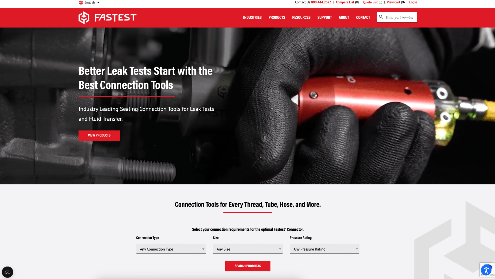
FasTest's homepage blends text, images, and videos to engage visitors.
FasTest stands out for its emphasis on strong messaging, effectively leveraging various media to communicate its value proposition. The homepage presents compelling text, images, and videos, creating a multi-dimensional storytelling experience for visitors the moment they arrive.
One notable item is the captivating video showcasing one of Fastest's connection tools in action. Despite its brevity, the video effectively conveys the tool's functionality and benefits and provides a visually engaging introduction to Fastest offerings.
Fastest messaging is succinct yet powerful, with statements like "Leave the engineering to us. We’ve got you covered."
This message instills confidence in Fastest's expertise and reliability and reassures potential customers that their needs will be met with professionalism and proficiency.
CMS: concrete5
Marion | Effective Use of Color
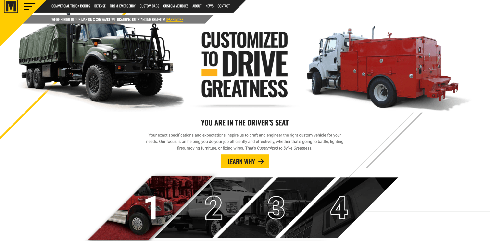
Marion's website exemplifies excellent design principles through its simple yet impactful use of color and typography. The website's design is characterized by a clean layout and a restrained color palette, with black and yellow hues dominating the visual landscape.
This minimalist approach ensures visual cohesion and allows the content to take center stage without distractions.
Additionally, Marion's website features great imagery that complements its overall design aesthetic. High-quality visuals are thoughtfully integrated throughout the site, adding visual interest and helping to tell the brand's story effectively.
Whether showcasing products, services, or brand values, the imagery on Marion's website enhances the user experience and reinforces the brand's messaging.
CMS: HubSpot CMS Hub
Astec | Great Messaging
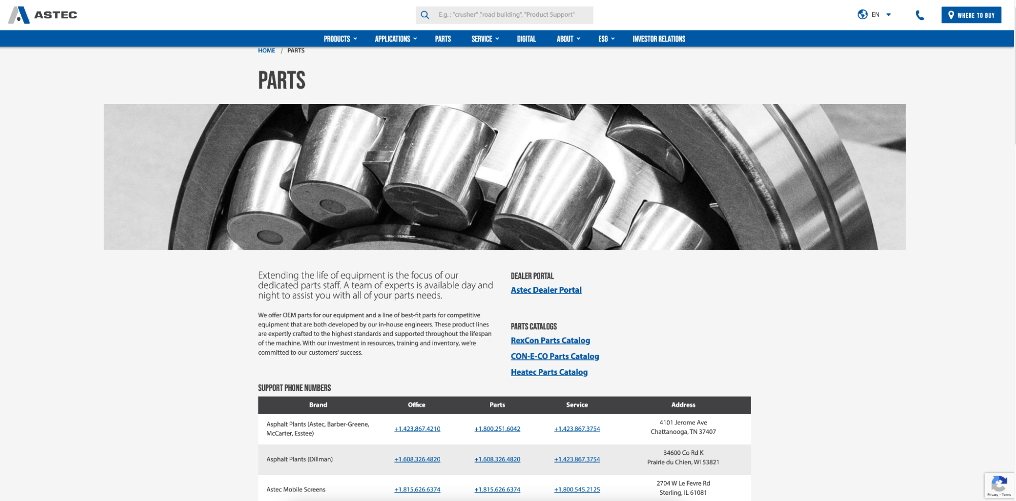
Astec’s website helps users find information quickly and
Astec's website stands out with compelling messaging and intuitive navigation, offering visitors a seamless browsing experience coupled with clear communication of its value proposition. Right from the outset, Astec effectively communicates its benefits to retailers with messages like "Real-time data, increased control, higher profits.".
This messaging captures attention and sets clear expectations for potential customers.
Moreover, Astec's website is designed for ease of navigation, allowing visitors to browse categories effortlessly, either by applications or product lines. This intuitive navigation structure ensures that users can quickly find the information they need, whether they're exploring specific product offerings or seeking solutions tailored to their industry or use case.
By organizing content in a logical and user-friendly manner, Astec enhances the overall user experience and facilitates efficient information discovery.
CMS: Sitefinity
Magnum | Great Product Display
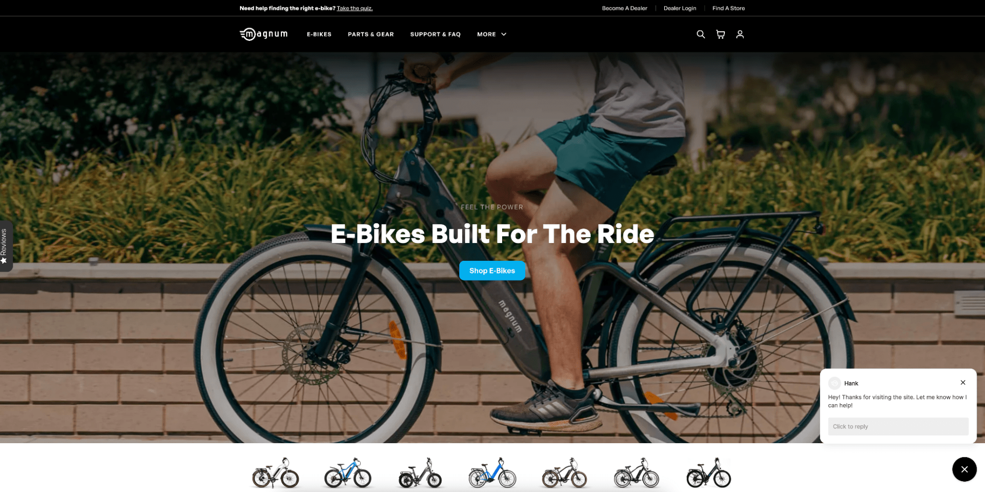
Magum's commitment to exceptional product display ensures informed purchasing decisions.
Magum's website sets itself apart with its exceptional product display. They showcase bikes and bike parts with clarity and precision. The website's design prioritizes visual appeal and product visibility, allowing visitors to explore Magum's offerings with ease.
Each product is presented in high resolution, providing detailed views and allowing customers to examine key features and components.
Magum's commitment to great product display extends beyond aesthetics. The website is designed to ensure that relevant product information is readily accessible, enabling customers to make informed purchasing decisions.
Detailed descriptions, specifications, and pricing information are provided alongside each product.
Also, Magum's website uses intuitive navigation features to enhance the browsing experience. Visitors can easily filter products by category, price range, or other criteria, allowing them to quickly narrow down their options and find exactly what they're looking for.
This streamlined navigation process saves time and effort for customers, improving overall satisfaction and facilitating conversions.
You Support Your Dealers, and We Support You
Whether emphasizing intuitive navigation, compelling messaging, or seamless e-commerce integration, each example provides valuable lessons for enhancing the online presence of B2B distributors.
At DBS, we craft award-worthy B2B websites tailored to your business needs. Elevate your online impact, drive organic search leads, and propel business growth.
Related Posts