The Alliance’s New Website Navigates a Complex Business
DBS Interactive DBS Interactive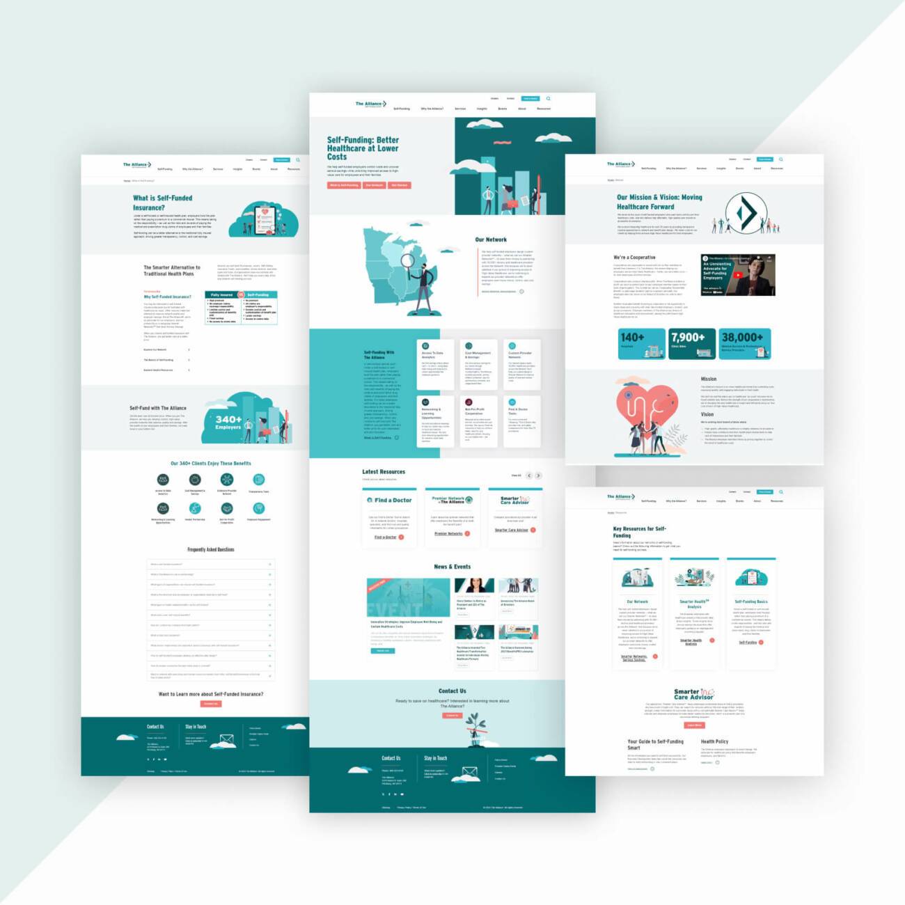
The Alliance holds a unique and valuable position in the often confusing world of employee health benefits. When they came to us, the organization needed a new website that clearly demonstrated its role in bringing various stakeholders together to help employers navigate self-funded insurance plans.
What does that mean, exactly? In short: It’s complicated.
Simply put, the Alliance needed new designs and messaging that helped visitors quickly understand the opportunities of self-funding among different audiences in their industry. This was all within the already confusing process of selecting employee insurance plans and carriers.
Ultimately, the organization must convey its mission and provide detailed information in a seamless user experience. So our work began with meticulous planning, where every step was guided by a strategic and collaborative vision to create a new web experience that resonates with the Alliance’s audience.
Building Strategy from the Ground Up

Subtle animation adds a touch of energy to the homepage without distracting users or affecting page speed.
The Alliance’s website project was not just about building a digital presence; it was about conveying its unique value proposition while simplifying the complexities of self-funded employee healthcare coverage.
We collaborated with the Alliance team during a series of strategy sessions that laid the foundation for the project:
Website Project Objectives
- Emphasize the Alliance’s unique value proposition
- Organize self-funding information and resources for optimal user pathways
- Spotlight the regional footprint of the Alliance’s service areas
- Segment blog articles based on audience interests
- Provide a superior and accessible user experience (UX)
- Provide on-page access to video content
- Retain links to third-party resources for the “Find a Doctor” tool and the online claims portal
- Simplify workflows and consolidate redundant on-page forms
- Deliver a high-performance website built to best practices to support the client’s self-hosting environment
Our Challenges
It was important to acknowledge these hurdles and potential roadblocks so we could take a proactive approach to addressing obstacles in achieving the project objectives:
- Creating unique user pathways for each of The Alliance’s distinct audiences
- Developing intuitive navigation so visitors could easily and efficiently find information
- Optimizing third-party integrations (including Microsoft applications) to work seamlessly with the CMS (WordPress)
- Recognizing and addressing the needs and expectations of both internal and external (public) users
- Integrating ADA-compliant accessibility throughout all aspects of the UX
The insights gained during our initial strategy sessions streamlined the information architecture development and initiated internal discussions about marketing alignment.
Identifying the Target Audience
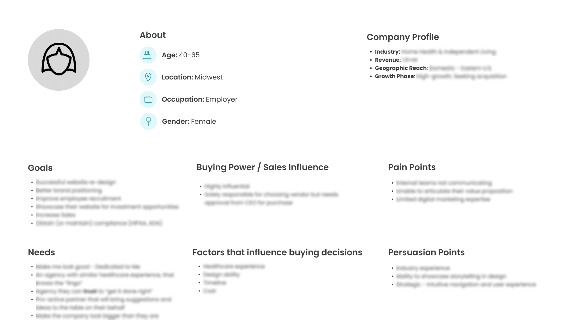
Example of a user persona created for the new Alliance website
Understanding the needs and motivations of The Alliance’s audience was critical. With the right approach, personas and user stories significantly reduce project risk.
Developing Personas and User Stories
Five user personas were identified, each representing a distinct group with specific goals and pain points:
- An employer looking to provide healthcare for their employees
- A broker looking for health insurance innovations to help employers
- An employee’s spouse making decisions and managing her family’s health coverage
- A provider looking to get connected
- A TPA (Third-Party Administrator) working to implement a self-insured plan for a client
What are User Stories?
User stories outline and detail the motivations and priorities of key personas when they visit the website, as well as potential website pathways and content that will satisfy each user story.
As with any project, the user stories we wrote for the Alliance’s new website were critical for achieving several goals, including:
- Documenting user needs among various personas
- Helping to prioritize website features
- Fostering project alignment among cross-functional teams
- Facilitating internal communication of progress and objectives
- Keeping customization of the new site within the project scope
- Identifying features and functionality to plan for future phases of the website
Creating the Sitemap and Navigation
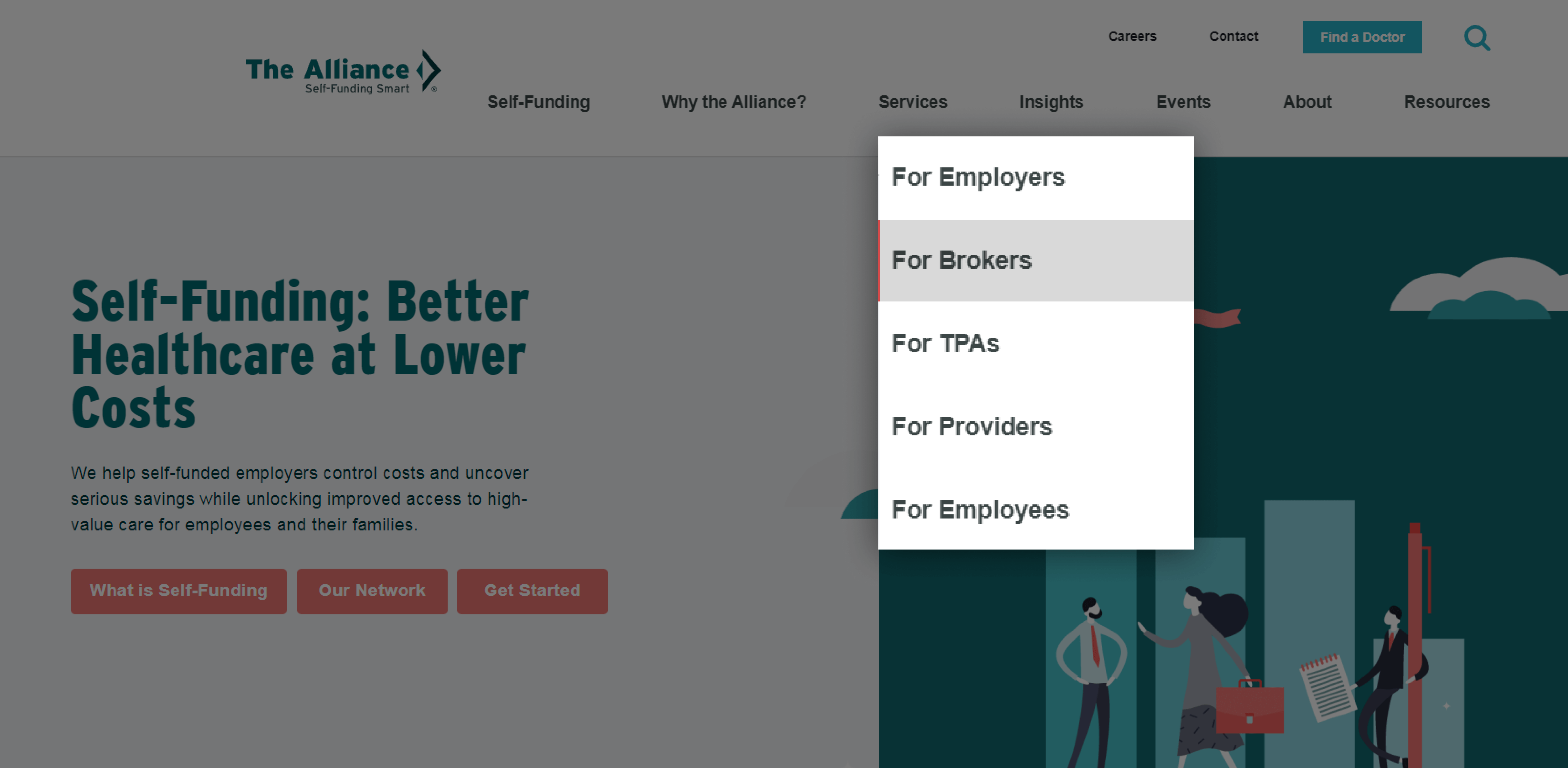
The Services navigation features each of the personas.
The attention to these personas and user stories is evident in messaging and site navigation. Importantly, the labels used in the primary navigation address each group’s universal topics of interest.
Before scrolling, visitors have access to multiple pathways to content and information. There is something for all personas.
Collaboration was key in producing a simplified sitemap and navigation structure. The new layout focused on needs and benefits, allowing users to easily find the information they seek.
Primary navigation was designed to intuitively lead users through their journey, while secondary navigation provided quick access to high-utility sections.
The goal was to eliminate clutter and guide users seamlessly through the website.
Redesigning the Web Experience
The Alliance had an established brand style but needed new elements to support storytelling on the new site and maintain design consistency to drive the user experience. So, we incorporated their branding into new visuals and messaging that make it easier for users to understand and navigate the site and engage with content.
The client informed the development of mockups during the project, ensuring consistency and coherence across the website, reinforcing the brand identity, and enhancing user experience.
The style guides we created for the new website relied on the Alliance’s established brand expressions. The guides also provide helpful guidance for content admins managing the site moving forward.
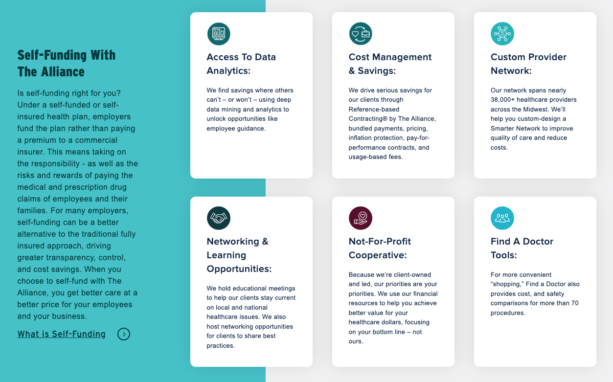
Visual ReliefThe writers at The Alliance did a great job conveying the value proposition in the headline in the hero section of the homepage. Designing in subtle animation and whitespace allows visitors to catch their breath. Notice that the hero also intentionally features three calls to action. This demonstrates that rules are made to be broken when creating a great user experience. |
 |
Since The Alliance chose the monumental task of writing the content for their new website, wireframes and more realistic mockups helped their team visualize how design and content could work together for more powerful messaging.
Mockups breathed life into the project, incorporating headlines, copy, and images to validate the design concepts. These visual representations provided stakeholders with a clear understanding of the final product and facilitated quick revisions based on feedback.
Digestible InformationInformation quickly overwhelms users. The designers understood that and created opportunities for The Alliance team to write introductions to information featuring bottom-line-up-front headlines. |
 |
Foundational Best Practices and Opportunities
Technical specifications were meticulously considered and detailed to ensure the website delivered optimal performance and met accessibility requirements. Every aspect, from CMS selection to integrations and SEO enhancements, was designed to meet industry standards and user expectations.
The website was also built as a progressive web application (PWA) to offer a uniform experience across devices, while adherence to WCAG 2.1 AA standards ensured accessibility compliance.
Launching the New Site, and Looking Ahead
The months of planning and collaboration led to the successful launch of The Alliance’s redesigned website.
But the journey doesn’t end here.
Continuous monitoring and optimization will be essential for the Alliance’s new site to maintain peak performance and address evolving user needs.
Key performance indicators (KPIs) will be monitored to measure the redesign’s success and identify areas for improvement. This will ensure that the new website remains a valuable asset for The Alliance and its audience for years to come.
Navigating the complex planning, designing, and launch of the Alliance’s new site demonstrated our commitment to collaboration and strategic thinking needed to simplify complex information and position the new site for success.
Ready for a website redesign to increase traffic and leads? Get Started
