Today's skilled nursing industry is facing serious headwinds when it comes to staffing and regulation, in addition to elevated levels of consolidation as healthcare brands offering skilled nursing services and facilities continue to position themselves either to grow through acquisition or become acquired.
Well-designed websites are a key to success for any skilled nursing business. The best skilled nursing websites exemplify superior website design practices that position the site to deliver an exceptional user experience that effectively connects visitors with brand messaging, business services, and company information.
By prioritizing clarity and simplicity, the following websites ensure that whether visitors are seeking services or employment with a skilled nursing company, they can navigate the site's content and pages without feeling overwhelmed.
The Top 7 Skilled Nursing Website Designs
Each website example below highlights a skilled nursing company's distinct approach to creating a user-centric web design that leverages visuals, features, and content to bolster brand credibility and build trust in the company's commitment to care.


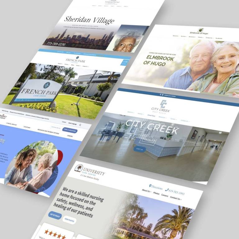
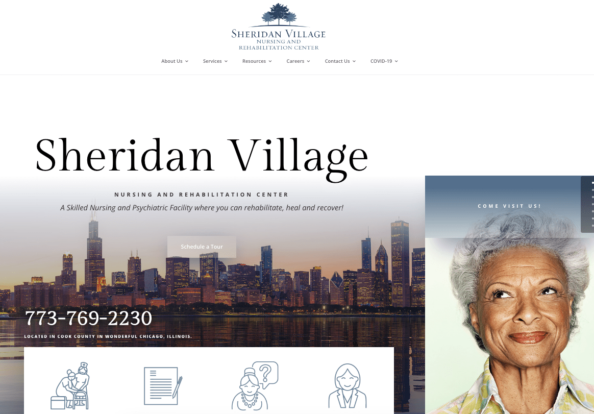 This nursing home’s website puts a focus on content that facilitates navigating and understanding the company's service offerings. Visitors won’t get lost in a maze of information. Each service is explained thoroughly so family members, loved ones, or patients can understand the care offered. For many first-time visitors to a skilled nursing website, that is important.
The site's style is modern and sleek. The contemporary aesthetic avoids the stereotypical “nursing home” look and feel, so that anyone can see themselves living within the facility.
A fun and thoughtful feature of the Sheridan Village site is its interactive tool for sending an e-greeting card to patients to foster ongoing connections. This exemplifies how web content can strengthen a skilled nursing brand's values and connection with its target audiences.
CMS: WordPress

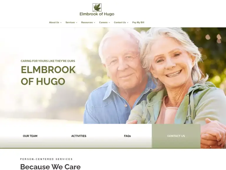
Elmbrook’s website consistently conveys its commitment to patients, evident in its messaging themes centered on “We Care.” The site offers validation by showcasing the four-star overall rating from the Centers for Medicaid and Medicare Services. Beyond messaging, the website uses a pleasant color palette in shades of green. Images incorporate these shades of complimentary shades.
The colors and simple design focus users on their primary goal of finding information bolstered with the messaging about the quality of care.
CMS: WordPress
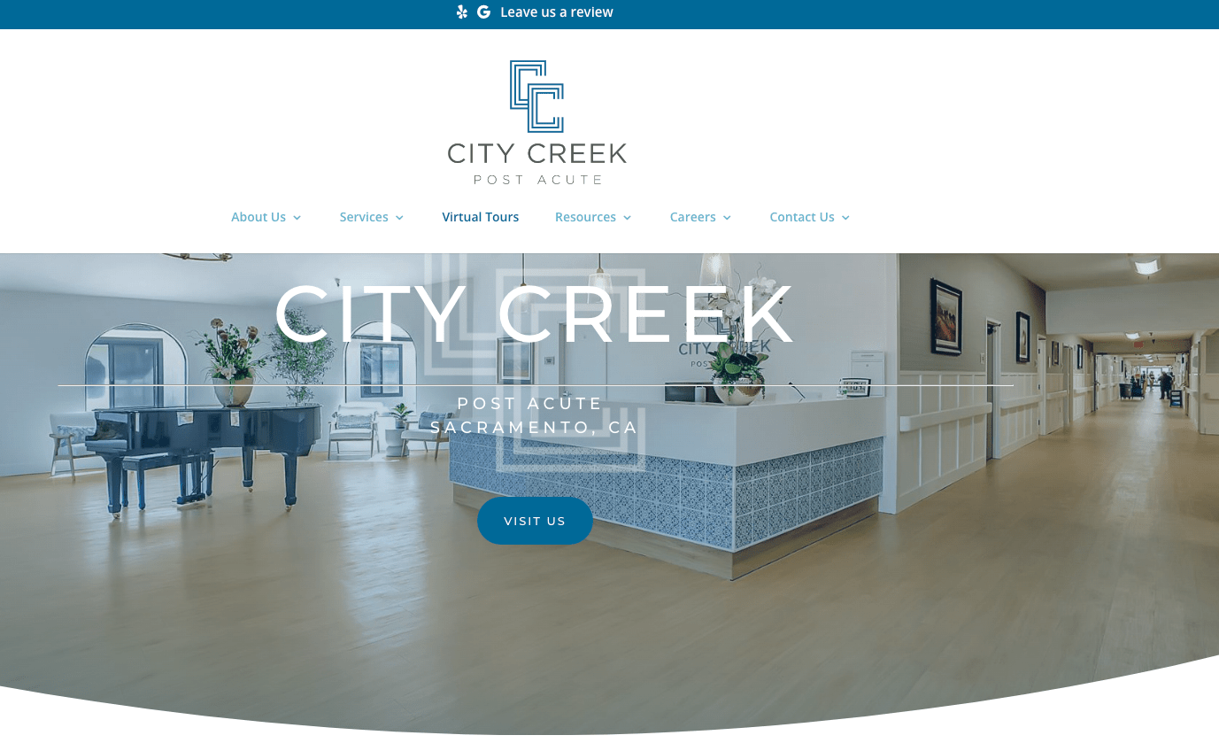
When designing its website, City Creek didn't underestimate the power of white space. It's like a breath of fresh air amidst the chaos of healthcare information that gets technical and overwhelming. By giving elements room to breathe, the site creates a sense of calmness and clarity for visitors. Smartly, the website’s color palette maintains brand consistency by matching the facility’s interior design’s color scheme.
White space helps to enhance readability by reducing visual clutter. Visitors can quickly identify and focus on the content that matters.
With less distraction, comprehension improves as visitors can digest information more effectively. Moreover, white space conveys elegance and sophistication.
CMS: Wordpress
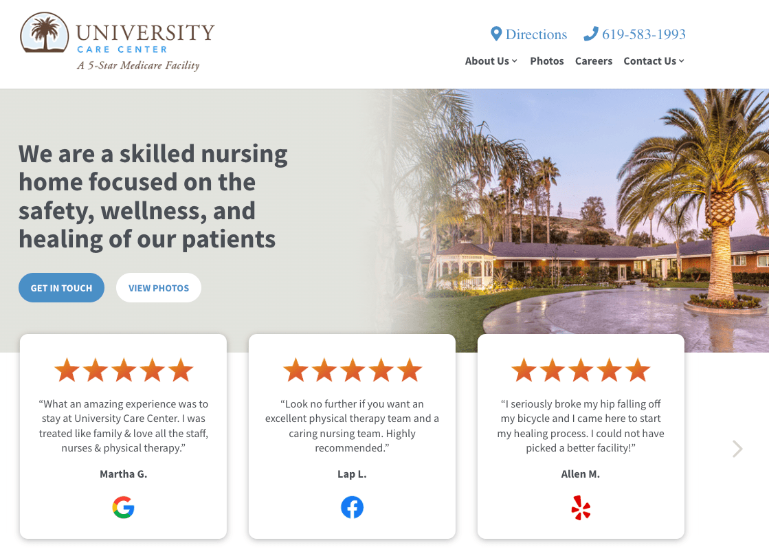
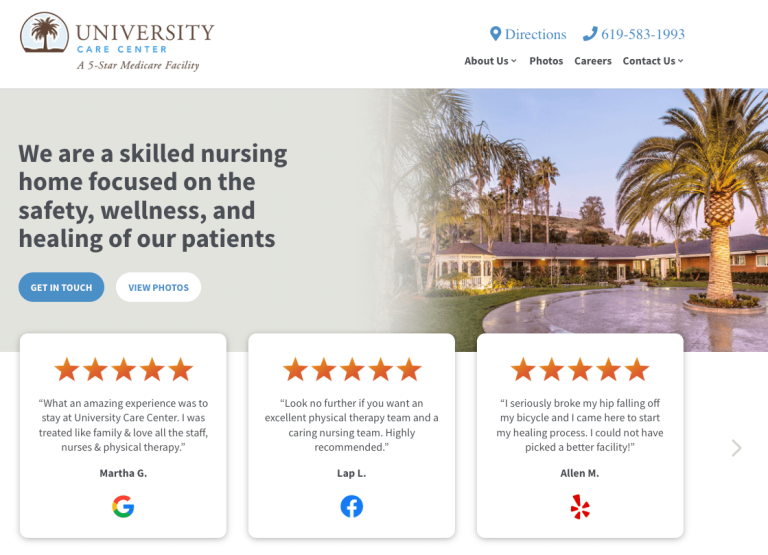
University Care Center understands that a great review can influence a new visitor. Justly proud of their five-star overall Medicare ratings Medicare, the home page has many positive customer reviews from various online sources to support their government rating. Highlighting the reviews prominently at the top of the home page in a gallery device helps frame the user journey.
Inviting imagery and large content sections with easy-to-read information in only a few well-placed sections makes the user journey intuitive and easy to navigate entry.
Like the Sheridan Village website, the University Care Center prominently displays a section for greeting patients.
CMS: WordPress
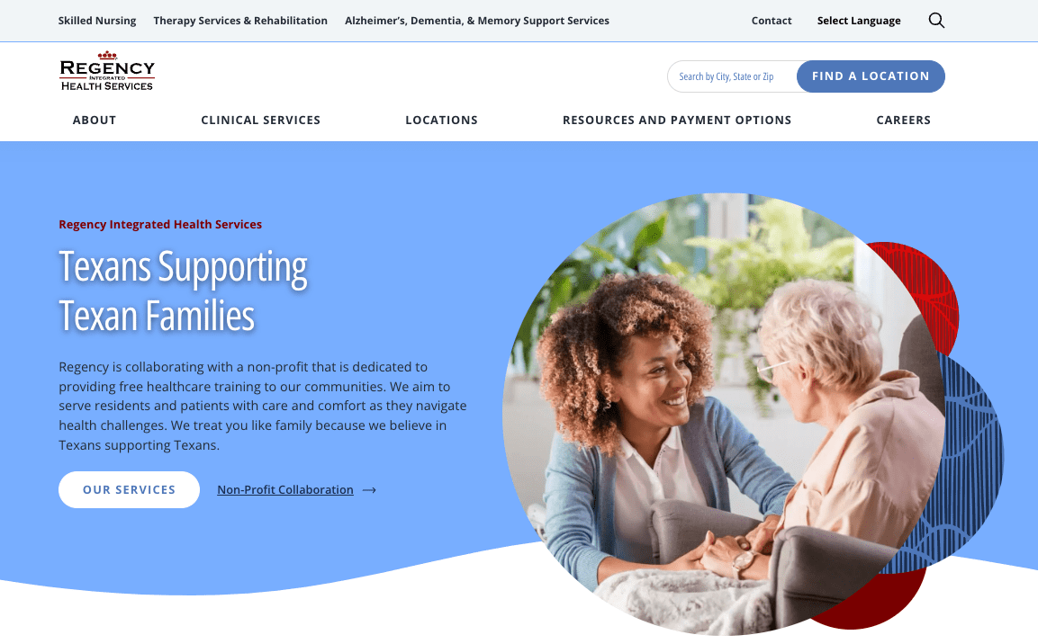
Regency Integrated Health Services guides users to their facilities throughout Texas, from the simple primary navigation to the focused sections on the homepage. With over 60 facilities, the site has to help users quickly narrow options for finding skilled nursing care.
 The home page guides users to what’s likely most important: services, locations, and the mission. The site also seeks to attract job applications.
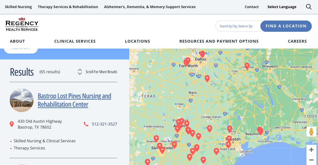
Users can control a map with interactive pins that display brief information about a facility and link details about the locations. A search tool allows users to search by city, state, or ZIP code and control their search radius. Each location page features information and photos unique to that facility.
CMS: WordPress
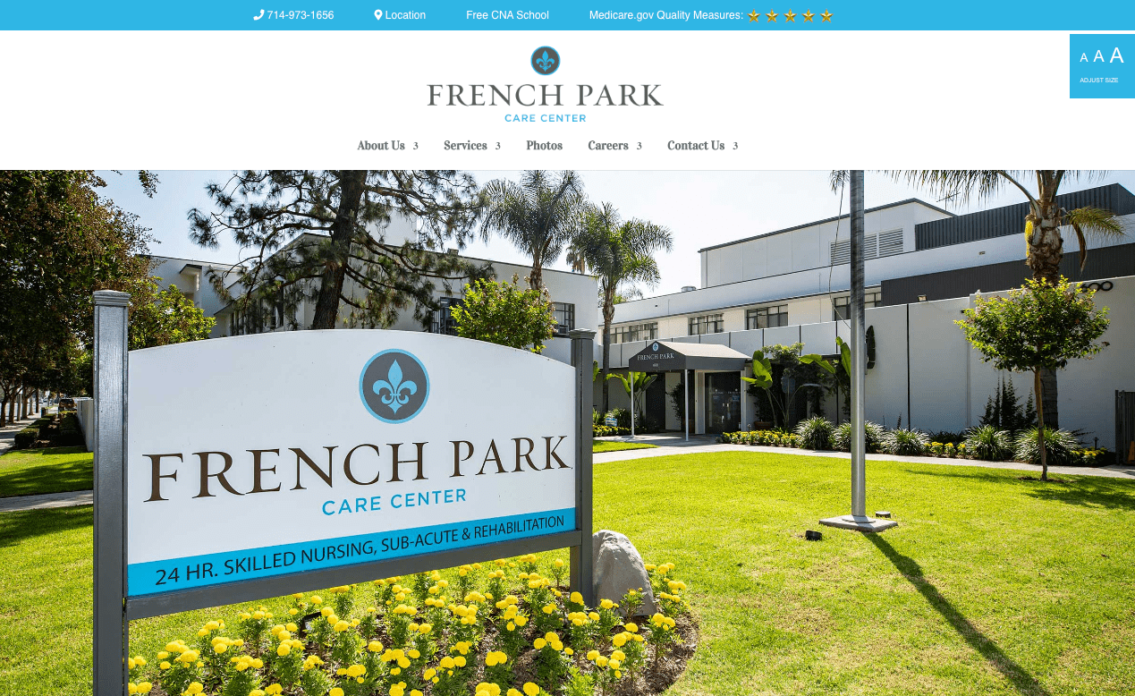
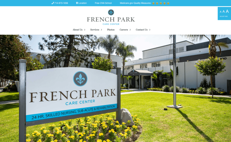
The website uses the secondary navigation at the top of the page to highlight their five-star government rating and free CNA school to help in employee recruitment. Each of these links targets different and equally essential audiences.
A prominent controller at the top right of all pages allows users to adjust the type size on the pages. This offers users with reduced vision an option for a better experience. The button remains stationary as users scroll, making it always available.
The site offers links to downloadable brochures in multiple languages to meet the needs of the diverse community. Users can find these links prominently displayed on all pages after the home page.
The Careers section prominently displays several innovative employee benefits to encourage applications while presenting the corporate culture/emphasis on employees.
CMS: WordPress
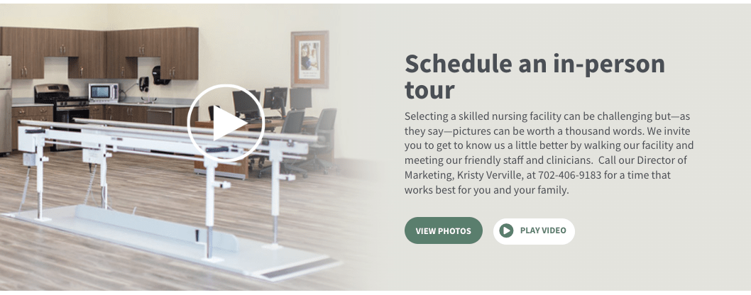
The website focuses on showing potential patients what the facility offers. The site relies on photo galleries and standard and 360-degree videos for users to see for themselves. Trellis Centennial invites site visitors to join them on a virtual tour that does just that.
After clicking on the prominent calls-to-action on the homepage, site visitors are taken to a gallery of high-resolution photos that showcase the facility and staff.
Below this Gallery is a Video tour filled with more shots of the complex and testimonials from staff and patrons of the center. Mixing high-quality videos with first-hand experiences helps to maximize the time users spend on their site.
Create a Compassionate Online Presence
Beyond clinical descriptions of services, these websites reflect the commitment to quality care. They showcase the brand's mission through easy-to-use design, engaging visuals, and a focus on user needs. The overall designs make a statement that extends beyond basic functionality, reflecting compassion and expertise while reshaping the online experience with empathy at the forefront.
At DBS, we have over 20 years of experience designing and developing healthcare websites that attract patients and job applicants through optimized organic search that outperforms competitors.
Take a look at our award-winning work for healthcare clients.
Contact us today for a free consultation and custom quote for your skilled nursing website project.
Related Posts