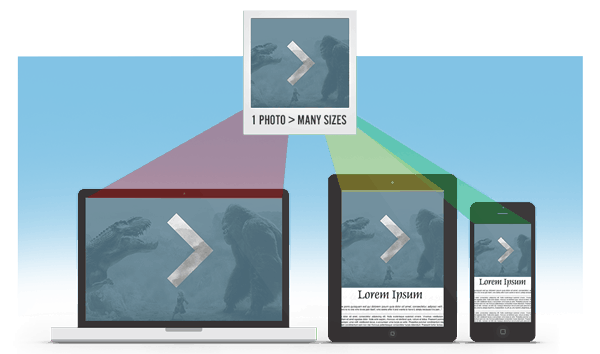
Responsive web design (RWD) provides great mechanisms for handling CSS images. Images of the appropriate size and resolution are easily delivered to the browser. A good thing.
HTML images can be another matter in RWD. Unless additional steps are taken, these are served to the client at the largest dimension, downloaded and then scaled by the browser to fit the available space, effectively annoying untold millions of innocent mobile bystanders. Not such a good thing.

The problem, of course, is that the smallest and slowest devices, which could benefit most from a properly sized image, are often downloading a lot more than they need. Then they must do the extra work of scaling from very big to very small – wasting memory, CPU, bandwidth and our most precious commodity, time. Mobile devices are penalized in this model. Just the opposite of the “mobile first” holy grail.
There is not a native HTML method of dealing with this (yet). The difficulty here is compounded when using web application frameworks like WordPress, where the framework can dynamically dictate much of the HTML. And where we have users adding images via a CMS, we can’t realistically expect most of them to be providing images in multiple sizes and crafting HTML to accommodate that, can we?
Of the current hacks that hope to solve this dilemma, we are going to take a look at using the Picturefill based approach within WordPress. We have found Picturefill to be the best solution for us, primarily because it is the most scalable. We also tried the “Adaptive Images” approach where images are re-sized directly by server side scripting. That approach works fine and was much easier to implement, but just does not scale and play well with CDNs, so we ruled that out as having an undesirable limitation. And there are several cloud based solutions, but we didn’t like how little control we had over our own work product.
Picturefill is a JavaScript take on the HTML5 proposed picture element where multiple image sources are provided and the browser then selects the right one based on device characteristics. It’s a hack, but it works nicely. WordPress provides a nice set of native tools for creating and working with multiple image sizes. A good fit. Mostly. But requires some work.
The very nicely done WordPress plugin, Picturefill.WP, will do most of the heavy lifting for us by leveraging native WP internals.
This approach can work for any images that are in the WordPress Media Library. Also, before starting, you should know what your theme’s breakpoints are, and then set the default WordPress image sizes accordingly. You can have more than the default three image sizes, but save yourself some time and think this through beforehand.
Our Picturefill / WordPress integration doesn’t completely solve all the issues raised by responsive images, but it sure gets us a good part of the way there. At least until something better comes along.
We will look at five scenarios:
- Images inside the WP “loop”
- “Other” images in WP templates but outside the “loop”
- Images from the popular Advanced Custom Fields plugin
- NextGEN Gallery Images
- Adding more than the default 3 image sizes
#1 is a piece of cake. It just “works” for any WordPress page, post or custom post type! The only caveat being the image must be in the Media Library and should be inserted using the ‘Add Media’ button.
#2 would include image elements that are referenced in WordPress templates, but not inside the WP “loop”. These img tags must have fully qualified src attributes that point to an image in the Media Library:
[sourcecode language=”html”]<img id=”slideimg” alt=”” src=”http://example.com/wp-content/uploads/image.jpg” />[/sourcecode]
This requires a small bit of additional code. Examples for handling this situation and others can be found at https://github.com/kylereicks/picturefill.js.wp#extending-picturefillwp. Then in your functions.php, you would add:
[sourcecode language=”php”]add_filter(‘filter’, ‘theme_function_to_apply_picturefill_wp_to_filter’);
function theme_function_to_apply_picturefill_wp_to_filter($content){
return Picturefill_WP::get_instance()->;cache_picturefill_output($content, ‘name_of_the_filter’);
}[/sourcecode]
#3 also requires some additional steps. First, your images must be defined in ACF as “image objects”. Secondly, there will need to be minor tweaks to your template code:
[sourcecode language=”php”]$image_object = get_field(‘image’);
$image_output = ‘<img id=”slideimg” alt=”” src=”‘ . $image_object[‘sizes’][‘large’] . ‘” />;’
echo apply_filters(‘theme_acf_image’, $image_output, ‘image’);
[/sourcecode]
and then to support ACF, include this code then in your theme’s functions.php:
[sourcecode language=”php”]add_filter(‘acf/format_value_for_api’, ‘theme_function_picturefill_for_acf’, 11, 3);
function theme_function_picturefill_for_acf($content, $post_id, $field){
if (in_array($field[‘type’], array(‘textarea’, ‘wysiwyg’, text))){
return Picturefill_WP::get_instance()->cache_picturefill_output($content, $field[‘name’]);
}else{
return $content;
}
}
add_filter(‘theme_acf_image’, ‘theme_function_for_acf_image’, 10, 2);
function theme_function_for_acf_image($content, $name_of_the_image_field){
return Picturefill_WP::get_instance()->cache_picturefill_output($content, $name_of_the_image_field)
}[/sourcecode]
#4 NextGEN poses a problem since it completely bypasses the Media Library, and creates its own thumbnails. ACH! We will have to do a hacker tap dance to get around this one. First, we will need another plugin: NextGEN Gallery Media Library Addon. Note this plugin does not work with NextGEN 2.x versions! ACH! Specifically you will need 1.9.13, which can be downloaded from the NextGEN archives (NextGEN plans to support Media Library images, so this is a temp fix). Get those downloaded and activated. Now when adding images to a NextGEN gallery, you will have a new option, “Add Images from Media Library”. This is important! What this does though is copy the original uploaded image from the Media Library to NextGEN gallery folder only. It does not copy all the sizes that WP has created for us and that Picturefill.WP will need. Warning: NextGEN normalizes filenames such that filenames are forced to lowercase, spaces remove, ‘jpeg’ corrected to ‘jpg’, etc.
Now get the dance shoes ready …. First, to simplify our lives, we will tell WordPress to not use the default Year/Month folder structure, but to put everything in wp-content/uploads. This is toggled a check box under the Settings -> Media menu for “Uploading Files”. Uncheck that. Save Changes. Now we will need a custom NextGEN template, use plugins/next-gen-gallery/ngglegacy/view/gallery.php as a model for this, and configure NextGEN accordingly for your gallery.
Inside the outer foreach loop of the NG template, we will need to grab the $image object, and rewrite the URL to reference the /wp-content/uploads folder instead of the referenced NextGEN folder. NextGEN won’t care since its essentially the same image, and we’ll be able to keep Picturefill happy that way with all our WP related image sizes from the Media Library.
First, the template code:
[sourcecode language=”php”]
<?php foreach ( $images as $image ) : ?>
<?php $tags = wp_get_object_terms($image->pid,’ngg_tag’) ?>
<?php
echo ‘<li class=”gallery-thumbnail ‘;
foreach ( $tags as $tag ) :
echo $tag->name . ‘ ‘;
endforeach;
echo ‘”>’
?>
<?php
// rewrite image URL to keep picturefillWP code happy.
$image->imageURL = _nextgen_picturefill( $image );
/////////////////////////////////////////////////////
_picturefill( ‘<img src=”‘ . $image->imageURL . ‘” title=”” alt=”” />’ );
?>
</li>
<?php if ( $image->hidden ) continue; ?>
<?php $i++; ?>
<?php endforeach; ?>[/sourcecode]
Notice we’ve referenced two custom functions inside the foreach loop. Those will be in our functions.php:
[sourcecode language=”php”]
function _nextgen_picturefill( $image ) {
if ( is_file( ABSPATH . ‘wp-content/uploads/’ . basename( $image->imageURL ) ) ) {
// see if image is where we think it should be
$image->imageURL = WP_SITEURL . ‘/wp-content/uploads/’ . basename( $image->imageURL );
}
// return the imageURL, rewritten for our default WP uploads location
return $image->imageURL;
}
function _picturefill( $image ) {
// $image = fully populated <img alt=”” /> element
echo Picturefill_WP::get_instance()->cache_picturefill_output( $image, ‘image’ );
}[/sourcecode]
Whew!
# 5 WordPress by default provides 3 image sizes. You can add more if needed, and in some cases we might need more depending on the number of breakpoints in our design. This is easily done by using the add_image_size() WP function. But we will also need some helper code for Picturefill.WP, so it can handle these additional images accordingly. Example functions.php code to add 2 new sizes (including for Retina resolution):
[sourcecode language=”php”]
// Add 2 additional images to the default 3 WP images selection here, including for retina
add_image_size( ‘mytheme-thumb-1000’, 1000, 1000, false );
add_image_size( ‘mytheme-thumb-1000@2x’, 2000, 2000, false );
add_image_size( ‘mytheme-thumb-1500’, 1500, 1500, false );
add_image_size( ‘mytheme-thumb-1500@2x’, 3000, 3000, false );
// Make sure Picturefill.WP has the attachment data for the new image size(s)
add_filter(‘picturefill_wp_image_attachment_data’, ‘theme_picturefill_new_size_attachment_data’, 10, 2);
function theme_picturefill_new_size_attachment_data($attachment_data, $attachment_id){
$new_size_data = array(
‘mytheme-thumb-1000’ => wp_get_attachment_image_src($attachment_id, ‘mytheme-thumb-1000’),
‘mytheme-thumb-1000@2x’ => wp_get_attachment_image_src($attachment_id, ‘mytheme-thumb-1000@2x’),
‘mytheme-thumb-1500’ => wp_get_attachment_image_src($attachment_id, ‘mytheme-thumb-1500’),
‘mytheme-thumb-1500@2x’ => wp_get_attachment_image_src($attachment_id, ‘mytheme-thumb-1500@2x’)
);
return array_merge($attachment_data, $new_size_data);
}
// Add the new image size(s) to the responsive queue
add_filter(‘picturefill_wp_image_sizes’, ‘theme_add_new_small_size_to_responsive_image_list’, 11, 2);
function theme_add_new_small_size_to_responsive_image_list($image_sizes, $image_attributes){
if (!in_array($image_attributes[‘min_size’], array(‘thumbnail’, ‘medium’, ‘large’, ‘mytheme-thumb-1000’, ‘mytheme-thumb-1000@2x’, ‘mytheme-thumb-1500’, ‘mytheme-thumb-1500@2x’, ‘full’))){
return array(‘thumbnail’, ‘medium’, ‘large’, ‘mytheme-thumb-1000’, ‘mytheme-thumb-1000@2x’, ‘mytheme-thumb-1500’, ‘mytheme-thumb-1500@2x’, ‘full’);
} else {
return $image_sizes;
}
}
// Set the breakpoint for the 1st new image … we have 5 now
add_filter(‘picturefill_wp_media_query_breakpoint’, ‘theme_picturefill_new_small_size_breakpoint’, 10, 3);
function theme_picturefill_new_small_size_breakpoint($breakpoint, $image_size, $width){
return in_array($image_size, array(‘mytheme-thumb-1000’, ‘mytheme-thumb-1000@2x’)) ? 1000 : $breakpoint;
}
// ditto for the 2nd additional image size.
add_filter(‘picturefill_wp_media_query_breakpoint’, ‘theme_picturefill_new_small_size_breakpoint2’, 10, 3);
function theme_picturefill_new_small_size_breakpoint2($breakpoint, $image_size, $width){
return in_array($image_size, array(‘mytheme-thumb-1500’, ‘mytheme-thumb-1500@2x’)) ? 1500 : $breakpoint;
}[/sourcecode]
That’s pretty much it for these use cases. When all this is working right, you will see a series of span elements corresponding to the image size and resolutions in the generated source code.
[sourcecode language=”html”]
<span data-picture data-title=”myimage” data-id=”slideimg”>
<span data-src=”http://example.com/wp-content/uploads/myimage.jpg”></span>
<span data-src=”http://example.com/wp-content/uploads/myimage-480×319.jpg” data-width=”480″ data-height=”319″ data-media=”(min-width: 1px)” class=”picturefill-wp-source thumbnail”></span>
<span data-src=”http://example.com/wp-content/uploads/myimage-768×511.jpg” data-width=”768″ data-height=”511″ data-media=”(min-width: 788px)” class=”picturefill-wp-source medium”></span>
<span data-src=”http://example.com/wp-content/uploads/myimage.jpg” data-width=”2000″ data-height=”1331″ data-media=”(min-width: 2020px)” class=”picturefill-wp-source large”></span>
<span data-src=”http://example.com/wp-content/uploads/myimage-1000×665.jpg” data-width=”1000″ data-height=”665″ data-media=”(min-width: 1000px)” class=”picturefill-wp-source myimage-thumb-1000″></span>
<span data-src=”http://example.com/wp-content/uploads/myimage.jpg” data-width=”1000″ data-height=”665″ data-media=”(min-width: 1000px) and (-webkit-min-device-pixel-ratio: 1.5),(min-resolution: 144dpi),(min-resolution: 1.5dppx)” class=”picturefill-wp-source retina myimage-thumb-1000″></span>
<span data-src=”http://example.com/wp-content/uploads/myimage-1500×998.jpg” data-width=”1500″ data-height=”998″ data-media=”(min-width: 1500px)” class=”picturefill-wp-source myimage-thumb-1500″></span>
<span data-src=”http://example.com/wp-content/uploads/myimage.jpg” data-width=”1500″ data-height=”998″ data-media=”(min-width: 1500px) and (-webkit-min-device-pixel-ratio: 1.5),(min-resolution: 144dpi),(min-resolution: 1.5dppx)” class=”picturefill-wp-source retina myimage-thumb-1500″></span>
<span data-src=”http://example.com/wp-content/uploads/myimage.jpg” data-width=”2000″ data-height=”1331″ data-media=”(min-width: 2020px)” class=”picturefill-wp-source full”></span>
<noscript><img id=”slideimg” src=”http://example.com/wp-content/uploads/myimage.jpg” title=”myimage” alt=”” /></noscript>
</span>[/sourcecode]
picturefill.js will choose the proper one from that based on browser metrics. How sweet is that?
Footnotes
- CSS background images are not affected. You’ll need media queries for those.
- External images are out of bounds.
- If you have a multi-domain development environment, eg local, staging, production, you’ll find that because of the way WordPress handles image uploads, Picturefill.WP will only work correctly on the domain to which the images were uploaded, eg if they were uploaded to a staging domain, they work fine on a staging URL.
- Picturefill.WP caches, which can cause unexpected results during development. The cache is easily cleared by de-activating, re-activating the plugin.
- Lots more tips and tricks to be found on Picturefill.WP on github
- NextGEN has said they plan to support images from the Media Library. So we are not stuck at 1.* indefinitely.
- And please make sure your images are properly optimized for web usage. Don’t assume because you use an expensive, licensed product that this happens automatically (it doesn’t!).
- Code examples based on WordPress 3.7.1 and Picturefill.WP 1.2.6. FYI.
@dbsinteractive
