
Web design has come a long way in the twenty years since the first website was published. The ease of use that today's users experience on sites like Google and Amazon.com necessarily resulted from the trials of the early days.
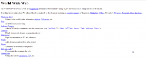
The first website.
While design techniques may come and go, one overarching goal of our efforts is increased usability. Here are a few ways to improve the readability of a web page.
Split up the Content
What Google did:
Google isolated the most frequently-used part of the page (the search bar) and moved the other stuff to the top and bottom. The result is a less-crowded page.
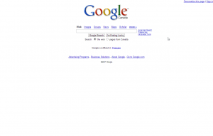
Google, 2007
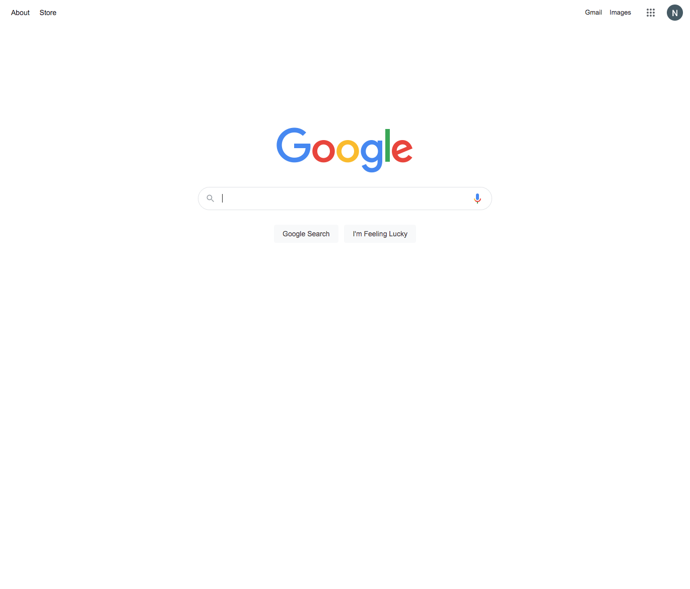
Google, 2022
Use High-contrast Colors with your Typography
What ESPN did:
Since 2005, the sports media giant ESPN replaced much of the green and gray backgrounds seen below with white backgrounds. The result? The text is easier to read, which is especially important on dimmer mobile screens.
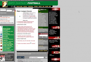
ESPN.com, 2005
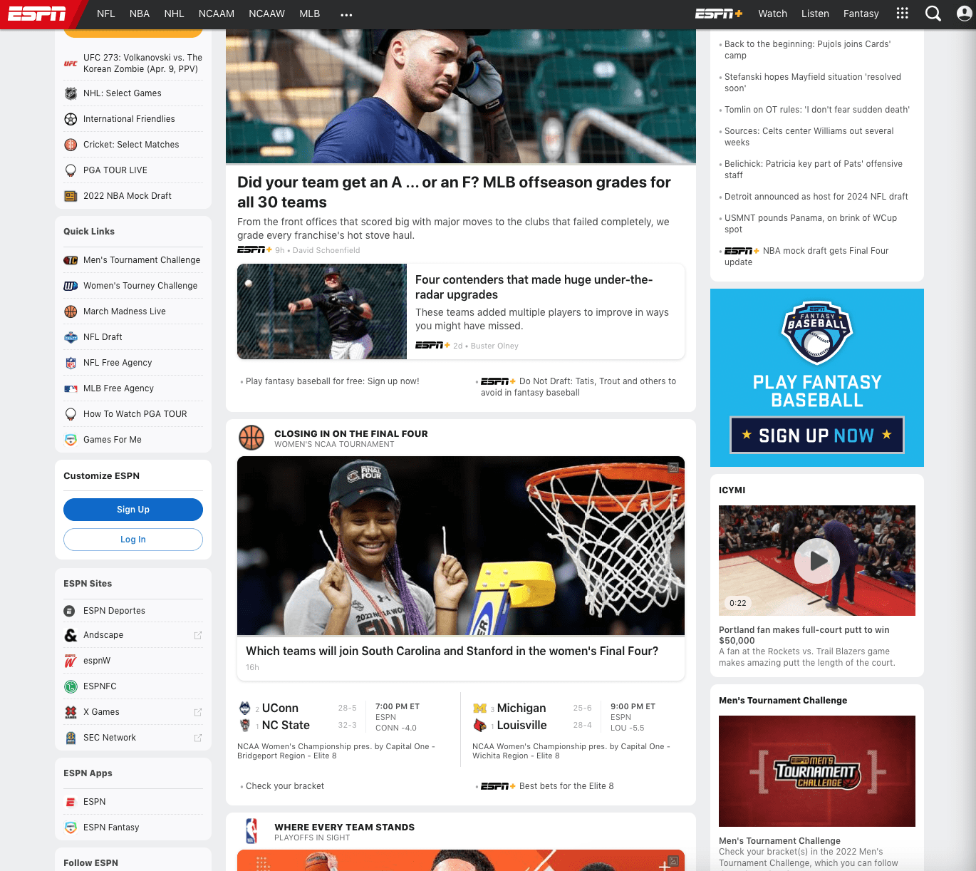
ESPN.com, 2022
Use Icons
What Yahoo! did:
See the big blue box under the Yahoo search bar in the screenshot below? Generally, the more stuff is crowded into a content box, the less likely it is that people will actually read and digest it before eye strain or frustration provokes them to navigate elsewhere. Instead of keeping that style, Yahoo opted to only display a fraction of the services they offer. Moreover, they accompanied each service with a unique icon. This serves to aid the user in quickly finding what he or she is looking for.
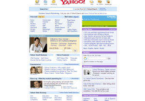
Yahoo, 2005

Yahoo, 2022
Remove Extra Visual "Stuff"
What Amazon.com did:
In some cases, it is necessary to distinguish a hyperlink from regular text so that the user knows what text, when clicked, will lead to another page. But on other pages, such as Amazon.com's landing page, the user already knows that almost everything on that page is clickable. In this case, underlined links may make the task of reading them more difficult. Looking at the changes to the left-hand sidebar between 2005 and 2022, one can see that Amazon got rid of the underlining as well as the bullets in this list. The result is greater readability.
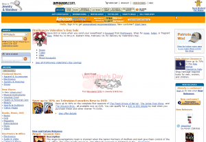
Amazon.com, 2007
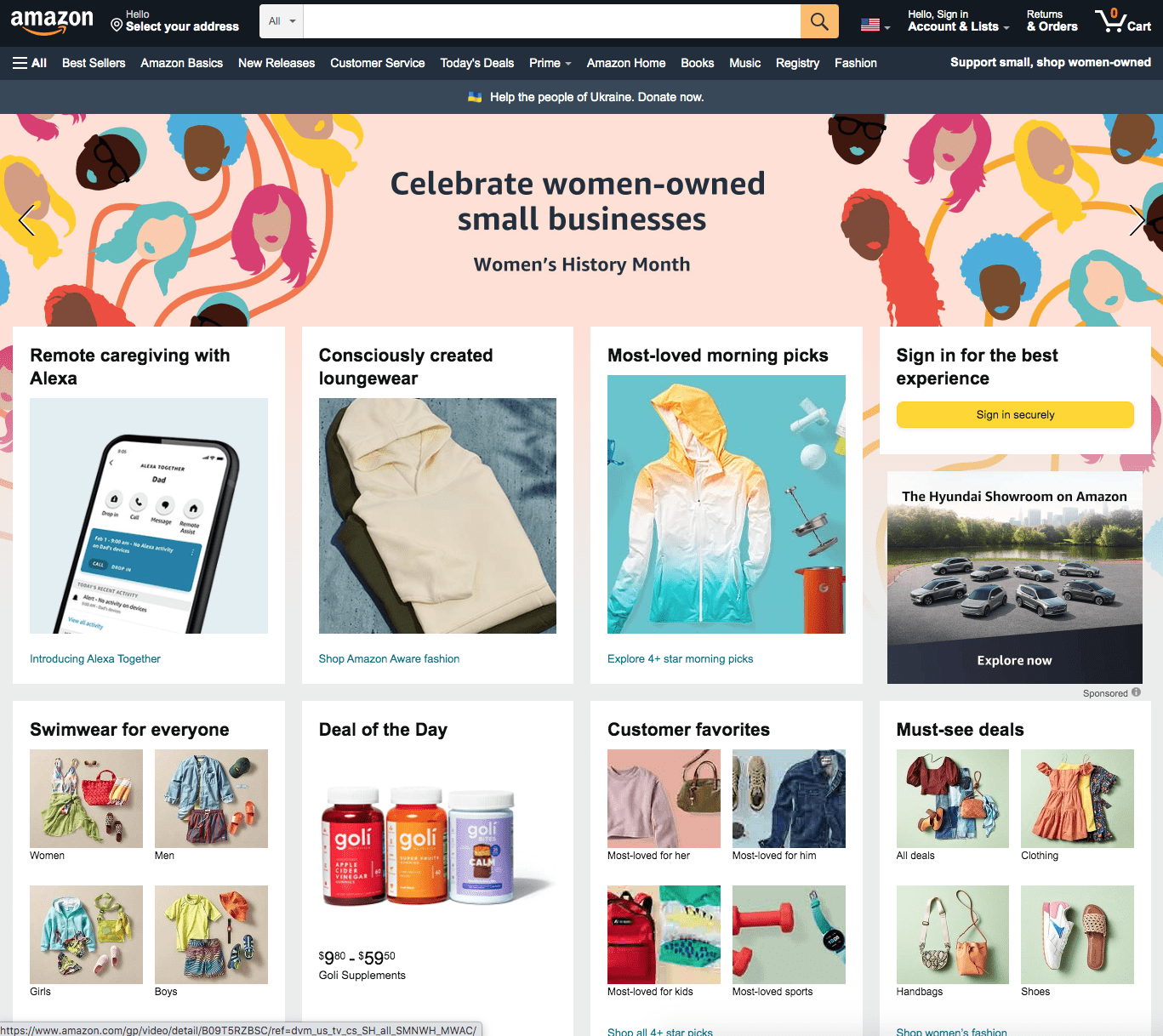
amazon.com, 2022
Increase Spacing between Elements
What eBay did:
Adding more content does not always make a website better. eBay improved the appearance of their homepage by increasing the font size of the important stuff and completely removing other parts of the page. The result is a cleaner, less cluttered page.

eBay, 2005
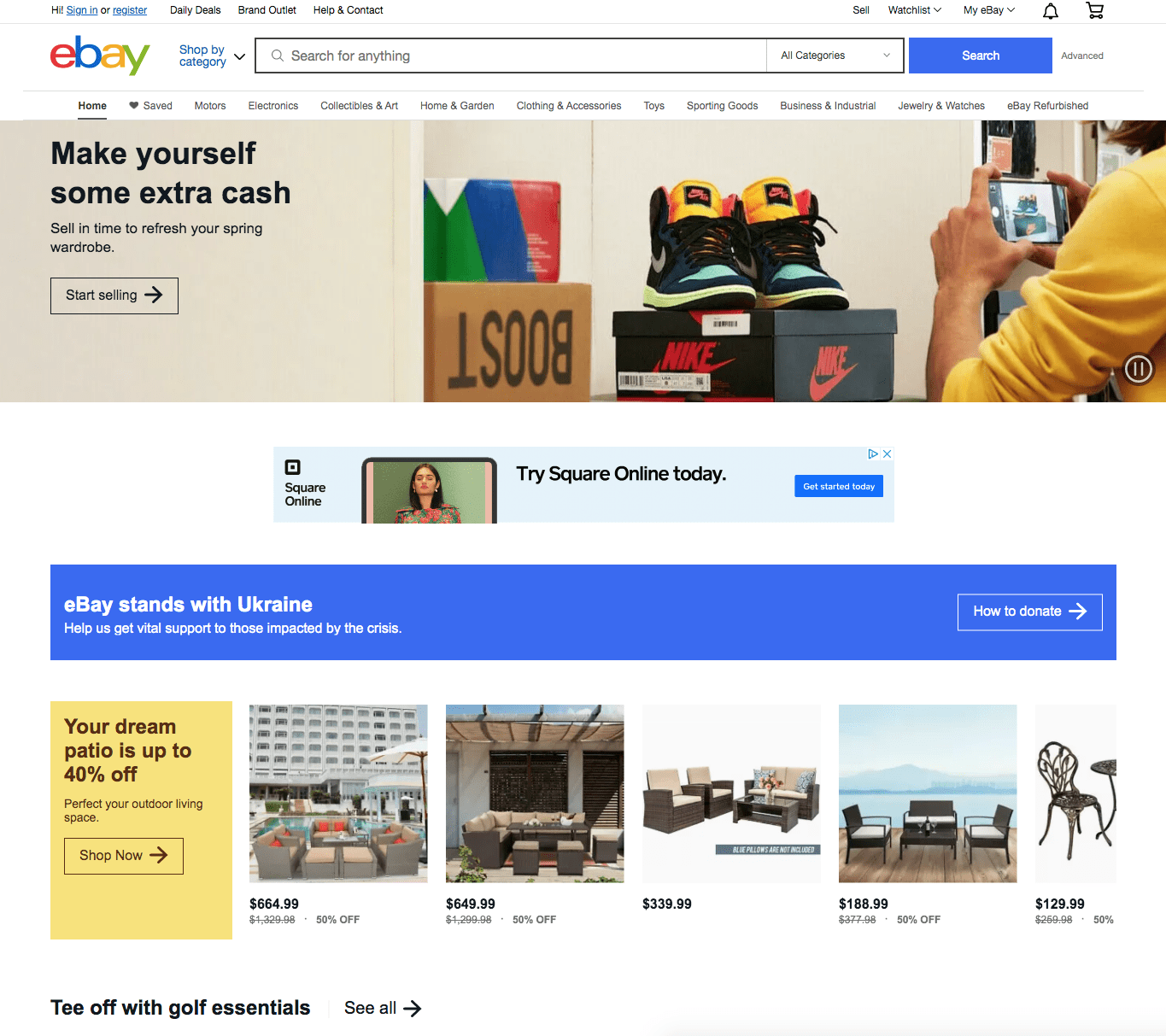
eBay, 2022
Anyone can use these techniques to make a good website great.
Related Posts